Willkommen bei den Top‑Schriften – hier treffen Beliebtheit und Qualität aufeinander. Das sind die in diesem Jahr am häufigsten heruntergeladenen und genutzten Fonts. Wenn Sie sichere Optionen für Logo, Web oder Social suchen, starten Sie hier.
Jeder Top‑Font überzeugt durch Balance, Lesbarkeit und Vielseitigkeit. Sie finden moderne Sans‑Serifs, elegante Scripts, Vintage‑Serifs und minimalistische Displays.
-
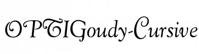
( Fonts by Castcraft Software - opti.netii.net - check the website before use )
A classic cursive font with elegant, flowing lines and sophisticated style.
 Herunterladen 3515 Downloads@WebFont
 -
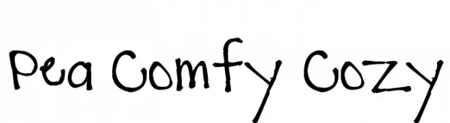
( Free for a personal use. For a commercial use please visit www.kevinandamanda.com )
A playful, hand-drawn font with irregular, whimsical strokes.
![Pea Comfy Cozy Frei Schriftart Herunterladen]() Herunterladen 3515 Downloads@WebFont
Herunterladen 3515 Downloads@WebFont -
![Yana Frei Schriftart Herunterladen]() Herunterladen 3514 Downloads@WebFont
Herunterladen 3514 Downloads@WebFont -
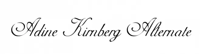
( Fonts by Dieter Steffmann )
An elegant, cursive font with ornate swirls and flourishes.
![Adine Kirnberg Alternate Frei Schriftart Herunterladen]() Herunterladen 3514 Downloads@WebFont
Herunterladen 3514 Downloads@WebFont -
( Copyright (c) 2012, Eduardo Tunni (http://www.tipo.net.ar), with Reserved Font Name 'Strait' )
A modern, geometric sans-serif font with consistent stroke width and clear readability.
![Strait Frei Schriftart Herunterladen]() Herunterladen 3514 Downloads@WebFont
Herunterladen 3514 Downloads@WebFont -
-
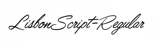
( Fonts by Mario Arturo - marioarturo.com. Personal-use only. For commercial use please contact owner. Contact the owner for a donation. )
A flowing, cursive script font with elegant, handwritten calligraphy style.
![LisbonScript-Regular Frei Schriftart Herunterladen]() Herunterladen 3513 Downloads@WebFont
Herunterladen 3513 Downloads@WebFont -
![CochinArchaic Frei Schriftart Herunterladen]() Herunterladen 3513 Downloads@WebFont
Herunterladen 3513 Downloads@WebFont -
( Fonts by Zetafonts - Personal-use only. For commercial use please contact owner. )
A bold, modern sans-serif font with clean lines and uniform strokes.
![Heading Now Trial 45 Medium Frei Schriftart Herunterladen]() Herunterladen 3512 Downloads@WebFont
Herunterladen 3512 Downloads@WebFont -
( Fonts by www.blambot.com )
A playful, rounded font with a hand-drawn feel and consistent stroke thickness.
![DigitalStrip 2.0 BB Frei Schriftart Herunterladen]() Herunterladen 3512 Downloads@WebFont
Herunterladen 3512 Downloads@WebFont -
![An Unfortunate Event Frei Schriftart Herunterladen]() Herunterladen 3511 Downloads@WebFont
Herunterladen 3511 Downloads@WebFont -
![DV_Divyae Italic Frei Schriftart Herunterladen]() Herunterladen 3511 Downloads@WebFont
Herunterladen 3511 Downloads@WebFont -
( Fonts by Jacob Fisher - www.pizzadude.dk )
A hand-drawn, sketch-like font with irregular, jagged edges.
![10 Minutes Frei Schriftart Herunterladen]() Herunterladen 3510 Downloads@WebFont
Herunterladen 3510 Downloads@WebFont -
( Fonts by billyargel.blogspot.com - Billy Argel )
A bold, cartoonish font with rounded, balloon-like letters.
![BOMB FONT Frei Schriftart Herunterladen]() Herunterladen 3509 Downloads@WebFont
Herunterladen 3509 Downloads@WebFont -
![TeXGyreTermes-Regular Frei Schriftart Herunterladen]() Herunterladen 3508 Downloads@WebFont
Herunterladen 3508 Downloads@WebFont -
![Kelvinized Normal Frei Schriftart Herunterladen]() Herunterladen 3508 Downloads@WebFont
Herunterladen 3508 Downloads@WebFont -
( Fonts by Steve Deffeyes - www.deffeyes.com )
An elegant serif font with swash elements and flowing curves.
![Gondola SD - Swash Frei Schriftart Herunterladen]() Herunterladen 3507 Downloads@WebFont
Herunterladen 3507 Downloads@WebFont -
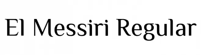
( Copyright 2015 The El Messiri Project Authors. )
A modern, elegant font with smooth curves and sharp edges, suitable for versatile applications.
![El Messiri Regular Frei Schriftart Herunterladen]() Herunterladen 3506 Downloads@WebFont
Herunterladen 3506 Downloads@WebFont -
( Fonts by Daniel Zadorozny - www.iconian.com - Free for personal use )
A futuristic, geometric font with bold, angular letterforms.
![Dodger Title Frei Schriftart Herunterladen]() Herunterladen 3506 Downloads@WebFont
Herunterladen 3506 Downloads@WebFont -
![Baramond Frei Schriftart Herunterladen]() Herunterladen 3506 Downloads@WebFont
Herunterladen 3506 Downloads@WebFont -
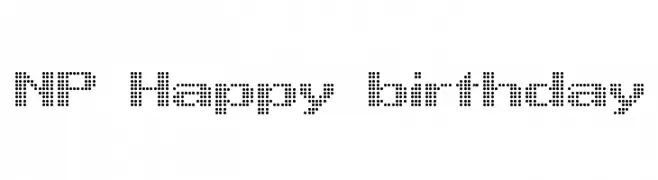
( Fonts by Dan P. Lyons - Personal-use only. For commercial use please contact owner. )
A playful, bold font with rounded, bubbly characters.
![ToySans Frei Schriftart Herunterladen]() Herunterladen 3505 Downloads@WebFont
Herunterladen 3505 Downloads@WebFont -
![NP Happy birthday Frei Schriftart Herunterladen]() Herunterladen 3505 Downloads@WebFont
Herunterladen 3505 Downloads@WebFont -
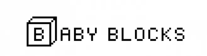
( Fonts by Colorful Typhoon - http://orange.s56.xrea.com/blog/ )
A playful, blocky font with a pixelated, retro style.
![Baby blocks Frei Schriftart Herunterladen]() Herunterladen 3505 Downloads@WebFont
Herunterladen 3505 Downloads@WebFont -
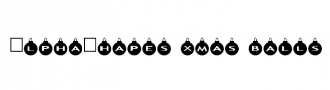
Schriftart von fontsnthings. For commercial use please contact the owner.
![AlphaShapes xmas balls Frei Schriftart Herunterladen]() Herunterladen 3503 Downloads@WebFont
Herunterladen 3503 Downloads@WebFont -
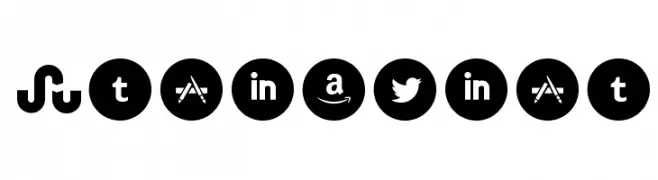
( Fonts by www.Fontfabric.com )
A bold, modern set of social media and brand icons in circular shapes.
![Socialico Frei Schriftart Herunterladen]() Herunterladen 3503 Downloads@WebFont
Herunterladen 3503 Downloads@WebFont -
![Amalgam Shadow Frei Schriftart Herunterladen]() Herunterladen 3503 Downloads@WebFont
Herunterladen 3503 Downloads@WebFont -
![Care Bear Family Frei Schriftart Herunterladen]() Herunterladen 3503 Downloads@WebFont
Herunterladen 3503 Downloads@WebFont -
( Copyright 2014-2017 Indian Type Foundry (info@indiantypefoundry.com) )
A clean, modern, geometric sans-serif font with a light, italicized style.
![Poppins Light Italic Frei Schriftart Herunterladen]() Herunterladen 3502 Downloads@WebFont
Herunterladen 3502 Downloads@WebFont -
( Fonts by Paul Reid - tracertong.co.uk )
A bold, geometric font with high contrast and minimal spacing.
![Unrealised Frei Schriftart Herunterladen]() Herunterladen 3502 Downloads@WebFont
Herunterladen 3502 Downloads@WebFont -
( Fonts by a Neale Davidson - www.pixelsagas.com. Personal-use only. For commercial use please contact owner. )
A modern, geometric font with rounded edges and a tech-inspired design.
![Downlink Frei Schriftart Herunterladen]() Herunterladen 3501 Downloads@WebFont
Herunterladen 3501 Downloads@WebFont -
![Pseudo-APL Frei Schriftart Herunterladen]() Herunterladen 3501 Downloads@WebFont
Herunterladen 3501 Downloads@WebFont -
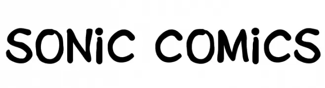
( Fonts by Daniel Werneck )
A playful, bold font with a hand-drawn, energetic style.
![Sonic Comics Frei Schriftart Herunterladen]() Herunterladen 3501 Downloads@WebFont
Herunterladen 3501 Downloads@WebFont -
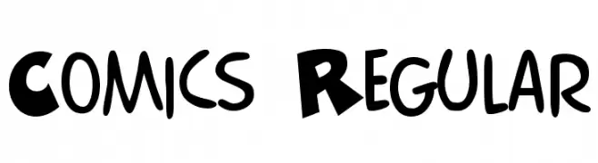
![Comics Regular Frei Schriftart Herunterladen]() Herunterladen 3501 Downloads@WebFont
Herunterladen 3501 Downloads@WebFont -
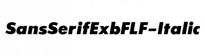
( Fonts by Casady & Greene )
Bold, italicized sans-serif font with high contrast and modern style.
![SansSerifExbFLF-Italic Frei Schriftart Herunterladen]() Herunterladen 3500 Downloads@WebFont
Herunterladen 3500 Downloads@WebFont -
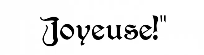
![Joyeuse!]() Herunterladen 3500 Downloads@WebFont
Herunterladen 3500 Downloads@WebFont -
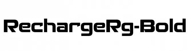
( Typodermic Fonts - Ray Larabie - www.typodermicfonts.com/ )
A bold, geometric font with a modern and futuristic style.
![RechargeRg-Bold Frei Schriftart Herunterladen]() Herunterladen 3499 Downloads@WebFont
Herunterladen 3499 Downloads@WebFont


Welche Schriften sind gerade am populärsten?
Poppins, Roboto, Montserrat, Open Sans und Lato sind wegen ihrer klaren Formen und breiten Einsetzbarkeit sehr gefragt – von Markenauftritt über Landingpages bis hin zu Postern.
Welche Fonts eignen sich für Logos?
Geometrische Sans‑Serifs (z. B. Poppins, Familien im Gotham‑Stil) sind ein häufiger Griff für sauberes, skalierbares Branding. Für eine persönlichere Note bleiben Scripts und Handschrift‑Stile beliebt. Kombinieren Sie einen prägnanten Headline‑Font mit einer neutralen Brotschrift für Wiedererkennung und Harmonie.
Wie oft wird die Top‑Liste aktualisiert?
Regelmäßig – basierend auf realen Downloads und Interaktionen. Schauen Sie öfter vorbei, um aufstrebende Favoriten früh zu entdecken.
💡 Tipp: Seite bookmarken – Trends wechseln schnell, und heutige Top‑Schriften inspirieren morgen vielleicht das Rebranding.