Willkommen bei den Top‑Schriften – hier treffen Beliebtheit und Qualität aufeinander. Das sind die in diesem Jahr am häufigsten heruntergeladenen und genutzten Fonts. Wenn Sie sichere Optionen für Logo, Web oder Social suchen, starten Sie hier.
Jeder Top‑Font überzeugt durch Balance, Lesbarkeit und Vielseitigkeit. Sie finden moderne Sans‑Serifs, elegante Scripts, Vintage‑Serifs und minimalistische Displays.
-
 Herunterladen 243 Downloads@WebFont
 -
( www.tattoowoo.com )
A bold, expressive script font with dynamic strokes and artistic flair.
![Motives Frei Schriftart Herunterladen]() Herunterladen 243 Downloads@WebFont
Herunterladen 243 Downloads@WebFont -
( Typodermic Fonts - Ray Larabie - www.typodermicfonts.com/ )
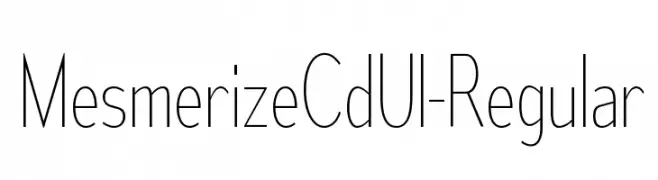
A modern, thin, and elegant font with elongated letterforms.
![MesmerizeCdUl-Regular Frei Schriftart Herunterladen]() Herunterladen 243 Downloads@WebFont
Herunterladen 243 Downloads@WebFont -
( Fonts by Ardyanatypes - Personal-use only. For commercial use please contact owner. )
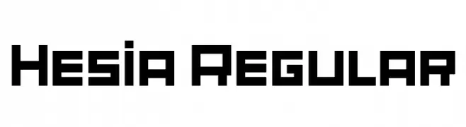
A bold, geometric font with strong, angular lines and uniform strokes.
![Hesia Regular Frei Schriftart Herunterladen]() Herunterladen 243 Downloads@WebFont
Herunterladen 243 Downloads@WebFont -
( Fonts by Iconian Fonts )
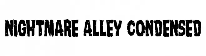
A bold, distressed font with a vintage horror theme.
![Nightmare Alley Condensed Frei Schriftart Herunterladen]() Herunterladen 243 Downloads@WebFont
Herunterladen 243 Downloads@WebFont -
-
( Fonts by Vladimir Nikolic - www.creativefabrica.com/designer/vladimirnikolic/ - Personal-use only. For commercial use please contact owner. )
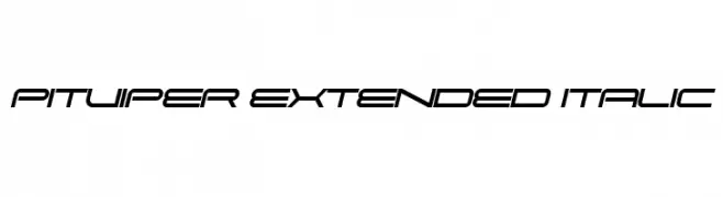
A sleek, futuristic italic font with extended characters and a modern vibe.
![Pitviper Extended Italic Frei Schriftart Herunterladen]() Herunterladen 243 Downloads@WebFont
Herunterladen 243 Downloads@WebFont -
( Fonts by www.fontalicious.com )
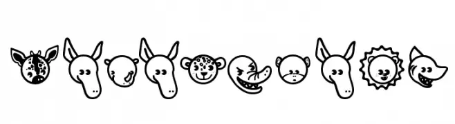
Cartoon animal-themed decorative font with bold outlines.
![Garanimals Frei Schriftart Herunterladen]() Herunterladen 243 Downloads@WebFont
Herunterladen 243 Downloads@WebFont -
( Fonts by Utopia - www.daleharris.com )
A bold, hand-drawn font with expressive strokes and a lively appearance.
![Pigae Frei Schriftart Herunterladen]() Herunterladen 243 Downloads@WebFont
Herunterladen 243 Downloads@WebFont -
( Free on condition that you make a donation of 5€ favor of an organization dealing with global warming. http://www.sergiolelli.it )
A bold, high-contrast serif font with sharp, angular serifs and dramatic style.
![KarlKraus Frei Schriftart Herunterladen]() Herunterladen 243 Downloads@WebFont
Herunterladen 243 Downloads@WebFont -
( Fonts by Woodcutter Manero - http://www.woodcutter.es - Personal-use only. For commercial use please contact owner. )
A bold, distressed medieval-style font with sharp serifs and a vintage feel.
![Austrian Castle Frei Schriftart Herunterladen]() Herunterladen 243 Downloads@WebFont
Herunterladen 243 Downloads@WebFont -
( Fonts by www.omniglot.com )
A futuristic and abstract font with geometric shapes and lines.
![Inspired Frei Schriftart Herunterladen]() Herunterladen 243 Downloads@WebFont
Herunterladen 243 Downloads@WebFont -
( Fonts by www.fugit-tempus.de )
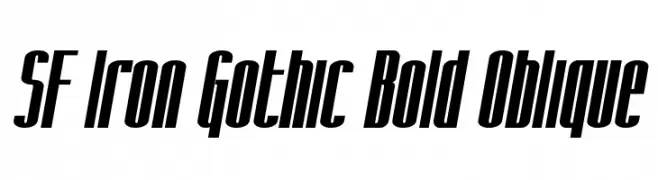
A bold, oblique, and condensed font with a modern, industrial style.
![SF Iron Gothic Bold Oblique Frei Schriftart Herunterladen]() Herunterladen 243 Downloads@WebFont
Herunterladen 243 Downloads@WebFont -
( Fonts by a Galdino Otten - galdinootten.com . Personal-use only. For commercial use please contact owner. )
A playful, handwritten-style font with a casual and friendly appearance.
![Write Righ Frei Schriftart Herunterladen]() Herunterladen 243 Downloads@WebFont
Herunterladen 243 Downloads@WebFont -
( Fonts by www.blambot.com )
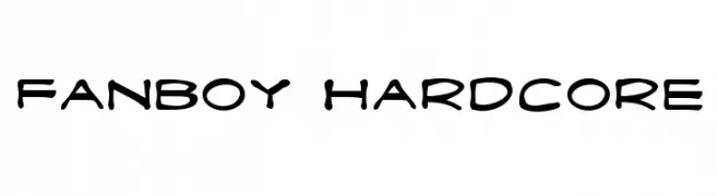
A bold, playful font with rounded, irregular shapes, ideal for informal designs.
![Fanboy Hardcore Frei Schriftart Herunterladen]() Herunterladen 243 Downloads@WebFont
Herunterladen 243 Downloads@WebFont -
( Fonts by Alpaprana Studio - Personal-use only. For commercial use please contact owner. )
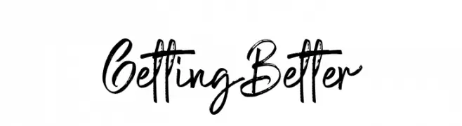
A dynamic, expressive handwritten font with brush-like strokes.
![Getting Better Frei Schriftart Herunterladen]() Herunterladen 243 Downloads@WebFont
Herunterladen 243 Downloads@WebFont -
( Fonts by ShyFonts )
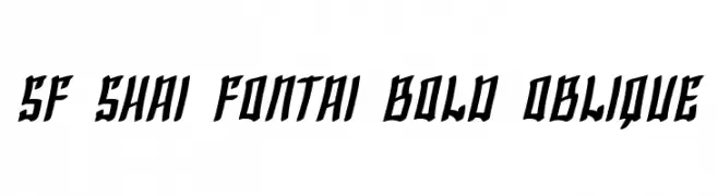
A bold, oblique font with dynamic, angled strokes for a powerful impact.
![SF Shai Fontai Bold Oblique Frei Schriftart Herunterladen]() Herunterladen 243 Downloads@WebFont
Herunterladen 243 Downloads@WebFont -
( www.loosydesign.com )
A bold, decorative font with a dripping effect for a playful and eerie look.
![Slutotronic Bold Frei Schriftart Herunterladen]() Herunterladen 243 Downloads@WebFont
Herunterladen 243 Downloads@WebFont -
( Fonts by Steve Cloutier - www.cloutierfontes.ca )
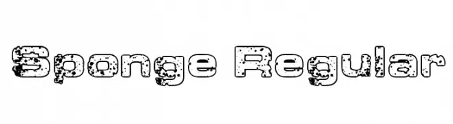
A bold, distressed font with a rugged, textured appearance.
![Sponge Regular Frei Schriftart Herunterladen]() Herunterladen 243 Downloads@WebFont
Herunterladen 243 Downloads@WebFont -
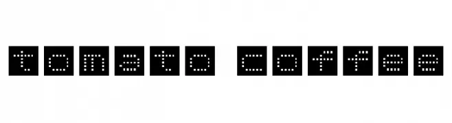
![tomato coffee Frei Schriftart Herunterladen]() Herunterladen 243 Downloads@WebFont
Herunterladen 243 Downloads@WebFont -
( Fonts by Syaf Rizal - Khurasan - Personal-use only. For commercial use please contact owner. )
A graceful script font with fluid, cursive strokes and artistic flair.
![Sheenaz Frei Schriftart Herunterladen]() Herunterladen 243 Downloads@WebFont
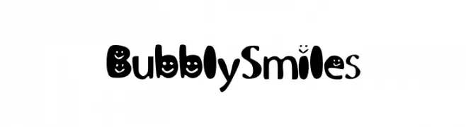
Herunterladen 243 Downloads@WebFont -
![BubblySmiles Frei Schriftart Herunterladen]() Herunterladen 243 Downloads@WebFont
Herunterladen 243 Downloads@WebFont -
( imagex - www.imagex-fonts.com )
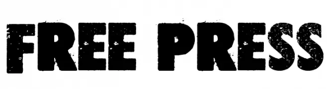
A bold, distressed font with a grunge texture and vintage appeal.
![Free press Frei Schriftart Herunterladen]() Herunterladen 243 Downloads@WebFont
Herunterladen 243 Downloads@WebFont -
( Fonts by weknow - Wino S Kadir )
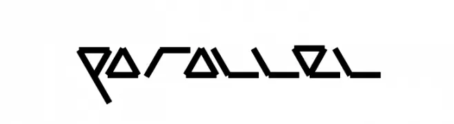
A futuristic, angular font with sharp lines and a geometric style.
![parallel Frei Schriftart Herunterladen]() Herunterladen 243 Downloads@WebFont
Herunterladen 243 Downloads@WebFont -
![soda light Frei Schriftart Herunterladen]() Herunterladen 243 Downloads@WebFont
Herunterladen 243 Downloads@WebFont -
( www.teacherspayteachers.com/Store/Khrys-Bosland )
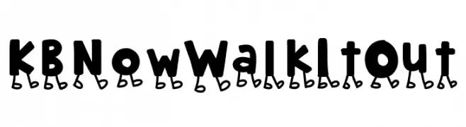
A playful, cartoonish font with characters that appear to be walking.
![KBNowWalkItOut Frei Schriftart Herunterladen]() Herunterladen 243 Downloads@WebFont
Herunterladen 243 Downloads@WebFont -
( Fonts by Haris Prawoto )
A playful, bold handwritten font with rounded strokes and a casual vibe.
![TARYO Frei Schriftart Herunterladen]() Herunterladen 243 Downloads@WebFont
Herunterladen 243 Downloads@WebFont -
( Fonts by Daniel Zadorozny - www.iconian.com )
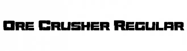
A bold, distressed font with a rugged, industrial look.
![Ore Crusher Regular Frei Schriftart Herunterladen]() Herunterladen 243 Downloads@WebFont
Herunterladen 243 Downloads@WebFont -
( Fonts by Daniel Zadorozny - www.iconian.com - Free for personal use )
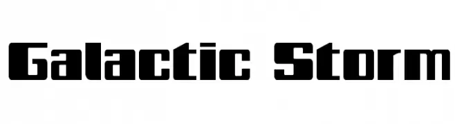
A bold, futuristic font with geometric shapes and sharp angles.
![Galactic Storm Frei Schriftart Herunterladen]() Herunterladen 243 Downloads@WebFont
Herunterladen 243 Downloads@WebFont -
( Fonts by Iconian Fonts )
A bold, expanded, and italic font with a dynamic and playful style.
![Mystery Mobile Expanded Italic Frei Schriftart Herunterladen]() Herunterladen 243 Downloads@WebFont
Herunterladen 243 Downloads@WebFont -
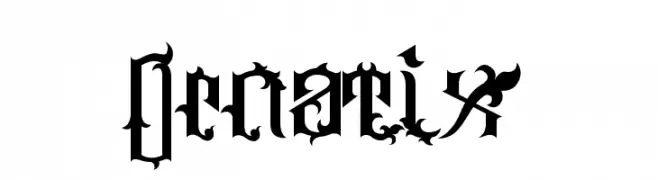
![Ornatix Frei Schriftart Herunterladen]() Herunterladen 243 Downloads@WebFont
Herunterladen 243 Downloads@WebFont -
( Fonts by Dieter Steffmann )
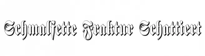
A bold, shadowed Blackletter font with intricate, angular designs.
![Schmalfette Fraktur Schattiert Frei Schriftart Herunterladen]() Herunterladen 243 Downloads@WebFont
Herunterladen 243 Downloads@WebFont -
( Fonts by weknow - Wino S Kadir )
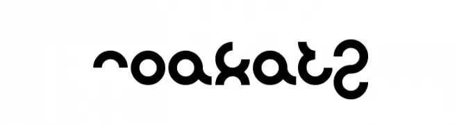
A bold, decorative font with geometric shapes and unique cut-out patterns.
![noakatz Frei Schriftart Herunterladen]() Herunterladen 243 Downloads@WebFont
Herunterladen 243 Downloads@WebFont -
( Fonts by Balpirick Studio - Personal-use only. For commercial use please contact owner. )
A bold, playful handwritten font with rounded, dynamic strokes.
![Bombslide Frei Schriftart Herunterladen]() Herunterladen 243 Downloads@WebFont
Herunterladen 243 Downloads@WebFont -
( Fonts by Jason Arthur - JibbaJabba Fonts - www.myspace.com/jasonarthurloaded )
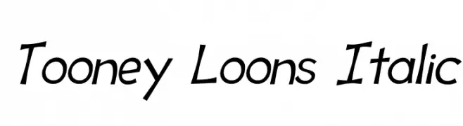
A playful, italicized font with a cartoon-like, hand-drawn style.
![Tooney Loons Italic Frei Schriftart Herunterladen]() Herunterladen 243 Downloads@WebFont
Herunterladen 243 Downloads@WebFont -
( Fonts by Jacob Fisher - www.pizzadude.dk )
A futuristic, geometric font with angular, streamlined letterforms.
![Transistor 2.15 Frei Schriftart Herunterladen]() Herunterladen 243 Downloads@WebFont
Herunterladen 243 Downloads@WebFont


Welche Schriften sind gerade am populärsten?
Poppins, Roboto, Montserrat, Open Sans und Lato sind wegen ihrer klaren Formen und breiten Einsetzbarkeit sehr gefragt – von Markenauftritt über Landingpages bis hin zu Postern.
Welche Fonts eignen sich für Logos?
Geometrische Sans‑Serifs (z. B. Poppins, Familien im Gotham‑Stil) sind ein häufiger Griff für sauberes, skalierbares Branding. Für eine persönlichere Note bleiben Scripts und Handschrift‑Stile beliebt. Kombinieren Sie einen prägnanten Headline‑Font mit einer neutralen Brotschrift für Wiedererkennung und Harmonie.
Wie oft wird die Top‑Liste aktualisiert?
Regelmäßig – basierend auf realen Downloads und Interaktionen. Schauen Sie öfter vorbei, um aufstrebende Favoriten früh zu entdecken.
💡 Tipp: Seite bookmarken – Trends wechseln schnell, und heutige Top‑Schriften inspirieren morgen vielleicht das Rebranding.