Willkommen bei den Top‑Schriften – hier treffen Beliebtheit und Qualität aufeinander. Das sind die in diesem Jahr am häufigsten heruntergeladenen und genutzten Fonts. Wenn Sie sichere Optionen für Logo, Web oder Social suchen, starten Sie hier.
Jeder Top‑Font überzeugt durch Balance, Lesbarkeit und Vielseitigkeit. Sie finden moderne Sans‑Serifs, elegante Scripts, Vintage‑Serifs und minimalistische Displays.
-
( Fonts by Mats )
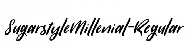
A lively and dynamic script font with fluid, cursive letterforms.
 Herunterladen 1018 Downloads@WebFont
 -
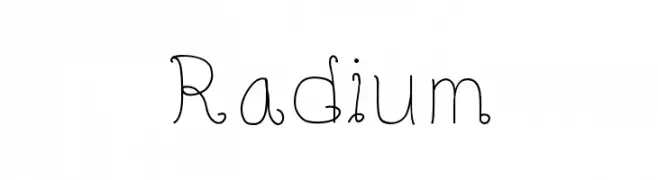
![Radium Frei Schriftart Herunterladen]() Herunterladen 1018 Downloads@WebFont
Herunterladen 1018 Downloads@WebFont -
( Fonts by Daniel Zadorozny - www.iconian.com - Free for personal use )
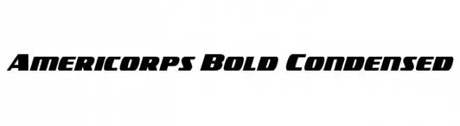
A bold, condensed font with angular lines and a dynamic style.
![Americorps Bold Condensed Frei Schriftart Herunterladen]() Herunterladen 1018 Downloads@WebFont
Herunterladen 1018 Downloads@WebFont -
![Bonnie Frei Schriftart Herunterladen]() Herunterladen 1018 Downloads@WebFont
Herunterladen 1018 Downloads@WebFont -
( Fonts by Castcraft Software - opti.netii.net - check the website before use )
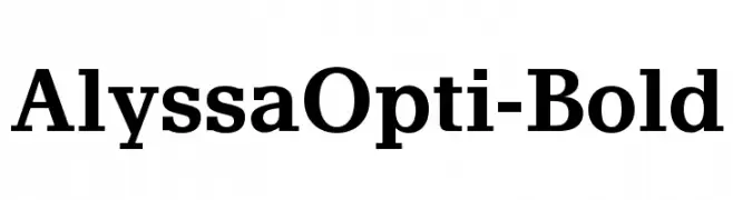
A bold serif font with strong, authoritative strokes and classic elegance.
![AlyssaOpti-Bold Frei Schriftart Herunterladen]() Herunterladen 1018 Downloads@WebFont
Herunterladen 1018 Downloads@WebFont -
-
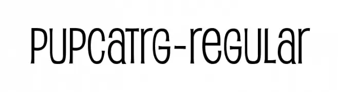
( Fonts by www.typodermicfonts.com - Ray Larabie )
A playful, modern font with tall, narrow letters and rounded edges.
![PupcatRg-Regular Frei Schriftart Herunterladen]() Herunterladen 1018 Downloads@WebFont
Herunterladen 1018 Downloads@WebFont -
( Fonts by Jacob Fisher - www.pizzadude.dk )
A bold, geometric stencil font with a modern industrial aesthetic.
![Mute Fruit Frei Schriftart Herunterladen]() Herunterladen 1018 Downloads@WebFont
Herunterladen 1018 Downloads@WebFont -
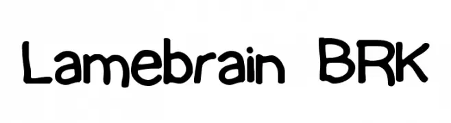
( Fonts by www.aenigmafonts.com )
A playful, handwritten font with bold, rounded characters.
![Lamebrain BRK Frei Schriftart Herunterladen]() Herunterladen 1018 Downloads@WebFont
Herunterladen 1018 Downloads@WebFont -
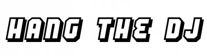
( Fonts by Jacob Fisher - www.pizzadude.dk )
A bold, three-dimensional font with a strong shadow effect and geometric forms.
![Hang the DJ Frei Schriftart Herunterladen]() Herunterladen 1018 Downloads@WebFont
Herunterladen 1018 Downloads@WebFont -
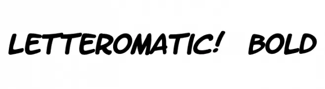
( Fonts by www.blambot.com )
A bold, playful handwritten font with rounded, slanted characters.
![LetterOMatic! Bold Frei Schriftart Herunterladen]() Herunterladen 1018 Downloads@WebFont
Herunterladen 1018 Downloads@WebFont


Welche Schriften sind gerade am populärsten?
Poppins, Roboto, Montserrat, Open Sans und Lato sind wegen ihrer klaren Formen und breiten Einsetzbarkeit sehr gefragt – von Markenauftritt über Landingpages bis hin zu Postern.
Welche Fonts eignen sich für Logos?
Geometrische Sans‑Serifs (z. B. Poppins, Familien im Gotham‑Stil) sind ein häufiger Griff für sauberes, skalierbares Branding. Für eine persönlichere Note bleiben Scripts und Handschrift‑Stile beliebt. Kombinieren Sie einen prägnanten Headline‑Font mit einer neutralen Brotschrift für Wiedererkennung und Harmonie.
Wie oft wird die Top‑Liste aktualisiert?
Regelmäßig – basierend auf realen Downloads und Interaktionen. Schauen Sie öfter vorbei, um aufstrebende Favoriten früh zu entdecken.
💡 Tipp: Seite bookmarken – Trends wechseln schnell, und heutige Top‑Schriften inspirieren morgen vielleicht das Rebranding.