Willkommen bei den Top‑Schriften – hier treffen Beliebtheit und Qualität aufeinander. Das sind die in diesem Jahr am häufigsten heruntergeladenen und genutzten Fonts. Wenn Sie sichere Optionen für Logo, Web oder Social suchen, starten Sie hier.
Jeder Top‑Font überzeugt durch Balance, Lesbarkeit und Vielseitigkeit. Sie finden moderne Sans‑Serifs, elegante Scripts, Vintage‑Serifs und minimalistische Displays.
-
 Herunterladen 1017 Downloads@WebFont
 -
( Personal-use only. For commercial use please contact owner. )
A classic serif font with a soft, rounded appearance and excellent readability.
![Averia Serif GWF Regular Frei Schriftart Herunterladen]() Herunterladen 1016 Downloads@WebFont
Herunterladen 1016 Downloads@WebFont -
( JoannaVu - ioannaladopoulou.com )
A bold, gothic-style font with sharp edges and a distressed texture.
![Frozito Frei Schriftart Herunterladen]() Herunterladen 1016 Downloads@WebFont
Herunterladen 1016 Downloads@WebFont -
( Alex Dale - www.behance.net/alexiandale )
A bold, geometric font with sharp angles and a modern industrial feel.
![Reckoner Bold Frei Schriftart Herunterladen]() Herunterladen 1016 Downloads@WebFont
Herunterladen 1016 Downloads@WebFont -
( Fonts by CannotIntoSpaceFonts - KineticPlasma Fonts - Personal-use only. For commercial use please contact owner. )
A bold, slab serif font with a mechanical and structured design.
![Mechanical Frei Schriftart Herunterladen]() Herunterladen 1016 Downloads@WebFont
Herunterladen 1016 Downloads@WebFont -
-
( Fonts by Alessandra M )
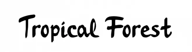
A bold, playful script font with a hand-drawn, brush-like style.
![Tropical Forest Frei Schriftart Herunterladen]() Herunterladen 1016 Downloads@WebFont
Herunterladen 1016 Downloads@WebFont -
( Fonts by Maelle.K - Thomas Boucherie )
A bold, graffiti-inspired font with sharp angles and dynamic strokes.
![Zenzai Itachi Frei Schriftart Herunterladen]() Herunterladen 1016 Downloads@WebFont
Herunterladen 1016 Downloads@WebFont -
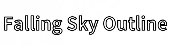
![Falling Sky Outline Frei Schriftart Herunterladen]() Herunterladen 1016 Downloads@WebFont
Herunterladen 1016 Downloads@WebFont -
( Font by Jonathan Harris - www.tattoowoo.com )
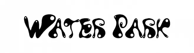
A playful, fluid font with organic, water-like shapes and bold, rounded forms.
![Water Park Frei Schriftart Herunterladen]() Herunterladen 1016 Downloads@WebFont
Herunterladen 1016 Downloads@WebFont -
( Fonts by Cumberland Fontworks - http://www222.pair.com/sjohn/fonts.htm - S. John Ross )
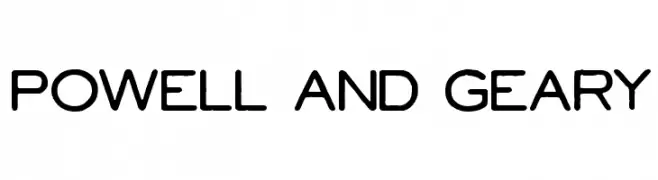
A modern, rounded sans-serif font with a clean and approachable style.
![Powell and Geary Frei Schriftart Herunterladen]() Herunterladen 1016 Downloads@WebFont
Herunterladen 1016 Downloads@WebFont

Welche Schriften sind gerade am populärsten?
Poppins, Roboto, Montserrat, Open Sans und Lato sind wegen ihrer klaren Formen und breiten Einsetzbarkeit sehr gefragt – von Markenauftritt über Landingpages bis hin zu Postern.
Welche Fonts eignen sich für Logos?
Geometrische Sans‑Serifs (z. B. Poppins, Familien im Gotham‑Stil) sind ein häufiger Griff für sauberes, skalierbares Branding. Für eine persönlichere Note bleiben Scripts und Handschrift‑Stile beliebt. Kombinieren Sie einen prägnanten Headline‑Font mit einer neutralen Brotschrift für Wiedererkennung und Harmonie.
Wie oft wird die Top‑Liste aktualisiert?
Regelmäßig – basierend auf realen Downloads und Interaktionen. Schauen Sie öfter vorbei, um aufstrebende Favoriten früh zu entdecken.
💡 Tipp: Seite bookmarken – Trends wechseln schnell, und heutige Top‑Schriften inspirieren morgen vielleicht das Rebranding.