Willkommen bei den Top‑Schriften – hier treffen Beliebtheit und Qualität aufeinander. Das sind die in diesem Jahr am häufigsten heruntergeladenen und genutzten Fonts. Wenn Sie sichere Optionen für Logo, Web oder Social suchen, starten Sie hier.
Jeder Top‑Font überzeugt durch Balance, Lesbarkeit und Vielseitigkeit. Sie finden moderne Sans‑Serifs, elegante Scripts, Vintage‑Serifs und minimalistische Displays.
-
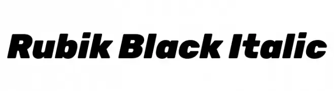
( Copyright 2015 The Rubik Project Authors (https://github.com/googlefonts/rubik) )
A bold, modern italic font with strong visual impact.
 Herunterladen 3074 Downloads@WebFont
 -
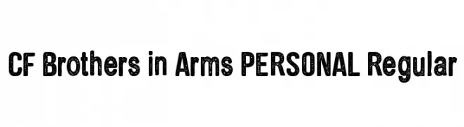
( Fonts by CloutierFontes )
A bold, distressed font with a vintage, handcrafted feel.
![CF Brothers in Arms PERSONAL Regular Frei Schriftart Herunterladen]() Herunterladen 3073 Downloads@WebFont
Herunterladen 3073 Downloads@WebFont -
( Copyright 2014, Erin McLaughlin (hello@erinmclaughlin.com). )
A modern, geometric sans-serif font with clean lines and uniform strokes.
![Yantramanav Light Frei Schriftart Herunterladen]() Herunterladen 3073 Downloads@WebFont
Herunterladen 3073 Downloads@WebFont -
( Copyright (c) 2012, Soytutype (contact@soytutype.com.ar|soytutype@gmail.com), with Reserved Font Name "Oleo Script" )
A bold, flowing script font with elegant swash caps and dynamic curves.
![Oleo Script Swash Caps Frei Schriftart Herunterladen]() Herunterladen 3073 Downloads@WebFont
Herunterladen 3073 Downloads@WebFont -
( Fonts by Sora Sagano - www.dotcolon.net )
A clean, modern sans-serif font with uniform stroke width and excellent readability.
![Vegur Frei Schriftart Herunterladen]() Herunterladen 3072 Downloads@WebFont
Herunterladen 3072 Downloads@WebFont -
-
![Samtol Frei Schriftart Herunterladen]() Herunterladen 3072 Downloads@WebFont
Herunterladen 3072 Downloads@WebFont -
![Country Hearts Frei Schriftart Herunterladen]() Herunterladen 3072 Downloads@WebFont
Herunterladen 3072 Downloads@WebFont -
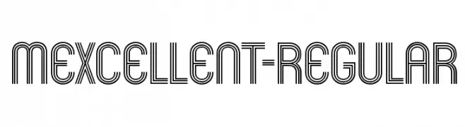
( Fonts by www.typodermicfonts.com - Ray Larabie )
A geometric, multi-line font with a modern and bold aesthetic.
![Mexcellent-Regular Frei Schriftart Herunterladen]() Herunterladen 3070 Downloads@WebFont
Herunterladen 3070 Downloads@WebFont -
![Amphibia Frei Schriftart Herunterladen]() Herunterladen 3070 Downloads@WebFont
Herunterladen 3070 Downloads@WebFont -
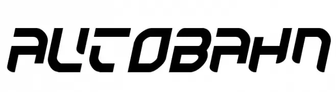
( Fonts by Jacob Fisher - www.pizzadude.dk )
A bold, futuristic font with angular, geometric shapes and a dynamic slant.
![Autobahn Frei Schriftart Herunterladen]() Herunterladen 3070 Downloads@WebFont
Herunterladen 3070 Downloads@WebFont -
( imagex - www.imagex-fonts.com )
A bold, dynamic font with wide, condensed characters and a modern style.
![Supersonic Rocketship Frei Schriftart Herunterladen]() Herunterladen 3069 Downloads@WebFont
Herunterladen 3069 Downloads@WebFont -
![King Frei Schriftart Herunterladen]() Herunterladen 3069 Downloads@WebFont
Herunterladen 3069 Downloads@WebFont -
![F25 Executive Frei Schriftart Herunterladen]() Herunterladen 3068 Downloads@WebFont
Herunterladen 3068 Downloads@WebFont -
![Urdu Naskh Asiatype Frei Schriftart Herunterladen]() Herunterladen 3068 Downloads@WebFont
Herunterladen 3068 Downloads@WebFont -
( Fonts by www.aenigmafonts.com )
A bold, playful font with a whimsical, hand-drawn style.
![Impossibilium BRK Frei Schriftart Herunterladen]() Herunterladen 3068 Downloads@WebFont
Herunterladen 3068 Downloads@WebFont -
( Copyright (c) 2009-2011 by Accademia di Belle Arti di Urbino and students of MA course of Visual design. Some rights reserved. )
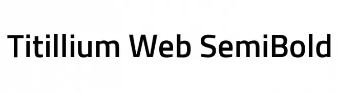
A modern sans-serif font with a semi-bold weight and slightly condensed width.
![Titillium Web SemiBold Frei Schriftart Herunterladen]() Herunterladen 3066 Downloads@WebFont
Herunterladen 3066 Downloads@WebFont -
![Darbar Frei Schriftart Herunterladen]() Herunterladen 3065 Downloads@WebFont
Herunterladen 3065 Downloads@WebFont -
![Venus-Normal Frei Schriftart Herunterladen]() Herunterladen 3065 Downloads
Herunterladen 3065 Downloads -
( Fonts by Manfred Klein. Free for private and charity use. Free for commercial with donation to organizations )
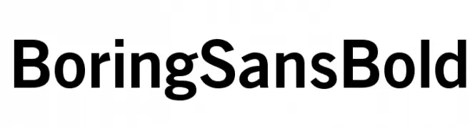
A bold, modern sans-serif font with clean lines and excellent readability.
![BoringSansBold Frei Schriftart Herunterladen]() Herunterladen 3064 Downloads@WebFont
Herunterladen 3064 Downloads@WebFont -
( Fonts by Dieter Steffmann )
A bold, decorative font with a shadow effect and pronounced serifs.
![Montague Frei Schriftart Herunterladen]() Herunterladen 3062 Downloads@WebFont
Herunterladen 3062 Downloads@WebFont -
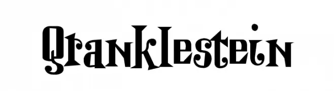
![Qranklestein Frei Schriftart Herunterladen]() Herunterladen 3061 Downloads@WebFont
Herunterladen 3061 Downloads@WebFont -
![Duke Frei Schriftart Herunterladen]() Herunterladen 3061 Downloads@WebFont
Herunterladen 3061 Downloads@WebFont -
![Mulan Frei Schriftart Herunterladen]() Herunterladen 3061 Downloads@WebFont
Herunterladen 3061 Downloads@WebFont -
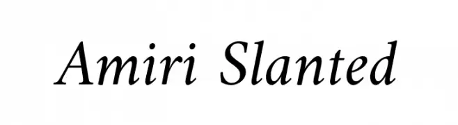
( Copyright (c) 2010-2012, Khaled Hosny (
A classic, slanted serif font with elegant, italicized characters and moderate contrast.
![Amiri Slanted Frei Schriftart Herunterladen]() Herunterladen 3060 Downloads@WebFont
Herunterladen 3060 Downloads@WebFont -
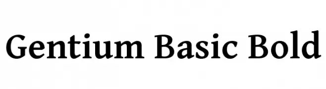
( Copyright (c) 2003-2013 SIL International (http://www.sil.org/) )
A bold serif font with classic elegance and moderate contrast.
![Gentium Basic Bold Frei Schriftart Herunterladen]() Herunterladen 3060 Downloads@WebFont
Herunterladen 3060 Downloads@WebFont -
![JESSIE Frei Schriftart Herunterladen]() Herunterladen 3060 Downloads@WebFont
Herunterladen 3060 Downloads@WebFont -
![Nouveau IBM Frei Schriftart Herunterladen]() Herunterladen 3060 Downloads@WebFont
Herunterladen 3060 Downloads@WebFont -
![Casino Queen Normal Frei Schriftart Herunterladen]() Herunterladen 3060 Downloads@WebFont
Herunterladen 3060 Downloads@WebFont -
( Fonts by Luke Owens - Personal-use only. For commercial use please contact owner. )
A modern, elegant font with balanced proportions and medium weight.
![Oregon LDO Medium Frei Schriftart Herunterladen]() Herunterladen 3059 Downloads@WebFont
Herunterladen 3059 Downloads@WebFont -
![TypoGraphica Frei Schriftart Herunterladen]() Herunterladen 3058 Downloads@WebFont
Herunterladen 3058 Downloads@WebFont -
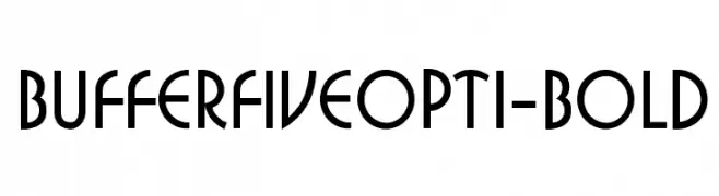
( Fonts by Castcraft Software - opti.netii.net - check the website before use )
A bold, modern font with geometric lines and elegant curves.
![BufferFiveOpti-Bold Frei Schriftart Herunterladen]() Herunterladen 3058 Downloads@WebFont
Herunterladen 3058 Downloads@WebFont -
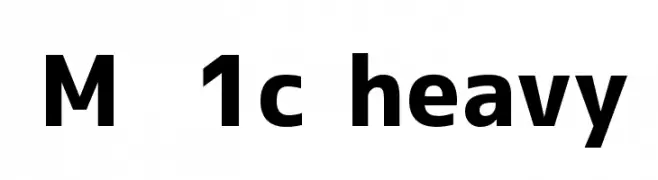
![M+ 1c heavy Frei Schriftart Herunterladen]() Herunterladen 3058 Downloads@WebFont
Herunterladen 3058 Downloads@WebFont -
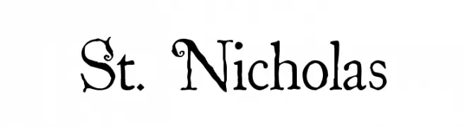
( Fonts by The Scriptorium - Dave Nalle )
A whimsical and decorative serif font with playful curls and flourishes.
![St. Nicholas Frei Schriftart Herunterladen]() Herunterladen 3058 Downloads@WebFont
Herunterladen 3058 Downloads@WebFont -
![VTCSuperMarketSale Frei Schriftart Herunterladen]() Herunterladen 3058 Downloads@WebFont
Herunterladen 3058 Downloads@WebFont -
( Fonts by Arkandis Digital Foundry )
A bold, classic serif typeface with strong strokes and pronounced serifs.
![VenturisADF-Bold Frei Schriftart Herunterladen]() Herunterladen 3057 Downloads@WebFont
Herunterladen 3057 Downloads@WebFont


Welche Schriften sind gerade am populärsten?
Poppins, Roboto, Montserrat, Open Sans und Lato sind wegen ihrer klaren Formen und breiten Einsetzbarkeit sehr gefragt – von Markenauftritt über Landingpages bis hin zu Postern.
Welche Fonts eignen sich für Logos?
Geometrische Sans‑Serifs (z. B. Poppins, Familien im Gotham‑Stil) sind ein häufiger Griff für sauberes, skalierbares Branding. Für eine persönlichere Note bleiben Scripts und Handschrift‑Stile beliebt. Kombinieren Sie einen prägnanten Headline‑Font mit einer neutralen Brotschrift für Wiedererkennung und Harmonie.
Wie oft wird die Top‑Liste aktualisiert?
Regelmäßig – basierend auf realen Downloads und Interaktionen. Schauen Sie öfter vorbei, um aufstrebende Favoriten früh zu entdecken.
💡 Tipp: Seite bookmarken – Trends wechseln schnell, und heutige Top‑Schriften inspirieren morgen vielleicht das Rebranding.