Willkommen bei den Top‑Schriften – hier treffen Beliebtheit und Qualität aufeinander. Das sind die in diesem Jahr am häufigsten heruntergeladenen und genutzten Fonts. Wenn Sie sichere Optionen für Logo, Web oder Social suchen, starten Sie hier.
Jeder Top‑Font überzeugt durch Balance, Lesbarkeit und Vielseitigkeit. Sie finden moderne Sans‑Serifs, elegante Scripts, Vintage‑Serifs und minimalistische Displays.
-
( Fonts by Danilo De Marco )
A bold, modern sans-serif font with clean lines and strong presence.
 Herunterladen 3058 Downloads@WebFont
 -
( Copyright (c) 2010-2012 Patrick Wagesreiter (mail@patrickwagesreiter.at) )
A friendly, handwritten font with rounded edges and a casual style.
![Patrick Hand Frei Schriftart Herunterladen]() Herunterladen 3058 Downloads@WebFont
Herunterladen 3058 Downloads@WebFont -
![Skyland Frei Schriftart Herunterladen]() Herunterladen 3058 Downloads@WebFont
Herunterladen 3058 Downloads@WebFont -
( Fonts by Andreas Hofeld - www.fontgrube.de )
A playful, informal font with a mix of serif and handwritten styles.
![Jorvik Informal Frei Schriftart Herunterladen]() Herunterladen 3057 Downloads
Herunterladen 3057 Downloads -
![Blackout Frei Schriftart Herunterladen]() Herunterladen 3057 Downloads@WebFont
Herunterladen 3057 Downloads@WebFont -
( Fonts by Bumbayo Font Fabrik )
A bold, distressed font with a vintage, hand-crafted appearance.
![Zubajda Dt Frei Schriftart Herunterladen]() Herunterladen 3056 Downloads@WebFont
Herunterladen 3056 Downloads@WebFont -
![Minima SSi Frei Schriftart Herunterladen]() Herunterladen 3056 Downloads
Herunterladen 3056 Downloads -
( Fonts by junkohanhero )
A bold, distressed font with a rugged, textured appearance.
![Dark Underground Frei Schriftart Herunterladen]() Herunterladen 3055 Downloads@WebFont
Herunterladen 3055 Downloads@WebFont -
( Fonts by Luedecke Design Font Co. - ldfonts.weebly.com )
A bold, hand-drawn font with a rough, textured appearance resembling brush strokes.
![Stroke Frei Schriftart Herunterladen]() Herunterladen 3055 Downloads@WebFont
Herunterladen 3055 Downloads@WebFont -
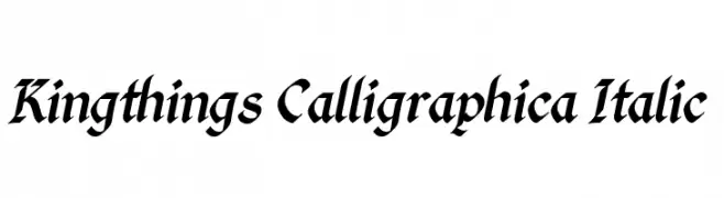
( Font by kingthingsfonts.co.uk )
A classic calligraphic font with elegant, flowing strokes and a modern italicized style.
![Kingthings Calligraphica Italic Frei Schriftart Herunterladen]() Herunterladen 3055 Downloads@WebFont
Herunterladen 3055 Downloads@WebFont -
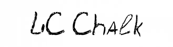
![LC Chalk Frei Schriftart Herunterladen]() Herunterladen 3055 Downloads@WebFont
Herunterladen 3055 Downloads@WebFont -
( Copyright (c) 2010-2012, TipoType (produccion.taller@gmail.com www.tipotype.com), with Reserved Font Name "Chau Philomene" )
A bold, modern font with a slightly condensed and clean design.
![Chau Philomene One Frei Schriftart Herunterladen]() Herunterladen 3054 Downloads@WebFont
Herunterladen 3054 Downloads@WebFont -
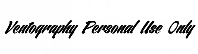
![Ventography Personal Use Only Frei Schriftart Herunterladen]() Herunterladen 3053 Downloads@WebFont
Herunterladen 3053 Downloads@WebFont -
![Reckless Frei Schriftart Herunterladen]() Herunterladen 3053 Downloads@WebFont
Herunterladen 3053 Downloads@WebFont -
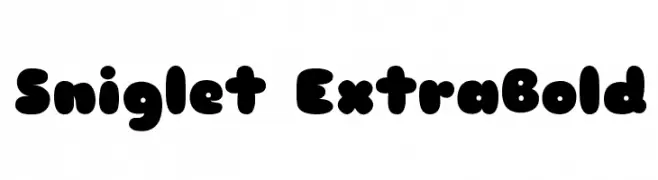
( Copyright (c) 2008, Haley Fiege (haley@kingdomofawesome.com), )
A playful, bold font with rounded, bubbly characters.
![Sniglet ExtraBold Frei Schriftart Herunterladen]() Herunterladen 3052 Downloads@WebFont
Herunterladen 3052 Downloads@WebFont -
( Copyright (c) 2014, Eduardo Rodriguez Tunni. )
A calligraphic font with elegant curves and a fluid, handwritten style.
![Amita Frei Schriftart Herunterladen]() Herunterladen 3052 Downloads@WebFont
Herunterladen 3052 Downloads@WebFont -
( Copyright (c) 2011, Andreas Kalpakides (hello@inderesting.com) )
A modern, geometric sans-serif font with clean lines and balanced proportions.
![Advent Pro Regular Frei Schriftart Herunterladen]() Herunterladen 3052 Downloads@WebFont
Herunterladen 3052 Downloads@WebFont -
( Fonts by Graham Meade - GemFonts )
A bold, rounded font with a playful and friendly style.
![GosmickSansBold Frei Schriftart Herunterladen]() Herunterladen 3052 Downloads@WebFont
Herunterladen 3052 Downloads@WebFont -
( Fonts by a kmzero font foundry - www.zetafonts.com. Personal-use only. For commercial use please contact owner. )
A bold, modern font with clean, geometric lines and strong visual impact.
![Aquawax Black Frei Schriftart Herunterladen]() Herunterladen 3051 Downloads@WebFont
Herunterladen 3051 Downloads@WebFont -
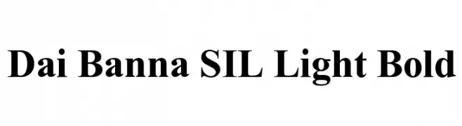
![Dai Banna SIL Light Bold Frei Schriftart Herunterladen]() Herunterladen 3051 Downloads@WebFont
Herunterladen 3051 Downloads@WebFont -
Schriftart von spideraysfonts. For commercial use please contact the owner.
![FARSCAPE Frei Schriftart Herunterladen]() Herunterladen 3051 Downloads@WebFont
Herunterladen 3051 Downloads@WebFont -
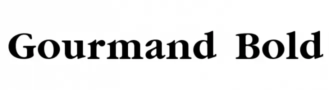
![Gourmand Bold Frei Schriftart Herunterladen]() Herunterladen 3051 Downloads@WebFont
Herunterladen 3051 Downloads@WebFont -
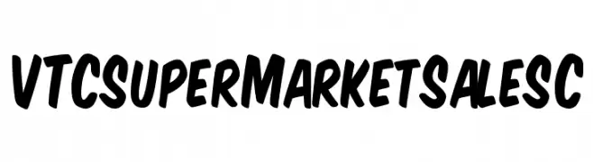
![VTCSuperMarketSaleSC Frei Schriftart Herunterladen]() Herunterladen 3051 Downloads@WebFont
Herunterladen 3051 Downloads@WebFont -
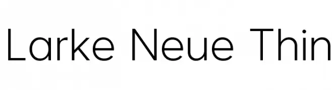
( Fonts by Steve Gardner - www.explogos.com. Personal-use only. For commercial use please contact owner. )
A modern, thin sans-serif font with a clean and elegant design.
![Larke Neue Thin Frei Schriftart Herunterladen]() Herunterladen 3050 Downloads@WebFont
Herunterladen 3050 Downloads@WebFont -
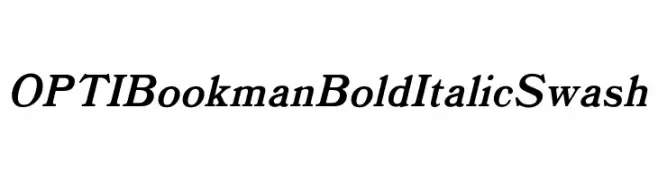
( Fonts by Castcraft Software - opti.netii.net - check the website before use )
A bold, italic swash font with classic elegance and decorative flair.
![OPTIBookmanBoldItalicSwash Frei Schriftart Herunterladen]() Herunterladen 3050 Downloads@WebFont
Herunterladen 3050 Downloads@WebFont -
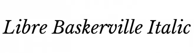
( Copyright (c) 2012, Pablo Impallari (www.impallari.com|impallari@gmail.com) )
A classic serif font with elegant italics and moderate contrast, perfect for refined applications.
![Libre Baskerville Italic Frei Schriftart Herunterladen]() Herunterladen 3050 Downloads@WebFont
Herunterladen 3050 Downloads@WebFont -
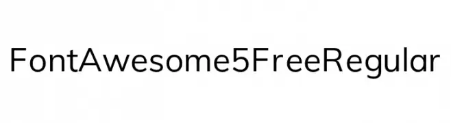
( Fonts by Dave Gandy )
A clean, modern sans-serif font with uniform stroke widths and excellent readability.
![Font Awesome 5 Free Regular Frei Schriftart Herunterladen]() Herunterladen 3049 Downloads@WebFont
Herunterladen 3049 Downloads@WebFont -
Schriftart von HammerBro101. For commercial use please contact the owner.
![Mario Kart Position Font Regular Frei Schriftart Herunterladen]() Herunterladen 3049 Downloads@WebFont
Herunterladen 3049 Downloads@WebFont -
![Candles Chrome Frei Schriftart Herunterladen]() Herunterladen 3049 Downloads@WebFont
Herunterladen 3049 Downloads@WebFont -
( Fonts by Dan P. Lyons - Personal-use only. For commercial use please contact owner. )
A whimsical, playful font with bold curves and enchanting flourishes.
![Dan's Disney Frei Schriftart Herunterladen]() Herunterladen 3047 Downloads@WebFont
Herunterladen 3047 Downloads@WebFont -
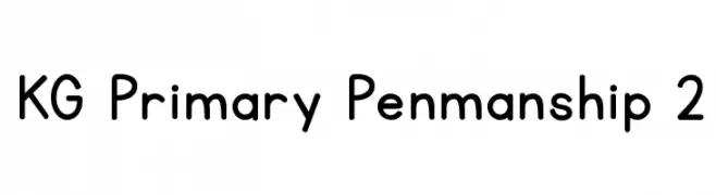
( Fonts by www.kimberlygeswein.com - Kimberly Geswein )
A clean, rounded font with a primary school penmanship style.
![KG Primary Penmanship 2 Frei Schriftart Herunterladen]() Herunterladen 3047 Downloads@WebFont
Herunterladen 3047 Downloads@WebFont -
![MinimaSSK Frei Schriftart Herunterladen]() Herunterladen 3047 Downloads@WebFont
Herunterladen 3047 Downloads@WebFont -
![Schindler Small Caps Frei Schriftart Herunterladen]() Herunterladen 3047 Downloads@WebFont
Herunterladen 3047 Downloads@WebFont -
( Fonts by www.houseoflime.com )
An ornate, gothic-style font with elaborate flourishes and embellishments.
![Gothic Flourish Frei Schriftart Herunterladen]() Herunterladen 3046 Downloads@WebFont
Herunterladen 3046 Downloads@WebFont -
( Copyright 2016 The Merriweather Project Authors (https://github.com/EbenSorkin/Merriweather), with Reserved Font Name "Merriweather". )
A serif typeface with balanced contrast and elegant curves for readability.
![Merriweather Regular Frei Schriftart Herunterladen]() Herunterladen 3045 Downloads@WebFont
Herunterladen 3045 Downloads@WebFont


Welche Schriften sind gerade am populärsten?
Poppins, Roboto, Montserrat, Open Sans und Lato sind wegen ihrer klaren Formen und breiten Einsetzbarkeit sehr gefragt – von Markenauftritt über Landingpages bis hin zu Postern.
Welche Fonts eignen sich für Logos?
Geometrische Sans‑Serifs (z. B. Poppins, Familien im Gotham‑Stil) sind ein häufiger Griff für sauberes, skalierbares Branding. Für eine persönlichere Note bleiben Scripts und Handschrift‑Stile beliebt. Kombinieren Sie einen prägnanten Headline‑Font mit einer neutralen Brotschrift für Wiedererkennung und Harmonie.
Wie oft wird die Top‑Liste aktualisiert?
Regelmäßig – basierend auf realen Downloads und Interaktionen. Schauen Sie öfter vorbei, um aufstrebende Favoriten früh zu entdecken.
💡 Tipp: Seite bookmarken – Trends wechseln schnell, und heutige Top‑Schriften inspirieren morgen vielleicht das Rebranding.