Willkommen bei den Top‑Schriften – hier treffen Beliebtheit und Qualität aufeinander. Das sind die in diesem Jahr am häufigsten heruntergeladenen und genutzten Fonts. Wenn Sie sichere Optionen für Logo, Web oder Social suchen, starten Sie hier.
Jeder Top‑Font überzeugt durch Balance, Lesbarkeit und Vielseitigkeit. Sie finden moderne Sans‑Serifs, elegante Scripts, Vintage‑Serifs und minimalistische Displays.
-
( Alexander Pravdin )
A modern, geometric sans-serif font with uniform stroke width and clean lines.
 Herunterladen 995 Downloads@WebFont
 -
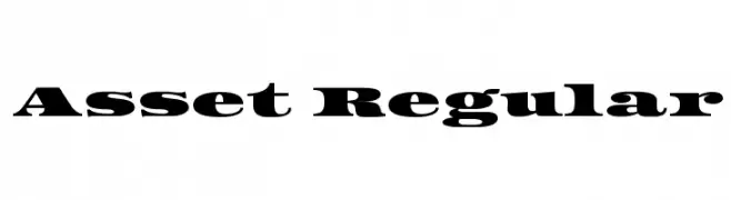
( Copyright (c) 2011 by Sorkin Type Co (www.sorkintype.com) )
A bold, high-contrast serif font with prominent serifs and strong visual impact.
![Asset Regular Frei Schriftart Herunterladen]() Herunterladen 995 Downloads@WebFont
Herunterladen 995 Downloads@WebFont -
![Chica Mono Frei Schriftart Herunterladen]() Herunterladen 995 Downloads@WebFont
Herunterladen 995 Downloads@WebFont -
( Copyright (c) 2015, Cadson Demak (info@cadsondemak.com) )
A modern, medium-weight, italicized sans-serif font with clean lines and balanced proportions.
![Kanit Medium Italic Frei Schriftart Herunterladen]() Herunterladen 995 Downloads@WebFont
Herunterladen 995 Downloads@WebFont -
( Fonts by a Max Infeld - XEROGRAPHER FONTS - xerographer.blogspot.com . Personal-use only. For commercial use please contact owner. )
A bold, decorative font with circular cutout patterns for a playful, artistic look.
![Boulevard Frei Schriftart Herunterladen]() Herunterladen 995 Downloads@WebFont
Herunterladen 995 Downloads@WebFont -
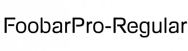
-
![FoobarPro-Regular Frei Schriftart Herunterladen]() Herunterladen 995 Downloads@WebFont
Herunterladen 995 Downloads@WebFont -
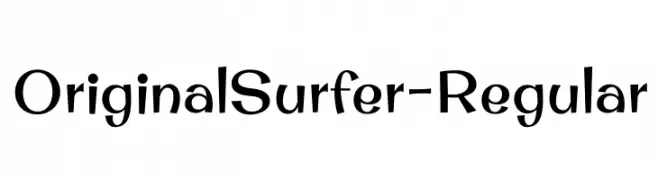
( Copyright (c) 2011 by Brian J. Bonislawsky DBA Astigmatic (AOETI) )
A playful and dynamic font with bold, irregular letterforms and a whimsical style.
![OriginalSurfer-Regular Frei Schriftart Herunterladen]() Herunterladen 995 Downloads@WebFont
Herunterladen 995 Downloads@WebFont -
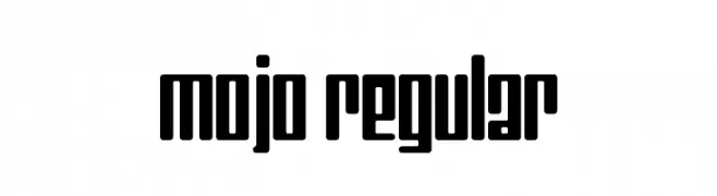
![Mojo Regular Frei Schriftart Herunterladen]() Herunterladen 995 Downloads@WebFont
Herunterladen 995 Downloads@WebFont -
( Fonts by Manfred Klein. Free for private and charity use. Free for commercial with donation to organizations )
A classic blackletter font with ornate, angular strokes and a bold, structured appearance.
![CancellerescA Frei Schriftart Herunterladen]() Herunterladen 995 Downloads@WebFont
Herunterladen 995 Downloads@WebFont -
( Fonts by joeBob graff-X )
A casual, handwritten font with fluid and expressive strokes.
![dearJoe II Frei Schriftart Herunterladen]() Herunterladen 995 Downloads@WebFont
Herunterladen 995 Downloads@WebFont


Welche Schriften sind gerade am populärsten?
Poppins, Roboto, Montserrat, Open Sans und Lato sind wegen ihrer klaren Formen und breiten Einsetzbarkeit sehr gefragt – von Markenauftritt über Landingpages bis hin zu Postern.
Welche Fonts eignen sich für Logos?
Geometrische Sans‑Serifs (z. B. Poppins, Familien im Gotham‑Stil) sind ein häufiger Griff für sauberes, skalierbares Branding. Für eine persönlichere Note bleiben Scripts und Handschrift‑Stile beliebt. Kombinieren Sie einen prägnanten Headline‑Font mit einer neutralen Brotschrift für Wiedererkennung und Harmonie.
Wie oft wird die Top‑Liste aktualisiert?
Regelmäßig – basierend auf realen Downloads und Interaktionen. Schauen Sie öfter vorbei, um aufstrebende Favoriten früh zu entdecken.
💡 Tipp: Seite bookmarken – Trends wechseln schnell, und heutige Top‑Schriften inspirieren morgen vielleicht das Rebranding.