Willkommen bei den Top‑Schriften – hier treffen Beliebtheit und Qualität aufeinander. Das sind die in diesem Jahr am häufigsten heruntergeladenen und genutzten Fonts. Wenn Sie sichere Optionen für Logo, Web oder Social suchen, starten Sie hier.
Jeder Top‑Font überzeugt durch Balance, Lesbarkeit und Vielseitigkeit. Sie finden moderne Sans‑Serifs, elegante Scripts, Vintage‑Serifs und minimalistische Displays.
-
( Fonts by Galdino Otten - galdinootten.com )
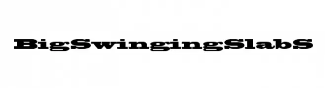
A bold, distressed font with a grunge, weathered appearance.
 Herunterladen 889 Downloads@WebFont
 -
![BigSwingingSlabS Frei Schriftart Herunterladen]() Herunterladen 889 Downloads@WebFont
Herunterladen 889 Downloads@WebFont -
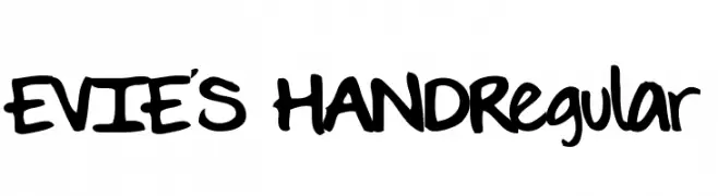
![EVIE'S HANDRegular Frei Schriftart Herunterladen]() Herunterladen 889 Downloads@WebFont
Herunterladen 889 Downloads@WebFont -
( Fonts by Manfred Klein. Free for private and charity use. Free for commercial with donation to organizations )
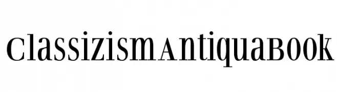
A classic serif font with elegant lines and medium contrast, perfect for traditional and versatile uses.
![ClassizismAntiquaBook Frei Schriftart Herunterladen]() Herunterladen 889 Downloads@WebFont
Herunterladen 889 Downloads@WebFont -
( Fonts by Daniel Zadorozny - www.iconian.com - Free for personal use )
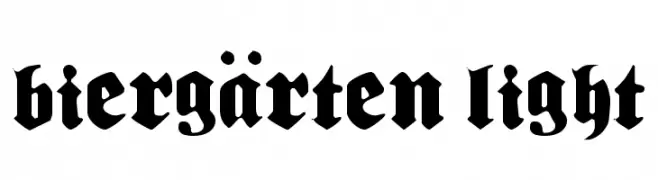
A bold, blackletter font with a gothic, medieval style.
![Biergärten Light Frei Schriftart Herunterladen]() Herunterladen 889 Downloads@WebFont
Herunterladen 889 Downloads@WebFont -
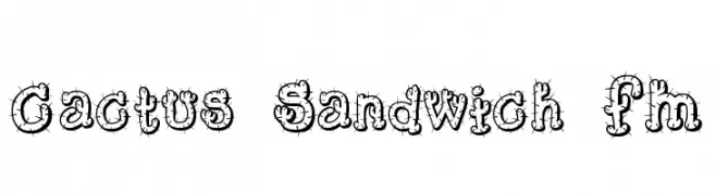
-
![Cactus Sandwich FM Frei Schriftart Herunterladen]() Herunterladen 889 Downloads@WebFont
Herunterladen 889 Downloads@WebFont -
( Fonts by Graham Meade - GemFonts )
A bold, artistic font with a freehand, hand-drawn appearance.
![Kelt Caps Freehand Frei Schriftart Herunterladen]() Herunterladen 889 Downloads@WebFont
Herunterladen 889 Downloads@WebFont -
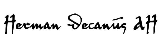
( Fonts by Andreas Hofeld - www.fontgrube.de )
An artistic and expressive font with calligraphic influences and high contrast.
![Herman Decanus AH Frei Schriftart Herunterladen]() Herunterladen 889 Downloads@WebFont
Herunterladen 889 Downloads@WebFont -
( Fonts by Khurasan )
A playful, bold, and rounded font with a whimsical, bubbly appearance.
![Cheesy Cats Frei Schriftart Herunterladen]() Herunterladen 888 Downloads@WebFont
Herunterladen 888 Downloads@WebFont -
( Michael D. Adams - www.triskele.com/roadgeek-fonts/ )
A modern, clean sans-serif font with uniform strokes and excellent readability.
![Roadgeek 2005 Series 5B Frei Schriftart Herunterladen]() Herunterladen 888 Downloads@WebFont
Herunterladen 888 Downloads@WebFont


Welche Schriften sind gerade am populärsten?
Poppins, Roboto, Montserrat, Open Sans und Lato sind wegen ihrer klaren Formen und breiten Einsetzbarkeit sehr gefragt – von Markenauftritt über Landingpages bis hin zu Postern.
Welche Fonts eignen sich für Logos?
Geometrische Sans‑Serifs (z. B. Poppins, Familien im Gotham‑Stil) sind ein häufiger Griff für sauberes, skalierbares Branding. Für eine persönlichere Note bleiben Scripts und Handschrift‑Stile beliebt. Kombinieren Sie einen prägnanten Headline‑Font mit einer neutralen Brotschrift für Wiedererkennung und Harmonie.
Wie oft wird die Top‑Liste aktualisiert?
Regelmäßig – basierend auf realen Downloads und Interaktionen. Schauen Sie öfter vorbei, um aufstrebende Favoriten früh zu entdecken.
💡 Tipp: Seite bookmarken – Trends wechseln schnell, und heutige Top‑Schriften inspirieren morgen vielleicht das Rebranding.