Herunterladen
Neue Schriftarten
Spitze Schriftarten
Trending
Werkzeuge ▾
❤ Instagram Schriften
♡ Kursiv-Generator
⇋ Compare Fonts
🔎 Schrift erkennen ↗
Anmelden
Free Fonts
»
Spitze Schriftarten (168,889)
Spitze Schriftarten
168,889 fonts
35 / schriftarten pro seite
50 / schriftarten pro seite
100 / schriftarten pro seite
Die beste erste
Neuere ersten
Font-Titel
Gehen
✕
KOSTENLOS
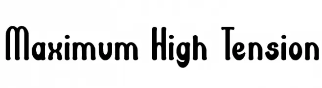
Maximum High Tension Font
Maximum High Tension Font
203 downloads
2016-09-28
Schrift von Wino S Kadir - weknow - www.revolge.com/shop/weknow/ - Personal-use only. For commercial use please contact owner.
Herunterladen
@ Web Font
KOSTENLOS
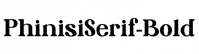
PhinisiSerif-Bold Font
PhinisiSerif-Bold Font
203 downloads
2025-07-18
Schrift von Jetsmax.com - Personal-use only. For commercial use please contact owner.
Herunterladen
@ Web Font
KOSTENLOS
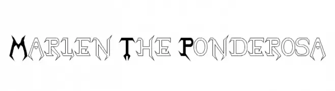
Marlen The Ponderosa Font
Marlen The Ponderosa Font
203 downloads
2015-02-23
Herunterladen
@ Web Font
KOSTENLOS
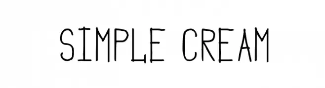
Simple Cream Font
Simple Cream Font
203 downloads
2017-03-08
Schrift von Woodcutter
Herunterladen
@ Web Font
KOSTENLOS
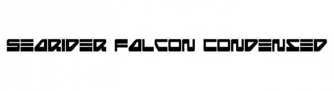
Searider Falcon Condensed Font
Searider Falcon Condensed Font
203 downloads
2010-03-31
Schrift von Daniel Zadorozny - www.iconian.com - Free for personal use
Herunterladen
@ Web Font
KOSTENLOS
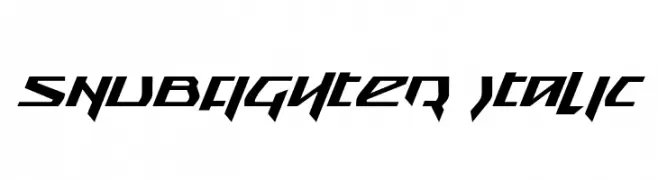
Snubfighter Italic Font
Snubfighter Italic Font
203 downloads
2010-03-31
Schrift von Daniel Zadorozny - www.iconian.com - Free for personal use
Herunterladen
@ Web Font
KOSTENLOS
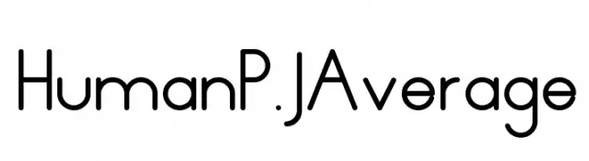
HumanP.J-Average Font
HumanP.J-Average Font
203 downloads
2018-11-12
Peter Judson - peterjudson.com/
Herunterladen
@ Web Font
KOSTENLOS
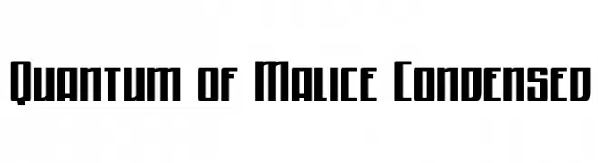
Quantum of Malice Condensed Font
Quantum of Malice Condensed Font
203 downloads
2015-07-09
Schrift von Daniel Zadorozny - www.iconian.com - Free for personal use
Herunterladen
@ Web Font
KOSTENLOS
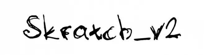
Skratch_v2 Font
Skratch_v2 Font
203 downloads
2010-04-01
Herunterladen
@ Web Font
KOSTENLOS
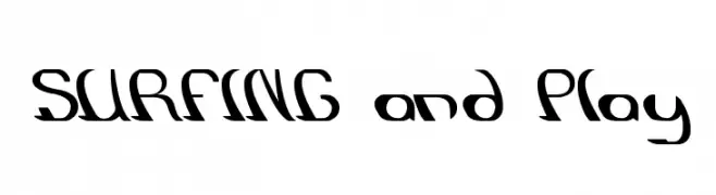
SURFING and Play Font
SURFING and Play Font
203 downloads
2012-07-18
Herunterladen
@ Web Font
KOSTENLOS
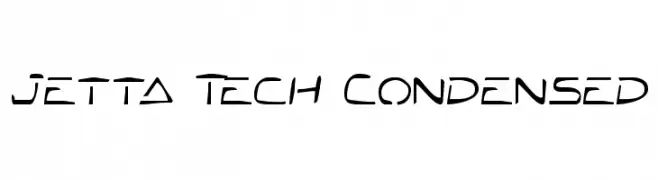
Jetta Tech Condensed Font
Jetta Tech Condensed Font
203 downloads
2009-05-27
Herunterladen
@ Web Font
KOSTENLOS
Heat Sinks 386 Font
Heat Sinks 386 Font
203 downloads
2009-05-27
Herunterladen
@ Web Font
KOSTENLOS
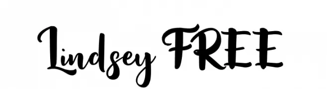
Lindsey FREE Font
Lindsey FREE Font
203 downloads
2023-02-11
Schrift von Vunira Design - Personal-use only. For commercial use please contact owner.
Herunterladen
@ Web Font
KOSTENLOS
meguido-jed- Font
meguido-jed- Font
203 downloads
2010-03-31
Herunterladen
@ Web Font
KOSTENLOS
Giga66 Font
Giga66 Font
203 downloads
2011-01-29
Herunterladen
Aktualisieren
KOSTENLOS
sunspire Italic Font
sunspire Italic Font
203 downloads
2018-11-10
Darrell Flood
Herunterladen
@ Web Font
KOSTENLOS
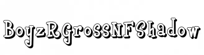
Boyz R Gross NF Shadow Font
Boyz R Gross NF Shadow Font
203 downloads
2019-02-22
Schrift von Nick Curtis - Personal-use only. For commercial use please contact owner.
Herunterladen
@ Web Font
KOSTENLOS
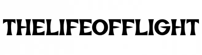
The Life of Flight Font
The Life of Flight Font
203 downloads
2017-12-06
Schrift von www.chequered.ink - Chequered Ink - Personal-use only. For commercial use please contact owner.
Herunterladen
@ Web Font
KOSTENLOS
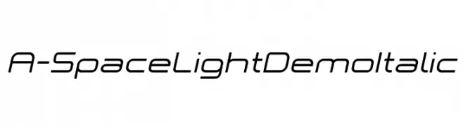
A-Space Light Demo Italic Font
A-Space Light Demo Italic Font
203 downloads
2018-06-29
Schrift von www.studiotypo.com - Personal-use only. For commercial use please contact owner.
Herunterladen
@ Web Font
KOSTENLOS
NeueFrakturExtraBold Font
NeueFrakturExtraBold Font
203 downloads
2010-10-01
Herunterladen
@ Web Font
KOSTENLOS
Winne Vinne Font
Winne Vinne Font
203 downloads
2021-02-09
Schrift von Kong Font - https://fontkong.com/ - Personal-use only. For commercial use please contact owner.
Herunterladen
@ Web Font
KOSTENLOS
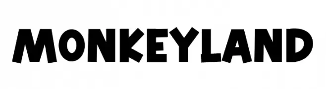
Monkey Land Font
Monkey Land Font
203 downloads
2025-04-02
Schrift von RantautypeStudio
Herunterladen
@ Web Font
KOSTENLOS
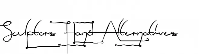
Sculptors Hand Alternatives Font
Sculptors Hand Alternatives Font
203 downloads
2012-06-05
Schrift von Mans Greback - www.mawns.com
Herunterladen
@ Web Font
KOSTENLOS
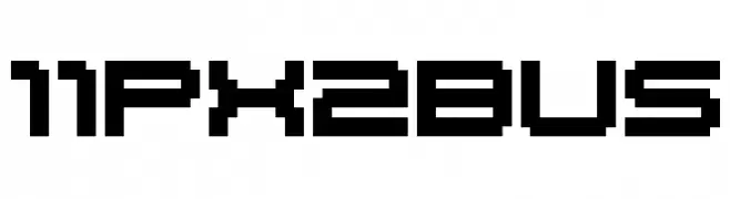
11px2bus Font
11px2bus Font
203 downloads
2018-11-20
010Bus
Herunterladen
@ Web Font
KOSTENLOS
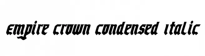
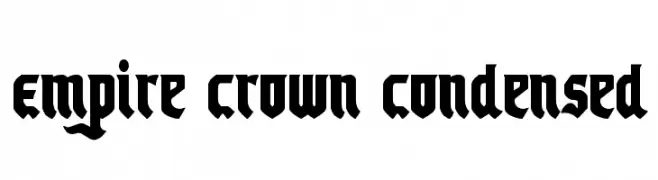
Empire Crown Condensed Italic Font
Empire Crown Condensed Italic Font
203 downloads
2012-01-17
Schrift von Daniel Zadorozny - www.iconian.com
Herunterladen
@ Web Font
KOSTENLOS
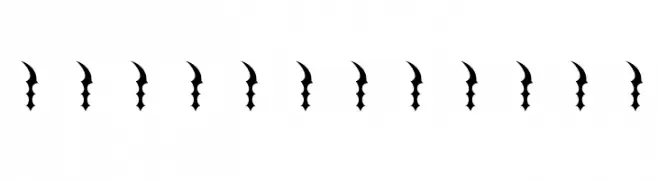
AbstractOrnamentBatsTwo Font
AbstractOrnamentBatsTwo Font
203 downloads
2010-10-03
Schrift von Manfred Klein. Free for private and charity use. Free for commercial with donation to organizations
Herunterladen
@ Web Font
KOSTENLOS
Empire Crown Condensed Font
Empire Crown Condensed Font
203 downloads
2012-01-17
Schrift von Daniel Zadorozny - www.iconian.com
Herunterladen
@ Web Font
KOSTENLOS
Oplo Sans Font
Oplo Sans Font
203 downloads
2014-11-30
Herunterladen
@ Web Font
KOSTENLOS
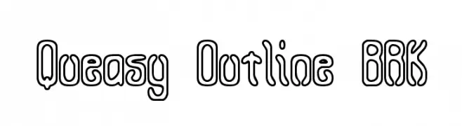
Queasy Outline BRK Font
Queasy Outline BRK Font
203 downloads
2009-05-26
Schrift von www.aenigmafonts.com
Herunterladen
@ Web Font
KOSTENLOS
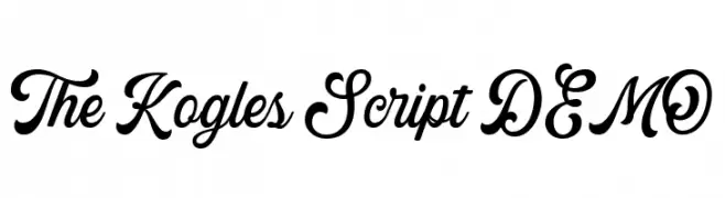
The Kogles Script DEMO Font
The Kogles Script DEMO Font
203 downloads
2023-01-20
Schrift von Letterhend Studio - Hendry Juanda - Personal-use only. For commercial use please contact owner.
Herunterladen
@ Web Font
KOSTENLOS
imperatives tables Font
imperatives tables Font
203 downloads
2010-04-01
Herunterladen
@ Web Font
KOSTENLOS
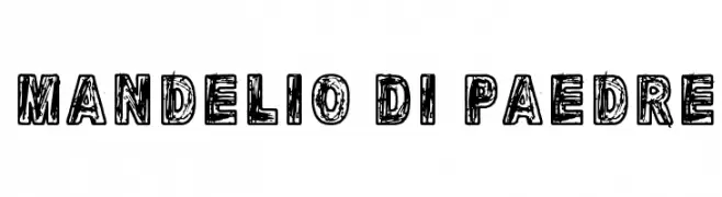
Mandelio Di Paedre Font
Mandelio Di Paedre Font
203 downloads
2015-12-09
Schrift von junkohanhero
Herunterladen
@ Web Font
KOSTENLOS
Magaz Light Font
Magaz Light Font
203 downloads
2010-03-03
Please check the owner website: http://www.billie.grosse.is-a-geek.com
Herunterladen
@ Web Font
KOSTENLOS
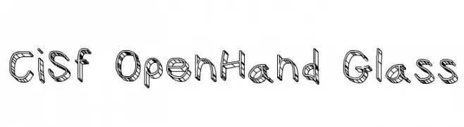
CiSf OpenHand Glass Font
CiSf OpenHand Glass Font
203 downloads
2015-07-21
Herunterladen
@ Web Font
KOSTENLOS
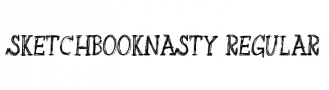
SketchbookNasty-Regular Font
SketchbookNasty-Regular Font
203 downloads
2013-01-17
Schrift von Alex Tomlinson - Skyhaven Fonts - shfonts.com
Herunterladen
@ Web Font
⇋
Compare Fonts
Side by side
« Prev
1
…
2186
2187
2188
2189
2190
2191
2192
2193
2194
…
4826
Next »
×
‹
›