Willkommen bei den Top‑Schriften – hier treffen Beliebtheit und Qualität aufeinander. Das sind die in diesem Jahr am häufigsten heruntergeladenen und genutzten Fonts. Wenn Sie sichere Optionen für Logo, Web oder Social suchen, starten Sie hier.
Jeder Top‑Font überzeugt durch Balance, Lesbarkeit und Vielseitigkeit. Sie finden moderne Sans‑Serifs, elegante Scripts, Vintage‑Serifs und minimalistische Displays.
-
( Fonts by Koczman Balint - magiquefonts.gportal.hu )
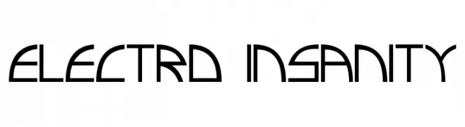
A futuristic, geometric font with sharp angles and clean lines.
 Herunterladen 790 Downloads@WebFont
 -
( Fonts by www.typodermicfonts.com - Ray Larabie )
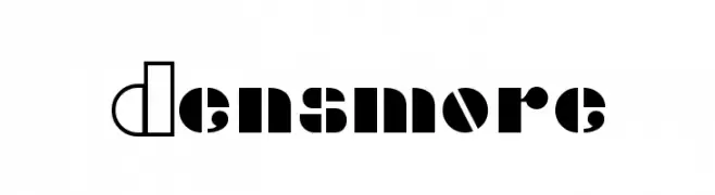
A bold, modern font with geometric shapes and contrasting solid and outlined segments.
![Densmore Frei Schriftart Herunterladen]() Herunterladen 790 Downloads@WebFont
Herunterladen 790 Downloads@WebFont -
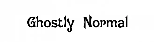
![Ghostly Normal Frei Schriftart Herunterladen]() Herunterladen 790 Downloads@WebFont
Herunterladen 790 Downloads@WebFont -
![Airmole Frei Schriftart Herunterladen]() Herunterladen 790 Downloads@WebFont
Herunterladen 790 Downloads@WebFont -
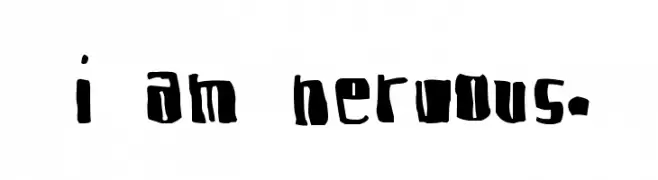
![I am Nervous. Frei Schriftart Herunterladen]() Herunterladen 790 Downloads@WebFont
Herunterladen 790 Downloads@WebFont -
-
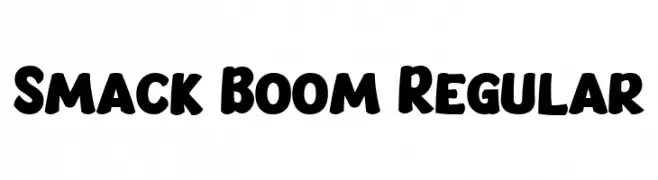
( Fonts by Bangkit Tri Setiadi )
A bold, rounded font with a playful and cartoonish style.
![Smack Boom Regular Frei Schriftart Herunterladen]() Herunterladen 789 Downloads@WebFont
Herunterladen 789 Downloads@WebFont -
( Fonts by Creatype Studio )
A playful, bold font with rounded, thick strokes and a whimsical style.
![Kidos Park Frei Schriftart Herunterladen]() Herunterladen 789 Downloads@WebFont
Herunterladen 789 Downloads@WebFont -
( Fonts by Fillo Graphic )
A bold, geometric font with a modern and versatile style.
![Summer Display Frei Schriftart Herunterladen]() Herunterladen 789 Downloads@WebFont
Herunterladen 789 Downloads@WebFont -
( Noto is a trademark of Google Inc. Noto fonts are open source. All Noto fonts are published under the SIL Open Font License, Version 1.1 )
A modern, legible font supporting the Oriya script with clean lines and balanced proportions.
![Noto Sans Oriya Frei Schriftart Herunterladen]() Herunterladen 789 Downloads@WebFont
Herunterladen 789 Downloads@WebFont -
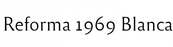
( Fonts by PampaType - Personal-use only. For commercial use please contact owner. )
A modern serif font with elegant, refined letterforms and versatile special characters.
![Reforma 1969 Blanca Frei Schriftart Herunterladen]() Herunterladen 789 Downloads@WebFont
Herunterladen 789 Downloads@WebFont


Welche Schriften sind gerade am populärsten?
Poppins, Roboto, Montserrat, Open Sans und Lato sind wegen ihrer klaren Formen und breiten Einsetzbarkeit sehr gefragt – von Markenauftritt über Landingpages bis hin zu Postern.
Welche Fonts eignen sich für Logos?
Geometrische Sans‑Serifs (z. B. Poppins, Familien im Gotham‑Stil) sind ein häufiger Griff für sauberes, skalierbares Branding. Für eine persönlichere Note bleiben Scripts und Handschrift‑Stile beliebt. Kombinieren Sie einen prägnanten Headline‑Font mit einer neutralen Brotschrift für Wiedererkennung und Harmonie.
Wie oft wird die Top‑Liste aktualisiert?
Regelmäßig – basierend auf realen Downloads und Interaktionen. Schauen Sie öfter vorbei, um aufstrebende Favoriten früh zu entdecken.
💡 Tipp: Seite bookmarken – Trends wechseln schnell, und heutige Top‑Schriften inspirieren morgen vielleicht das Rebranding.