Willkommen bei den Top‑Schriften – hier treffen Beliebtheit und Qualität aufeinander. Das sind die in diesem Jahr am häufigsten heruntergeladenen und genutzten Fonts. Wenn Sie sichere Optionen für Logo, Web oder Social suchen, starten Sie hier.
Jeder Top‑Font überzeugt durch Balance, Lesbarkeit und Vielseitigkeit. Sie finden moderne Sans‑Serifs, elegante Scripts, Vintage‑Serifs und minimalistische Displays.
-
( Free for a personal use. For a commercial use please visit www.kevinandamanda.com )
A playful, handwritten font with a whimsical and informal style.
 Herunterladen 785 Downloads@WebFont
 -
( SDFonts. http://www.angelfire.com/scifi2/sdfonts/index.html )
A bold, modern sans-serif font with a strong, geometric design.
![Paolo Frei Schriftart Herunterladen]() Herunterladen 785 Downloads@WebFont
Herunterladen 785 Downloads@WebFont -
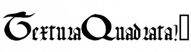
![TexturaQuadrata!]() Herunterladen 785 Downloads@WebFont
Herunterladen 785 Downloads@WebFont -
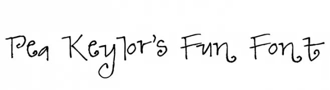
( Fonts by Kat`s Fun Fonts - Personal-use only. For commercial use please contact owner. )
A playful font with letters inside popcorn buckets, perfect for entertainment themes.
![KR Popcorn Time! Frei Schriftart Herunterladen]() Herunterladen 785 Downloads@WebFont
Herunterladen 785 Downloads@WebFont -
( Fonts by www.tipometar.org )
A modern, clean sans-serif font with excellent readability and versatility.
![ResavskaBGSans Frei Schriftart Herunterladen]() Herunterladen 785 Downloads@WebFont
Herunterladen 785 Downloads@WebFont -
-
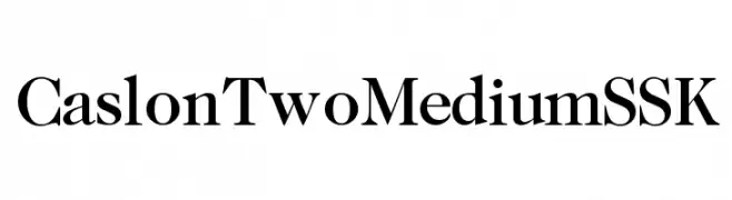
![CaslonTwoMediumSSK Frei Schriftart Herunterladen]() Herunterladen 785 Downloads@WebFont
Herunterladen 785 Downloads@WebFont -
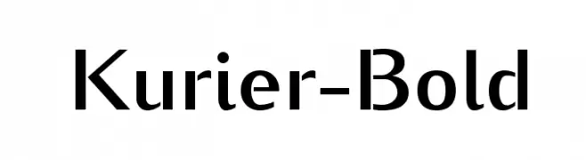
![Kurier-Bold Frei Schriftart Herunterladen]() Herunterladen 785 Downloads@WebFont
Herunterladen 785 Downloads@WebFont -
![SILDoulosIPA Regular Frei Schriftart Herunterladen]() Herunterladen 785 Downloads@WebFont
Herunterladen 785 Downloads@WebFont -
( Fonts by Manfred Klein. Free for private and charity use. Free for commercial with donation to organizations )
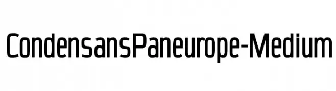
A modern, condensed sans-serif font with a clean and professional appearance.
![CondensansPaneurope-Medium Frei Schriftart Herunterladen]() Herunterladen 785 Downloads@WebFont
Herunterladen 785 Downloads@WebFont -
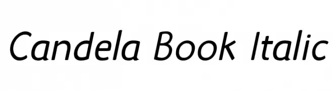
![Candela Book Italic Frei Schriftart Herunterladen]() Herunterladen 785 Downloads@WebFont
Herunterladen 785 Downloads@WebFont


Welche Schriften sind gerade am populärsten?
Poppins, Roboto, Montserrat, Open Sans und Lato sind wegen ihrer klaren Formen und breiten Einsetzbarkeit sehr gefragt – von Markenauftritt über Landingpages bis hin zu Postern.
Welche Fonts eignen sich für Logos?
Geometrische Sans‑Serifs (z. B. Poppins, Familien im Gotham‑Stil) sind ein häufiger Griff für sauberes, skalierbares Branding. Für eine persönlichere Note bleiben Scripts und Handschrift‑Stile beliebt. Kombinieren Sie einen prägnanten Headline‑Font mit einer neutralen Brotschrift für Wiedererkennung und Harmonie.
Wie oft wird die Top‑Liste aktualisiert?
Regelmäßig – basierend auf realen Downloads und Interaktionen. Schauen Sie öfter vorbei, um aufstrebende Favoriten früh zu entdecken.
💡 Tipp: Seite bookmarken – Trends wechseln schnell, und heutige Top‑Schriften inspirieren morgen vielleicht das Rebranding.