Willkommen bei den Top‑Schriften – hier treffen Beliebtheit und Qualität aufeinander. Das sind die in diesem Jahr am häufigsten heruntergeladenen und genutzten Fonts. Wenn Sie sichere Optionen für Logo, Web oder Social suchen, starten Sie hier.
Jeder Top‑Font überzeugt durch Balance, Lesbarkeit und Vielseitigkeit. Sie finden moderne Sans‑Serifs, elegante Scripts, Vintage‑Serifs und minimalistische Displays.
-
 Herunterladen 710 Downloads@WebFont
 -
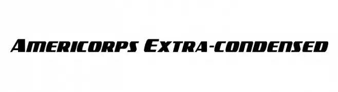
( Fonts by Daniel Zadorozny - www.iconian.com - Free for personal use )
A bold, extra-condensed font with a dynamic and modern style.
![Americorps Extra-condensed Frei Schriftart Herunterladen]() Herunterladen 710 Downloads@WebFont
Herunterladen 710 Downloads@WebFont -
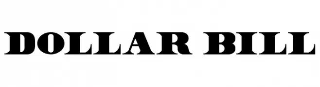
( Fonts by twicolabs.com - Twicolabs Typefoundry )
A bold, high-contrast serif font with a modern twist.
![Dollar Bill Frei Schriftart Herunterladen]() Herunterladen 710 Downloads@WebFont
Herunterladen 710 Downloads@WebFont -
( Font by Jonathan Harris - www.tattoowoo.com )
A dynamic, expressive script font with a hand-drawn, brush-like appearance.
![Praying Angel Frei Schriftart Herunterladen]() Herunterladen 710 Downloads@WebFont
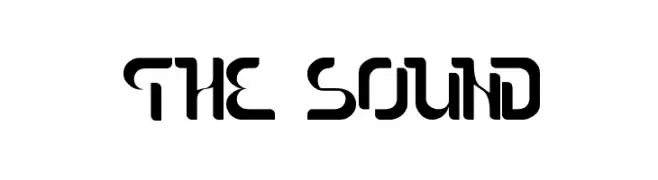
Herunterladen 710 Downloads@WebFont -
![The Sound Frei Schriftart Herunterladen]() Herunterladen 710 Downloads@WebFont
Herunterladen 710 Downloads@WebFont -
-
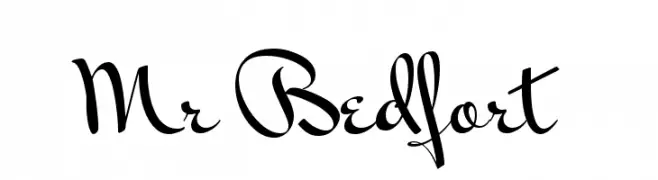
( Copyright (c) 2011 Alejandro Paul (sudtipos@sudtipos.com) )
A sophisticated and flowing script font with elegant cursive letterforms.
![Mr Bedfort Frei Schriftart Herunterladen]() Herunterladen 710 Downloads@WebFont
Herunterladen 710 Downloads@WebFont -
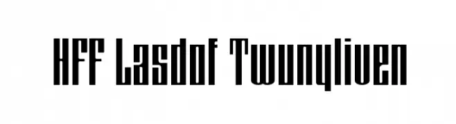
( Fonts by Have Fun with Fonts )
A bold, narrow font with a modern, geometric style.
![HFF Lasdof Twunyliven Frei Schriftart Herunterladen]() Herunterladen 710 Downloads@WebFont
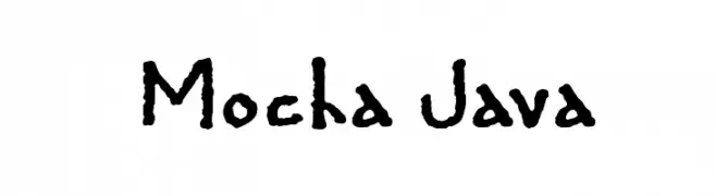
Herunterladen 710 Downloads@WebFont -
![Mocha Java Frei Schriftart Herunterladen]() Herunterladen 710 Downloads@WebFont
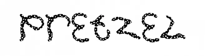
Herunterladen 710 Downloads@WebFont -
( Fonts by AJ Palmer )
A playful, pretzel-inspired font with a whimsical and hand-drawn appearance.
![Pretzel Frei Schriftart Herunterladen]() Herunterladen 710 Downloads@WebFont
Herunterladen 710 Downloads@WebFont -
( Free for a personal use. For a commercial use please visit www.kevinandamanda.com )
A whimsical and playful font with elegant curves and decorative elements.
![Three Dates, One Night Frei Schriftart Herunterladen]() Herunterladen 710 Downloads@WebFont
Herunterladen 710 Downloads@WebFont

Welche Schriften sind gerade am populärsten?
Poppins, Roboto, Montserrat, Open Sans und Lato sind wegen ihrer klaren Formen und breiten Einsetzbarkeit sehr gefragt – von Markenauftritt über Landingpages bis hin zu Postern.
Welche Fonts eignen sich für Logos?
Geometrische Sans‑Serifs (z. B. Poppins, Familien im Gotham‑Stil) sind ein häufiger Griff für sauberes, skalierbares Branding. Für eine persönlichere Note bleiben Scripts und Handschrift‑Stile beliebt. Kombinieren Sie einen prägnanten Headline‑Font mit einer neutralen Brotschrift für Wiedererkennung und Harmonie.
Wie oft wird die Top‑Liste aktualisiert?
Regelmäßig – basierend auf realen Downloads und Interaktionen. Schauen Sie öfter vorbei, um aufstrebende Favoriten früh zu entdecken.
💡 Tipp: Seite bookmarken – Trends wechseln schnell, und heutige Top‑Schriften inspirieren morgen vielleicht das Rebranding.