Willkommen bei den Top‑Schriften – hier treffen Beliebtheit und Qualität aufeinander. Das sind die in diesem Jahr am häufigsten heruntergeladenen und genutzten Fonts. Wenn Sie sichere Optionen für Logo, Web oder Social suchen, starten Sie hier.
Jeder Top‑Font überzeugt durch Balance, Lesbarkeit und Vielseitigkeit. Sie finden moderne Sans‑Serifs, elegante Scripts, Vintage‑Serifs und minimalistische Displays.
-
( Copyright (c) YoonDesign Inc. All Rights Reserved. )
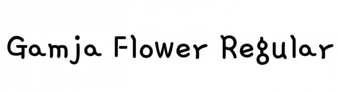
A playful, handwritten font with rounded, irregular letterforms.
 Herunterladen 709 Downloads@WebFont
 -
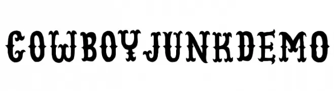
![CowboyJunkDEMO Frei Schriftart Herunterladen]() Herunterladen 709 Downloads@WebFont
Herunterladen 709 Downloads@WebFont -
( Fonts by a Neale Davidson - www.pixelsagas.com. Personal-use only. For commercial use please contact owner. )
A bold, italicized font with a futuristic and dynamic style.
![Cyberfall Italic Frei Schriftart Herunterladen]() Herunterladen 709 Downloads@WebFont
Herunterladen 709 Downloads@WebFont -
( Fonts by Daniel Zadorozny - www.iconian.com )
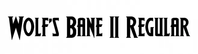
A bold, angular font with a vintage, gothic style.
![Wolf's Bane II Regular Frei Schriftart Herunterladen]() Herunterladen 709 Downloads@WebFont
Herunterladen 709 Downloads@WebFont -
( Fonts by Harder Type Foundry )
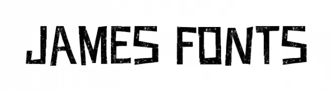
A bold, distressed font with a grunge, urban style.
![JAMES FONTS Frei Schriftart Herunterladen]() Herunterladen 709 Downloads@WebFont
Herunterladen 709 Downloads@WebFont -
-
( Fonts by Cyril Mikhailov )
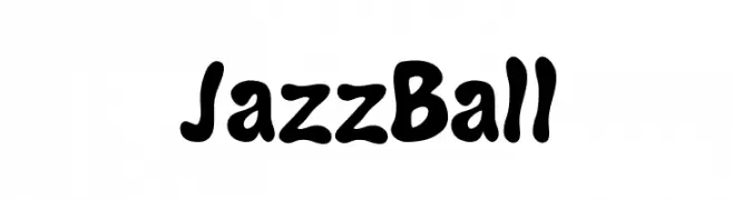
A playful, bold font with rounded, bubbly characters and a hand-drawn feel.
![JazzBall Frei Schriftart Herunterladen]() Herunterladen 709 Downloads@WebFont
Herunterladen 709 Downloads@WebFont -
( Fonts by Typodermic Fonts )
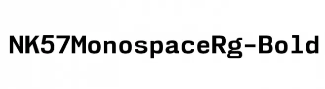
A bold, monospaced typeface with uniform character width and strong readability.
![NK57MonospaceRg-Bold Frei Schriftart Herunterladen]() Herunterladen 709 Downloads@WebFont
Herunterladen 709 Downloads@WebFont -
![Loki Frei Schriftart Herunterladen]() Herunterladen 709 Downloads@WebFont
Herunterladen 709 Downloads@WebFont -
( Fonts by Castcraft Software - opti.netii.net - check the website before use )
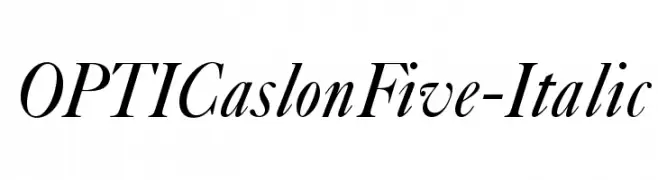
An elegant italic serif font with smooth curves and a classic style.
![OPTICaslonFive-Italic Frei Schriftart Herunterladen]() Herunterladen 709 Downloads@WebFont
Herunterladen 709 Downloads@WebFont -
( Fonts by a Neale Davidson - www.pixelsagas.com. Personal-use only. For commercial use please contact owner. )
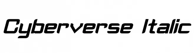
A sleek, futuristic italic font with sharp angles and smooth curves.
![Cyberverse Italic Frei Schriftart Herunterladen]() Herunterladen 709 Downloads@WebFont
Herunterladen 709 Downloads@WebFont


Welche Schriften sind gerade am populärsten?
Poppins, Roboto, Montserrat, Open Sans und Lato sind wegen ihrer klaren Formen und breiten Einsetzbarkeit sehr gefragt – von Markenauftritt über Landingpages bis hin zu Postern.
Welche Fonts eignen sich für Logos?
Geometrische Sans‑Serifs (z. B. Poppins, Familien im Gotham‑Stil) sind ein häufiger Griff für sauberes, skalierbares Branding. Für eine persönlichere Note bleiben Scripts und Handschrift‑Stile beliebt. Kombinieren Sie einen prägnanten Headline‑Font mit einer neutralen Brotschrift für Wiedererkennung und Harmonie.
Wie oft wird die Top‑Liste aktualisiert?
Regelmäßig – basierend auf realen Downloads und Interaktionen. Schauen Sie öfter vorbei, um aufstrebende Favoriten früh zu entdecken.
💡 Tipp: Seite bookmarken – Trends wechseln schnell, und heutige Top‑Schriften inspirieren morgen vielleicht das Rebranding.