Willkommen bei den Top‑Schriften – hier treffen Beliebtheit und Qualität aufeinander. Das sind die in diesem Jahr am häufigsten heruntergeladenen und genutzten Fonts. Wenn Sie sichere Optionen für Logo, Web oder Social suchen, starten Sie hier.
Jeder Top‑Font überzeugt durch Balance, Lesbarkeit und Vielseitigkeit. Sie finden moderne Sans‑Serifs, elegante Scripts, Vintage‑Serifs und minimalistische Displays.
-
( Fonts by www.aenigmafonts.com )
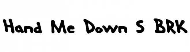
A playful, hand-drawn font with bold, rounded strokes and an informal style.
 Herunterladen 685 Downloads@WebFont
 -
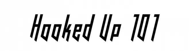
![Hooked Up 101 Frei Schriftart Herunterladen]() Herunterladen 685 Downloads@WebFont
Herunterladen 685 Downloads@WebFont -
( Fonts by AVODEVIL - www.instagram.com/avodevil - Personal-use only. For commercial use please contact owner. )
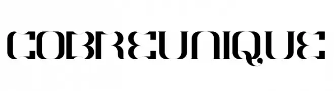
A modern, high-contrast font with decorative and geometric elements.
![COBRE UNIQUE Frei Schriftart Herunterladen]() Herunterladen 684 Downloads@WebFont
Herunterladen 684 Downloads@WebFont -
( Fonts by DumadiStyle )
A playful and artistic font with unique, dynamic letterforms.
![Shibori Frei Schriftart Herunterladen]() Herunterladen 684 Downloads@WebFont
Herunterladen 684 Downloads@WebFont -
( Fonts by Vladimir Nikolic - www.creativefabrica.com/designer/vladimirnikolic/ - Personal-use only. For commercial use please contact owner. )
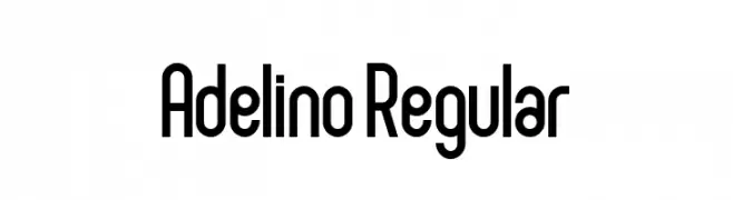
A modern, geometric typeface with a tall, narrow, and consistent design.
![Adelino Regular Frei Schriftart Herunterladen]() Herunterladen 684 Downloads@WebFont
Herunterladen 684 Downloads@WebFont -
-
( Fonts by www.chequered.ink - Chequered Ink - Personal-use only. For commercial use please contact owner. )
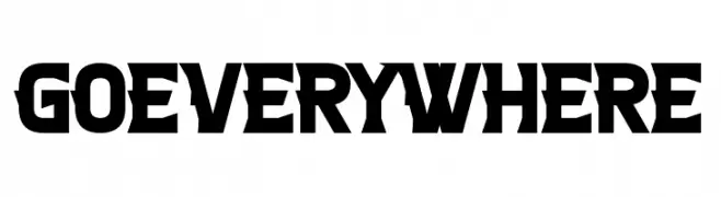
A bold, geometric font with strong, angular strokes.
![Go Everywhere Frei Schriftart Herunterladen]() Herunterladen 684 Downloads@WebFont
Herunterladen 684 Downloads@WebFont -
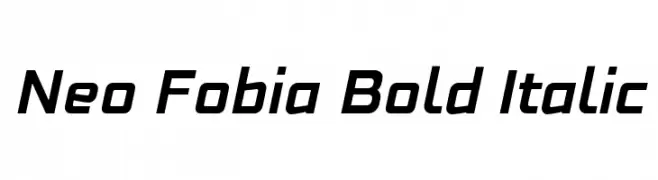
![Neo Fobia Bold Italic Frei Schriftart Herunterladen]() Herunterladen 684 Downloads@WebFont
Herunterladen 684 Downloads@WebFont -
( Fonts by Sorkin Type Co - Personal-use only. For commercial use please contact owner. )
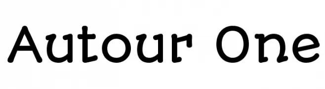
A playful, rounded font with smooth curves and a friendly appearance.
![Autour One Frei Schriftart Herunterladen]() Herunterladen 684 Downloads@WebFont
Herunterladen 684 Downloads@WebFont -
( LeoSupply.co - leosupply.co )
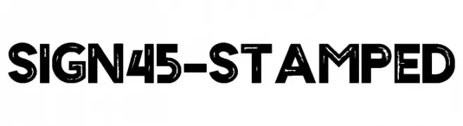
A bold, distressed font with a vintage, industrial style.
![Sign45- Stamped Frei Schriftart Herunterladen]() Herunterladen 684 Downloads@WebFont
Herunterladen 684 Downloads@WebFont -
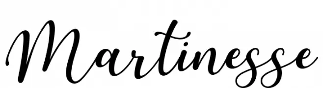
( Sronstudio - Yusron Billah )
An elegant, flowing script font with graceful curves and sophisticated flair.
![Martinesse Frei Schriftart Herunterladen]() Herunterladen 684 Downloads@WebFont
Herunterladen 684 Downloads@WebFont

Welche Schriften sind gerade am populärsten?
Poppins, Roboto, Montserrat, Open Sans und Lato sind wegen ihrer klaren Formen und breiten Einsetzbarkeit sehr gefragt – von Markenauftritt über Landingpages bis hin zu Postern.
Welche Fonts eignen sich für Logos?
Geometrische Sans‑Serifs (z. B. Poppins, Familien im Gotham‑Stil) sind ein häufiger Griff für sauberes, skalierbares Branding. Für eine persönlichere Note bleiben Scripts und Handschrift‑Stile beliebt. Kombinieren Sie einen prägnanten Headline‑Font mit einer neutralen Brotschrift für Wiedererkennung und Harmonie.
Wie oft wird die Top‑Liste aktualisiert?
Regelmäßig – basierend auf realen Downloads und Interaktionen. Schauen Sie öfter vorbei, um aufstrebende Favoriten früh zu entdecken.
💡 Tipp: Seite bookmarken – Trends wechseln schnell, und heutige Top‑Schriften inspirieren morgen vielleicht das Rebranding.