Willkommen bei den Top‑Schriften – hier treffen Beliebtheit und Qualität aufeinander. Das sind die in diesem Jahr am häufigsten heruntergeladenen und genutzten Fonts. Wenn Sie sichere Optionen für Logo, Web oder Social suchen, starten Sie hier.
Jeder Top‑Font überzeugt durch Balance, Lesbarkeit und Vielseitigkeit. Sie finden moderne Sans‑Serifs, elegante Scripts, Vintage‑Serifs und minimalistische Displays.
-
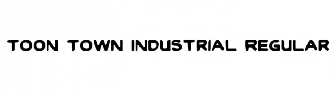
( Fonts by Daniel Zadorozny - www.iconian.com - Free for personal use )
A playful, bold font with rounded, cartoonish letterforms.
 Herunterladen 669 Downloads@WebFont
 -
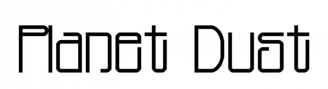
( Fonts by Jacob Fisher - www.pizzadude.dk )
A futuristic, geometric font with clean lines and rounded edges.
![Planet Dust Frei Schriftart Herunterladen]() Herunterladen 669 Downloads@WebFont
Herunterladen 669 Downloads@WebFont -
![Delta Hey Max Nine Frei Schriftart Herunterladen]() Herunterladen 669 Downloads@WebFont
Herunterladen 669 Downloads@WebFont -
![SF Eccentric Opus Condensed Frei Schriftart Herunterladen]() Herunterladen 669 Downloads@WebFont
Herunterladen 669 Downloads@WebFont -
![Puzzle Pieces Outline Frei Schriftart Herunterladen]() Herunterladen 669 Downloads@WebFont
Herunterladen 669 Downloads@WebFont -
-
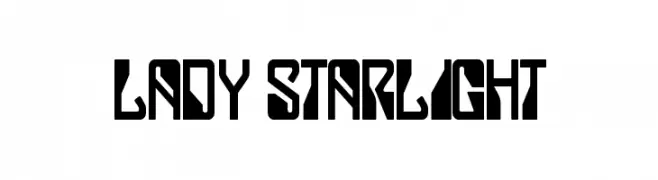
![Lady Starlight Frei Schriftart Herunterladen]() Herunterladen 669 Downloads@WebFont
Herunterladen 669 Downloads@WebFont -
( Fonts by Namara Creative Studio - Personal-use only. For commercial use please contact owner. )
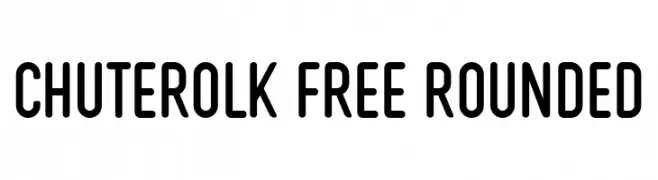
A modern, rounded sans-serif font with a clean and approachable style.
![CHUTEROLK Free Rounded Frei Schriftart Herunterladen]() Herunterladen 668 Downloads@WebFont
Herunterladen 668 Downloads@WebFont -
( Fonts by Johan Kallas )
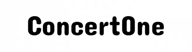
A bold, rounded font with a playful and approachable style.
![Concert One Frei Schriftart Herunterladen]() Herunterladen 668 Downloads@WebFont
Herunterladen 668 Downloads@WebFont -
( Fonts by blue studio09 - Personal-use only. For commercial use please contact owner. )
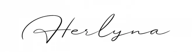
An elegant, flowing script font with sophisticated, graceful lines.
![Herlyna Frei Schriftart Herunterladen]() Herunterladen 668 Downloads@WebFont
Herunterladen 668 Downloads@WebFont -
( Fonts by Syaf Rizal - Khurasan - Personal-use only. For commercial use please contact owner. )
A sophisticated serif font with high contrast and elegant serifs.
![Recoba Frei Schriftart Herunterladen]() Herunterladen 668 Downloads@WebFont
Herunterladen 668 Downloads@WebFont


Welche Schriften sind gerade am populärsten?
Poppins, Roboto, Montserrat, Open Sans und Lato sind wegen ihrer klaren Formen und breiten Einsetzbarkeit sehr gefragt – von Markenauftritt über Landingpages bis hin zu Postern.
Welche Fonts eignen sich für Logos?
Geometrische Sans‑Serifs (z. B. Poppins, Familien im Gotham‑Stil) sind ein häufiger Griff für sauberes, skalierbares Branding. Für eine persönlichere Note bleiben Scripts und Handschrift‑Stile beliebt. Kombinieren Sie einen prägnanten Headline‑Font mit einer neutralen Brotschrift für Wiedererkennung und Harmonie.
Wie oft wird die Top‑Liste aktualisiert?
Regelmäßig – basierend auf realen Downloads und Interaktionen. Schauen Sie öfter vorbei, um aufstrebende Favoriten früh zu entdecken.
💡 Tipp: Seite bookmarken – Trends wechseln schnell, und heutige Top‑Schriften inspirieren morgen vielleicht das Rebranding.