Willkommen bei den Top‑Schriften – hier treffen Beliebtheit und Qualität aufeinander. Das sind die in diesem Jahr am häufigsten heruntergeladenen und genutzten Fonts. Wenn Sie sichere Optionen für Logo, Web oder Social suchen, starten Sie hier.
Jeder Top‑Font überzeugt durch Balance, Lesbarkeit und Vielseitigkeit. Sie finden moderne Sans‑Serifs, elegante Scripts, Vintage‑Serifs und minimalistische Displays.
-
( Fonts by www.graphicartsunit.com - Personal-use only. For commercial use please contact owner. )
A playful, modern font with rounded edges and a dynamic, slightly condensed style.
 Herunterladen 2087 Downloads@WebFont
 -
( Fonts by Graham Meade - GemFonts )
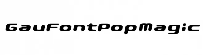
A geometric, angular font with a futuristic and bold style.
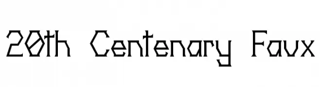
![20th Centenary Faux Frei Schriftart Herunterladen]() Herunterladen 2087 Downloads@WebFont
Herunterladen 2087 Downloads@WebFont -
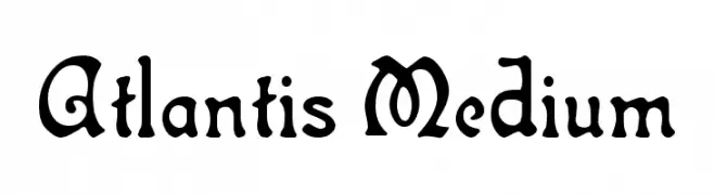
![Atlantis Medium Frei Schriftart Herunterladen]() Herunterladen 2087 Downloads@WebFont
Herunterladen 2087 Downloads@WebFont -
![Pharmount Personal Use Only Frei Schriftart Herunterladen]() Herunterladen 2086 Downloads@WebFont
Herunterladen 2086 Downloads@WebFont -
( Fonts by www.aenigmafonts.com )
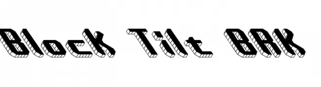
A bold, 3D block-style font with a tilted, dynamic appearance.
![Block Tilt BRK Frei Schriftart Herunterladen]() Herunterladen 2086 Downloads@WebFont
Herunterladen 2086 Downloads@WebFont -
-
( Fonts by The Docallisme )
A playful, bold font with dotted outlines, perfect for lively and engaging designs.
![Ding Dong Frei Schriftart Herunterladen]() Herunterladen 2085 Downloads@WebFont
Herunterladen 2085 Downloads@WebFont -
![NCAA Arizona Wildcats Rawlings Frei Schriftart Herunterladen]() Herunterladen 2085 Downloads@WebFont
Herunterladen 2085 Downloads@WebFont -
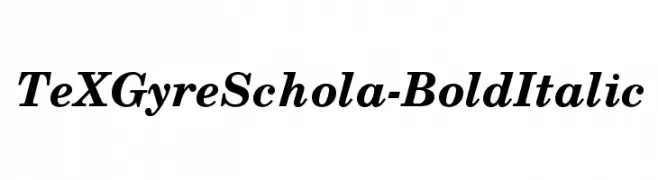
![TeXGyreSchola-BoldItalic Frei Schriftart Herunterladen]() Herunterladen 2085 Downloads@WebFont
Herunterladen 2085 Downloads@WebFont -
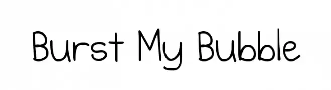
( Fonts by Kimberly Geswein - kimberlygeswein.com )
A playful, rounded font with a whimsical and lighthearted style.
![Burst My Bubble Frei Schriftart Herunterladen]() Herunterladen 2085 Downloads@WebFont
Herunterladen 2085 Downloads@WebFont -
( Fonts by Jacob Fisher - www.pizzadude.dk )
A tall, narrow font with high contrast and a modern, sophisticated style.
![Fake Plastic Frei Schriftart Herunterladen]() Herunterladen 2085 Downloads@WebFont
Herunterladen 2085 Downloads@WebFont -
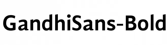
( Fonts by Cristobal Henestrosa and Raul Plancarte - Personal-use only. For commercial use please contact owner. )
A bold, modern sans-serif font with clean lines and strong visual impact.
![GandhiSans-Bold Frei Schriftart Herunterladen]() Herunterladen 2084 Downloads@WebFont
Herunterladen 2084 Downloads@WebFont -
![Organo Frei Schriftart Herunterladen]() Herunterladen 2084 Downloads@WebFont
Herunterladen 2084 Downloads@WebFont -
( This is Homizio Nova, a sans-serif font designed by Alvaro Thomaz. )
A modern, geometric sans-serif font with clean lines and balanced proportions.
![Homizio Nova Light Frei Schriftart Herunterladen]() Herunterladen 2084 Downloads@WebFont
Herunterladen 2084 Downloads@WebFont -
( گالری فانت فارسی پژوهش آريانا - only compatible with Farsi and Arabic )
A classic serif font with elegant, sharp serifs and balanced proportions.
![Atom Frei Schriftart Herunterladen]() Herunterladen 2084 Downloads@WebFont
Herunterladen 2084 Downloads@WebFont -
( Copyright (c) 2010-2011, Nathan Willis (nwillis@glyphography.com), with Reserved Font Name "News Cycle." )
A bold, modern sans-serif font with clean lines and geometric shapes.
![News Cycle Bold Frei Schriftart Herunterladen]() Herunterladen 2084 Downloads@WebFont
Herunterladen 2084 Downloads@WebFont -
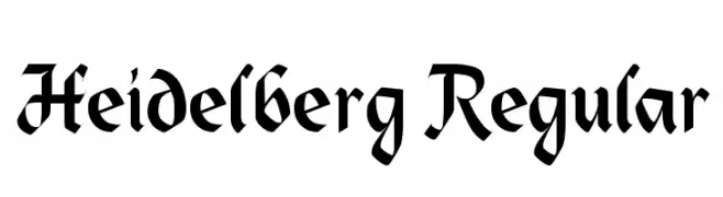
![Heidelberg Regular Frei Schriftart Herunterladen]() Herunterladen 2084 Downloads@WebFont
Herunterladen 2084 Downloads@WebFont -
( Please check the owner website: http://www.billie.grosse.is-a-geek.com )
Modern, geometric Gurmukhi script with monolinear strokes.
![Bulara Frei Schriftart Herunterladen]() Herunterladen 2084 Downloads@WebFont
Herunterladen 2084 Downloads@WebFont -
( Fonts by Omega Font Labs )
A bold, dripping font perfect for horror themes.
![Bloody Stump Frei Schriftart Herunterladen]() Herunterladen 2084 Downloads@WebFont
Herunterladen 2084 Downloads@WebFont -
( Jef Triforce - Francisco Arellano - www.ixipcalli.com )
A bold, rounded font with smooth curves and a friendly, modern appearance.
![Copilme Bold Frei Schriftart Herunterladen]() Herunterladen 2083 Downloads@WebFont
Herunterladen 2083 Downloads@WebFont -
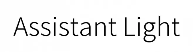
( Copyright 2010 The Assistant Project Authors, with Reserved Font Name 'Source'. Source is a trademark of Adobe Systems Incorporated in the United States and/or other countries. )
A modern, geometric sans-serif font with clean lines and balanced spacing.
![Assistant Light Frei Schriftart Herunterladen]() Herunterladen 2083 Downloads@WebFont
Herunterladen 2083 Downloads@WebFont -
![LED 16 Segment Frei Schriftart Herunterladen]() Herunterladen 2083 Downloads@WebFont
Herunterladen 2083 Downloads@WebFont -
![NiseJSRF Frei Schriftart Herunterladen]() Herunterladen 2083 Downloads@WebFont
Herunterladen 2083 Downloads@WebFont -
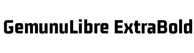
( Fonts by Mooniak - Personal-use only. For commercial use please contact owner. )
A bold, modern sans-serif font with clean lines and a strong presence.
![GemunuLibre ExtraBold Frei Schriftart Herunterladen]() Herunterladen 2082 Downloads@WebFont
Herunterladen 2082 Downloads@WebFont -
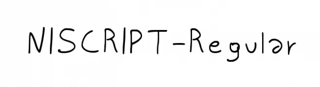
( Fonts by Niccolò Agnoletti )
A playful, informal handwritten font with a lively and dynamic style.
![NISCRIPT-Regular Frei Schriftart Herunterladen]() Herunterladen 2082 Downloads@WebFont
Herunterladen 2082 Downloads@WebFont -
![TVA 2012 Frei Schriftart Herunterladen]() Herunterladen 2082 Downloads@WebFont
Herunterladen 2082 Downloads@WebFont -
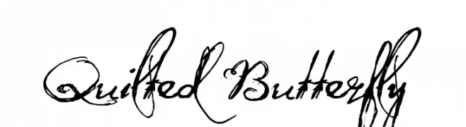
![Quilted Butterfly Frei Schriftart Herunterladen]() Herunterladen 2082 Downloads@WebFont
Herunterladen 2082 Downloads@WebFont -
![LeviStubbsTears Frei Schriftart Herunterladen]() Herunterladen 2082 Downloads@WebFont
Herunterladen 2082 Downloads@WebFont -
( Fonts by BLKBK - https://blkbk.ink - Personal-use only. For commercial use please contact owner. Sponsoren Schriftart )
A cursive, handwritten font with elegant and fluid strokes.
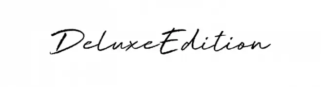
![Deluxe Edition Frei Schriftart Herunterladen]() Herunterladen 2081 Downloads
Herunterladen 2081 Downloads -
( Copyright (c) 2010-2012, TipoType (produccion.taller@gmail.com www.tipotype.com), with Reserved Font Name "Chau Philomene" )
A bold, modern font with smooth, rounded characters and a slightly condensed structure.
![Chau Philomene One Regular Frei Schriftart Herunterladen]() Herunterladen 2081 Downloads@WebFont
Herunterladen 2081 Downloads@WebFont -
( Copyright 2011 The Londrina Solid Authors (https://github.com/marcelommp/Londrina-Typeface), with Reserved Font Name "Londrina Solid†)
A bold, solid font with uniform strokes and rounded edges, ideal for impactful headlines.
![Londrina Solid Regular Frei Schriftart Herunterladen]() Herunterladen 2081 Downloads@WebFont
Herunterladen 2081 Downloads@WebFont -
( Fonts by Billy Argel - www.billyargel.com - Personal-use only. For commercial use please contact owner. )
A bold, distressed font with a rugged, textured appearance.
![DIRTYBAG BOLD TRIAL Frei Schriftart Herunterladen]() Herunterladen 2081 Downloads@WebFont
Herunterladen 2081 Downloads@WebFont -
( Free for a personal use. For a commercial use please visit www.kevinandamanda.com )
A bold, playful serif font with thick, rounded serifs and strong character presence.
![Cafe Rojo Frei Schriftart Herunterladen]() Herunterladen 2081 Downloads@WebFont
Herunterladen 2081 Downloads@WebFont -
![TransRobotics Extended Italic Frei Schriftart Herunterladen]() Herunterladen 2081 Downloads@WebFont
Herunterladen 2081 Downloads@WebFont -
( Fonts by Quote-Unquote Apps - Personal-use only. For commercial use please contact owner. )
A bold, monospaced font with a classic typewriter style.
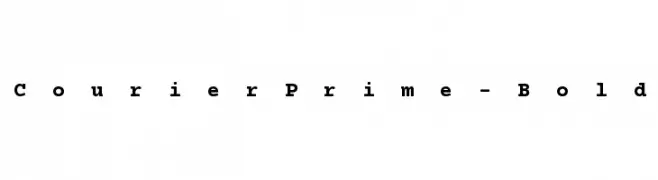
![CourierPrime-Bold Frei Schriftart Herunterladen]() Herunterladen 2080 Downloads@WebFont
Herunterladen 2080 Downloads@WebFont -
( Fonts by BLKBK - https://blkbk.ink - Personal-use only. For commercial use please contact owner. Sponsoren Schriftart )
A bold, fluid script font with elegant, interconnected letters.
![Painted Paradise Frei Schriftart Herunterladen]() Herunterladen 2080 Downloads
Herunterladen 2080 Downloads


Welche Schriften sind gerade am populärsten?
Poppins, Roboto, Montserrat, Open Sans und Lato sind wegen ihrer klaren Formen und breiten Einsetzbarkeit sehr gefragt – von Markenauftritt über Landingpages bis hin zu Postern.
Welche Fonts eignen sich für Logos?
Geometrische Sans‑Serifs (z. B. Poppins, Familien im Gotham‑Stil) sind ein häufiger Griff für sauberes, skalierbares Branding. Für eine persönlichere Note bleiben Scripts und Handschrift‑Stile beliebt. Kombinieren Sie einen prägnanten Headline‑Font mit einer neutralen Brotschrift für Wiedererkennung und Harmonie.
Wie oft wird die Top‑Liste aktualisiert?
Regelmäßig – basierend auf realen Downloads und Interaktionen. Schauen Sie öfter vorbei, um aufstrebende Favoriten früh zu entdecken.
💡 Tipp: Seite bookmarken – Trends wechseln schnell, und heutige Top‑Schriften inspirieren morgen vielleicht das Rebranding.