Willkommen bei den Top‑Schriften – hier treffen Beliebtheit und Qualität aufeinander. Das sind die in diesem Jahr am häufigsten heruntergeladenen und genutzten Fonts. Wenn Sie sichere Optionen für Logo, Web oder Social suchen, starten Sie hier.
Jeder Top‑Font überzeugt durch Balance, Lesbarkeit und Vielseitigkeit. Sie finden moderne Sans‑Serifs, elegante Scripts, Vintage‑Serifs und minimalistische Displays.
-
( Fonts by Typographer Mediengestaltung - Personal-use only. For commercial use please contact owner. )
A classic serif font with bold strokes and high contrast, exuding elegance and tradition.
 Herunterladen 2052 Downloads@WebFont
 -
( Fonts by www.kimberlygeswein.com - Kimberly Geswein )
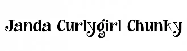
A playful, chunky font with whimsical curls and bold strokes.
![Janda Curlygirl Chunky Frei Schriftart Herunterladen]() Herunterladen 2052 Downloads@WebFont
Herunterladen 2052 Downloads@WebFont -
( Copyright (c) 2010, Sebastian Kosch (sebastian@aldusleaf.org) )
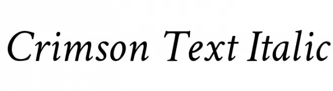
A classic, elegant italic serif font with refined serifs and balanced contrast.
![Crimson Text Italic Frei Schriftart Herunterladen]() Herunterladen 2052 Downloads@WebFont
Herunterladen 2052 Downloads@WebFont -
![M+ 1c regular Frei Schriftart Herunterladen]() Herunterladen 2052 Downloads@WebFont
Herunterladen 2052 Downloads@WebFont -
( Fonts by Verneri Kontto )
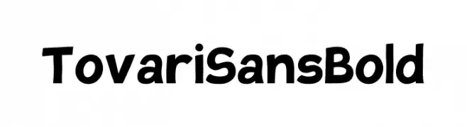
A bold, playful font with rounded edges and a friendly appearance.
![Tovari Sans Bold Frei Schriftart Herunterladen]() Herunterladen 2050 Downloads@WebFont
Herunterladen 2050 Downloads@WebFont -
-
( Fonts by ShyFonts )
A bold, modern italic font with a dynamic and sleek design.
![SF Intellivised Italic Frei Schriftart Herunterladen]() Herunterladen 2050 Downloads@WebFont
Herunterladen 2050 Downloads@WebFont -
Schriftart von HammerBro101. For commercial use please contact the owner.
![HammerBro101 Movie Bold Regular Frei Schriftart Herunterladen]() Herunterladen 2049 Downloads@WebFont
Herunterladen 2049 Downloads@WebFont -
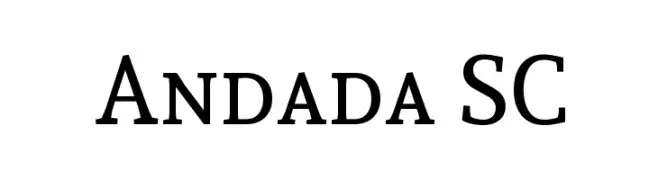
( Copyright (c) 2012 by Carolina Giovagnoli (huertatipografica.com.ar). All rights reserved. )
A classic serif font with modern elegance and medium contrast.
![Andada SC Frei Schriftart Herunterladen]() Herunterladen 2049 Downloads@WebFont
Herunterladen 2049 Downloads@WebFont -
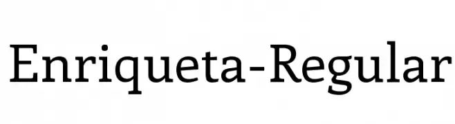
( Copyright (c) 2011, FontFuror (info@fontfuror.com) )
A modern serif font with elegant, readable letterforms and versatile design.
![Enriqueta-Regular Frei Schriftart Herunterladen]() Herunterladen 2049 Downloads@WebFont
Herunterladen 2049 Downloads@WebFont -
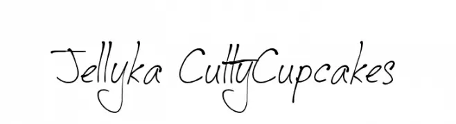
( Fonts are free for a personal use only - www.cuttyfruty.com )
A whimsical, handwritten font with a playful and dynamic style.
![Jellyka CuttyCupcakes Frei Schriftart Herunterladen]() Herunterladen 2049 Downloads@WebFont
Herunterladen 2049 Downloads@WebFont -
( Fonts by Nick Curtis - www.nicksfonts.com )
A sophisticated Art Deco-inspired font with geometric shapes and elegant curves.
![Raconteur NF Frei Schriftart Herunterladen]() Herunterladen 2049 Downloads@WebFont
Herunterladen 2049 Downloads@WebFont -
![Kubra_Bold Frei Schriftart Herunterladen]() Herunterladen 2049 Downloads@WebFont
Herunterladen 2049 Downloads@WebFont -
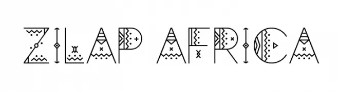
( Fonts by LJ Design Studios )
A decorative font with geometric patterns and African motifs, ideal for cultural projects.
![Zilap Africa Frei Schriftart Herunterladen]() Herunterladen 2048 Downloads@WebFont
Herunterladen 2048 Downloads@WebFont -
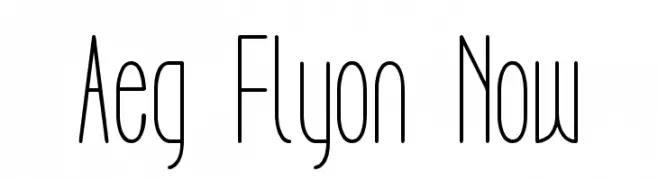
![Aeg Flyon Now Frei Schriftart Herunterladen]() Herunterladen 2048 Downloads@WebFont
Herunterladen 2048 Downloads@WebFont -
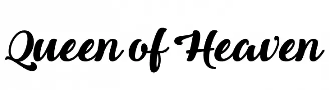
( Fonts by Misti`s Fonts - mistifonts.com - Personal-use only. For commercial use please contact owner. )
A bold, elegant script font with flowing curves and high contrast.
![Queen of Heaven Frei Schriftart Herunterladen]() Herunterladen 2048 Downloads@WebFont
Herunterladen 2048 Downloads@WebFont -
( Fonts by Daniel Zadorozny - www.iconian.com )
A bold, modern, and condensed geometric font with a striking appearance.
![Usuzi Condensed Frei Schriftart Herunterladen]() Herunterladen 2048 Downloads@WebFont
Herunterladen 2048 Downloads@WebFont -
![Crooked Frei Schriftart Herunterladen]() Herunterladen 2048 Downloads@WebFont
Herunterladen 2048 Downloads@WebFont -
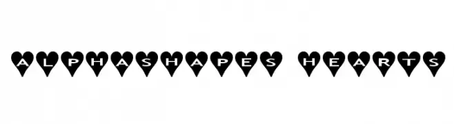
Schriftart von fontsnthings. For commercial use please contact the owner.
![AlphaShapes hearts Frei Schriftart Herunterladen]() Herunterladen 2048 Downloads@WebFont
Herunterladen 2048 Downloads@WebFont -
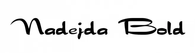
![Nadejda Bold Frei Schriftart Herunterladen]() Herunterladen 2048 Downloads@WebFont
Herunterladen 2048 Downloads@WebFont -
( 7NTypes - Situjuh Nazara - 7ntypes.com )
A bold, flowing script font with elegant curves and interconnected letters.
![Soe Frei Schriftart Herunterladen]() Herunterladen 2047 Downloads@WebFont
Herunterladen 2047 Downloads@WebFont -
Schriftart von defharo. For commercial use please contact the owner.
![TheJukeBox-FFP Frei Schriftart Herunterladen]() Herunterladen 2047 Downloads@WebFont
Herunterladen 2047 Downloads@WebFont -
( Fonts by Mocha Frappuccino - Personal-use only. For commercial use please contact owner. )
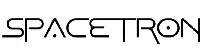
A futuristic, geometric font with sharp angles and clean lines.
![Spacetron Frei Schriftart Herunterladen]() Herunterladen 2046 Downloads@WebFont
Herunterladen 2046 Downloads@WebFont -
( Fonts by Castcraft Software - OPTI Fonts Archive - opti.netii.net - Personal-use only. For commercial use please contact owner. )
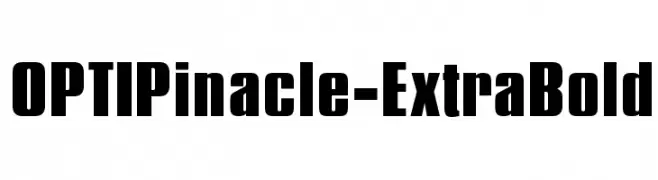
A bold, modern font with thick strokes and geometric shapes, perfect for impactful designs.
![OPTIPinacle-ExtraBold Frei Schriftart Herunterladen]() Herunterladen 2046 Downloads@WebFont
Herunterladen 2046 Downloads@WebFont -
( Fonts by Michael Tension - www.TensionType.com )
A bold, dynamic script font with flowing strokes and a modern flair.
![Bottle Depot Frei Schriftart Herunterladen]() Herunterladen 2046 Downloads@WebFont
Herunterladen 2046 Downloads@WebFont -
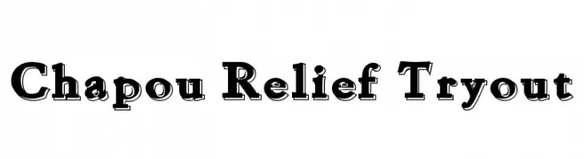
![Chapou Relief Tryout Frei Schriftart Herunterladen]() Herunterladen 2046 Downloads@WebFont
Herunterladen 2046 Downloads@WebFont -
( Fonts by Dieter Steffmann )
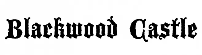
A gothic, medieval-style font with ornate and intricate letterforms.
![Blackwood Castle Frei Schriftart Herunterladen]() Herunterladen 2045 Downloads@WebFont
Herunterladen 2045 Downloads@WebFont -
( Fonts by Utopiafonts )
A bold, gothic-inspired font with sharp, angular lines and dramatic serifs.
![Mael Frei Schriftart Herunterladen]() Herunterladen 2045 Downloads@WebFont
Herunterladen 2045 Downloads@WebFont -
( Fonts by David Rakowski )
An elegant script font with flowing, calligraphic elements and ornate flourishes.
![Dobkin Plain Frei Schriftart Herunterladen]() Herunterladen 2045 Downloads@WebFont
Herunterladen 2045 Downloads@WebFont -
![Forgotten Futurist Frei Schriftart Herunterladen]() Herunterladen 2045 Downloads@WebFont
Herunterladen 2045 Downloads@WebFont -
( Fonts by Castcraft Software - OPTI Fonts Archive - opti.netii.net - Personal-use only. For commercial use please contact owner. )
A bold, modern font with thick strokes and strong presence.
![OPTISimilunatix-Heavy Frei Schriftart Herunterladen]() Herunterladen 2044 Downloads@WebFont
Herunterladen 2044 Downloads@WebFont -
![Back to the future 2002 Frei Schriftart Herunterladen]() Herunterladen 2044 Downloads@WebFont
Herunterladen 2044 Downloads@WebFont -
( Fonts by Rajesh Rajput - gumroad.com/rajputrajesh_448 - Personal-use only. For commercial use please contact owner. )
A bold, high-contrast serif font with elegant and sophisticated details.
![Emberly Bold Frei Schriftart Herunterladen]() Herunterladen 2043 Downloads@WebFont
Herunterladen 2043 Downloads@WebFont -
( Andrew Bulhak - dev.null.org/fonts/ )
A pixelated, monospaced font with a retro digital style.
![ModeSeven Frei Schriftart Herunterladen]() Herunterladen 2043 Downloads@WebFont
Herunterladen 2043 Downloads@WebFont -
Schriftart von AlfinVincent. For commercial use please contact the owner.
![Onefont Frei Schriftart Herunterladen]() Herunterladen 2043 Downloads@WebFont
Herunterladen 2043 Downloads@WebFont -
( Fonts by Tom Oetken - Ash Pikachu Font )
A tall, narrow font with a modern and sleek design.
![Seattle Sans Frei Schriftart Herunterladen]() Herunterladen 2043 Downloads@WebFont
Herunterladen 2043 Downloads@WebFont


Welche Schriften sind gerade am populärsten?
Poppins, Roboto, Montserrat, Open Sans und Lato sind wegen ihrer klaren Formen und breiten Einsetzbarkeit sehr gefragt – von Markenauftritt über Landingpages bis hin zu Postern.
Welche Fonts eignen sich für Logos?
Geometrische Sans‑Serifs (z. B. Poppins, Familien im Gotham‑Stil) sind ein häufiger Griff für sauberes, skalierbares Branding. Für eine persönlichere Note bleiben Scripts und Handschrift‑Stile beliebt. Kombinieren Sie einen prägnanten Headline‑Font mit einer neutralen Brotschrift für Wiedererkennung und Harmonie.
Wie oft wird die Top‑Liste aktualisiert?
Regelmäßig – basierend auf realen Downloads und Interaktionen. Schauen Sie öfter vorbei, um aufstrebende Favoriten früh zu entdecken.
💡 Tipp: Seite bookmarken – Trends wechseln schnell, und heutige Top‑Schriften inspirieren morgen vielleicht das Rebranding.