Herunterladen
Neue Schriftarten
Spitze Schriftarten
Trending
Werkzeuge ▾
❤ Instagram Schriften
♡ Kursiv-Generator
⇋ Compare Fonts
🔎 Schrift erkennen ↗
Anmelden
Free Fonts
»
Spitze Schriftarten (169,065)
Spitze Schriftarten
169,065 fonts
35 / schriftarten pro seite
50 / schriftarten pro seite
100 / schriftarten pro seite
Die beste erste
Neuere ersten
Font-Titel
Gehen
✕
KOSTENLOS
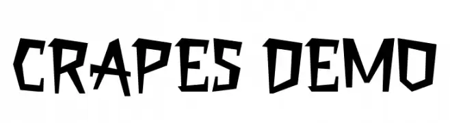
Crapes Demo Font
Crapes Demo Font
126 downloads
2025-04-19
Schrift von Faqih Fawaji
Herunterladen
@ Web Font
KOSTENLOS
Singapore Sling Leftalic Font
Singapore Sling Leftalic Font
126 downloads
2015-07-09
Schrift von Daniel Zadorozny - www.iconian.com - Free for personal use
Herunterladen
@ Web Font
KOSTENLOS
BD Spinner Font
BD Spinner Font
126 downloads
2018-11-09
Büro Destruct - Lorenz Gianfreda - www.typedifferent.com/
Herunterladen
@ Web Font
KOSTENLOS
RadiosinMotionHard-Regular Font
RadiosinMotionHard-Regular Font
126 downloads
2010-10-08
Schrift von www.typodermicfonts.com - Ray Larabie
Herunterladen
@ Web Font
KOSTENLOS
SpaceInKees Caligrafic Font
SpaceInKees Caligrafic Font
126 downloads
2012-07-10
Schrift von www.omniglot.com
Herunterladen
@ Web Font
KOSTENLOS
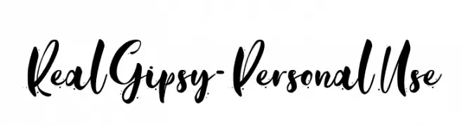
Real Gipsy - Personal Use Font
Real Gipsy - Personal Use Font
126 downloads
2022-03-07
Schrift von Typhoon Type - Suthi Srisopha - www.typhoontype.net - Personal-use only. For commercial use please contact owner.
Herunterladen
@ Web Font
KOSTENLOS
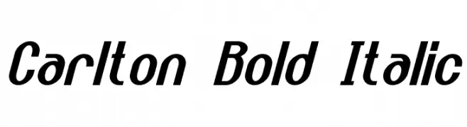
Carlton Bold Italic Font
Carlton Bold Italic Font
126 downloads
2016-04-04
Schrift von a Neale Davidson - www.pixelsagas.com. Personal-use only. For commercial use please contact owner.
Herunterladen
@ Web Font
KOSTENLOS
BardonDemo-Clean Font
BardonDemo-Clean Font
126 downloads
2023-02-09
Schrift von Sabrcreative - Personal-use only. For commercial use please contact owner.
Herunterladen
@ Web Font
KOSTENLOS
MArteFact Font
MArteFact Font
126 downloads
2010-10-04
Schrift von Manfred Klein. Free for private and charity use. Free for commercial with donation to organizations
Herunterladen
@ Web Font
KOSTENLOS
Rellanic Bold Italic Font
Rellanic Bold Italic Font
126 downloads
2014-08-22
Schrift von a Neale Davidson - www.pixelsagas.com. Personal-use only. For commercial use please contact owner.
Herunterladen
@ Web Font
KOSTENLOS
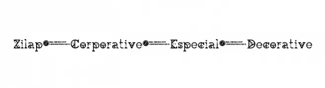
Zilap Corporative Especial Decorative Font
Zilap Corporative Especial Decorative Font
126 downloads
2018-11-24
LJ Design Studios - www.ljdesignstudios.com
Herunterladen
@ Web Font
KOSTENLOS
MBHatch Font
MBHatch Font
126 downloads
2018-11-11
Marcus Burnette - www.mburnette.com
Herunterladen
@ Web Font
KOSTENLOS
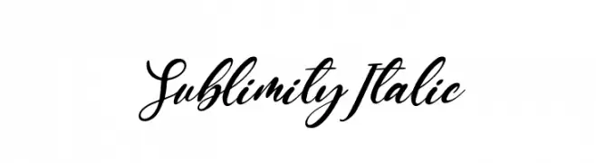
Sublimity Italic Font
Sublimity Italic Font
126 downloads
2025-08-25
Schrift von Staircase Studio
Herunterladen
@ Web Font
KOSTENLOS
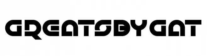
Greatsby Gat Font
Greatsby Gat Font
126 downloads
2019-12-28
Schrift von www.chequered.ink - Chequered Ink - Personal-use only. For commercial use please contact owner.
Herunterladen
@ Web Font
KOSTENLOS
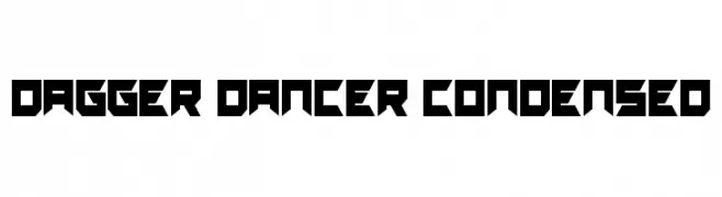
Dagger Dancer Condensed Font
Dagger Dancer Condensed Font
126 downloads
2022-01-13
Schrift von Daniel Zadorozny - www.iconian.com - Personal-use only. For commercial use please contact owner.
Herunterladen
@ Web Font
KOSTENLOS
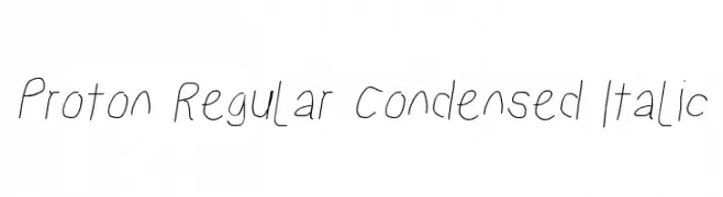
Proton Regular Condensed Italic Font
Proton Regular Condensed Italic Font
126 downloads
2015-06-15
Herunterladen
@ Web Font
KOSTENLOS
Singapore Sling 3D Italic Font
Singapore Sling 3D Italic Font
126 downloads
2015-07-09
Schrift von Daniel Zadorozny - www.iconian.com - Free for personal use
Herunterladen
@ Web Font
KOSTENLOS
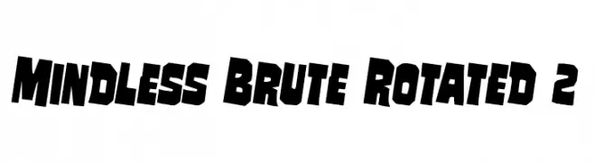
Mindless Brute Rotated 2 Font
Mindless Brute Rotated 2 Font
126 downloads
2017-05-19
Schrift von Iconian Fonts
Herunterladen
@ Web Font
KOSTENLOS
BRISKET Font
BRISKET Font
126 downloads
2023-02-24
Schrift von wep - Wahyu Eka Prasetya - Personal-use only. For commercial use please contact owner.
Herunterladen
@ Web Font
KOSTENLOS
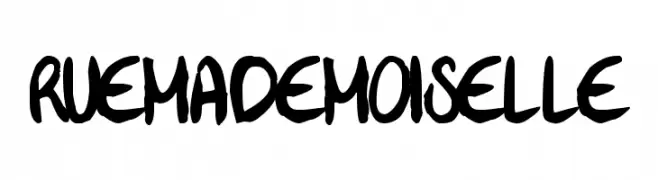
Rue Mademoiselle Font
Rue Mademoiselle Font
126 downloads
2018-11-14
Woodcutter - woodcutter Manero - www.woodcutter.es
Herunterladen
@ Web Font
KOSTENLOS
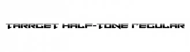
Tarrget Half-Tone Regular Font
Tarrget Half-Tone Regular Font
126 downloads
2015-07-09
Schrift von Daniel Zadorozny - www.iconian.com - Free for personal use
Herunterladen
@ Web Font
KOSTENLOS
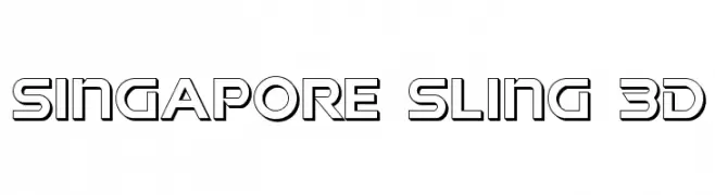
Singapore Sling 3D Font
Singapore Sling 3D Font
126 downloads
2015-07-09
Schrift von Daniel Zadorozny - www.iconian.com - Free for personal use
Herunterladen
@ Web Font
KOSTENLOS
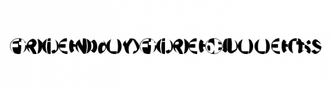
FriendlyFireBullets Font
FriendlyFireBullets Font
126 downloads
2010-10-04
Schrift von Manfred Klein. Free for private and charity use. Free for commercial with donation to organizations
Herunterladen
@ Web Font
KOSTENLOS
Anytime Soon Demo Font
Anytime Soon Demo Font
126 downloads
2024-11-05
Schrift von Noah Type - noahtype.com - Personal-use only. For commercial use please contact owner.
Herunterladen
@ Web Font
KOSTENLOS
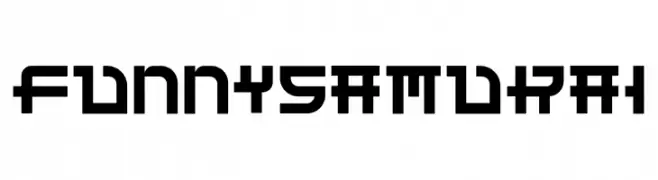
Funny Samurai Font
Funny Samurai Font
126 downloads
2019-08-14
Schrift von Edric Studio www.creativefabrica.com/designer/edricstudio/ - Personal-use only. For commercial use please contact owner.
Herunterladen
@ Web Font
KOSTENLOS
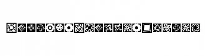
KaleidoQuattroInvers Font
KaleidoQuattroInvers Font
126 downloads
2010-10-02
Schrift von Manfred Klein. Free for private and charity use. Free for commercial with donation to organizations
Herunterladen
@ Web Font
KOSTENLOS
Ruler Stencil Italic Font
Ruler Stencil Italic Font
126 downloads
2018-11-11
Levi Szekeres - www.loremipsum.ro
Herunterladen
@ Web Font
KOSTENLOS
Bailey Sidney Font
Bailey Sidney Font
126 downloads
2025-06-27
Schrift von Qwrtype Foundry
Herunterladen
@ Web Font
KOSTENLOS
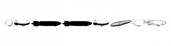
Xeppelin Font
Xeppelin Font
126 downloads
2010-04-01
Schrift von Daniel Zadorozny - www.iconian.com - Free for personal use
Herunterladen
@ Web Font
KOSTENLOS
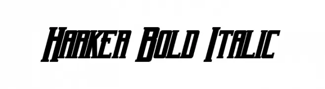
Harker Bold Italic Font
Harker Bold Italic Font
126 downloads
2016-04-04
Schrift von a Neale Davidson - www.pixelsagas.com. Personal-use only. For commercial use please contact owner.
Herunterladen
@ Web Font
KOSTENLOS
Black Klisse Free Font Regular Font
Black Klisse Free Font Regular Font
126 downloads
2023-01-20
Schrift von Maulana Creative - Gilang Maulana - Personal-use only. For commercial use please contact owner.
Herunterladen
@ Web Font
KOSTENLOS
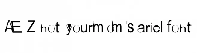
AEZ not your mom's ariel font Font
AEZ not your mom's ariel font Font
126 downloads
2018-09-16
Schrift von Adult Ramblings - Anastacia E. Zittel - Personal-use only. For commercial use please contact owner.
Herunterladen
@ Web Font
KOSTENLOS
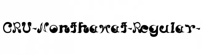
CRU-Nonthawat-Regular- Font
CRU-Nonthawat-Regular- Font
126 downloads
2013-02-28
Herunterladen
@ Web Font
KOSTENLOS
LesserConcernShadow-Regular Font
LesserConcernShadow-Regular Font
126 downloads
2010-10-06
Schrift von www.typodermicfonts.com - Ray Larabie
Herunterladen
@ Web Font
KOSTENLOS
POMEROLE LIGHT Font
POMEROLE LIGHT Font
126 downloads
2014-04-11
Schrift von Maelle.K - Thomas Boucherie
Herunterladen
@ Web Font
⇋
Compare Fonts
Side by side
« Prev
1
…
3003
3004
3005
3006
3007
3008
3009
3010
3011
…
4831
Next »
×
‹
›