Willkommen bei den Top‑Schriften – hier treffen Beliebtheit und Qualität aufeinander. Das sind die in diesem Jahr am häufigsten heruntergeladenen und genutzten Fonts. Wenn Sie sichere Optionen für Logo, Web oder Social suchen, starten Sie hier.
Jeder Top‑Font überzeugt durch Balance, Lesbarkeit und Vielseitigkeit. Sie finden moderne Sans‑Serifs, elegante Scripts, Vintage‑Serifs und minimalistische Displays.
-
( HypeForType.com - Alex Haigh - www.hypefortype.com )
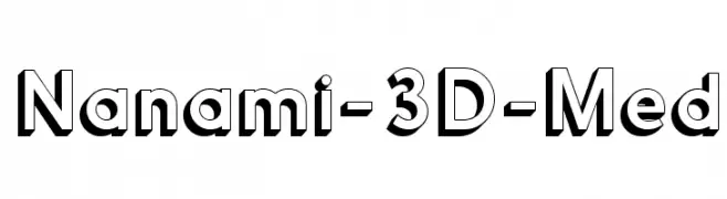
A bold, 3D font with clean lines and a modern, playful style.
 Herunterladen 581 Downloads@WebFont
 -
![mimi Frei Schriftart Herunterladen]() Herunterladen 581 Downloads@WebFont
Herunterladen 581 Downloads@WebFont -
( Fonts by Peter Wiegel - www.peter-wiegel.de - Personal-use only. For commercial use please contact owner. )
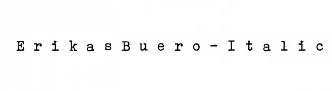
A vintage, typewriter-style font with a distressed, monospaced design.
![ErikasBuero-Italic Frei Schriftart Herunterladen]() Herunterladen 581 Downloads@WebFont
Herunterladen 581 Downloads@WebFont -
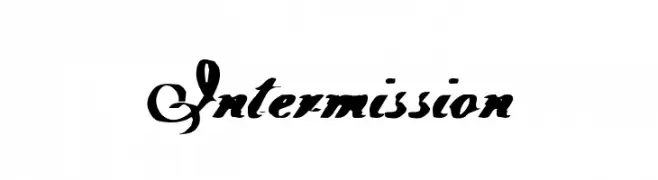
![Intermission Frei Schriftart Herunterladen]() Herunterladen 581 Downloads@WebFont
Herunterladen 581 Downloads@WebFont -
( Fonts by Marcelo Magalhães - Personal-use only. For commercial use please contact owner. )
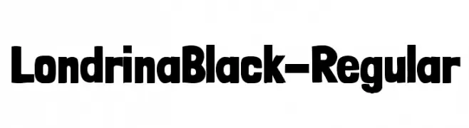
A bold, rounded font with thick strokes and a playful, assertive style.
![LondrinaBlack-Regular Frei Schriftart Herunterladen]() Herunterladen 581 Downloads@WebFont
Herunterladen 581 Downloads@WebFont -
-
( Fonts by Tobias Sommer - mentalmenthol.blogspot.com )
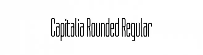
A modern, rounded font with a sleek, condensed style.
![Capitalia Rounded Regular Frei Schriftart Herunterladen]() Herunterladen 581 Downloads@WebFont
Herunterladen 581 Downloads@WebFont -
( Fonts by Émile Byeongsu Kim - Personal-use only. For commercial use please contact owner. )
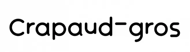
A playful, rounded font with smooth curves and uniform strokes.
![Crapaud-gros Frei Schriftart Herunterladen]() Herunterladen 581 Downloads@WebFont
Herunterladen 581 Downloads@WebFont -
( Fonts by Roland Huse - rolandhuse.com )
A futuristic, geometric font with blocky, angular letterforms.
![Solaria Frei Schriftart Herunterladen]() Herunterladen 581 Downloads@WebFont
Herunterladen 581 Downloads@WebFont -
( Fonts by a Max Infeld - XEROGRAPHER FONTS - xerographer.blogspot.com . Personal-use only. For commercial use please contact owner. )
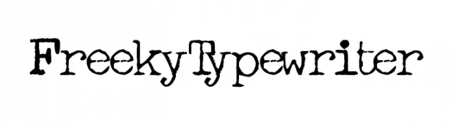
A vintage typewriter-style font with a distressed, grungy texture.
![FreekyTypewriter Frei Schriftart Herunterladen]() Herunterladen 581 Downloads@WebFont
Herunterladen 581 Downloads@WebFont -
( Fonts by Manfred Klein - manfred-klein.ina-mar.com )
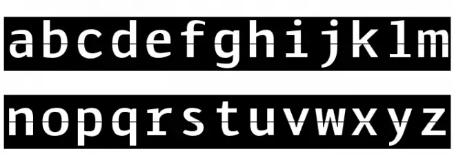
A modern slab serif with strong serifs and balanced medium weight.
![KleinSlabserif-Medium Frei Schriftart Herunterladen]() Herunterladen 581 Downloads@WebFont
Herunterladen 581 Downloads@WebFont

Welche Schriften sind gerade am populärsten?
Poppins, Roboto, Montserrat, Open Sans und Lato sind wegen ihrer klaren Formen und breiten Einsetzbarkeit sehr gefragt – von Markenauftritt über Landingpages bis hin zu Postern.
Welche Fonts eignen sich für Logos?
Geometrische Sans‑Serifs (z. B. Poppins, Familien im Gotham‑Stil) sind ein häufiger Griff für sauberes, skalierbares Branding. Für eine persönlichere Note bleiben Scripts und Handschrift‑Stile beliebt. Kombinieren Sie einen prägnanten Headline‑Font mit einer neutralen Brotschrift für Wiedererkennung und Harmonie.
Wie oft wird die Top‑Liste aktualisiert?
Regelmäßig – basierend auf realen Downloads und Interaktionen. Schauen Sie öfter vorbei, um aufstrebende Favoriten früh zu entdecken.
💡 Tipp: Seite bookmarken – Trends wechseln schnell, und heutige Top‑Schriften inspirieren morgen vielleicht das Rebranding.