Willkommen bei den Top‑Schriften – hier treffen Beliebtheit und Qualität aufeinander. Das sind die in diesem Jahr am häufigsten heruntergeladenen und genutzten Fonts. Wenn Sie sichere Optionen für Logo, Web oder Social suchen, starten Sie hier.
Jeder Top‑Font überzeugt durch Balance, Lesbarkeit und Vielseitigkeit. Sie finden moderne Sans‑Serifs, elegante Scripts, Vintage‑Serifs und minimalistische Displays.
-
( Fonts by benoitsjoholm.blogspot.com - Benoit Sjoholm - Personal-use only. For commercial use please contact owner. )
A modern, clean font with smooth curves and rounded elements.
 Herunterladen 567 Downloads@WebFont
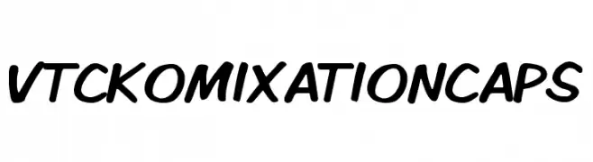
 -
![VTCKomixationCaps Frei Schriftart Herunterladen]() Herunterladen 567 Downloads@WebFont
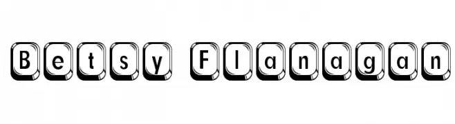
Herunterladen 567 Downloads@WebFont -
![Betsy Flanagan Frei Schriftart Herunterladen]() Herunterladen 567 Downloads@WebFont
Herunterladen 567 Downloads@WebFont -
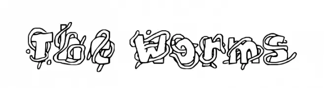
( Fonts by Mr Fisk - Mike Larsson - fontorama.net )
A decorative and intricate font with swirling, organic designs.
![The Worms Frei Schriftart Herunterladen]() Herunterladen 567 Downloads@WebFont
Herunterladen 567 Downloads@WebFont -
![JHand Regular Frei Schriftart Herunterladen]() Herunterladen 567 Downloads@WebFont
Herunterladen 567 Downloads@WebFont -
-
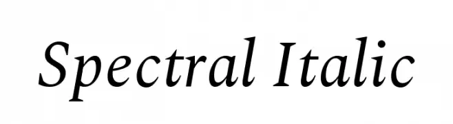
( Copyright 2017 The Spectral Project Authors (http://github.com/productiontype/spectral) )
An elegant italic serif font with smooth curves and a classic style.
![Spectral Italic Frei Schriftart Herunterladen]() Herunterladen 567 Downloads@WebFont
Herunterladen 567 Downloads@WebFont -
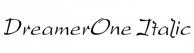
( Fonts by Varian`s Dreamfonts )
An elegant, cursive italic font with smooth curves and a sophisticated style.
![DreamerOne Italic Frei Schriftart Herunterladen]() Herunterladen 567 Downloads@WebFont
Herunterladen 567 Downloads@WebFont -
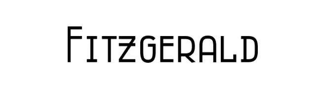
( Fonts by dartcanada.tripod.com - Darren Rigby )
A modern, geometric sans-serif font with uniform width and clean lines.
![Fitzgerald Frei Schriftart Herunterladen]() Herunterladen 567 Downloads@WebFont
Herunterladen 567 Downloads@WebFont -
( Fonts by Koczman Balint - magiquefonts.gportal.hu )
A bold, geometric font with sharp angles and a modern, edgy style.
![Hexatus Frei Schriftart Herunterladen]() Herunterladen 567 Downloads@WebFont
Herunterladen 567 Downloads@WebFont -
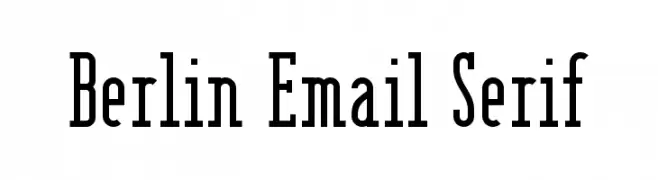
( Fonts by www.peter-wiegel.de. Personal-use only. For commercial use please contact owner. )
A bold, high-contrast serif font with strong vertical strokes and elegant serifs.
![Berlin Email Serif Frei Schriftart Herunterladen]() Herunterladen 567 Downloads@WebFont
Herunterladen 567 Downloads@WebFont


Welche Schriften sind gerade am populärsten?
Poppins, Roboto, Montserrat, Open Sans und Lato sind wegen ihrer klaren Formen und breiten Einsetzbarkeit sehr gefragt – von Markenauftritt über Landingpages bis hin zu Postern.
Welche Fonts eignen sich für Logos?
Geometrische Sans‑Serifs (z. B. Poppins, Familien im Gotham‑Stil) sind ein häufiger Griff für sauberes, skalierbares Branding. Für eine persönlichere Note bleiben Scripts und Handschrift‑Stile beliebt. Kombinieren Sie einen prägnanten Headline‑Font mit einer neutralen Brotschrift für Wiedererkennung und Harmonie.
Wie oft wird die Top‑Liste aktualisiert?
Regelmäßig – basierend auf realen Downloads und Interaktionen. Schauen Sie öfter vorbei, um aufstrebende Favoriten früh zu entdecken.
💡 Tipp: Seite bookmarken – Trends wechseln schnell, und heutige Top‑Schriften inspirieren morgen vielleicht das Rebranding.