Willkommen bei den Top‑Schriften – hier treffen Beliebtheit und Qualität aufeinander. Das sind die in diesem Jahr am häufigsten heruntergeladenen und genutzten Fonts. Wenn Sie sichere Optionen für Logo, Web oder Social suchen, starten Sie hier.
Jeder Top‑Font überzeugt durch Balance, Lesbarkeit und Vielseitigkeit. Sie finden moderne Sans‑Serifs, elegante Scripts, Vintage‑Serifs und minimalistische Displays.
-
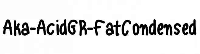
( Fonts by www.aka-acid.com )
A bold, playful, and condensed font with a hand-drawn, casual style.
 Herunterladen 536 Downloads@WebFont
 -
( Fonts by Paul Lloyd )
A modern-vintage serif font with tall, narrow letterforms and subtle curves.
![Peake Frei Schriftart Herunterladen]() Herunterladen 536 Downloads@WebFont
Herunterladen 536 Downloads@WebFont -
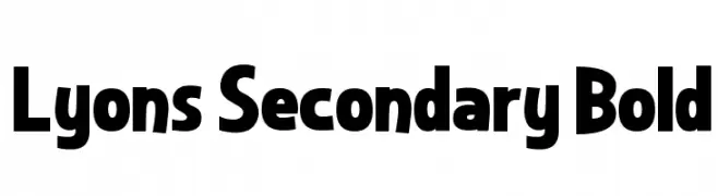
( Fonts by Dan P. Lyons - Personal-use only. For commercial use please contact owner. )
A bold, robust font with rounded edges and a strong presence.
![Lyons Secondary Bold Frei Schriftart Herunterladen]() Herunterladen 536 Downloads@WebFont
Herunterladen 536 Downloads@WebFont -
![Continue Frei Schriftart Herunterladen]() Herunterladen 536 Downloads@WebFont
Herunterladen 536 Downloads@WebFont -
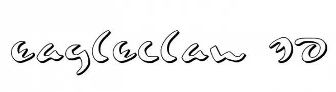
( Fonts by Daniel Zadorozny - www.iconian.com )
A bold, 3D cursive font with dynamic outlines and elegant curves.
![Eagleclaw 3D Frei Schriftart Herunterladen]() Herunterladen 536 Downloads@WebFont
Herunterladen 536 Downloads@WebFont -
-
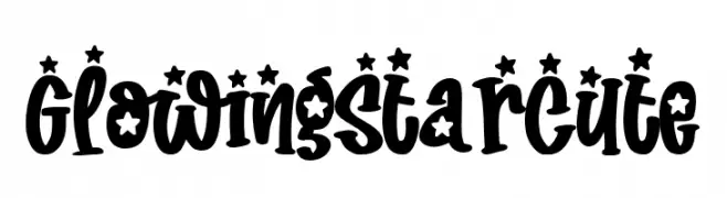
( Fonts by Subectype & Orenari )
A playful, star-adorned font with bold, rounded characters.
![Glowing Star Cute Frei Schriftart Herunterladen]() Herunterladen 536 Downloads@WebFont
Herunterladen 536 Downloads@WebFont -
![Nita Frei Schriftart Herunterladen]() Herunterladen 536 Downloads@WebFont
Herunterladen 536 Downloads@WebFont -
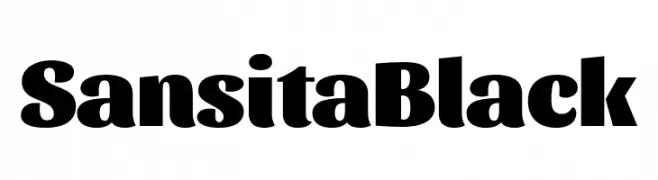
( Fonts by Omnibus Type )
A bold, modern font with thick strokes and a strong presence.
![Sansita Black Frei Schriftart Herunterladen]() Herunterladen 536 Downloads@WebFont
Herunterladen 536 Downloads@WebFont -
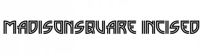
( Fonts by Nick Curtis - www.nicksfonts.com )
A bold, geometric font with a futuristic and architectural style.
![MadisonSquare Incised Frei Schriftart Herunterladen]() Herunterladen 536 Downloads@WebFont
Herunterladen 536 Downloads@WebFont -
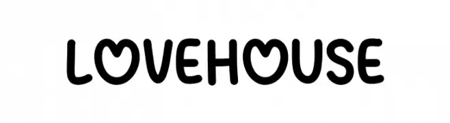
( Fonts by MJType - mjtype.com - Personal-use only. For commercial use please contact owner. )
A playful, rounded font with smooth curves and a friendly appearance.
![Love House Frei Schriftart Herunterladen]() Herunterladen 536 Downloads@WebFont
Herunterladen 536 Downloads@WebFont


Welche Schriften sind gerade am populärsten?
Poppins, Roboto, Montserrat, Open Sans und Lato sind wegen ihrer klaren Formen und breiten Einsetzbarkeit sehr gefragt – von Markenauftritt über Landingpages bis hin zu Postern.
Welche Fonts eignen sich für Logos?
Geometrische Sans‑Serifs (z. B. Poppins, Familien im Gotham‑Stil) sind ein häufiger Griff für sauberes, skalierbares Branding. Für eine persönlichere Note bleiben Scripts und Handschrift‑Stile beliebt. Kombinieren Sie einen prägnanten Headline‑Font mit einer neutralen Brotschrift für Wiedererkennung und Harmonie.
Wie oft wird die Top‑Liste aktualisiert?
Regelmäßig – basierend auf realen Downloads und Interaktionen. Schauen Sie öfter vorbei, um aufstrebende Favoriten früh zu entdecken.
💡 Tipp: Seite bookmarken – Trends wechseln schnell, und heutige Top‑Schriften inspirieren morgen vielleicht das Rebranding.