Willkommen bei den Top‑Schriften – hier treffen Beliebtheit und Qualität aufeinander. Das sind die in diesem Jahr am häufigsten heruntergeladenen und genutzten Fonts. Wenn Sie sichere Optionen für Logo, Web oder Social suchen, starten Sie hier.
Jeder Top‑Font überzeugt durch Balance, Lesbarkeit und Vielseitigkeit. Sie finden moderne Sans‑Serifs, elegante Scripts, Vintage‑Serifs und minimalistische Displays.
-
 Herunterladen 535 Downloads@WebFont
 -
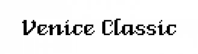
( Fonts by David Rakowski )
Bold, three-dimensional serif font with shadow effects.
![Tejaratchi Ex Lefti Frei Schriftart Herunterladen]() Herunterladen 535 Downloads@WebFont
Herunterladen 535 Downloads@WebFont -
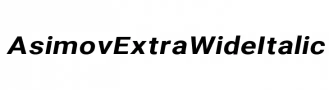
( Fonts by CannotIntoSpaceFonts - KineticPlasma Fonts - Personal-use only. For commercial use please contact owner. )
A bold, wide, and italic font with a modern and dynamic style.
![Asimov Extra Wide Italic Frei Schriftart Herunterladen]() Herunterladen 535 Downloads@WebFont
Herunterladen 535 Downloads@WebFont -
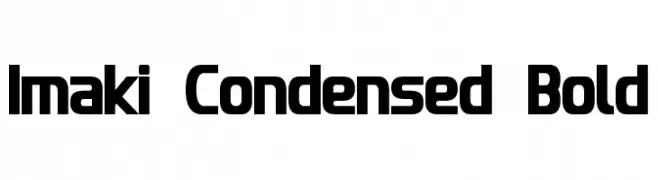
( Fonts by a Neale Davidson - www.pixelsagas.com. Personal-use only. For commercial use please contact owner. )
A bold, condensed typeface with a modern geometric style.
![Imaki Condensed Bold Frei Schriftart Herunterladen]() Herunterladen 535 Downloads@WebFont
Herunterladen 535 Downloads@WebFont -
( Fonts by Nick Curtis - www.nicksfonts.com )
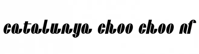
A bold, high-contrast font with a vintage yet modern flair.
![Catalunya Choo Choo NF Frei Schriftart Herunterladen]() Herunterladen 535 Downloads@WebFont
Herunterladen 535 Downloads@WebFont -
-
( Fonts by Katsia Jazwinska )
A playful and casual handwritten font with irregular strokes and organic flow.
![Million Notes Frei Schriftart Herunterladen]() Herunterladen 535 Downloads@WebFont
Herunterladen 535 Downloads@WebFont -
( Fonts by Davy Meykens - davymeykens.deviantart.com )
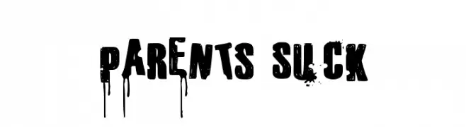
A bold, grunge-style font with splatters and drips for an edgy look.
![Parents Suck Frei Schriftart Herunterladen]() Herunterladen 535 Downloads@WebFont
Herunterladen 535 Downloads@WebFont -
( Fonts by Apostrophic Lab )
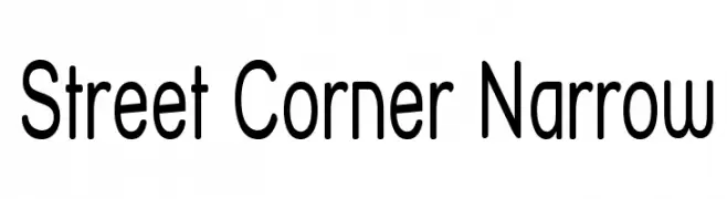
A modern, narrow geometric typeface with clean lines and consistent spacing.
![Street Corner Narrow Frei Schriftart Herunterladen]() Herunterladen 535 Downloads@WebFont
Herunterladen 535 Downloads@WebFont -
( Fonts by a Max Infeld - XEROGRAPHER FONTS - xerographer.blogspot.com . Personal-use only. For commercial use please contact owner. )
A bold, italicized font with a dynamic, wind-swept appearance.
![WindyMetro Frei Schriftart Herunterladen]() Herunterladen 535 Downloads@WebFont
Herunterladen 535 Downloads@WebFont -
( Fonts by www.tepidmonkey.net )
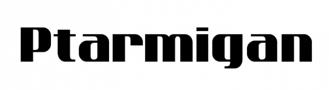
A bold, geometric font ideal for impactful headlines and titles.
![Ptarmigan Frei Schriftart Herunterladen]() Herunterladen 535 Downloads@WebFont
Herunterladen 535 Downloads@WebFont


Welche Schriften sind gerade am populärsten?
Poppins, Roboto, Montserrat, Open Sans und Lato sind wegen ihrer klaren Formen und breiten Einsetzbarkeit sehr gefragt – von Markenauftritt über Landingpages bis hin zu Postern.
Welche Fonts eignen sich für Logos?
Geometrische Sans‑Serifs (z. B. Poppins, Familien im Gotham‑Stil) sind ein häufiger Griff für sauberes, skalierbares Branding. Für eine persönlichere Note bleiben Scripts und Handschrift‑Stile beliebt. Kombinieren Sie einen prägnanten Headline‑Font mit einer neutralen Brotschrift für Wiedererkennung und Harmonie.
Wie oft wird die Top‑Liste aktualisiert?
Regelmäßig – basierend auf realen Downloads und Interaktionen. Schauen Sie öfter vorbei, um aufstrebende Favoriten früh zu entdecken.
💡 Tipp: Seite bookmarken – Trends wechseln schnell, und heutige Top‑Schriften inspirieren morgen vielleicht das Rebranding.