Willkommen bei den Top‑Schriften – hier treffen Beliebtheit und Qualität aufeinander. Das sind die in diesem Jahr am häufigsten heruntergeladenen und genutzten Fonts. Wenn Sie sichere Optionen für Logo, Web oder Social suchen, starten Sie hier.
Jeder Top‑Font überzeugt durch Balance, Lesbarkeit und Vielseitigkeit. Sie finden moderne Sans‑Serifs, elegante Scripts, Vintage‑Serifs und minimalistische Displays.
-
( Fonts by Grzegorz l - www.glukfonts.pl )
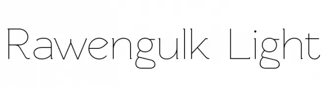
A sleek, modern font with clean, geometric lines and a minimalist aesthetic.
 Herunterladen 528 Downloads@WebFont
 -
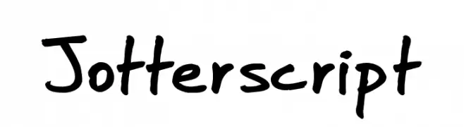
![Jotterscript Frei Schriftart Herunterladen]() Herunterladen 528 Downloads@WebFont
Herunterladen 528 Downloads@WebFont -
( www.hanodedfonts.com )
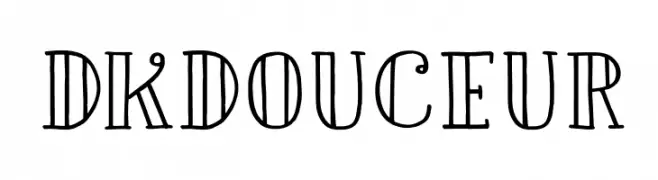
A whimsical and decorative font with vintage-modern elements and playful serifs.
![DKDouceur Frei Schriftart Herunterladen]() Herunterladen 528 Downloads@WebFont
Herunterladen 528 Downloads@WebFont -
( Fonts by Castcraft Software - OPTI Fonts Archive - opti.netii.net - Personal-use only. For commercial use please contact owner. )
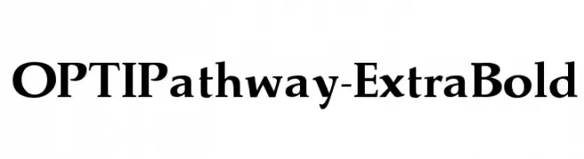
A bold serif typeface with high contrast and strong, elegant letterforms.
![OPTIPathway-ExtraBold Frei Schriftart Herunterladen]() Herunterladen 528 Downloads@WebFont
Herunterladen 528 Downloads@WebFont -
( Fonts by Dieter Steffmann )
A bold, dotted decorative font with a shadow effect, ideal for eye-catching designs.
![Tonight Frei Schriftart Herunterladen]() Herunterladen 528 Downloads@WebFont
Herunterladen 528 Downloads@WebFont -
-
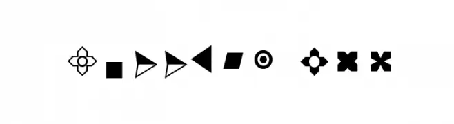
( Fonts by Arkandis Digital Foundry )
A diverse collection of geometric and symbolic bullet designs for decorative use.
![Bullets ADF Frei Schriftart Herunterladen]() Herunterladen 528 Downloads@WebFont
Herunterladen 528 Downloads@WebFont -
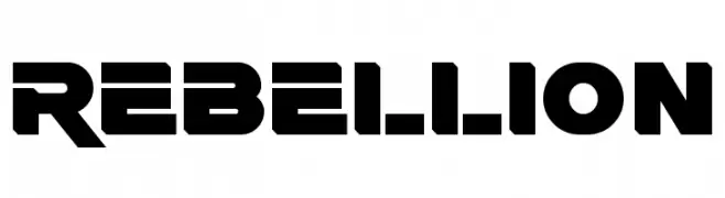
( Fonts by a Neale Davidson - www.pixelsagas.com. Personal-use only. For commercial use please contact owner. )
A bold, geometric font with strong, angular lines and a futuristic style.
![Rebellion Frei Schriftart Herunterladen]() Herunterladen 528 Downloads@WebFont
Herunterladen 528 Downloads@WebFont -
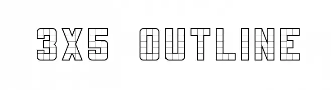
( K-Type Freebies (Free for Personal Use Only) FROM http://www.k-type.com )
A geometric, grid-based outline font with a modern and technical look.
![3x5 Outline Frei Schriftart Herunterladen]() Herunterladen 528 Downloads@WebFont
Herunterladen 528 Downloads@WebFont -
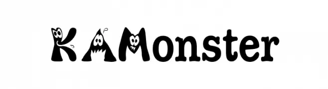
![KAMonster Frei Schriftart Herunterladen]() Herunterladen 528 Downloads@WebFont
Herunterladen 528 Downloads@WebFont -
![AnnMarker Frei Schriftart Herunterladen]() Herunterladen 528 Downloads@WebFont
Herunterladen 528 Downloads@WebFont

Welche Schriften sind gerade am populärsten?
Poppins, Roboto, Montserrat, Open Sans und Lato sind wegen ihrer klaren Formen und breiten Einsetzbarkeit sehr gefragt – von Markenauftritt über Landingpages bis hin zu Postern.
Welche Fonts eignen sich für Logos?
Geometrische Sans‑Serifs (z. B. Poppins, Familien im Gotham‑Stil) sind ein häufiger Griff für sauberes, skalierbares Branding. Für eine persönlichere Note bleiben Scripts und Handschrift‑Stile beliebt. Kombinieren Sie einen prägnanten Headline‑Font mit einer neutralen Brotschrift für Wiedererkennung und Harmonie.
Wie oft wird die Top‑Liste aktualisiert?
Regelmäßig – basierend auf realen Downloads und Interaktionen. Schauen Sie öfter vorbei, um aufstrebende Favoriten früh zu entdecken.
💡 Tipp: Seite bookmarken – Trends wechseln schnell, und heutige Top‑Schriften inspirieren morgen vielleicht das Rebranding.