Willkommen bei den Top‑Schriften – hier treffen Beliebtheit und Qualität aufeinander. Das sind die in diesem Jahr am häufigsten heruntergeladenen und genutzten Fonts. Wenn Sie sichere Optionen für Logo, Web oder Social suchen, starten Sie hier.
Jeder Top‑Font überzeugt durch Balance, Lesbarkeit und Vielseitigkeit. Sie finden moderne Sans‑Serifs, elegante Scripts, Vintage‑Serifs und minimalistische Displays.
-
 Herunterladen 528 Downloads@WebFont
 -
![Conduit 2 Italics BRK Frei Schriftart Herunterladen]() Herunterladen 528 Downloads@WebFont
Herunterladen 528 Downloads@WebFont -
( Fonts by Misti's Fonts )
A playful, handwritten font with smooth, rounded edges and a casual style.
![ItisDefinitelyPossible Frei Schriftart Herunterladen]() Herunterladen 528 Downloads@WebFont
Herunterladen 528 Downloads@WebFont -
( Fonts by Barry Bujol - theoriginal19.blogspot.com )
A distressed, grunge-style font with bold, irregular characters.
![Caged Prisoner Frei Schriftart Herunterladen]() Herunterladen 528 Downloads@WebFont
Herunterladen 528 Downloads@WebFont -
( Fonts by Steve Cloutier - www.cloutierfontes.ca )
A bold, decorative font with intricate patterns and a playful, adventurous style.
![CF Peru Adventure Regular Frei Schriftart Herunterladen]() Herunterladen 528 Downloads@WebFont
Herunterladen 528 Downloads@WebFont -
-
![Congrats Calligraphy Frei Schriftart Herunterladen]() Herunterladen 527 Downloads@WebFont
Herunterladen 527 Downloads@WebFont -
( Fonts by Bobistheowl - Personal-use only. For commercial use please contact owner. )
A bold, classic serif font with high contrast and strong serifs.
![CabbagetownSmCapsStd Frei Schriftart Herunterladen]() Herunterladen 527 Downloads@WebFont
Herunterladen 527 Downloads@WebFont -
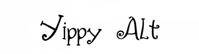
![Yippy Alt Frei Schriftart Herunterladen]() Herunterladen 527 Downloads@WebFont
Herunterladen 527 Downloads@WebFont -
( Fonts by Benoit Sjoholm - www.benoitsjoholm.com - All my fonts are for sale )
A cross-stitch patterned font with a handcrafted, geometric style.
![Cross Frei Schriftart Herunterladen]() Herunterladen 527 Downloads@WebFont
Herunterladen 527 Downloads@WebFont -
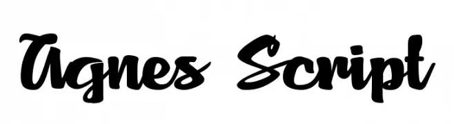
![Agnes Script Frei Schriftart Herunterladen]() Herunterladen 527 Downloads@WebFont
Herunterladen 527 Downloads@WebFont


Welche Schriften sind gerade am populärsten?
Poppins, Roboto, Montserrat, Open Sans und Lato sind wegen ihrer klaren Formen und breiten Einsetzbarkeit sehr gefragt – von Markenauftritt über Landingpages bis hin zu Postern.
Welche Fonts eignen sich für Logos?
Geometrische Sans‑Serifs (z. B. Poppins, Familien im Gotham‑Stil) sind ein häufiger Griff für sauberes, skalierbares Branding. Für eine persönlichere Note bleiben Scripts und Handschrift‑Stile beliebt. Kombinieren Sie einen prägnanten Headline‑Font mit einer neutralen Brotschrift für Wiedererkennung und Harmonie.
Wie oft wird die Top‑Liste aktualisiert?
Regelmäßig – basierend auf realen Downloads und Interaktionen. Schauen Sie öfter vorbei, um aufstrebende Favoriten früh zu entdecken.
💡 Tipp: Seite bookmarken – Trends wechseln schnell, und heutige Top‑Schriften inspirieren morgen vielleicht das Rebranding.