Willkommen bei den Top‑Schriften – hier treffen Beliebtheit und Qualität aufeinander. Das sind die in diesem Jahr am häufigsten heruntergeladenen und genutzten Fonts. Wenn Sie sichere Optionen für Logo, Web oder Social suchen, starten Sie hier.
Jeder Top‑Font überzeugt durch Balance, Lesbarkeit und Vielseitigkeit. Sie finden moderne Sans‑Serifs, elegante Scripts, Vintage‑Serifs und minimalistische Displays.
-
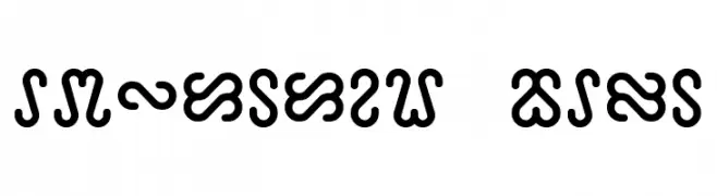
( Fonts by a Neale Davidson - www.pixelsagas.com. Personal-use only. For commercial use please contact owner. )
A bold, decorative font with interconnected loops and curves, ideal for creative display use.
 Herunterladen 1780 Downloads@WebFont
 -
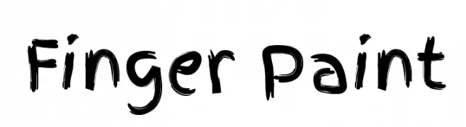
![Finger Paint Frei Schriftart Herunterladen]() Herunterladen 1780 Downloads@WebFont
Herunterladen 1780 Downloads@WebFont -
( Copyright (c) 2012, Sebastian Salazar (sebotas26@hotmail.com), with Reserved Font Name 'Sedan' )
A classic serif font with elegant lines and a sophisticated appearance.
![Sedan Frei Schriftart Herunterladen]() Herunterladen 1780 Downloads@WebFont
Herunterladen 1780 Downloads@WebFont -
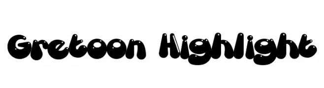
( Fonts by Mans Greback - www.mawns.com )
A playful, bold font with rounded, cartoonish characters and a three-dimensional effect.
![Gretoon Highlight Frei Schriftart Herunterladen]() Herunterladen 1780 Downloads@WebFont
Herunterladen 1780 Downloads@WebFont -
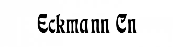
![Eckmann Cn Frei Schriftart Herunterladen]() Herunterladen 1780 Downloads@WebFont
Herunterladen 1780 Downloads@WebFont -
-
![FATTIP Frei Schriftart Herunterladen]() Herunterladen 1780 Downloads@WebFont
Herunterladen 1780 Downloads@WebFont -
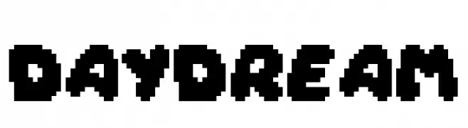
( Fonts by DoubleGum - Rahul Parihar - Personal-use only. For commercial use please contact owner. )
A bold, pixelated font with a retro digital aesthetic.
![Daydream Frei Schriftart Herunterladen]() Herunterladen 1779 Downloads@WebFont
Herunterladen 1779 Downloads@WebFont -
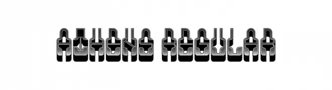
( Fonts by Vladimir Nikolic - www.creativefabrica.com/designer/vladimirnikolic/ - Personal-use only. For commercial use please contact owner. )
A bold, three-dimensional font with an industrial and futuristic design.
![Athens Regular Frei Schriftart Herunterladen]() Herunterladen 1779 Downloads@WebFont
Herunterladen 1779 Downloads@WebFont -
( Copyright HanYang I&C Co.,Ltd. All rights reserved. )
A modern sans-serif typeface with geometric shapes and uniform strokes.
![Gothic A1 Medium Frei Schriftart Herunterladen]() Herunterladen 1779 Downloads@WebFont
Herunterladen 1779 Downloads@WebFont -
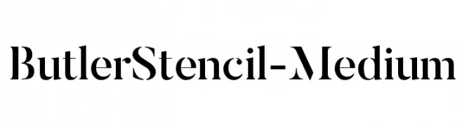
( Fonts by fabiandesmet.com )
A modern serif font with a bold stencil effect, offering elegance and sophistication.
![ButlerStencil-Medium Frei Schriftart Herunterladen]() Herunterladen 1779 Downloads@WebFont
Herunterladen 1779 Downloads@WebFont -
![Roomfer Frei Schriftart Herunterladen]() Herunterladen 1779 Downloads@WebFont
Herunterladen 1779 Downloads@WebFont -
( Fonts by www.blambot.com )
A bold, playful font with rounded characters and a lively, energetic style.
![PalookaBB Frei Schriftart Herunterladen]() Herunterladen 1779 Downloads@WebFont
Herunterladen 1779 Downloads@WebFont -
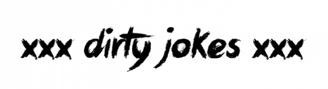
( Font by Jonathan Harris - www.tattoowoo.com )
A bold, expressive brush-style font with a textured, hand-painted look.
![xxx Dirty Jokes xxx Frei Schriftart Herunterladen]() Herunterladen 1779 Downloads@WebFont
Herunterladen 1779 Downloads@WebFont -
![Paghetti Frei Schriftart Herunterladen]() Herunterladen 1779 Downloads@WebFont
Herunterladen 1779 Downloads@WebFont -
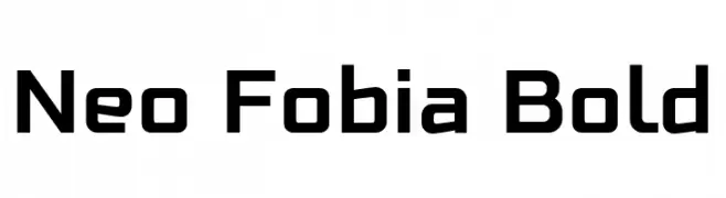
![Neo Fobia Bold Frei Schriftart Herunterladen]() Herunterladen 1778 Downloads@WebFont
Herunterladen 1778 Downloads@WebFont -
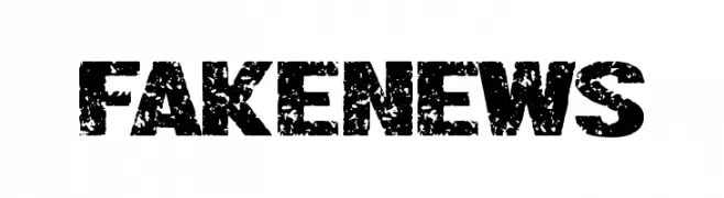
( Fonts by Chequered Ink )
A bold, distressed font with a rough, textured appearance for an urban, gritty feel.
![Fake News Frei Schriftart Herunterladen]() Herunterladen 1778 Downloads@WebFont
Herunterladen 1778 Downloads@WebFont -
( Fonts by Castcraft Software - OPTI Fonts Archive - opti.netii.net - Personal-use only. For commercial use please contact owner. )
An elegant script font with fluid, cursive strokes and high contrast.
![OPTIYale-Script Frei Schriftart Herunterladen]() Herunterladen 1778 Downloads@WebFont
Herunterladen 1778 Downloads@WebFont -
( Copyright (c) 2013 by Sorkin Type Co (www.sorkintype.com), with Reserved Font Name 'Tauri' )
A modern, clean sans-serif font with consistent stroke width and excellent readability.
![Tauri-Regular Frei Schriftart Herunterladen]() Herunterladen 1778 Downloads@WebFont
Herunterladen 1778 Downloads@WebFont -
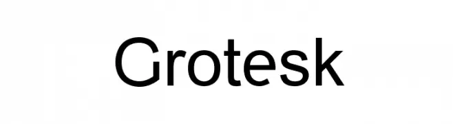
( Fonts by Manfred Klein. Free for private and charity use. Free for commercial with donation to organizations )
A modern, geometric typeface with clean lines and uniform stroke widths.
![Grotesk Frei Schriftart Herunterladen]() Herunterladen 1778 Downloads@WebFont
Herunterladen 1778 Downloads@WebFont -
![Maroc Frei Schriftart Herunterladen]() Herunterladen 1778 Downloads@WebFont
Herunterladen 1778 Downloads@WebFont -
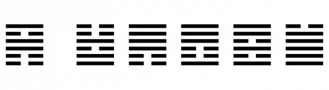
![I Ching Frei Schriftart Herunterladen]() Herunterladen 1778 Downloads@WebFont
Herunterladen 1778 Downloads@WebFont -
( Fonts by StringLabs Creative Studio )
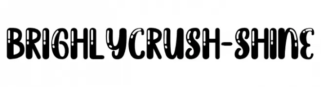
A bold, playful font with decorative accents and rounded characters.
![BrighlyCrush-Shine Frei Schriftart Herunterladen]() Herunterladen 1777 Downloads@WebFont
Herunterladen 1777 Downloads@WebFont -
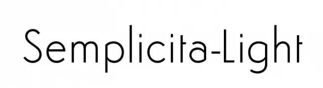
( Fonts by Flanker - Personal-use only. For commercial use please contact owner. )
A clean, geometric sans-serif font with a modern and minimalist style.
![Semplicita-Light Frei Schriftart Herunterladen]() Herunterladen 1777 Downloads@WebFont
Herunterladen 1777 Downloads@WebFont -
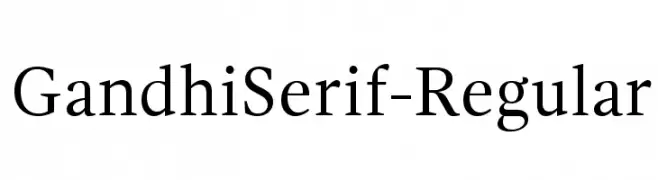
( Fonts by Cristobal Henestrosa and Raul Plancarte - Personal-use only. For commercial use please contact owner. )
A classic serif typeface with elegant proportions and refined serifs.
![GandhiSerif-Regular Frei Schriftart Herunterladen]() Herunterladen 1777 Downloads@WebFont
Herunterladen 1777 Downloads@WebFont -
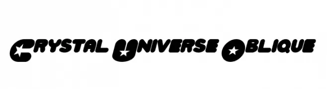
( MaxiGamer )
A bold, playful font with star motifs and an oblique style.
![Crystal Universe Oblique Frei Schriftart Herunterladen]() Herunterladen 1777 Downloads@WebFont
Herunterladen 1777 Downloads@WebFont -
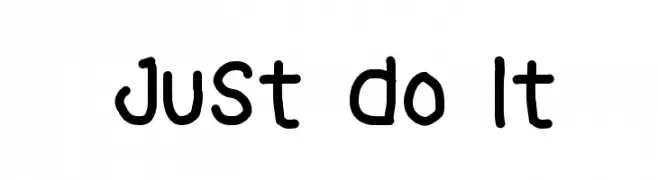
( Alifia )
A playful, hand-drawn font with rounded, informal characters.
![Just Do It Frei Schriftart Herunterladen]() Herunterladen 1776 Downloads@WebFont
Herunterladen 1776 Downloads@WebFont -
( Fonts by Michel Martinsson - lunchtype.com - Personal-use only. For commercial use please contact owner. )
A modern, expanded sans-serif font with medium contrast and excellent readability.
![Lunchtype24 Expanded Medium Frei Schriftart Herunterladen]() Herunterladen 1776 Downloads@WebFont
Herunterladen 1776 Downloads@WebFont -
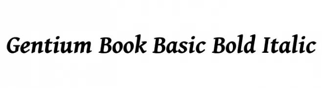
( Copyright (c) 2003-2013 SIL International (http://www.sil.org/) )
A bold, italic serif font with classic elegance and moderate contrast.
![Gentium Book Basic Bold Italic Frei Schriftart Herunterladen]() Herunterladen 1776 Downloads@WebFont
Herunterladen 1776 Downloads@WebFont -
![MuggyNew84 Bold Frei Schriftart Herunterladen]() Herunterladen 1776 Downloads@WebFont
Herunterladen 1776 Downloads@WebFont -
![Pokemon Solid Frei Schriftart Herunterladen]() Herunterladen 1776 Downloads@WebFont
Herunterladen 1776 Downloads@WebFont -
( Fonts by Dieter Steffmann )
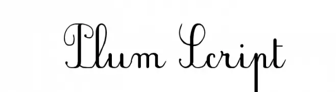
An elegant script font with intricate loops and decorative flourishes.
![Plum Script Frei Schriftart Herunterladen]() Herunterladen 1776 Downloads@WebFont
Herunterladen 1776 Downloads@WebFont -
( Free for a personal use. For a commercial use please visit www.kevinandamanda.com )
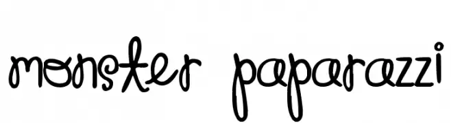
A playful, handwritten font with a whimsical and friendly appearance.
![Monster Paparazzi Frei Schriftart Herunterladen]() Herunterladen 1776 Downloads@WebFont
Herunterladen 1776 Downloads@WebFont -
( Fonts by Apostrophic Lab )
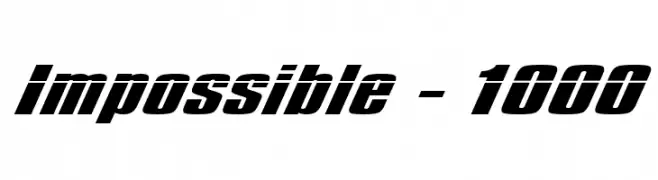
A bold, italicized font with a dynamic and impactful style.
![Impossible - 1000 Frei Schriftart Herunterladen]() Herunterladen 1776 Downloads@WebFont
Herunterladen 1776 Downloads@WebFont -
( Fonts by Utopiafonts )
A modern, geometric font with clean lines and consistent stroke width.
![Azrael Frei Schriftart Herunterladen]() Herunterladen 1776 Downloads@WebFont
Herunterladen 1776 Downloads@WebFont -
( Fonts by BLKBK Fonts - www.blkbk.shop - Personal-use only. For commercial use please contact owner. Sponsoren Schriftart )
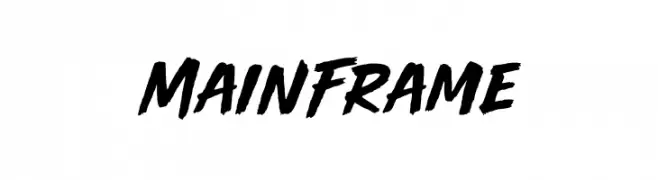
A bold, dynamic brush script font with energetic strokes and a hand-painted look.
![Main Frame Frei Schriftart Herunterladen]() Herunterladen 1775 Downloads
Herunterladen 1775 Downloads


Welche Schriften sind gerade am populärsten?
Poppins, Roboto, Montserrat, Open Sans und Lato sind wegen ihrer klaren Formen und breiten Einsetzbarkeit sehr gefragt – von Markenauftritt über Landingpages bis hin zu Postern.
Welche Fonts eignen sich für Logos?
Geometrische Sans‑Serifs (z. B. Poppins, Familien im Gotham‑Stil) sind ein häufiger Griff für sauberes, skalierbares Branding. Für eine persönlichere Note bleiben Scripts und Handschrift‑Stile beliebt. Kombinieren Sie einen prägnanten Headline‑Font mit einer neutralen Brotschrift für Wiedererkennung und Harmonie.
Wie oft wird die Top‑Liste aktualisiert?
Regelmäßig – basierend auf realen Downloads und Interaktionen. Schauen Sie öfter vorbei, um aufstrebende Favoriten früh zu entdecken.
💡 Tipp: Seite bookmarken – Trends wechseln schnell, und heutige Top‑Schriften inspirieren morgen vielleicht das Rebranding.