Willkommen bei den Top‑Schriften – hier treffen Beliebtheit und Qualität aufeinander. Das sind die in diesem Jahr am häufigsten heruntergeladenen und genutzten Fonts. Wenn Sie sichere Optionen für Logo, Web oder Social suchen, starten Sie hier.
Jeder Top‑Font überzeugt durch Balance, Lesbarkeit und Vielseitigkeit. Sie finden moderne Sans‑Serifs, elegante Scripts, Vintage‑Serifs und minimalistische Displays.
-
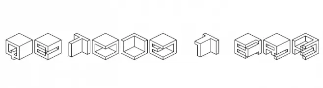
( Fonts by www.aenigmafonts.com )
A 3D cubic font with a modern, geometric style.
 Herunterladen 521 Downloads@WebFont
 -
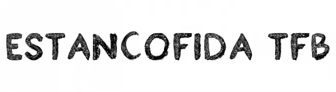
( truefonts.blogspot.com )
A textured, hand-drawn font with a playful and artistic style.
![Estancofida tfb Frei Schriftart Herunterladen]() Herunterladen 521 Downloads@WebFont
Herunterladen 521 Downloads@WebFont -
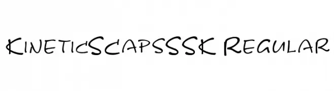
![KineticSCapsSSK Regular Frei Schriftart Herunterladen]() Herunterladen 521 Downloads@WebFont
Herunterladen 521 Downloads@WebFont -
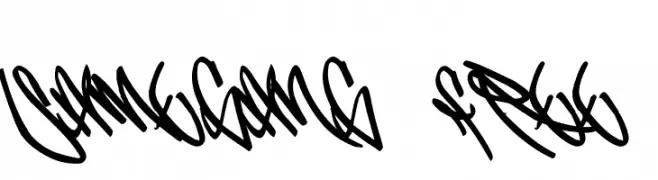
( Fonts by or from www.graffitifonts.net )
Graffiti-inspired font with bold, fluid strokes and interconnected characters.
![SameGang_Free Frei Schriftart Herunterladen]() Herunterladen 521 Downloads@WebFont
Herunterladen 521 Downloads@WebFont -
( Fonts by Masato Shimojima - Personal-use only. For commercial use please contact owner. )
A playful, bold font with rounded edges and a hand-drawn feel.
![Celon Frei Schriftart Herunterladen]() Herunterladen 521 Downloads@WebFont
Herunterladen 521 Downloads@WebFont -
-
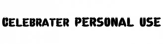
( www.mawns.com )
A bold, playful font with rounded, cartoon-like characters.
![Celebrater PERSONAL USE Frei Schriftart Herunterladen]() Herunterladen 521 Downloads@WebFont
Herunterladen 521 Downloads@WebFont -
( Fonts by Peter Wiegel - www.peter-wiegel.de - Personal-use only. For commercial use please contact owner. )
A bold, modern typeface with clean lines and strong visual impact.
![TGL12096.01 Frei Schriftart Herunterladen]() Herunterladen 521 Downloads@WebFont
Herunterladen 521 Downloads@WebFont -
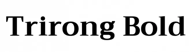
( Copyright (c) 2015, Cadson Demak (info@cadsondemak.com) )
A bold serif font with strong strokes and elegant serifs, ideal for authoritative text.
![Trirong Bold Frei Schriftart Herunterladen]() Herunterladen 521 Downloads@WebFont
Herunterladen 521 Downloads@WebFont -
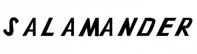
( Fonts by Paul Reid - tracertong.co.uk )
A bold, angular font with a modern and futuristic style.
![Gothikka Frei Schriftart Herunterladen]() Herunterladen 521 Downloads@WebFont
Herunterladen 521 Downloads@WebFont -
![Salamander Frei Schriftart Herunterladen]() Herunterladen 521 Downloads@WebFont
Herunterladen 521 Downloads@WebFont


Welche Schriften sind gerade am populärsten?
Poppins, Roboto, Montserrat, Open Sans und Lato sind wegen ihrer klaren Formen und breiten Einsetzbarkeit sehr gefragt – von Markenauftritt über Landingpages bis hin zu Postern.
Welche Fonts eignen sich für Logos?
Geometrische Sans‑Serifs (z. B. Poppins, Familien im Gotham‑Stil) sind ein häufiger Griff für sauberes, skalierbares Branding. Für eine persönlichere Note bleiben Scripts und Handschrift‑Stile beliebt. Kombinieren Sie einen prägnanten Headline‑Font mit einer neutralen Brotschrift für Wiedererkennung und Harmonie.
Wie oft wird die Top‑Liste aktualisiert?
Regelmäßig – basierend auf realen Downloads und Interaktionen. Schauen Sie öfter vorbei, um aufstrebende Favoriten früh zu entdecken.
💡 Tipp: Seite bookmarken – Trends wechseln schnell, und heutige Top‑Schriften inspirieren morgen vielleicht das Rebranding.