Willkommen bei den Top‑Schriften – hier treffen Beliebtheit und Qualität aufeinander. Das sind die in diesem Jahr am häufigsten heruntergeladenen und genutzten Fonts. Wenn Sie sichere Optionen für Logo, Web oder Social suchen, starten Sie hier.
Jeder Top‑Font überzeugt durch Balance, Lesbarkeit und Vielseitigkeit. Sie finden moderne Sans‑Serifs, elegante Scripts, Vintage‑Serifs und minimalistische Displays.
-
 Herunterladen 514 Downloads@WebFont
 -
( Fonts by Chequered Ink )
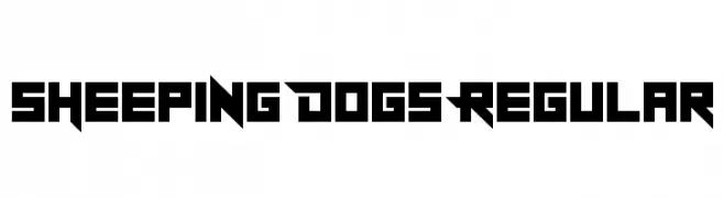
A bold, geometric font with sharp angles and a futuristic style.
![Sheeping Dogs Regular Frei Schriftart Herunterladen]() Herunterladen 514 Downloads@WebFont
Herunterladen 514 Downloads@WebFont -
( Fonts by Galdino Otten )
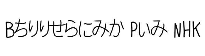
A casual, handwritten-style font with smooth, medium-thick strokes.
![Ballpoint Pen NHK Frei Schriftart Herunterladen]() Herunterladen 514 Downloads@WebFont
Herunterladen 514 Downloads@WebFont -
![Lilac Frei Schriftart Herunterladen]() Herunterladen 514 Downloads@WebFont
Herunterladen 514 Downloads@WebFont -
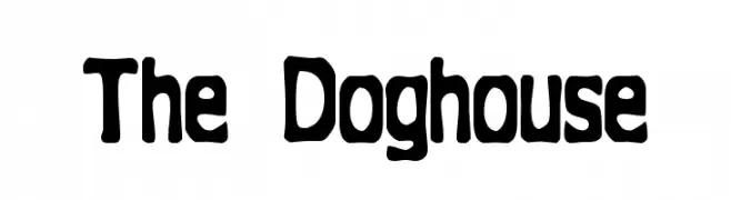
![The Doghouse Frei Schriftart Herunterladen]() Herunterladen 514 Downloads@WebFont
Herunterladen 514 Downloads@WebFont -
-
( Fonts by typedepot - Personal-use only. For commercial use please contact owner. )
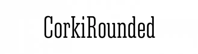
A modern rounded serif font with a clean and approachable style.
![Corki Rounded Frei Schriftart Herunterladen]() Herunterladen 514 Downloads@WebFont
Herunterladen 514 Downloads@WebFont -
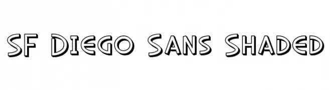
![SF Diego Sans Shaded Frei Schriftart Herunterladen]() Herunterladen 514 Downloads@WebFont
Herunterladen 514 Downloads@WebFont -
( Fonts by www.chequered.ink - Chequered Ink - Personal-use only. For commercial use please contact owner. )
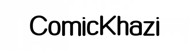
A playful, rounded font with a friendly and approachable style.
![Comic Khazi Frei Schriftart Herunterladen]() Herunterladen 514 Downloads@WebFont
Herunterladen 514 Downloads@WebFont -
( Fonts by Fenotype - Emil Bertell - Personal-use only. For commercial use please contact owner. )
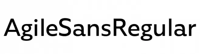
A clean, modern sans-serif font with balanced spacing and consistent stroke width.
![Agile Sans Regular Frei Schriftart Herunterladen]() Herunterladen 514 Downloads@WebFont
Herunterladen 514 Downloads@WebFont -
( Fonts by Castcraft Software - opti.netii.net - check the website before use )
A classic serif font with elegant and balanced characters.
![OPTIBarMay-Book Frei Schriftart Herunterladen]() Herunterladen 514 Downloads@WebFont
Herunterladen 514 Downloads@WebFont

Welche Schriften sind gerade am populärsten?
Poppins, Roboto, Montserrat, Open Sans und Lato sind wegen ihrer klaren Formen und breiten Einsetzbarkeit sehr gefragt – von Markenauftritt über Landingpages bis hin zu Postern.
Welche Fonts eignen sich für Logos?
Geometrische Sans‑Serifs (z. B. Poppins, Familien im Gotham‑Stil) sind ein häufiger Griff für sauberes, skalierbares Branding. Für eine persönlichere Note bleiben Scripts und Handschrift‑Stile beliebt. Kombinieren Sie einen prägnanten Headline‑Font mit einer neutralen Brotschrift für Wiedererkennung und Harmonie.
Wie oft wird die Top‑Liste aktualisiert?
Regelmäßig – basierend auf realen Downloads und Interaktionen. Schauen Sie öfter vorbei, um aufstrebende Favoriten früh zu entdecken.
💡 Tipp: Seite bookmarken – Trends wechseln schnell, und heutige Top‑Schriften inspirieren morgen vielleicht das Rebranding.