Willkommen bei den Top‑Schriften – hier treffen Beliebtheit und Qualität aufeinander. Das sind die in diesem Jahr am häufigsten heruntergeladenen und genutzten Fonts. Wenn Sie sichere Optionen für Logo, Web oder Social suchen, starten Sie hier.
Jeder Top‑Font überzeugt durch Balance, Lesbarkeit und Vielseitigkeit. Sie finden moderne Sans‑Serifs, elegante Scripts, Vintage‑Serifs und minimalistische Displays.
-
 Herunterladen 511 Downloads@WebFont
 -
( Free on condition that you make a donation of 5€ favor of an organization dealing with global warming. http://www.sergiolelli.it )
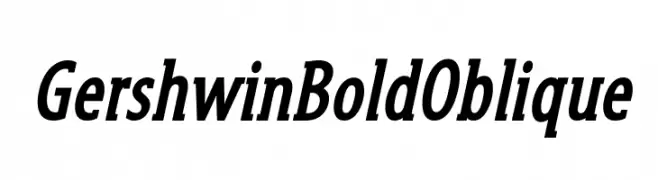
A bold, oblique font with a dynamic and modern style.
![GershwinBoldOblique Frei Schriftart Herunterladen]() Herunterladen 511 Downloads@WebFont
Herunterladen 511 Downloads@WebFont -
( Fonts by David Rakowski )
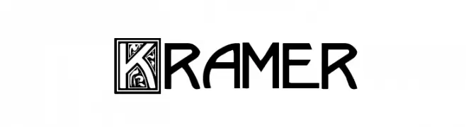
A decorative font with ornate uppercase letters in framed designs.
![Kramer Frei Schriftart Herunterladen]() Herunterladen 511 Downloads@WebFont
Herunterladen 511 Downloads@WebFont -
( Fonts by wep )
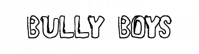
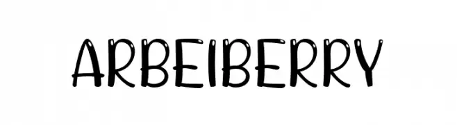
A playful, hand-drawn font with rounded edges and a whimsical style.
![ARBEI BERRY Frei Schriftart Herunterladen]() Herunterladen 511 Downloads@WebFont
Herunterladen 511 Downloads@WebFont -
( Noto is a trademark of Google Inc. Noto fonts are open source. All Noto fonts are published under the SIL Open Font License, Version 1.1 )
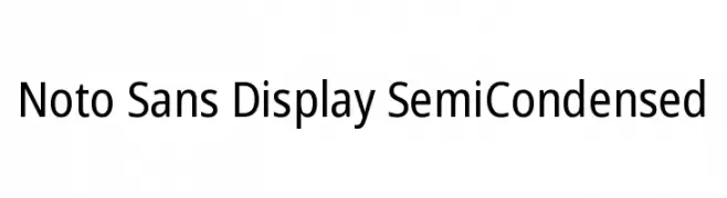
A clean, modern sans-serif typeface with semi-condensed proportions for optimal readability.
![Noto Sans Display SemiCondensed Frei Schriftart Herunterladen]() Herunterladen 511 Downloads@WebFont
Herunterladen 511 Downloads@WebFont -
-
( Fonts by Ibram Syah )
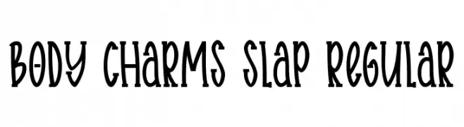
A playful, hand-drawn font with tall, narrow characters and a whimsical style.
![Body charms slap Regular Frei Schriftart Herunterladen]() Herunterladen 511 Downloads@WebFont
Herunterladen 511 Downloads@WebFont -
( Fonts by backpacker.gr )
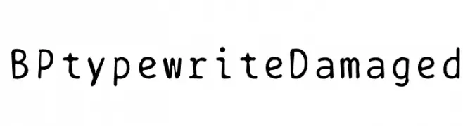
A vintage typewriter-style font with a distressed, hand-drawn appearance.
![BPtypewriteDamaged Frei Schriftart Herunterladen]() Herunterladen 511 Downloads@WebFont
Herunterladen 511 Downloads@WebFont -
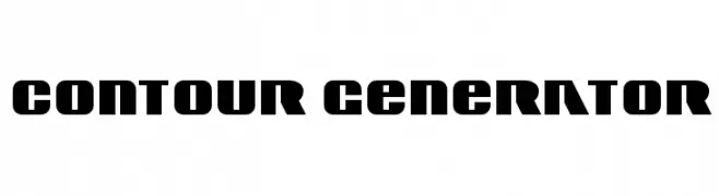
![Contour Generator Frei Schriftart Herunterladen]() Herunterladen 510 Downloads@WebFont
Herunterladen 510 Downloads@WebFont -
( Fonts by a Claude Pelletier . Personal-use only. For commercial use please contact owner. )
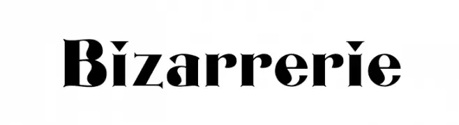
A bold, high-contrast font with dramatic, theatrical styling.
![Bizarrerie Frei Schriftart Herunterladen]() Herunterladen 510 Downloads@WebFont
Herunterladen 510 Downloads@WebFont -
![KR Cuori Divertenti 1 Frei Schriftart Herunterladen]() Herunterladen 510 Downloads@WebFont
Herunterladen 510 Downloads@WebFont
Welche Schriften sind gerade am populärsten?
Poppins, Roboto, Montserrat, Open Sans und Lato sind wegen ihrer klaren Formen und breiten Einsetzbarkeit sehr gefragt – von Markenauftritt über Landingpages bis hin zu Postern.
Welche Fonts eignen sich für Logos?
Geometrische Sans‑Serifs (z. B. Poppins, Familien im Gotham‑Stil) sind ein häufiger Griff für sauberes, skalierbares Branding. Für eine persönlichere Note bleiben Scripts und Handschrift‑Stile beliebt. Kombinieren Sie einen prägnanten Headline‑Font mit einer neutralen Brotschrift für Wiedererkennung und Harmonie.
Wie oft wird die Top‑Liste aktualisiert?
Regelmäßig – basierend auf realen Downloads und Interaktionen. Schauen Sie öfter vorbei, um aufstrebende Favoriten früh zu entdecken.
💡 Tipp: Seite bookmarken – Trends wechseln schnell, und heutige Top‑Schriften inspirieren morgen vielleicht das Rebranding.