Willkommen bei den Top‑Schriften – hier treffen Beliebtheit und Qualität aufeinander. Das sind die in diesem Jahr am häufigsten heruntergeladenen und genutzten Fonts. Wenn Sie sichere Optionen für Logo, Web oder Social suchen, starten Sie hier.
Jeder Top‑Font überzeugt durch Balance, Lesbarkeit und Vielseitigkeit. Sie finden moderne Sans‑Serifs, elegante Scripts, Vintage‑Serifs und minimalistische Displays.
-
( Fonts by Castcraft Software - opti.netii.net - check the website before use )
A classic serif font with elegant strokes and refined proportions.
 Herunterladen 511 Downloads@WebFont
 -
( Fonts by Sharkshock Productions----www.sharkshock.com. Personal-use only. For commercial use please contact owner. )
A bold, block-like font with a strong, modern presence.
![Hackney Block Frei Schriftart Herunterladen]() Herunterladen 511 Downloads@WebFont
Herunterladen 511 Downloads@WebFont -
( Fonts by www.peter-wiegel.de. Personal-use only. For commercial use please contact owner. )
A bold, three-dimensional font with geometric lines and a shadow effect.
![Varieté Artist Frei Schriftart Herunterladen]() Herunterladen 511 Downloads@WebFont
Herunterladen 511 Downloads@WebFont -
( Zetafonts - www.zetafonts.com )
A modern, sleek font with elongated, narrow letterforms and a minimalist design.
![Heading Pro Trial ExtraLight Frei Schriftart Herunterladen]() Herunterladen 511 Downloads@WebFont
Herunterladen 511 Downloads@WebFont -
( Fonts by Dieter Steffmann )
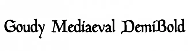
A classic serif font with a medieval flair, featuring bold strokes and elegant serifs.
![Goudy Mediaeval DemiBold Frei Schriftart Herunterladen]() Herunterladen 511 Downloads@WebFont
Herunterladen 511 Downloads@WebFont -
-
( Dieter Lausus )
A playful, handwritten-style font with dynamic strokes and a casual feel.
![Dieter Frei Schriftart Herunterladen]() Herunterladen 511 Downloads@WebFont
Herunterladen 511 Downloads@WebFont -
( Fonts by www.freakyfonts.de )
A pixelated, retro-style font inspired by classic video games.
![Gamegirl Classic Frei Schriftart Herunterladen]() Herunterladen 511 Downloads@WebFont
Herunterladen 511 Downloads@WebFont -
( Chequered Ink - chequered.ink/ )
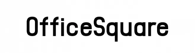
A modern, bold sans-serif font with geometric structure and excellent readability.
![Office Square Frei Schriftart Herunterladen]() Herunterladen 511 Downloads@WebFont
Herunterladen 511 Downloads@WebFont -
( Fonts by Daniel Zadorozny - www.iconian.com )
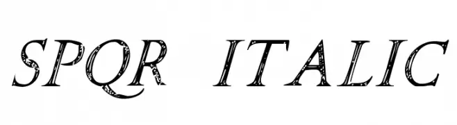
A decorative italic font with a hand-drawn, textured style reminiscent of Roman inscriptions.
![SPQR Italic Frei Schriftart Herunterladen]() Herunterladen 511 Downloads@WebFont
Herunterladen 511 Downloads@WebFont -
![Hadrianus Demo Frei Schriftart Herunterladen]() Herunterladen 511 Downloads@WebFont
Herunterladen 511 Downloads@WebFont


Welche Schriften sind gerade am populärsten?
Poppins, Roboto, Montserrat, Open Sans und Lato sind wegen ihrer klaren Formen und breiten Einsetzbarkeit sehr gefragt – von Markenauftritt über Landingpages bis hin zu Postern.
Welche Fonts eignen sich für Logos?
Geometrische Sans‑Serifs (z. B. Poppins, Familien im Gotham‑Stil) sind ein häufiger Griff für sauberes, skalierbares Branding. Für eine persönlichere Note bleiben Scripts und Handschrift‑Stile beliebt. Kombinieren Sie einen prägnanten Headline‑Font mit einer neutralen Brotschrift für Wiedererkennung und Harmonie.
Wie oft wird die Top‑Liste aktualisiert?
Regelmäßig – basierend auf realen Downloads und Interaktionen. Schauen Sie öfter vorbei, um aufstrebende Favoriten früh zu entdecken.
💡 Tipp: Seite bookmarken – Trends wechseln schnell, und heutige Top‑Schriften inspirieren morgen vielleicht das Rebranding.