Willkommen bei den Top‑Schriften – hier treffen Beliebtheit und Qualität aufeinander. Das sind die in diesem Jahr am häufigsten heruntergeladenen und genutzten Fonts. Wenn Sie sichere Optionen für Logo, Web oder Social suchen, starten Sie hier.
Jeder Top‑Font überzeugt durch Balance, Lesbarkeit und Vielseitigkeit. Sie finden moderne Sans‑Serifs, elegante Scripts, Vintage‑Serifs und minimalistische Displays.
-
( Fonts by www.pia-frauss.de )
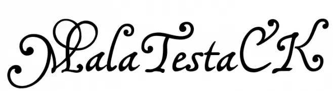
An elegant and decorative script font with intricate swirls and flowing curves.
 Herunterladen 508 Downloads@WebFont
 -
![Smallfoot Frei Schriftart Herunterladen]() Herunterladen 508 Downloads@WebFont
Herunterladen 508 Downloads@WebFont -
( Fonts by The Font Emporium )
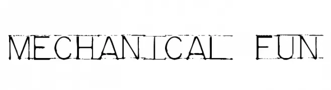
A mechanical, industrial font with a distressed, vintage texture.
![Mechanical Fun Frei Schriftart Herunterladen]() Herunterladen 508 Downloads@WebFont
Herunterladen 508 Downloads@WebFont -
( Fonts by Lantype Studio )
A playful, handwritten font with smooth, rounded edges and a casual style.
![DawetAyu Frei Schriftart Herunterladen]() Herunterladen 508 Downloads@WebFont
Herunterladen 508 Downloads@WebFont -
( Fonts by BLKBK - https://blkbk.ink - Personal-use only. For commercial use please contact owner. OFF SITE )
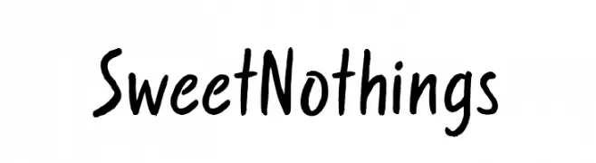
A playful handwritten font with fluid, dynamic strokes and a casual vibe.
![Sweet Nothings Frei Schriftart Herunterladen]() Herunterladen 508 Downloads
Herunterladen 508 Downloads -
-
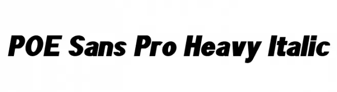
![POE Sans Pro Heavy Italic Frei Schriftart Herunterladen]() Herunterladen 508 Downloads@WebFont
Herunterladen 508 Downloads@WebFont -
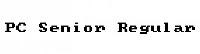
![PC Senior Regular Frei Schriftart Herunterladen]() Herunterladen 508 Downloads@WebFont
Herunterladen 508 Downloads@WebFont -
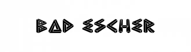
( Fonts by Mike Wolf )
A bold, geometric font with a three-dimensional, optical illusion style.
![Bad Escher Frei Schriftart Herunterladen]() Herunterladen 508 Downloads@WebFont
Herunterladen 508 Downloads@WebFont -
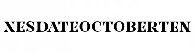
( Fonts by Situjuh Nazara - 7ntypes.com - Personal-use only. For commercial use please contact owner. )
A bold, high-contrast serif font with a classic and authoritative style.
![NesdateOctoberTen Frei Schriftart Herunterladen]() Herunterladen 508 Downloads@WebFont
Herunterladen 508 Downloads@WebFont -
( Fonts by Arlub )
A bold, playful font with whimsical, decorative elements.
![Simeol Frei Schriftart Herunterladen]() Herunterladen 508 Downloads@WebFont
Herunterladen 508 Downloads@WebFont


Welche Schriften sind gerade am populärsten?
Poppins, Roboto, Montserrat, Open Sans und Lato sind wegen ihrer klaren Formen und breiten Einsetzbarkeit sehr gefragt – von Markenauftritt über Landingpages bis hin zu Postern.
Welche Fonts eignen sich für Logos?
Geometrische Sans‑Serifs (z. B. Poppins, Familien im Gotham‑Stil) sind ein häufiger Griff für sauberes, skalierbares Branding. Für eine persönlichere Note bleiben Scripts und Handschrift‑Stile beliebt. Kombinieren Sie einen prägnanten Headline‑Font mit einer neutralen Brotschrift für Wiedererkennung und Harmonie.
Wie oft wird die Top‑Liste aktualisiert?
Regelmäßig – basierend auf realen Downloads und Interaktionen. Schauen Sie öfter vorbei, um aufstrebende Favoriten früh zu entdecken.
💡 Tipp: Seite bookmarken – Trends wechseln schnell, und heutige Top‑Schriften inspirieren morgen vielleicht das Rebranding.