Willkommen bei den Top‑Schriften – hier treffen Beliebtheit und Qualität aufeinander. Das sind die in diesem Jahr am häufigsten heruntergeladenen und genutzten Fonts. Wenn Sie sichere Optionen für Logo, Web oder Social suchen, starten Sie hier.
Jeder Top‑Font überzeugt durch Balance, Lesbarkeit und Vielseitigkeit. Sie finden moderne Sans‑Serifs, elegante Scripts, Vintage‑Serifs und minimalistische Displays.
-
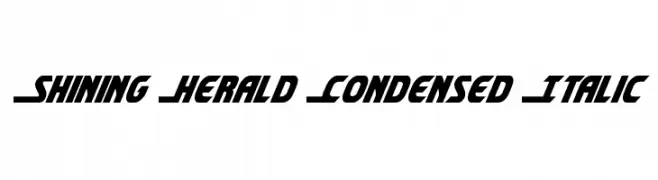
( Fonts by Daniel Zadorozny - www.iconian.com - Free for personal use )
A bold, condensed, and italicized font with a dynamic and modern style.
 Herunterladen 509 Downloads@WebFont
 -
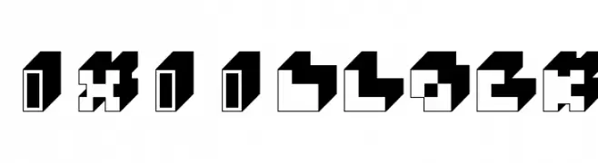
( Fonts by Marc Beekhuis - www.beekhuis.ch )
A bold, 3D geometric block font with a modern, futuristic style.
![3x3-block Frei Schriftart Herunterladen]() Herunterladen 509 Downloads@WebFont
Herunterladen 509 Downloads@WebFont -
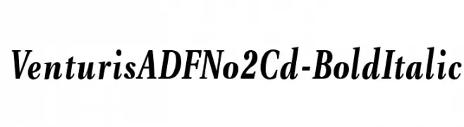
( Fonts by Arkandis Digital Foundry )
A bold, italic serif font with a classic and elegant style.
![VenturisADFNo2Cd-BoldItalic Frei Schriftart Herunterladen]() Herunterladen 509 Downloads@WebFont
Herunterladen 509 Downloads@WebFont -
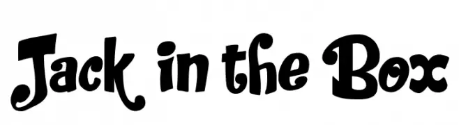
( imagex - www.imagex-fonts.com )
A playful, bold font with whimsical, hand-drawn characteristics.
![Jack in the Box Frei Schriftart Herunterladen]() Herunterladen 508 Downloads@WebFont
Herunterladen 508 Downloads@WebFont -
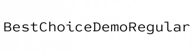
( Fonts by Dharma Type )
A modern, geometric sans-serif font with clean lines and uniform strokes.
![Best Choice Demo Regular Frei Schriftart Herunterladen]() Herunterladen 508 Downloads@WebFont
Herunterladen 508 Downloads@WebFont -
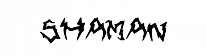
-
![Shaman Frei Schriftart Herunterladen]() Herunterladen 508 Downloads@WebFont
Herunterladen 508 Downloads@WebFont -
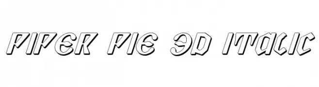
( Fonts by Daniel Zadorozny - www.iconian.com - Free for personal use )
A bold, 3D italic font with outlined characters and a modern, dynamic style.
![Piper Pie 3D Italic Frei Schriftart Herunterladen]() Herunterladen 508 Downloads@WebFont
Herunterladen 508 Downloads@WebFont -
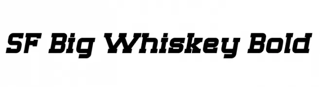
( Fonts by ShyFonts )
A bold, dynamic font with a slight slant and strong geometric influence.
![SF Big Whiskey Bold Frei Schriftart Herunterladen]() Herunterladen 508 Downloads@WebFont
Herunterladen 508 Downloads@WebFont -
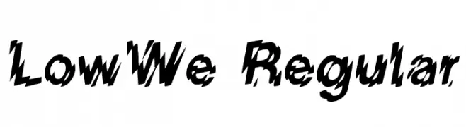
( Fonts by David Rakowski )
A bold, jagged font with a dynamic, distressed appearance.
![LowWe Regular Frei Schriftart Herunterladen]() Herunterladen 508 Downloads@WebFont
Herunterladen 508 Downloads@WebFont -
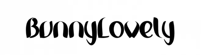
( Fonts by Inermedia Studio )
A playful, bold font with a whimsical, hand-drawn style.
![Bunny Lovely Frei Schriftart Herunterladen]() Herunterladen 508 Downloads@WebFont
Herunterladen 508 Downloads@WebFont
Welche Schriften sind gerade am populärsten?
Poppins, Roboto, Montserrat, Open Sans und Lato sind wegen ihrer klaren Formen und breiten Einsetzbarkeit sehr gefragt – von Markenauftritt über Landingpages bis hin zu Postern.
Welche Fonts eignen sich für Logos?
Geometrische Sans‑Serifs (z. B. Poppins, Familien im Gotham‑Stil) sind ein häufiger Griff für sauberes, skalierbares Branding. Für eine persönlichere Note bleiben Scripts und Handschrift‑Stile beliebt. Kombinieren Sie einen prägnanten Headline‑Font mit einer neutralen Brotschrift für Wiedererkennung und Harmonie.
Wie oft wird die Top‑Liste aktualisiert?
Regelmäßig – basierend auf realen Downloads und Interaktionen. Schauen Sie öfter vorbei, um aufstrebende Favoriten früh zu entdecken.
💡 Tipp: Seite bookmarken – Trends wechseln schnell, und heutige Top‑Schriften inspirieren morgen vielleicht das Rebranding.