Willkommen bei den Top‑Schriften – hier treffen Beliebtheit und Qualität aufeinander. Das sind die in diesem Jahr am häufigsten heruntergeladenen und genutzten Fonts. Wenn Sie sichere Optionen für Logo, Web oder Social suchen, starten Sie hier.
Jeder Top‑Font überzeugt durch Balance, Lesbarkeit und Vielseitigkeit. Sie finden moderne Sans‑Serifs, elegante Scripts, Vintage‑Serifs und minimalistische Displays.
-
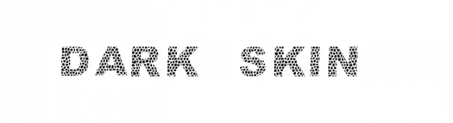
( Fonts by Dieter Schumacher )
A bold, mosaic-patterned decorative font with a unique artistic style.
 Herunterladen 490 Downloads@WebFont
 -
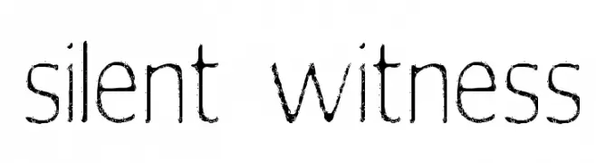
Schriftart von spideraysfonts. For commercial use please contact the owner.
![silent witness Frei Schriftart Herunterladen]() Herunterladen 490 Downloads@WebFont
Herunterladen 490 Downloads@WebFont -
![Margit Frei Schriftart Herunterladen]() Herunterladen 490 Downloads
Herunterladen 490 Downloads -
( Fonts by Erik Studio - Personal-use only. For commercial use please contact owner. )
A classic and elegant font with clean lines and balanced proportions.
![Algeria Frei Schriftart Herunterladen]() Herunterladen 490 Downloads@WebFont
Herunterladen 490 Downloads@WebFont -
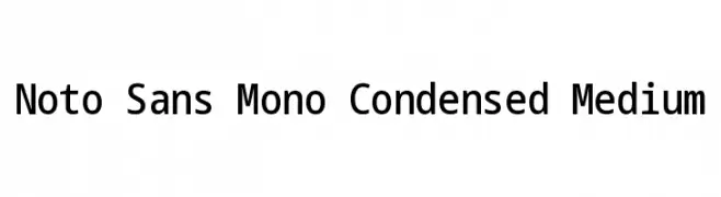
( Noto is a trademark of Google Inc. Noto fonts are open source. All Noto fonts are published under the SIL Open Font License, Version 1.1 )
A clean, modern monospaced font with a condensed, medium-weight design.
![Noto Sans Mono Condensed Medium Frei Schriftart Herunterladen]() Herunterladen 490 Downloads@WebFont
Herunterladen 490 Downloads@WebFont -
-
![Majestic Romance Thin Frei Schriftart Herunterladen]() Herunterladen 490 Downloads@WebFont
Herunterladen 490 Downloads@WebFont -
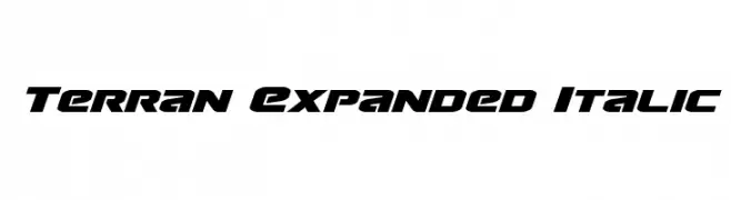
( Fonts by Daniel Zadorozny - www.iconian.com - Free for personal use )
A bold, italicized, and expanded font with a futuristic and dynamic style.
![Terran Expanded Italic Frei Schriftart Herunterladen]() Herunterladen 490 Downloads@WebFont
Herunterladen 490 Downloads@WebFont -
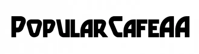
( Fonts by Nick Curtis - www.nicksfonts.com )
A bold, geometric font with a modern, futuristic style.
![PopularCafeAA Frei Schriftart Herunterladen]() Herunterladen 490 Downloads
Herunterladen 490 Downloads -
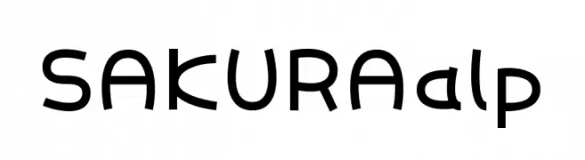
( These fonts are free to use in any private, recreational manner.For commercial go to www.flopdesign.com/fordesign/font.html )
A playful, modern font with rounded, bold characters.
![SAKURAalp Frei Schriftart Herunterladen]() Herunterladen 490 Downloads@WebFont
Herunterladen 490 Downloads@WebFont -
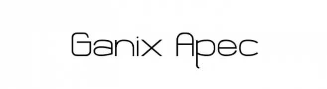
( Fonts by Andrew Hart - dirt2.com )
A modern, geometric font with clean lines and rounded edges.
![Ganix Apec Frei Schriftart Herunterladen]() Herunterladen 490 Downloads@WebFont
Herunterladen 490 Downloads@WebFont


Welche Schriften sind gerade am populärsten?
Poppins, Roboto, Montserrat, Open Sans und Lato sind wegen ihrer klaren Formen und breiten Einsetzbarkeit sehr gefragt – von Markenauftritt über Landingpages bis hin zu Postern.
Welche Fonts eignen sich für Logos?
Geometrische Sans‑Serifs (z. B. Poppins, Familien im Gotham‑Stil) sind ein häufiger Griff für sauberes, skalierbares Branding. Für eine persönlichere Note bleiben Scripts und Handschrift‑Stile beliebt. Kombinieren Sie einen prägnanten Headline‑Font mit einer neutralen Brotschrift für Wiedererkennung und Harmonie.
Wie oft wird die Top‑Liste aktualisiert?
Regelmäßig – basierend auf realen Downloads und Interaktionen. Schauen Sie öfter vorbei, um aufstrebende Favoriten früh zu entdecken.
💡 Tipp: Seite bookmarken – Trends wechseln schnell, und heutige Top‑Schriften inspirieren morgen vielleicht das Rebranding.