Willkommen bei den Top‑Schriften – hier treffen Beliebtheit und Qualität aufeinander. Das sind die in diesem Jahr am häufigsten heruntergeladenen und genutzten Fonts. Wenn Sie sichere Optionen für Logo, Web oder Social suchen, starten Sie hier.
Jeder Top‑Font überzeugt durch Balance, Lesbarkeit und Vielseitigkeit. Sie finden moderne Sans‑Serifs, elegante Scripts, Vintage‑Serifs und minimalistische Displays.
-
 Herunterladen 485 Downloads@WebFont
 -
( Fonts by www.gliphmaker.com. Personal-use only. For commercial use please contact owner. )
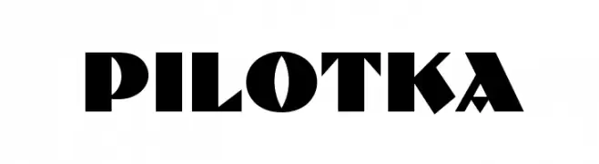
A bold, geometric font with sharp edges and a modern aesthetic.
![Pilotka Frei Schriftart Herunterladen]() Herunterladen 485 Downloads@WebFont
Herunterladen 485 Downloads@WebFont -
( Fonts by James Barnardo - Personal-use only. For commercial use please contact owner. )
A bold, modern font with rounded edges and a geometric structure.
![Coyote Frei Schriftart Herunterladen]() Herunterladen 485 Downloads@WebFont
Herunterladen 485 Downloads@WebFont -
( Fonts by notfon1234 )
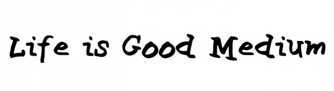
A playful, hand-drawn style font with bold, uneven strokes.
![Life is Good Medium Frei Schriftart Herunterladen]() Herunterladen 485 Downloads@WebFont
Herunterladen 485 Downloads@WebFont -
( Fonts by www.studiotypo.com - Personal-use only. For commercial use please contact owner. )
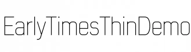
A sleek, modern font with thin, uniform strokes and a minimalist design.
![Early Times Thin Demo Frei Schriftart Herunterladen]() Herunterladen 485 Downloads@WebFont
Herunterladen 485 Downloads@WebFont -
-
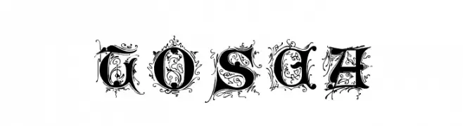
![Tosca Frei Schriftart Herunterladen]() Herunterladen 485 Downloads@WebFont
Herunterladen 485 Downloads@WebFont -
( Fonts by Geronimo Fonts - Personal-use only. For commercial use please contact owner. )
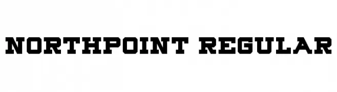
A bold, geometric font with strong, angular lines and a robust, industrial feel.
![Northpoint Regular Frei Schriftart Herunterladen]() Herunterladen 485 Downloads@WebFont
Herunterladen 485 Downloads@WebFont -
![DavysDingbats Medium Frei Schriftart Herunterladen]() Herunterladen 485 Downloads@WebFont
Herunterladen 485 Downloads@WebFont -
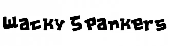
![Wacky Spankers Frei Schriftart Herunterladen]() Herunterladen 485 Downloads@WebFont
Herunterladen 485 Downloads@WebFont -
( Jon Grafton )
A playful, bold handwritten font with rounded, marker-like strokes.
![BestMarker Frei Schriftart Herunterladen]() Herunterladen 485 Downloads@WebFont
Herunterladen 485 Downloads@WebFont

Welche Schriften sind gerade am populärsten?
Poppins, Roboto, Montserrat, Open Sans und Lato sind wegen ihrer klaren Formen und breiten Einsetzbarkeit sehr gefragt – von Markenauftritt über Landingpages bis hin zu Postern.
Welche Fonts eignen sich für Logos?
Geometrische Sans‑Serifs (z. B. Poppins, Familien im Gotham‑Stil) sind ein häufiger Griff für sauberes, skalierbares Branding. Für eine persönlichere Note bleiben Scripts und Handschrift‑Stile beliebt. Kombinieren Sie einen prägnanten Headline‑Font mit einer neutralen Brotschrift für Wiedererkennung und Harmonie.
Wie oft wird die Top‑Liste aktualisiert?
Regelmäßig – basierend auf realen Downloads und Interaktionen. Schauen Sie öfter vorbei, um aufstrebende Favoriten früh zu entdecken.
💡 Tipp: Seite bookmarken – Trends wechseln schnell, und heutige Top‑Schriften inspirieren morgen vielleicht das Rebranding.