Willkommen bei den Top‑Schriften – hier treffen Beliebtheit und Qualität aufeinander. Das sind die in diesem Jahr am häufigsten heruntergeladenen und genutzten Fonts. Wenn Sie sichere Optionen für Logo, Web oder Social suchen, starten Sie hier.
Jeder Top‑Font überzeugt durch Balance, Lesbarkeit und Vielseitigkeit. Sie finden moderne Sans‑Serifs, elegante Scripts, Vintage‑Serifs und minimalistische Displays.
-
 Herunterladen 488 Downloads@WebFont
 -
( Noto is a trademark of Google Inc. Noto fonts are open source. All Noto fonts are published under the SIL Open Font License, Version 1.1 )
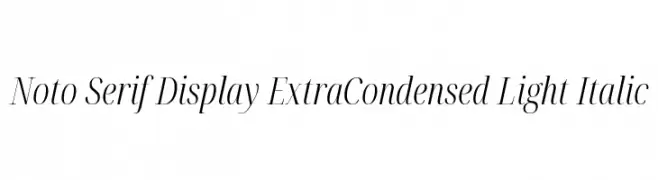
Elegant, extra condensed serif font with high contrast and italic style.
![Noto Serif Display ExtraCondensed Light Italic Frei Schriftart Herunterladen]() Herunterladen 488 Downloads@WebFont
Herunterladen 488 Downloads@WebFont -
( Fonts by Manfred Klein. Free for private and charity use. Free for commercial with donation to organizations )
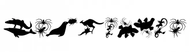
Animal and abstract silhouette dingbat font with playful, bold shapes.
![LetsDance Frei Schriftart Herunterladen]() Herunterladen 488 Downloads@WebFont
Herunterladen 488 Downloads@WebFont -
![Fantazija Frei Schriftart Herunterladen]() Herunterladen 488 Downloads@WebFont
Herunterladen 488 Downloads@WebFont -
( Fonts by Scratchones )
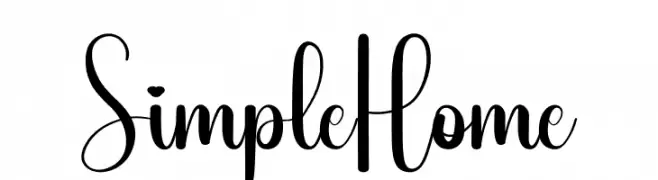
A modern, elegant script font with flowing cursive lines and smooth curves.
![Simple Home Frei Schriftart Herunterladen]() Herunterladen 488 Downloads@WebFont
Herunterladen 488 Downloads@WebFont -
-
( Fonts by www.dcoxy.com )
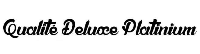
A bold, decorative script font with elegant loops and swirls.
![Qualité Deluxe Platinium Frei Schriftart Herunterladen]() Herunterladen 488 Downloads@WebFont
Herunterladen 488 Downloads@WebFont -
( Fonts by a Neale Davidson - www.pixelsagas.com. Personal-use only. For commercial use please contact owner. )
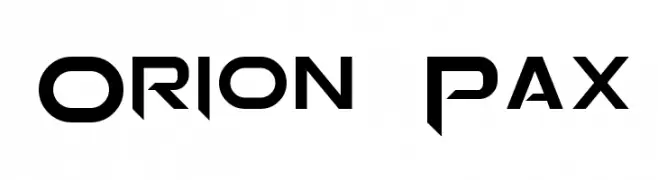
A bold, futuristic font with sharp, angular edges and a geometric structure.
![Orion Pax Frei Schriftart Herunterladen]() Herunterladen 488 Downloads@WebFont
Herunterladen 488 Downloads@WebFont -
![Hermano Regular Frei Schriftart Herunterladen]() Herunterladen 488 Downloads@WebFont
Herunterladen 488 Downloads@WebFont -
![BASTILLE Frei Schriftart Herunterladen]() Herunterladen 487 Downloads@WebFont
Herunterladen 487 Downloads@WebFont -
( Fonts by www.fontalicious.com )
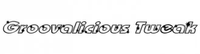
A bold, retro-inspired font with starburst effects and outlined characters.
![Groovalicious Tweak Frei Schriftart Herunterladen]() Herunterladen 487 Downloads@WebFont
Herunterladen 487 Downloads@WebFont

Welche Schriften sind gerade am populärsten?
Poppins, Roboto, Montserrat, Open Sans und Lato sind wegen ihrer klaren Formen und breiten Einsetzbarkeit sehr gefragt – von Markenauftritt über Landingpages bis hin zu Postern.
Welche Fonts eignen sich für Logos?
Geometrische Sans‑Serifs (z. B. Poppins, Familien im Gotham‑Stil) sind ein häufiger Griff für sauberes, skalierbares Branding. Für eine persönlichere Note bleiben Scripts und Handschrift‑Stile beliebt. Kombinieren Sie einen prägnanten Headline‑Font mit einer neutralen Brotschrift für Wiedererkennung und Harmonie.
Wie oft wird die Top‑Liste aktualisiert?
Regelmäßig – basierend auf realen Downloads und Interaktionen. Schauen Sie öfter vorbei, um aufstrebende Favoriten früh zu entdecken.
💡 Tipp: Seite bookmarken – Trends wechseln schnell, und heutige Top‑Schriften inspirieren morgen vielleicht das Rebranding.