Willkommen bei den Top‑Schriften – hier treffen Beliebtheit und Qualität aufeinander. Das sind die in diesem Jahr am häufigsten heruntergeladenen und genutzten Fonts. Wenn Sie sichere Optionen für Logo, Web oder Social suchen, starten Sie hier.
Jeder Top‑Font überzeugt durch Balance, Lesbarkeit und Vielseitigkeit. Sie finden moderne Sans‑Serifs, elegante Scripts, Vintage‑Serifs und minimalistische Displays.
-
( Fonts by Greg Medina - www.dcoxy.com - Personal-use only. For commercial use please contact owner. )
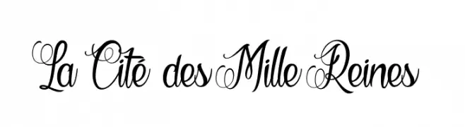
An elegant and intricate script font with ornate uppercase letters and flowing lowercase forms.
 Herunterladen 481 Downloads@WebFont
 -
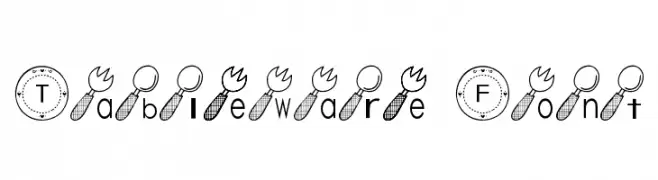
![Tableware Font Frei Schriftart Herunterladen]() Herunterladen 481 Downloads@WebFont
Herunterladen 481 Downloads@WebFont -
( Fonts by Daniel Zadorozny - www.iconian.com )
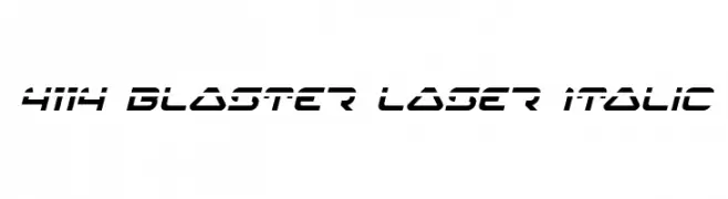
A futuristic, italicized font with sharp angles and a dynamic, geometric design.
![4114 Blaster Laser Italic Frei Schriftart Herunterladen]() Herunterladen 481 Downloads@WebFont
Herunterladen 481 Downloads@WebFont -
( Fonts by Castcraft Software - OPTI Fonts Archive - opti.netii.net - Personal-use only. For commercial use please contact owner. )
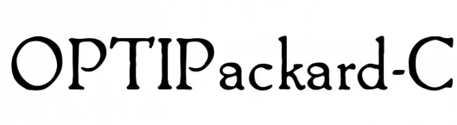
A classic serif font with elegant curves and a modern touch.
![OPTIPackard-C Frei Schriftart Herunterladen]() Herunterladen 481 Downloads@WebFont
Herunterladen 481 Downloads@WebFont -
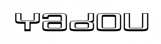
![Yadou Frei Schriftart Herunterladen]() Herunterladen 481 Downloads@WebFont
Herunterladen 481 Downloads@WebFont -
-
( Fonts by a Situjuh Nazara - c7n1.wordpress.com. Personal-use only. For commercial use please contact owner. )
A playful and whimsical script font with ornate uppercase and flowing lowercase letters.
![Theodista Decally Frei Schriftart Herunterladen]() Herunterladen 481 Downloads@WebFont
Herunterladen 481 Downloads@WebFont -
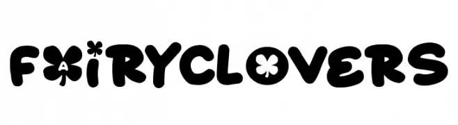
( Fonts by Darrell Flood )
A playful, bubbly font with rounded, bold characters ideal for fun and whimsical projects.
![Fairy Clovers Frei Schriftart Herunterladen]() Herunterladen 481 Downloads@WebFont
Herunterladen 481 Downloads@WebFont -
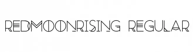
![RedMoonRising-Regular Frei Schriftart Herunterladen]() Herunterladen 481 Downloads@WebFont
Herunterladen 481 Downloads@WebFont -
![MyBlueRoom Frei Schriftart Herunterladen]() Herunterladen 481 Downloads@WebFont
Herunterladen 481 Downloads@WebFont -
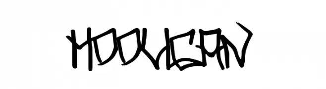
( Fonts by Chris Vile - fontmonger.com - Personal-use only. For commercial use please contact owner. )
A bold, graffiti-inspired font with sharp, angular edges and a rebellious flair.
![Hooligan Frei Schriftart Herunterladen]() Herunterladen 481 Downloads@WebFont
Herunterladen 481 Downloads@WebFont


Welche Schriften sind gerade am populärsten?
Poppins, Roboto, Montserrat, Open Sans und Lato sind wegen ihrer klaren Formen und breiten Einsetzbarkeit sehr gefragt – von Markenauftritt über Landingpages bis hin zu Postern.
Welche Fonts eignen sich für Logos?
Geometrische Sans‑Serifs (z. B. Poppins, Familien im Gotham‑Stil) sind ein häufiger Griff für sauberes, skalierbares Branding. Für eine persönlichere Note bleiben Scripts und Handschrift‑Stile beliebt. Kombinieren Sie einen prägnanten Headline‑Font mit einer neutralen Brotschrift für Wiedererkennung und Harmonie.
Wie oft wird die Top‑Liste aktualisiert?
Regelmäßig – basierend auf realen Downloads und Interaktionen. Schauen Sie öfter vorbei, um aufstrebende Favoriten früh zu entdecken.
💡 Tipp: Seite bookmarken – Trends wechseln schnell, und heutige Top‑Schriften inspirieren morgen vielleicht das Rebranding.