Willkommen bei den Top‑Schriften – hier treffen Beliebtheit und Qualität aufeinander. Das sind die in diesem Jahr am häufigsten heruntergeladenen und genutzten Fonts. Wenn Sie sichere Optionen für Logo, Web oder Social suchen, starten Sie hier.
Jeder Top‑Font überzeugt durch Balance, Lesbarkeit und Vielseitigkeit. Sie finden moderne Sans‑Serifs, elegante Scripts, Vintage‑Serifs und minimalistische Displays.
-
( Fonts by Gassstype )
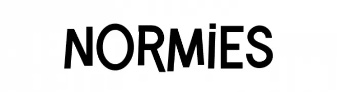
A modern, bold sans-serif font with geometric precision and high legibility.
 Herunterladen 479 Downloads@WebFont
 -
( Fonts by Khurasan )
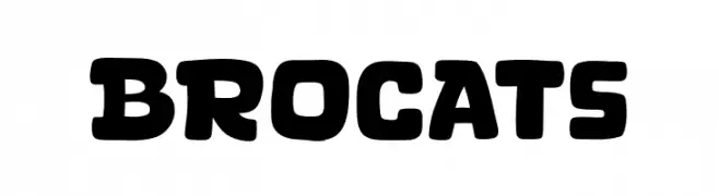
A bold, playful font with rounded edges and a retro-modern style.
![Brocats Frei Schriftart Herunterladen]() Herunterladen 479 Downloads@WebFont
Herunterladen 479 Downloads@WebFont -
( Fonts by deFharo )
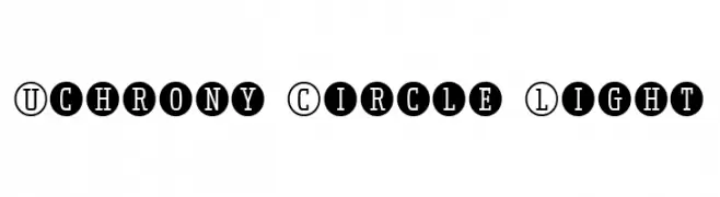
A modern, decorative font with characters enclosed in circles, offering a playful yet structured look.
![Uchrony Circle Light Frei Schriftart Herunterladen]() Herunterladen 479 Downloads@WebFont
Herunterladen 479 Downloads@WebFont -
( Fonts by Dan Steinbok - Out Of Step Font Company - outofstepfontco.com - Personal-use only. For commercial use please contact owner. )
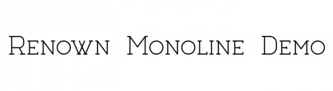
A clean, monoline font with consistent stroke widths and a classic, geometric influence.
![Renown Monoline Demo Frei Schriftart Herunterladen]() Herunterladen 479 Downloads@WebFont
Herunterladen 479 Downloads@WebFont -
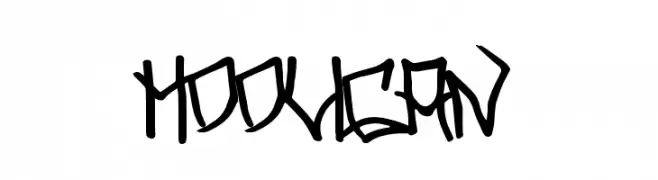
( Fonts by Chris Vile - fontmonger.com - Personal-use only. For commercial use please contact owner. )
A bold, graffiti-inspired font with sharp, angular edges and a rebellious flair.
![Hooligan Frei Schriftart Herunterladen]() Herunterladen 479 Downloads@WebFont
Herunterladen 479 Downloads@WebFont -
-
![Sinister-Plot Frei Schriftart Herunterladen]() Herunterladen 479 Downloads@WebFont
Herunterladen 479 Downloads@WebFont -
( Fonts by HansCo )
A playful and whimsical script font with decorative swirls and interconnected letters.
![Baby Bunny Script Frei Schriftart Herunterladen]() Herunterladen 479 Downloads@WebFont
Herunterladen 479 Downloads@WebFont -
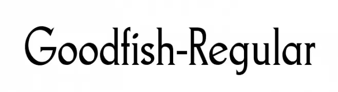
( Fonts by www.typodermicfonts.com - Ray Larabie )
A classic serif font with a modern twist, offering elegance and readability.
![Goodfish-Regular Frei Schriftart Herunterladen]() Herunterladen 479 Downloads@WebFont
Herunterladen 479 Downloads@WebFont -
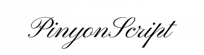
![Pinyon Script Frei Schriftart Herunterladen]() Herunterladen 479 Downloads@WebFont
Herunterladen 479 Downloads@WebFont -
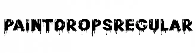
( Fonts by 177Studio )
A bold, dripping paint style font with a dramatic and artistic flair.
![Paint Drops Regular Frei Schriftart Herunterladen]() Herunterladen 479 Downloads@WebFont
Herunterladen 479 Downloads@WebFont


Welche Schriften sind gerade am populärsten?
Poppins, Roboto, Montserrat, Open Sans und Lato sind wegen ihrer klaren Formen und breiten Einsetzbarkeit sehr gefragt – von Markenauftritt über Landingpages bis hin zu Postern.
Welche Fonts eignen sich für Logos?
Geometrische Sans‑Serifs (z. B. Poppins, Familien im Gotham‑Stil) sind ein häufiger Griff für sauberes, skalierbares Branding. Für eine persönlichere Note bleiben Scripts und Handschrift‑Stile beliebt. Kombinieren Sie einen prägnanten Headline‑Font mit einer neutralen Brotschrift für Wiedererkennung und Harmonie.
Wie oft wird die Top‑Liste aktualisiert?
Regelmäßig – basierend auf realen Downloads und Interaktionen. Schauen Sie öfter vorbei, um aufstrebende Favoriten früh zu entdecken.
💡 Tipp: Seite bookmarken – Trends wechseln schnell, und heutige Top‑Schriften inspirieren morgen vielleicht das Rebranding.