Willkommen bei den Top‑Schriften – hier treffen Beliebtheit und Qualität aufeinander. Das sind die in diesem Jahr am häufigsten heruntergeladenen und genutzten Fonts. Wenn Sie sichere Optionen für Logo, Web oder Social suchen, starten Sie hier.
Jeder Top‑Font überzeugt durch Balance, Lesbarkeit und Vielseitigkeit. Sie finden moderne Sans‑Serifs, elegante Scripts, Vintage‑Serifs und minimalistische Displays.
-
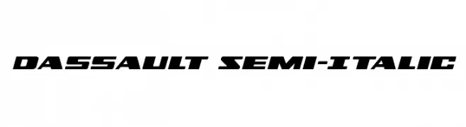
( Iconian Fonts - Daniel Zadorozny - www.iconian.com )
A bold, italicized font with a dynamic, futuristic style.
 Herunterladen 469 Downloads@WebFont
 -
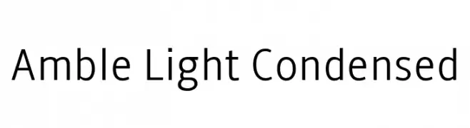
( Fonts by Punchcut )
A modern, light, and condensed sans-serif font with clean lines and uniform stroke width.
![Amble Light Condensed Frei Schriftart Herunterladen]() Herunterladen 469 Downloads@WebFont
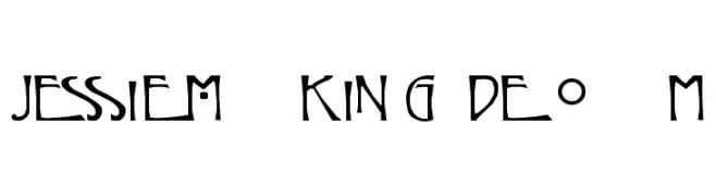
Herunterladen 469 Downloads@WebFont -
![Jessie M. King Demo Frei Schriftart Herunterladen]() Herunterladen 469 Downloads@WebFont
Herunterladen 469 Downloads@WebFont -
( Fonts by Zarma Type Foundry - Azzam Ridhamalik - Personal-use only. For commercial use please contact owner. )
A playful and flowing script font with smooth, rounded edges and interconnected letters.
![Beauty Adesha Regular Frei Schriftart Herunterladen]() Herunterladen 469 Downloads@WebFont
Herunterladen 469 Downloads@WebFont -
( Font by Jayvee D. Enaguas - grandchaos9000.deviantart.com )
A bold, modern sans-serif font with a clean and uniform design.
![Bimbo JVE Frei Schriftart Herunterladen]() Herunterladen 469 Downloads@WebFont
Herunterladen 469 Downloads@WebFont -
-
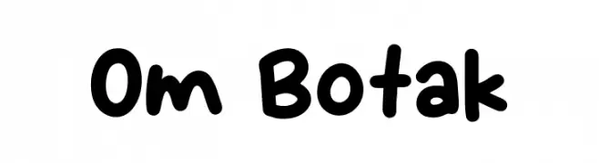
( Fonts by Khurasan )
A playful, rounded font with a hand-drawn, whimsical style.
![Om Botak Frei Schriftart Herunterladen]() Herunterladen 469 Downloads@WebFont
Herunterladen 469 Downloads@WebFont -
![Quasoid Regular Frei Schriftart Herunterladen]() Herunterladen 469 Downloads@WebFont
Herunterladen 469 Downloads@WebFont -
![Gargantua Demo Frei Schriftart Herunterladen]() Herunterladen 469 Downloads@WebFont
Herunterladen 469 Downloads@WebFont -
( Noto is a trademark of Google Inc. Noto fonts are open source. All Noto fonts are published under the SIL Open Font License, Version 1.1 )
A modern, clean font supporting the Devanagari script, ideal for digital interfaces.
![Noto Sans Devanagari UI Regular Frei Schriftart Herunterladen]() Herunterladen 469 Downloads@WebFont
Herunterladen 469 Downloads@WebFont -
( Fonts by Daniel Zadorozny - www.iconian.com - Free for personal use )
A bold, dynamic font with a slanted, energetic style.
![Virgin Hybrid Frei Schriftart Herunterladen]() Herunterladen 469 Downloads@WebFont
Herunterladen 469 Downloads@WebFont


Welche Schriften sind gerade am populärsten?
Poppins, Roboto, Montserrat, Open Sans und Lato sind wegen ihrer klaren Formen und breiten Einsetzbarkeit sehr gefragt – von Markenauftritt über Landingpages bis hin zu Postern.
Welche Fonts eignen sich für Logos?
Geometrische Sans‑Serifs (z. B. Poppins, Familien im Gotham‑Stil) sind ein häufiger Griff für sauberes, skalierbares Branding. Für eine persönlichere Note bleiben Scripts und Handschrift‑Stile beliebt. Kombinieren Sie einen prägnanten Headline‑Font mit einer neutralen Brotschrift für Wiedererkennung und Harmonie.
Wie oft wird die Top‑Liste aktualisiert?
Regelmäßig – basierend auf realen Downloads und Interaktionen. Schauen Sie öfter vorbei, um aufstrebende Favoriten früh zu entdecken.
💡 Tipp: Seite bookmarken – Trends wechseln schnell, und heutige Top‑Schriften inspirieren morgen vielleicht das Rebranding.