Willkommen bei den Top‑Schriften – hier treffen Beliebtheit und Qualität aufeinander. Das sind die in diesem Jahr am häufigsten heruntergeladenen und genutzten Fonts. Wenn Sie sichere Optionen für Logo, Web oder Social suchen, starten Sie hier.
Jeder Top‑Font überzeugt durch Balance, Lesbarkeit und Vielseitigkeit. Sie finden moderne Sans‑Serifs, elegante Scripts, Vintage‑Serifs und minimalistische Displays.
-
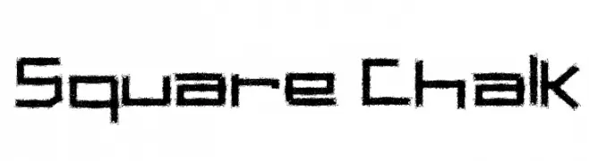
( Fonts by Galdino Otten - galdinootten.com )
A bold, chalk-textured font with a hand-drawn, informal style.
 Herunterladen 463 Downloads@WebFont
 -
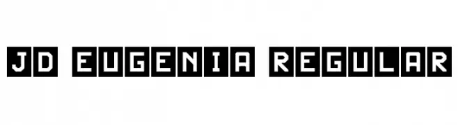
( Fonts by Jecko Development - www.jeckodevelopment.com )
A bold, geometric font with characters enclosed in squares, offering a modern, tech-inspired look.
![JD Eugenia Regular Frei Schriftart Herunterladen]() Herunterladen 463 Downloads@WebFont
Herunterladen 463 Downloads@WebFont -
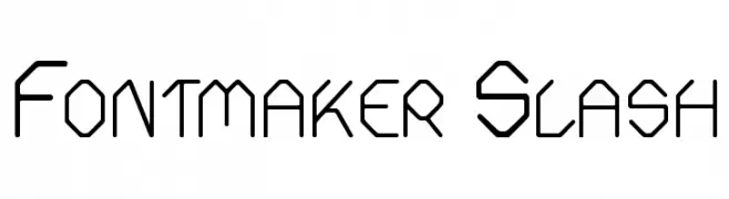
![Fontmaker Slash Frei Schriftart Herunterladen]() Herunterladen 463 Downloads@WebFont
Herunterladen 463 Downloads@WebFont -
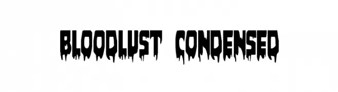
( Fonts by Daniel Zadorozny - www.iconian.com - Free for personal use )
A horror-themed, dripping font ideal for spooky designs.
![Bloodlust Condensed Frei Schriftart Herunterladen]() Herunterladen 463 Downloads@WebFont
Herunterladen 463 Downloads@WebFont -
![SaborLimitedFreeVersion Frei Schriftart Herunterladen]() Herunterladen 463 Downloads@WebFont
Herunterladen 463 Downloads@WebFont -
-
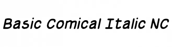
( Font by Jayvee D. Enaguas - grandchaos9000.deviantart.com )
A playful, italicized font with smooth, rounded strokes and moderate contrast.
![Basic Comical Italic NC Frei Schriftart Herunterladen]() Herunterladen 463 Downloads@WebFont
Herunterladen 463 Downloads@WebFont -
( zepply.blogspot.fr )
A bold, angular blackletter font with a traditional and ornate style.
![Edelweiss Regular Frei Schriftart Herunterladen]() Herunterladen 463 Downloads@WebFont
Herunterladen 463 Downloads@WebFont -
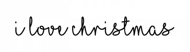
( Fonts by Misti`s Fonts - mistifonts.com - Personal-use only. For commercial use please contact owner. )
A playful handwritten font with smooth, flowing cursive lines.
![I Love Christmas Frei Schriftart Herunterladen]() Herunterladen 463 Downloads@WebFont
Herunterladen 463 Downloads@WebFont -
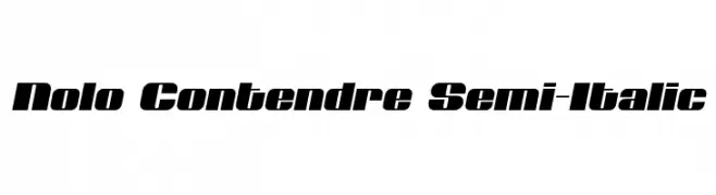
( Iconian Fonts - Daniel Zadorozny - www.iconian.com )
A bold, semi-italic font with a dynamic and modern style.
![Nolo Contendre Semi-Italic Frei Schriftart Herunterladen]() Herunterladen 463 Downloads@WebFont
Herunterladen 463 Downloads@WebFont -
![Candlemas Demo Frei Schriftart Herunterladen]() Herunterladen 463 Downloads@WebFont
Herunterladen 463 Downloads@WebFont

Welche Schriften sind gerade am populärsten?
Poppins, Roboto, Montserrat, Open Sans und Lato sind wegen ihrer klaren Formen und breiten Einsetzbarkeit sehr gefragt – von Markenauftritt über Landingpages bis hin zu Postern.
Welche Fonts eignen sich für Logos?
Geometrische Sans‑Serifs (z. B. Poppins, Familien im Gotham‑Stil) sind ein häufiger Griff für sauberes, skalierbares Branding. Für eine persönlichere Note bleiben Scripts und Handschrift‑Stile beliebt. Kombinieren Sie einen prägnanten Headline‑Font mit einer neutralen Brotschrift für Wiedererkennung und Harmonie.
Wie oft wird die Top‑Liste aktualisiert?
Regelmäßig – basierend auf realen Downloads und Interaktionen. Schauen Sie öfter vorbei, um aufstrebende Favoriten früh zu entdecken.
💡 Tipp: Seite bookmarken – Trends wechseln schnell, und heutige Top‑Schriften inspirieren morgen vielleicht das Rebranding.