Willkommen bei den Top‑Schriften – hier treffen Beliebtheit und Qualität aufeinander. Das sind die in diesem Jahr am häufigsten heruntergeladenen und genutzten Fonts. Wenn Sie sichere Optionen für Logo, Web oder Social suchen, starten Sie hier.
Jeder Top‑Font überzeugt durch Balance, Lesbarkeit und Vielseitigkeit. Sie finden moderne Sans‑Serifs, elegante Scripts, Vintage‑Serifs und minimalistische Displays.
-
( Fonts by StringLabs - stringlabscreative.com - Personal-use only. For commercial use please contact owner. )
An elegant, flowing script font with a handwritten style.
 Herunterladen 61 Downloads@WebFont
 -
( Fonts by Dmitry Astakhov - www.behance.net/adonis-abe1e - Personal-use only. For commercial use please contact owner. )
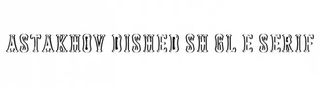
A bold, decorative serif font with a vintage, shadowed design.
![Astakhov Dished Sh Gl E Serif Frei Schriftart Herunterladen]() Herunterladen 61 Downloads@WebFont
Herunterladen 61 Downloads@WebFont -
( Iconian Fonts - Daniel Zadorozny - www.iconian.com )
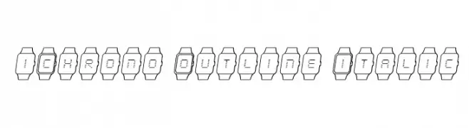
A modern, tech-inspired font with characters in digital watch outlines, featuring an italic style.
![iChrono Outline Italic Frei Schriftart Herunterladen]() Herunterladen 61 Downloads@WebFont
Herunterladen 61 Downloads@WebFont -
( Jaime Rangel Castro )
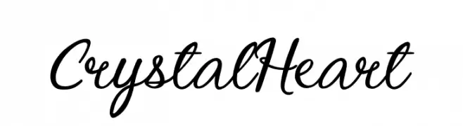
An elegant cursive script font with flowing, interconnected strokes.
![Crystal Heart Frei Schriftart Herunterladen]() Herunterladen 61 Downloads@WebFont
Herunterladen 61 Downloads@WebFont -
( Fonts by Hendrick Rolandez - Personal-use only. For commercial use please contact owner. )
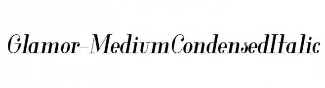
Elegant, modern, and italic with high contrast and condensed form.
![Glamor-MediumCondensedItalic Frei Schriftart Herunterladen]() Herunterladen 61 Downloads@WebFont
Herunterladen 61 Downloads@WebFont -
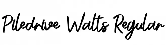
( Fonts by Yofi Aprilla - Personal-use only. For commercial use please contact owner. )
A dynamic and lively handwritten font with fluid strokes and a playful style.
![Piledrive Walts Regular Frei Schriftart Herunterladen]() Herunterladen 61 Downloads@WebFont
Herunterladen 61 Downloads@WebFont -
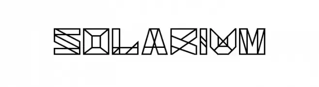
( Xerographer Fonts - Max Infeld - xerographer.blogspot.com )
A geometric and angular font with a futuristic and abstract design.
![Solarium Frei Schriftart Herunterladen]() Herunterladen 61 Downloads@WebFont
Herunterladen 61 Downloads@WebFont -
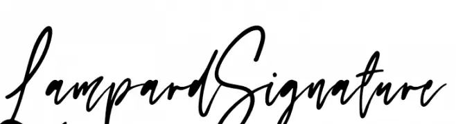
( Fonts by NJ Studio )
Handwritten cursive script with a casual elegance.
![Lampard Signature Frei Schriftart Herunterladen]() Herunterladen 61 Downloads@WebFont
Herunterladen 61 Downloads@WebFont -
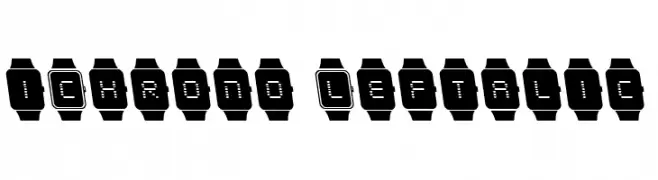
( Iconian Fonts - Daniel Zadorozny - www.iconian.com )
A pixelated, digital watch-inspired font with characters enclosed in watch outlines.
![iChrono Leftalic Frei Schriftart Herunterladen]() Herunterladen 61 Downloads@WebFont
Herunterladen 61 Downloads@WebFont -
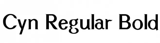
( Gregoryfonts - www.geocities.com/soho/coffeehouse/9609/fonts/fonts.html )
A bold, classic serif font with sharp serifs and medium contrast.
![Cyn Regular Bold Frei Schriftart Herunterladen]() Herunterladen 61 Downloads@WebFont
Herunterladen 61 Downloads@WebFont -
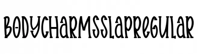
( Fonts by Ibram Syah - Personal-use only. For commercial use please contact owner. )
A whimsical, narrow font with a playful, hand-drawn style.
![Body charms slap Regular Frei Schriftart Herunterladen]() Herunterladen 61 Downloads@WebFont
Herunterladen 61 Downloads@WebFont -
( Lollibomb - www.lollibomb.com/ )
A bold, futuristic font with geometric shapes and sharp angles.
![TechnoX1 Frei Schriftart Herunterladen]() Herunterladen 61 Downloads@WebFont
Herunterladen 61 Downloads@WebFont -
( Amit Kumar )
A bold, angular font with sharp, geometric elements and high contrast.
![Teer Frei Schriftart Herunterladen]() Herunterladen 61 Downloads@WebFont
Herunterladen 61 Downloads@WebFont -
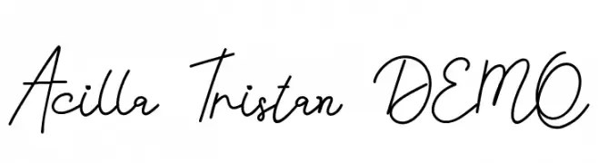
( Fonts by Edric Studio - Personal-use only. For commercial use please contact owner. )
A flowing, cursive font with a handwritten, elegant style.
![Acilla Tristan DEMO Frei Schriftart Herunterladen]() Herunterladen 61 Downloads@WebFont
Herunterladen 61 Downloads@WebFont -
( Fonts by Analogous Studio - Muhammad Ilham - Personal-use only. For commercial use please contact owner. )
An elegant, cursive font with flowing, interconnected letters and dynamic contrast.
![handlove Frei Schriftart Herunterladen]() Herunterladen 61 Downloads@WebFont
Herunterladen 61 Downloads@WebFont -
( Fonts by Kat`s Fun Fonts - Personal-use only. For commercial use please contact owner. )
A playful, quirky handwritten font with uneven letterforms and a casual appearance.
![KR Bad Boyz Frei Schriftart Herunterladen]() Herunterladen 61 Downloads@WebFont
Herunterladen 61 Downloads@WebFont -
( Fonts by myname5749 - Personal-use only. For commercial use please contact owner. )
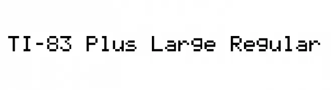
A pixelated, monospaced font with a retro digital aesthetic.
![TI-83 Plus Large Regular Frei Schriftart Herunterladen]() Herunterladen 61 Downloads@WebFont
Herunterladen 61 Downloads@WebFont -
( Fonts by Vladimir Nikolic - https://www.creativefabrica.com/product/educated-deers/ref/144265/ - Personal-use only. For commercial use please contact owner. )
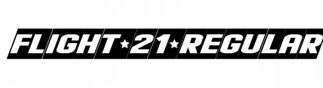
A bold, slanted font with a dynamic and modern style.
![Flight 21 Regular Frei Schriftart Herunterladen]() Herunterladen 61 Downloads@WebFont
Herunterladen 61 Downloads@WebFont -
( Fonts by Vunira Design - Personal-use only. For commercial use please contact owner. )
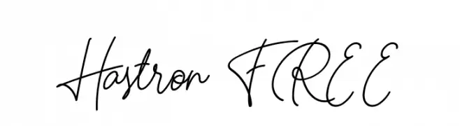
A flowing, cursive script font with elegant, continuous strokes.
![Hastron FREE Frei Schriftart Herunterladen]() Herunterladen 61 Downloads@WebFont
Herunterladen 61 Downloads@WebFont -
( http://www.typhoontype.net/category/fonts/ Sponsoren Schriftart )
An elegant script font with intricate swashes and flowing design.
![Antishbusy Frei Schriftart Herunterladen]() Herunterladen 61 Downloads
Herunterladen 61 Downloads -
( Noto is a trademark of Google Inc. Noto fonts are open source. All Noto fonts are published under the SIL Open Font License, Version 1.1 )
A bold, semi-condensed sans-serif font with uniform strokes and balanced spacing.
![Noto Sans Thai SemiCondensed Bold Frei Schriftart Herunterladen]() Herunterladen 61 Downloads@WebFont
Herunterladen 61 Downloads@WebFont -
( Fonts by fontalist - Andri Firmansyah - Personal-use only. For commercial use please contact owner. )
A playful, handwritten font with thin, irregular strokes and a casual style.
![Coasta Frei Schriftart Herunterladen]() Herunterladen 61 Downloads@WebFont
Herunterladen 61 Downloads@WebFont -
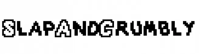
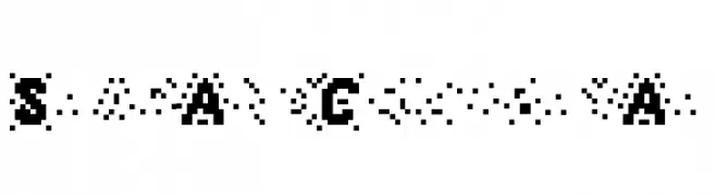
( Hazel Abbiati - diamondidiocy.tumblr.com )
A bold, pixelated font with a retro, digital aesthetic.
![SlapAndCrumbly Frei Schriftart Herunterladen]() Herunterladen 61 Downloads@WebFont
Herunterladen 61 Downloads@WebFont -
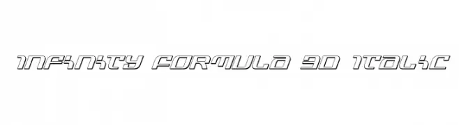
( Iconian Fonts - Daniel Zadorozny - www.iconian.com )
A futuristic, 3D italic font with bold, geometric outlines.
![Infinity Formula 3D Italic Frei Schriftart Herunterladen]() Herunterladen 61 Downloads@WebFont
Herunterladen 61 Downloads@WebFont -
( Eutypoce - www.eutypoce.com/ )
A playful, bold font with rounded terminals and uniform stroke width.
![Pruspic Paint Frei Schriftart Herunterladen]() Herunterladen 61 Downloads@WebFont
Herunterladen 61 Downloads@WebFont -
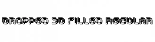
( Fonts by Vladimir Nikolic - https://www.creativefabrica.com/product/educated-deers/ref/144265/ - Personal-use only. For commercial use please contact owner. )
A bold, 3D font with filled interiors and outlined edges, offering a modern and dynamic look.
![Dropped 3D Filled Regular Frei Schriftart Herunterladen]() Herunterladen 61 Downloads@WebFont
Herunterladen 61 Downloads@WebFont -
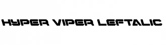
( Fonts by Daniel Zadorozny - www.iconian.com - Personal-use only. For commercial use please contact owner. )
A bold, futuristic font with angular, geometric shapes and a slight italic slant.
![Hyper Viper Leftalic Frei Schriftart Herunterladen]() Herunterladen 61 Downloads@WebFont
Herunterladen 61 Downloads@WebFont -
( Hazel Abbiati - diamondidiocy.tumblr.com )
A pixelated, retro-style font with a digital, fragmented appearance.
![SlapAndCrumblyAl Frei Schriftart Herunterladen]() Herunterladen 61 Downloads@WebFont
Herunterladen 61 Downloads@WebFont -
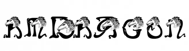
( Renny Murray - www.rennysniche.com )
A decorative font with dragon motifs integrated into each character.
![RMDragon Frei Schriftart Herunterladen]() Herunterladen 61 Downloads@WebFont
Herunterladen 61 Downloads@WebFont -
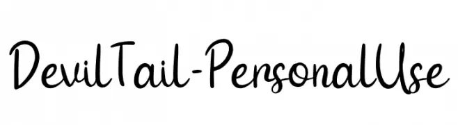
( Fonts by Attype Studio - Fadli Ramadhan Iskandar - Personal-use only. For commercial use please contact owner. )
A playful, handwritten script font with fluid, connected letters.
![Devil Tail - Personal Use Frei Schriftart Herunterladen]() Herunterladen 61 Downloads@WebFont
Herunterladen 61 Downloads@WebFont -
( Fonts by Typefar - Farul Arjianto - Personal-use only. For commercial use please contact owner. )
A bold, hand-drawn font with a playful and organic style.
![Chabitta Frei Schriftart Herunterladen]() Herunterladen 61 Downloads@WebFont
Herunterladen 61 Downloads@WebFont -
( weknow - Wino S Kadir - www.creativefabrica.com/designer/weknow/ )
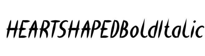
A bold, italic handwritten font with a dynamic and energetic style.
![HEART SHAPED Bold Italic Frei Schriftart Herunterladen]() Herunterladen 61 Downloads@WebFont
Herunterladen 61 Downloads@WebFont -
( Fonts by www.junkohanhero.com - Personal-use only. For commercial use please contact owner. )
A rugged, hand-drawn font with a vintage, organic feel.
![MOA 1 Frei Schriftart Herunterladen]() Herunterladen 61 Downloads@WebFont
Herunterladen 61 Downloads@WebFont -
( Iconian Fonts - Daniel Zadorozny - www.iconian.com )
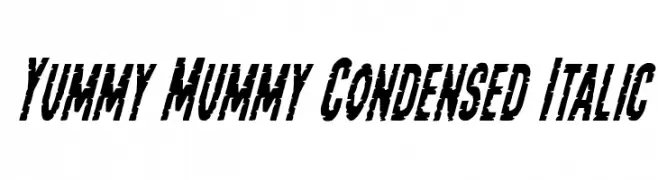
A bold, condensed, and italicized font with a distressed, energetic style.
![Yummy Mummy Condensed Italic Frei Schriftart Herunterladen]() Herunterladen 61 Downloads@WebFont
Herunterladen 61 Downloads@WebFont -
( Fonts by Daniel Zadorozny - www.iconian.com - Personal-use only. For commercial use please contact owner. )
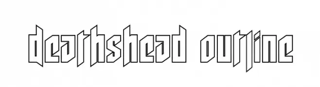
A bold, angular outline font with a modern, edgy design.
![Deathshead Outline Frei Schriftart Herunterladen]() Herunterladen 61 Downloads@WebFont
Herunterladen 61 Downloads@WebFont


Welche Schriften sind gerade am populärsten?
Poppins, Roboto, Montserrat, Open Sans und Lato sind wegen ihrer klaren Formen und breiten Einsetzbarkeit sehr gefragt – von Markenauftritt über Landingpages bis hin zu Postern.
Welche Fonts eignen sich für Logos?
Geometrische Sans‑Serifs (z. B. Poppins, Familien im Gotham‑Stil) sind ein häufiger Griff für sauberes, skalierbares Branding. Für eine persönlichere Note bleiben Scripts und Handschrift‑Stile beliebt. Kombinieren Sie einen prägnanten Headline‑Font mit einer neutralen Brotschrift für Wiedererkennung und Harmonie.
Wie oft wird die Top‑Liste aktualisiert?
Regelmäßig – basierend auf realen Downloads und Interaktionen. Schauen Sie öfter vorbei, um aufstrebende Favoriten früh zu entdecken.
💡 Tipp: Seite bookmarken – Trends wechseln schnell, und heutige Top‑Schriften inspirieren morgen vielleicht das Rebranding.