Willkommen bei den Top‑Schriften – hier treffen Beliebtheit und Qualität aufeinander. Das sind die in diesem Jahr am häufigsten heruntergeladenen und genutzten Fonts. Wenn Sie sichere Optionen für Logo, Web oder Social suchen, starten Sie hier.
Jeder Top‑Font überzeugt durch Balance, Lesbarkeit und Vielseitigkeit. Sie finden moderne Sans‑Serifs, elegante Scripts, Vintage‑Serifs und minimalistische Displays.
-
( weknow - Wino S Kadir - www.creativefabrica.com/designer/weknow/ )
A bold, antique-style font with retro decorative elements.
 Herunterladen 61 Downloads@WebFont
 -
( Eva Barabasne Olasz - www.etsy.com/ie/shop/digitaltypefaces )
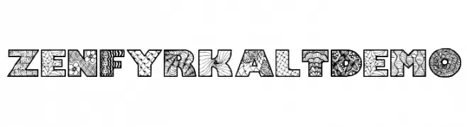
A decorative font with intricate patterns and textures, ideal for creative projects.
![Zenfyrkalt Demo Frei Schriftart Herunterladen]() Herunterladen 61 Downloads@WebFont
Herunterladen 61 Downloads@WebFont -
( Fonts by Måns Grebäck )
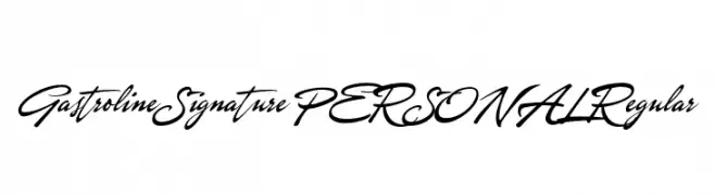
Elegant cursive script font.
![Gastroline Signature PERSONAL Regular Frei Schriftart Herunterladen]() Herunterladen 61 Downloads@WebFont
Herunterladen 61 Downloads@WebFont -
( Fonts by Darrell Flood - Personal-use only. For commercial use please contact owner. )
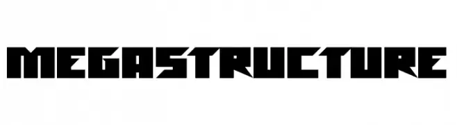
A bold, geometric font with sharp angles and a futuristic style.
![Megastructure Frei Schriftart Herunterladen]() Herunterladen 61 Downloads@WebFont
Herunterladen 61 Downloads@WebFont -
( Fonts by nariswari_creative - Taufik Dwi Purnomo - Personal-use only. For commercial use please contact owner. )
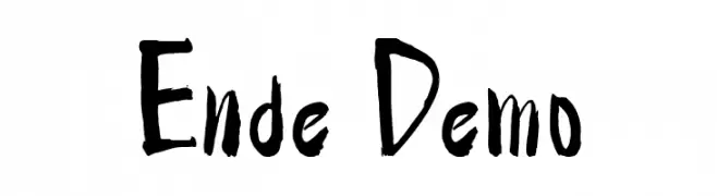
A bold, hand-painted style font with dynamic, expressive strokes.
![Ende Demo Frei Schriftart Herunterladen]() Herunterladen 61 Downloads@WebFont
Herunterladen 61 Downloads@WebFont -
( weknow - Wino S Kadir - www.creativefabrica.com/designer/weknow/ )
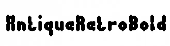
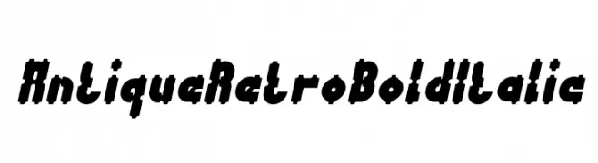
A bold, italicized retro font with an antique, decorative style.
![Antique Retro Bold Italic Frei Schriftart Herunterladen]() Herunterladen 61 Downloads@WebFont
Herunterladen 61 Downloads@WebFont -
( Fonts by Vigilante Typeface Corporation Larry Yerkes. Personal-use only. For commercial use please contact owner. )
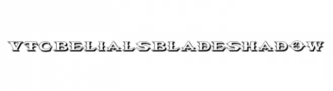
A bold, decorative font with sharp angles and a shadow effect, ideal for dramatic designs.
![VTCBelialsBladeShadow Frei Schriftart Herunterladen]() Herunterladen 61 Downloads@WebFont
Herunterladen 61 Downloads@WebFont -
( Fonts by HIRO std - Personal-use only. For commercial use please contact owner. )
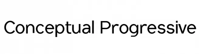
A modern, clean sans-serif font with uniform stroke width and versatile character set.
![Conceptual Progressive Frei Schriftart Herunterladen]() Herunterladen 61 Downloads@WebFont
Herunterladen 61 Downloads@WebFont -
( weknow - Wino S Kadir - www.creativefabrica.com/designer/weknow/ )
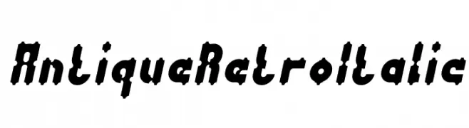
A bold, italicized retro font with high contrast and a vintage aesthetic.
![Antique Retro Italic Frei Schriftart Herunterladen]() Herunterladen 61 Downloads@WebFont
Herunterladen 61 Downloads@WebFont -
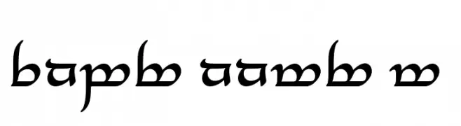
( Johan Winge - home.student.uu.se/jowi4905/ )
A decorative script inspired by Tolkien's Elvish writing, featuring elegant, flowing characters.
![Tengwar Annatar Alt Frei Schriftart Herunterladen]() Herunterladen 61 Downloads@WebFont
Herunterladen 61 Downloads@WebFont -
( Fonts by Edric Studio www.creativefabrica.com/designer/edricstudio/ - Personal-use only. For commercial use please contact owner. )
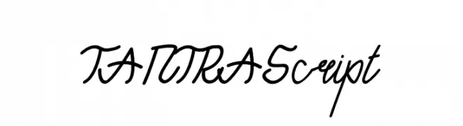
A dynamic, script-like font with fluid, interconnected letters and a personal touch.
![TANTRA Script Frei Schriftart Herunterladen]() Herunterladen 61 Downloads@WebFont
Herunterladen 61 Downloads@WebFont -
( Fonts by Kong Font - fontkong.com - Personal-use only. For commercial use please contact owner. )
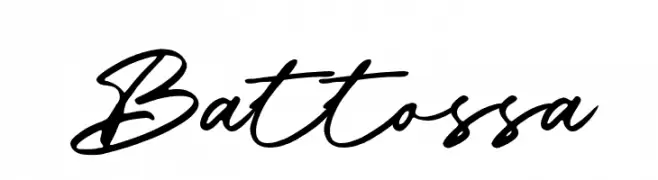
A dynamic and elegant script font with flowing, cursive letterforms.
![Battossa Frei Schriftart Herunterladen]() Herunterladen 61 Downloads@WebFont
Herunterladen 61 Downloads@WebFont -
( Fonts on us )
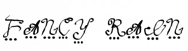
A whimsical, decorative handwritten font with playful dot embellishments.
![fancy rain Frei Schriftart Herunterladen]() Herunterladen 61 Downloads@WebFont
Herunterladen 61 Downloads@WebFont -
( Johan Winge - home.student.uu.se/jowi4905/ )
A bold, decorative script inspired by the Tengwar script with intricate and flowing characters.
![Tengwar Annatar Alt Bold Frei Schriftart Herunterladen]() Herunterladen 61 Downloads@WebFont
Herunterladen 61 Downloads@WebFont -
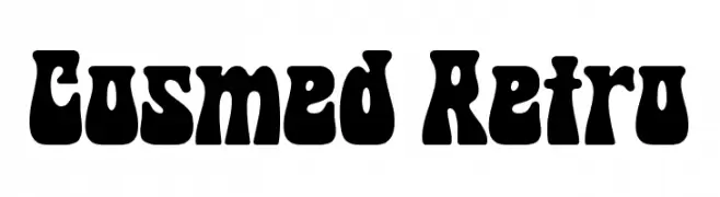
( Fonts by HansCo )
A bold, retro-inspired font with thick, rounded strokes and a playful, cartoonish style.
![Cosmed Retro Frei Schriftart Herunterladen]() Herunterladen 61 Downloads@WebFont
Herunterladen 61 Downloads@WebFont -
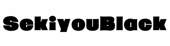
( Fonts by zone108.main.jp - Personal-use only. For commercial use please contact owner. )
A bold, impactful font with thick strokes and minimal spacing, ideal for strong visual statements.
![Sekiyou Black Frei Schriftart Herunterladen]() Herunterladen 61 Downloads@WebFont
Herunterladen 61 Downloads@WebFont -
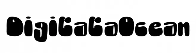
( Fonts by Jetsmax.com - Personal-use only. For commercial use please contact owner. )
A bold, playful font with rounded, bubble-like characters.
![Digitata Ocean Frei Schriftart Herunterladen]() Herunterladen 61 Downloads@WebFont
Herunterladen 61 Downloads@WebFont -
( Fonts by Maulana Creative - Gilang Maulana - Personal-use only. For commercial use please contact owner. )
An elegant script font with flowing, cursive letterforms and intricate swashes.
![Fallisanta Free Regular Frei Schriftart Herunterladen]() Herunterladen 61 Downloads@WebFont
Herunterladen 61 Downloads@WebFont -
( Fonts by Zanatlija - Personal-use only. For commercial use please contact owner. )
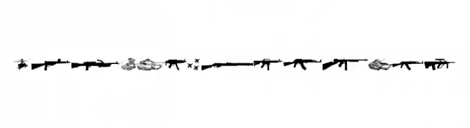
A military-themed dingbat font with weapon and vehicle icons.
![Army weapons tfb Frei Schriftart Herunterladen]() Herunterladen 61 Downloads@WebFont
Herunterladen 61 Downloads@WebFont -
( Fonts by Situjuh Nazara - 7ntypes.com - Personal-use only. For commercial use please contact owner. )
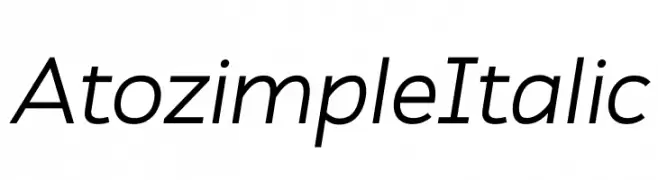
A modern, italic sans-serif font with clean lines and a dynamic style.
![Atozimple Italic Frei Schriftart Herunterladen]() Herunterladen 61 Downloads@WebFont
Herunterladen 61 Downloads@WebFont -
( Fonts by Colllab Studio - Personal-use only. For commercial use please contact owner. )
A lively, handwritten cursive font with dynamic strokes and a playful style.
![Beauty Bailey Frei Schriftart Herunterladen]() Herunterladen 61 Downloads@WebFont
Herunterladen 61 Downloads@WebFont -
( Fonts by Dasukreation - Dadan Sukma Nurdiansyah - Personal-use only. For commercial use please contact owner. )
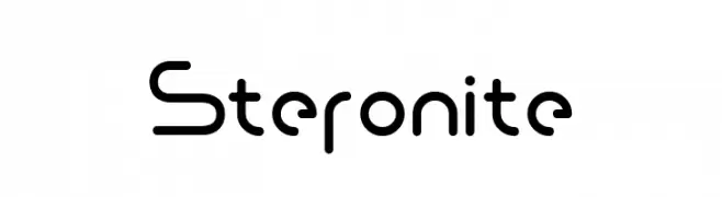
A modern, geometric font with rounded edges and a futuristic style.
![Steronite Frei Schriftart Herunterladen]() Herunterladen 61 Downloads@WebFont
Herunterladen 61 Downloads@WebFont -
( Fonts by 7NTypes - Personal-use only. For commercial use please contact owner. )
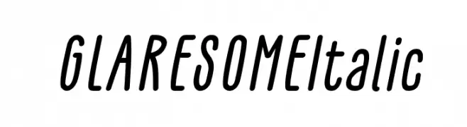
A sleek, italicized font with elongated characters and a modern, fluid style.
![GLARESOME Italic Frei Schriftart Herunterladen]() Herunterladen 61 Downloads@WebFont
Herunterladen 61 Downloads@WebFont -
( Fonts by Ahmad Zulfikar Ali - Personal-use only. For commercial use please contact owner. )
A futuristic, geometric font with sharp angles and a tech-inspired design.
![Allegias Bold Frei Schriftart Herunterladen]() Herunterladen 61 Downloads@WebFont
Herunterladen 61 Downloads@WebFont -
( Fonts by Heitor Berguerand - Personal-use only. For commercial use please contact owner. )
A modern, rounded sans-serif font with a clean and friendly appearance.
![HolySans Frei Schriftart Herunterladen]() Herunterladen 61 Downloads@WebFont
Herunterladen 61 Downloads@WebFont -
( Fonts by Graphix Line Studio - Personal-use only. For commercial use please contact owner. )
A graceful script font with fluid, connected letters and elegant style.
![Organic Frei Schriftart Herunterladen]() Herunterladen 61 Downloads@WebFont
Herunterladen 61 Downloads@WebFont -
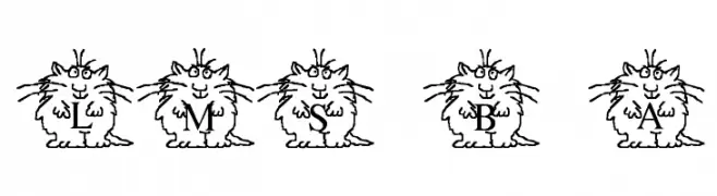
( London's Letters - www.londonsletters.com/ )
A playful font with letters inside cartoonish cat characters, perfect for creative projects.
![LMS Boyton Alphabet Frei Schriftart Herunterladen]() Herunterladen 61 Downloads@WebFont
Herunterladen 61 Downloads@WebFont -
( Fonts by Khurasan - Syaf Rizal - Personal-use only. For commercial use please contact owner. )
A playful, rounded font with smooth curves and a friendly appearance.
![Juice Avocado Frei Schriftart Herunterladen]() Herunterladen 61 Downloads@WebFont
Herunterladen 61 Downloads@WebFont -
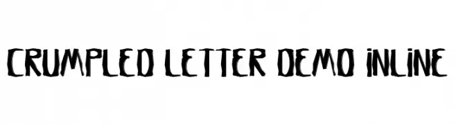
( Fonts by Noah Type - noahtype.com - Personal-use only. For commercial use please contact owner. )
A bold, crumpled, and artistic font with a hand-drawn, edgy style.
![Crumpled Letter Demo Inline Frei Schriftart Herunterladen]() Herunterladen 61 Downloads@WebFont
Herunterladen 61 Downloads@WebFont -
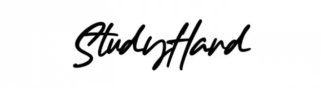
( Fonts by Gassstype )
Expressive handwritten script with energetic, slanted strokes.
![Study Hard Frei Schriftart Herunterladen]() Herunterladen 61 Downloads@WebFont
Herunterladen 61 Downloads@WebFont -
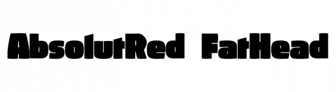
( Fonts by ingoFonts - Ingo Zimmermann - Personal-use only. For commercial use please contact owner. )
A bold, rounded font with thick, uniform letterforms ideal for impactful headlines.
![AbsolutRed-FatHead Frei Schriftart Herunterladen]() Herunterladen 61 Downloads@WebFont
Herunterladen 61 Downloads@WebFont -
( Fonts by Pia Frauss - Personal-use only. For commercial use please contact owner. )
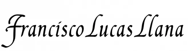
A classic and elegant script font with flowing, connected letterforms and medium contrast.
![FranciscoLucas Llana Frei Schriftart Herunterladen]() Herunterladen 61 Downloads@WebFont
Herunterladen 61 Downloads@WebFont -
( Fonts by Daniel Zadorozny - www.iconian.com - Personal-use only. For commercial use please contact owner. )
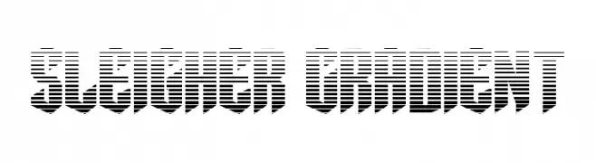
A bold, decorative font with a gradient effect and striped pattern for a modern look.
![Sleigher Gradient Frei Schriftart Herunterladen]() Herunterladen 61 Downloads@WebFont
Herunterladen 61 Downloads@WebFont -
( Fonts by BeeBasni - Personal-use only. For commercial use please contact owner. )
An elegant, flowing script font with ornate uppercase and smooth lowercase letters.
![amsterdune Frei Schriftart Herunterladen]() Herunterladen 61 Downloads@WebFont
Herunterladen 61 Downloads@WebFont -
( Fonts by Fontherapy - Siti Anisa - Personal-use only. For commercial use please contact owner. )
A playful, handwritten font with tall, narrow letters and smooth strokes.
![Gesture Frei Schriftart Herunterladen]() Herunterladen 61 Downloads@WebFont
Herunterladen 61 Downloads@WebFont


Welche Schriften sind gerade am populärsten?
Poppins, Roboto, Montserrat, Open Sans und Lato sind wegen ihrer klaren Formen und breiten Einsetzbarkeit sehr gefragt – von Markenauftritt über Landingpages bis hin zu Postern.
Welche Fonts eignen sich für Logos?
Geometrische Sans‑Serifs (z. B. Poppins, Familien im Gotham‑Stil) sind ein häufiger Griff für sauberes, skalierbares Branding. Für eine persönlichere Note bleiben Scripts und Handschrift‑Stile beliebt. Kombinieren Sie einen prägnanten Headline‑Font mit einer neutralen Brotschrift für Wiedererkennung und Harmonie.
Wie oft wird die Top‑Liste aktualisiert?
Regelmäßig – basierend auf realen Downloads und Interaktionen. Schauen Sie öfter vorbei, um aufstrebende Favoriten früh zu entdecken.
💡 Tipp: Seite bookmarken – Trends wechseln schnell, und heutige Top‑Schriften inspirieren morgen vielleicht das Rebranding.