Willkommen bei den Top‑Schriften – hier treffen Beliebtheit und Qualität aufeinander. Das sind die in diesem Jahr am häufigsten heruntergeladenen und genutzten Fonts. Wenn Sie sichere Optionen für Logo, Web oder Social suchen, starten Sie hier.
Jeder Top‑Font überzeugt durch Balance, Lesbarkeit und Vielseitigkeit. Sie finden moderne Sans‑Serifs, elegante Scripts, Vintage‑Serifs und minimalistische Displays.
-
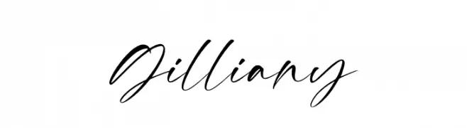
( Fonts by Pen Culture - Revo Farisky - Personal-use only. For commercial use please contact owner. )
A cursive, handwritten font with elegant, flowing strokes and medium contrast.
 Herunterladen 61 Downloads@WebFont
 -
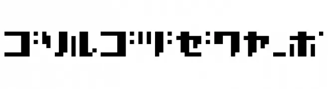
( BRIDGEco - bridgeco.jp/ )
A bold, pixelated font with a retro digital aesthetic.
![Bc.BMP07_K Frei Schriftart Herunterladen]() Herunterladen 61 Downloads@WebFont
Herunterladen 61 Downloads@WebFont -
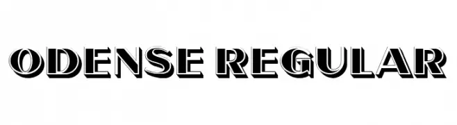
( Fonts by Vladimir Nikolic - www.creativefabrica.com/designer/vladimirnikolic/ - Personal-use only. For commercial use please contact owner. )
A bold, three-dimensional font with strong shadow effects and a vintage-inspired style.
![Odense Regular Frei Schriftart Herunterladen]() Herunterladen 61 Downloads@WebFont
Herunterladen 61 Downloads@WebFont -
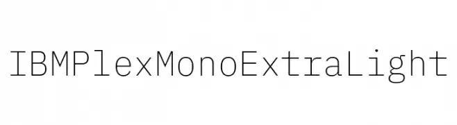
( Fonts by IBM )
A modern, monospaced font with an extra-light weight and geometric design.
![IBM Plex Mono ExtraLight Frei Schriftart Herunterladen]() Herunterladen 61 Downloads@WebFont
Herunterladen 61 Downloads@WebFont -
( Fonts by Manuel Ramos - www.infinitismo.com - Personal-use only. For commercial use please contact owner. )
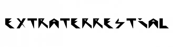
A bold, angular font with a futuristic, geometric design.
![Extraterrestial Frei Schriftart Herunterladen]() Herunterladen 61 Downloads@WebFont
Herunterladen 61 Downloads@WebFont -
( Fonts by Khurasan - Syaf Rizal - Personal-use only. For commercial use please contact owner. )
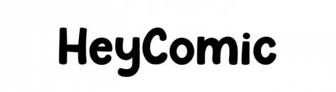
A playful, bold font with rounded edges and a hand-drawn style.
![Hey Comic Frei Schriftart Herunterladen]() Herunterladen 61 Downloads@WebFont
Herunterladen 61 Downloads@WebFont -
( Fonts by Kotak Kuning Studio - kotakkuning.com - Personal-use only. For commercial use please contact owner. )
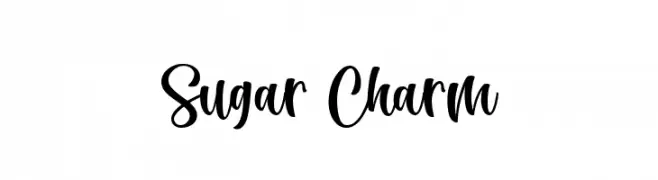
A bold, playful script font with a brush-like, handwritten style.
![Sugar Charm Frei Schriftart Herunterladen]() Herunterladen 61 Downloads@WebFont
Herunterladen 61 Downloads@WebFont -
( Fonts by Hanzel Space - Personal-use only. For commercial use please contact owner. )
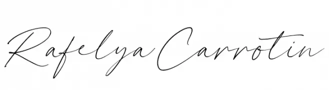
A flowing, cursive font with elegant, thin strokes and dynamic flair.
![Rafelya Carrotin Frei Schriftart Herunterladen]() Herunterladen 61 Downloads@WebFont
Herunterladen 61 Downloads@WebFont -
( Fonts by Stefani Letter - Stefani Tri Rosa - Personal-use only. For commercial use please contact owner. )
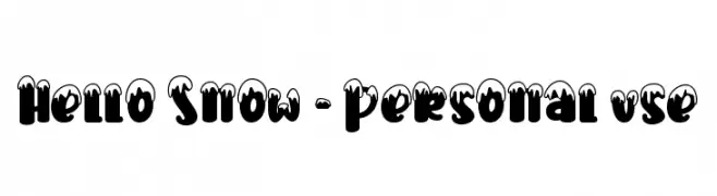
A bold, snow-capped decorative font perfect for festive designs.
![Hello Snow - Personal use Frei Schriftart Herunterladen]() Herunterladen 61 Downloads@WebFont
Herunterladen 61 Downloads@WebFont -
( Vladimir Nikolic - www.coroflot.com/vladimirnikolic )
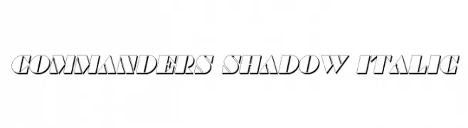
Bold, italicized font with a shadow effect for a dynamic, three-dimensional look.
![Commanders Shadow Italic Frei Schriftart Herunterladen]() Herunterladen 61 Downloads@WebFont
Herunterladen 61 Downloads@WebFont -
( Fonts by Vladimir Nikolic - https://www.creativefabrica.com/product/educated-deers/ref/144265/ - Personal-use only. For commercial use please contact owner. )
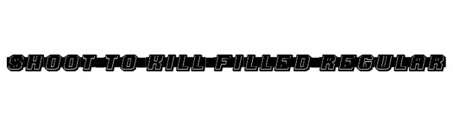
A bold, dynamic font with a three-dimensional effect and strong visual impact.
![Shoot to Kill Filled Regular Frei Schriftart Herunterladen]() Herunterladen 61 Downloads@WebFont
Herunterladen 61 Downloads@WebFont -
( Fonts by Vladimir Nikolic - www.creativefabrica.com/designer/vladimirnikolic/ - Personal-use only. For commercial use please contact owner. )
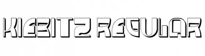
A bold, geometric font with a futuristic and dynamic style.
![Kiebitz Regular Frei Schriftart Herunterladen]() Herunterladen 61 Downloads@WebFont
Herunterladen 61 Downloads@WebFont -
( Fonts by Ænigma Fonts - Personal-use only. For commercial use please contact owner. )
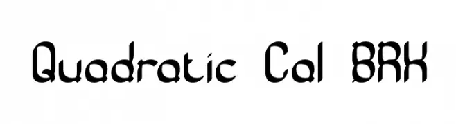
A bold, geometric font with a modern, futuristic style.
![Quadratic Cal BRK Frei Schriftart Herunterladen]() Herunterladen 61 Downloads@WebFont
Herunterladen 61 Downloads@WebFont -
( Fonts by Vladimir Nikolic - https://www.creativefabrica.com/product/educated-deers/ref/144265/ - Personal-use only. For commercial use please contact owner. )
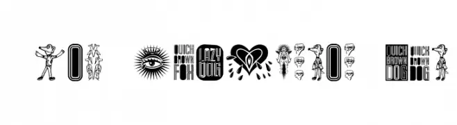
A decorative and artistic font with intricate illustrations and vintage tattoo art elements.
![The Quick Dog Regular Frei Schriftart Herunterladen]() Herunterladen 61 Downloads@WebFont
Herunterladen 61 Downloads@WebFont -
( Fonts by ShadowOnTheLoose )
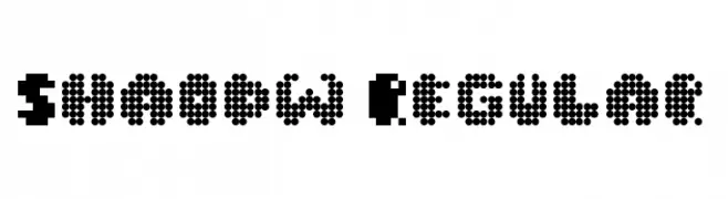
A pixelated, retro-style font with a bold, blocky appearance.
![Shaodw Regular Frei Schriftart Herunterladen]() Herunterladen 61 Downloads@WebFont
Herunterladen 61 Downloads@WebFont -
( Fonts by Akifatype Studio - Personal-use only. For commercial use please contact owner. )
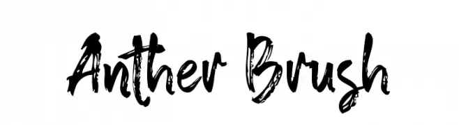
A bold, expressive brush-style font with dynamic strokes and a handcrafted appearance.
![Anther Brush Frei Schriftart Herunterladen]() Herunterladen 61 Downloads@WebFont
Herunterladen 61 Downloads@WebFont -
( Fonts by D&K Project - Degi Kurniawan - Personal-use only. For commercial use please contact owner. )
A bold, brushstroke-style font with an energetic and expressive appearance.
![brushield Italic Frei Schriftart Herunterladen]() Herunterladen 61 Downloads@WebFont
Herunterladen 61 Downloads@WebFont -
( Fonts by Hanzel Space - Personal-use only. For commercial use please contact owner. )
A graceful and sophisticated script font with dynamic contrast.
![Berdiolla Frei Schriftart Herunterladen]() Herunterladen 61 Downloads@WebFont
Herunterladen 61 Downloads@WebFont -
( Fonts by Pilcrowd )
A bold, handwritten-style font with a playful and dynamic appearance.
![Marvelous Rex Regular Frei Schriftart Herunterladen]() Herunterladen 61 Downloads@WebFont
Herunterladen 61 Downloads@WebFont -
( Noto is a trademark of Google Inc. Noto fonts are open source. All Noto fonts are published under the SIL Open Font License, Version 1.1 )
A modern, thin, condensed sans-serif font with a sleek and minimalistic design.
![Noto Sans Devanagari UI Condensed Thin Frei Schriftart Herunterladen]() Herunterladen 61 Downloads@WebFont
Herunterladen 61 Downloads@WebFont -
( Fonts by AminMario - Amin Mario - Personal-use only. For commercial use please contact owner. )
A dynamic and expressive handwritten font with fluid, cursive strokes.
![abrakadabra Frei Schriftart Herunterladen]() Herunterladen 61 Downloads@WebFont
Herunterladen 61 Downloads@WebFont -
( Fonts by Manuel Ramos - www.infinitismo.com - Personal-use only. For commercial use please contact owner. )
A sleek, light, and italicized font with a modern and elegant style.
![Exacta Light Italic Frei Schriftart Herunterladen]() Herunterladen 61 Downloads@WebFont
Herunterladen 61 Downloads@WebFont -
( Noto is a trademark of Google Inc. Noto fonts are open source. All Noto fonts are published under the SIL Open Font License, Version 1.1 )
A modern, condensed sans-serif font with an extra light weight.
![Noto Sans Display Condensed ExtraLight Frei Schriftart Herunterladen]() Herunterladen 61 Downloads@WebFont
Herunterladen 61 Downloads@WebFont -
( Fonts by Allouse Studio - Personal-use only. For commercial use please contact owner. )
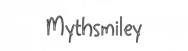
A playful, double-line font with a whimsical and lively appearance.
![Mythsmiley Frei Schriftart Herunterladen]() Herunterladen 61 Downloads@WebFont
Herunterladen 61 Downloads@WebFont -
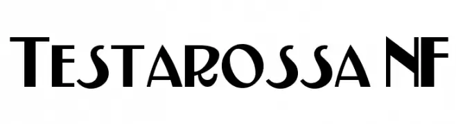
( Fonts by Nick Curtis - Personal-use only. For commercial use please contact owner. )
A bold, geometric font with sharp angles and smooth curves, ideal for modern designs.
![Testarossa NF Frei Schriftart Herunterladen]() Herunterladen 61 Downloads@WebFont
Herunterladen 61 Downloads@WebFont -
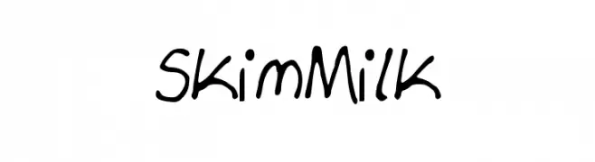
( Fonts by milkywayfonts - Personal-use only. For commercial use please contact owner. )
A playful, handwritten font with irregular, whimsical strokes.
![Skim_Milk Frei Schriftart Herunterladen]() Herunterladen 61 Downloads@WebFont
Herunterladen 61 Downloads@WebFont -
( Fonts by Geronimo Fonts - Personal-use only. For commercial use please contact owner. )
A playful, handwritten font with tall, narrow letters and a whimsical style.
![sundrop Frei Schriftart Herunterladen]() Herunterladen 61 Downloads@WebFont
Herunterladen 61 Downloads@WebFont -
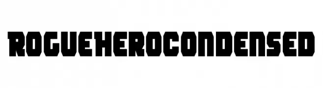
( Fonts by Iconian Fonts - Daniel Zadorozny - Personal-use only. For commercial use please contact owner. )
A bold, geometric, and condensed font with a modern style.
![Rogue Hero Condensed Frei Schriftart Herunterladen]() Herunterladen 61 Downloads@WebFont
Herunterladen 61 Downloads@WebFont -
( Fonts by Sabrcreative - Personal-use only. For commercial use please contact owner. )
A bold, outlined, italic font with a modern and dynamic style.
![Bonaro Outline Italic Demo Outline Italic Frei Schriftart Herunterladen]() Herunterladen 61 Downloads@WebFont
Herunterladen 61 Downloads@WebFont -
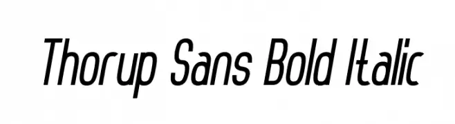
( Dan Thorup - www.danthorup.dk )
A bold, italicized sans-serif font with a modern and sleek design.
![Thorup Sans Bold Italic Frei Schriftart Herunterladen]() Herunterladen 61 Downloads@WebFont
Herunterladen 61 Downloads@WebFont -
( Noto is a trademark of Google Inc. Noto fonts are open source. All Noto fonts are published under the SIL Open Font License, Version 1.1 )
A bold, condensed serif typeface with strong, impactful characters.
![Noto Serif Tamil Condensed ExtraBold Frei Schriftart Herunterladen]() Herunterladen 61 Downloads@WebFont
Herunterladen 61 Downloads@WebFont -
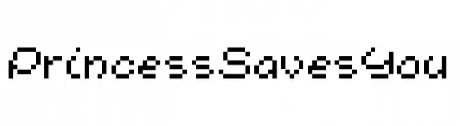
( Fonts by www.chequered.ink - Chequered Ink - Personal-use only. For commercial use please contact owner. )
A pixelated, retro-style font inspired by early video game graphics.
![Princess Saves You Frei Schriftart Herunterladen]() Herunterladen 61 Downloads@WebFont
Herunterladen 61 Downloads@WebFont -
( Fonts by Din Studio - Donis Miftahudin - Personal-use only. For commercial use please contact owner. )
A bold, playful script font with a modern, handwritten feel.
![Sweet Fig Personal Use Frei Schriftart Herunterladen]() Herunterladen 61 Downloads@WebFont
Herunterladen 61 Downloads@WebFont -
( Fonts by Kong Font - Personal-use only. For commercial use please contact owner. )
An elegant italic typeface with flowing, cursive design and distinctive swashes.
![Bricktown Italic Frei Schriftart Herunterladen]() Herunterladen 61 Downloads@WebFont
Herunterladen 61 Downloads@WebFont -
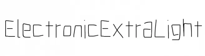
( Fonts by CannotIntoSpaceFonts - KineticPlasma Fonts - Personal-use only. For commercial use please contact owner. )
A minimalist, geometric font with thin lines and a modern, digital aesthetic.
![Electronic ExtraLight Frei Schriftart Herunterladen]() Herunterladen 61 Downloads@WebFont
Herunterladen 61 Downloads@WebFont


Welche Schriften sind gerade am populärsten?
Poppins, Roboto, Montserrat, Open Sans und Lato sind wegen ihrer klaren Formen und breiten Einsetzbarkeit sehr gefragt – von Markenauftritt über Landingpages bis hin zu Postern.
Welche Fonts eignen sich für Logos?
Geometrische Sans‑Serifs (z. B. Poppins, Familien im Gotham‑Stil) sind ein häufiger Griff für sauberes, skalierbares Branding. Für eine persönlichere Note bleiben Scripts und Handschrift‑Stile beliebt. Kombinieren Sie einen prägnanten Headline‑Font mit einer neutralen Brotschrift für Wiedererkennung und Harmonie.
Wie oft wird die Top‑Liste aktualisiert?
Regelmäßig – basierend auf realen Downloads und Interaktionen. Schauen Sie öfter vorbei, um aufstrebende Favoriten früh zu entdecken.
💡 Tipp: Seite bookmarken – Trends wechseln schnell, und heutige Top‑Schriften inspirieren morgen vielleicht das Rebranding.