Willkommen bei den Top‑Schriften – hier treffen Beliebtheit und Qualität aufeinander. Das sind die in diesem Jahr am häufigsten heruntergeladenen und genutzten Fonts. Wenn Sie sichere Optionen für Logo, Web oder Social suchen, starten Sie hier.
Jeder Top‑Font überzeugt durch Balance, Lesbarkeit und Vielseitigkeit. Sie finden moderne Sans‑Serifs, elegante Scripts, Vintage‑Serifs und minimalistische Displays.
-
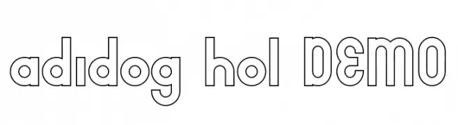
( Fonts by nariswari_creative - Taufik Dwi Purnomo - Personal-use only. For commercial use please contact owner. )
A bold, geometric outlined font with a modern and playful style.
 Herunterladen 61 Downloads@WebFont
 -
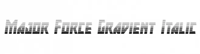
( Fonts by Iconian Fonts )
A bold, gradient-striped italic font with a modern, dynamic style.
![Major Force Gradient Italic Frei Schriftart Herunterladen]() Herunterladen 61 Downloads@WebFont
Herunterladen 61 Downloads@WebFont -
( Fonts by greataris - Agung Aris - Personal-use only. For commercial use please contact owner. )
A playful, handwritten font with rounded edges and a casual style.
![Cuties Caps Frei Schriftart Herunterladen]() Herunterladen 61 Downloads@WebFont
Herunterladen 61 Downloads@WebFont -
( Fonts by Vunira Design - Personal-use only. For commercial use please contact owner. )
A playful, bold font with rounded edges and a whimsical touch.
![MellifluousFREE Frei Schriftart Herunterladen]() Herunterladen 61 Downloads@WebFont
Herunterladen 61 Downloads@WebFont -
( Fonts by nendi emelia - pratiwi emelia - Personal-use only. For commercial use please contact owner. )
A bold, geometric sans-serif font with clean lines and modern appeal.
![NENDI Frei Schriftart Herunterladen]() Herunterladen 61 Downloads@WebFont
Herunterladen 61 Downloads@WebFont -
( Fonts by Boris Garic - Personal-use only. For commercial use please contact owner. )
A bold, expressive handwritten font with brush-like strokes.
![Bosk Frei Schriftart Herunterladen]() Herunterladen 61 Downloads@WebFont
Herunterladen 61 Downloads@WebFont -
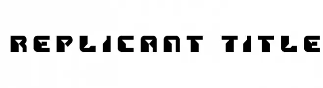
( Iconian Fonts - Daniel Zadorozny - www.iconian.com )
A bold, futuristic font with geometric shapes and sharp angles.
![Replicant Title Frei Schriftart Herunterladen]() Herunterladen 61 Downloads@WebFont
Herunterladen 61 Downloads@WebFont -
( Samson Tennela - www.flyingpens.com )
A playful, casual handwritten font with irregular strokes.
![SamT Frei Schriftart Herunterladen]() Herunterladen 61 Downloads@WebFont
Herunterladen 61 Downloads@WebFont -
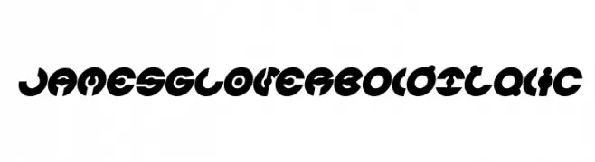
( weknow - Wino S Kadir - www.creativefabrica.com/designer/weknow/ )
A bold, italic, futuristic font with geometric cutouts and rounded shapes.
![JAMES GLOVER Bold Italic Frei Schriftart Herunterladen]() Herunterladen 61 Downloads@WebFont
Herunterladen 61 Downloads@WebFont -
( GeelynEdits - plus.google.com/u/0/108461348931992643310/ )
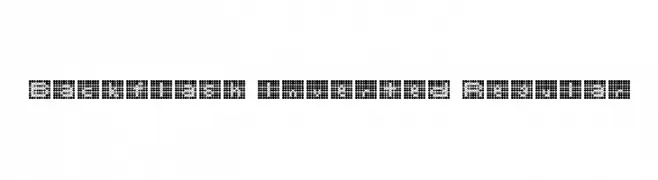
A pixelated, dot-based font with a retro digital aesthetic.
![Backflash Inverted Regular Frei Schriftart Herunterladen]() Herunterladen 61 Downloads@WebFont
Herunterladen 61 Downloads@WebFont -
( Fonts by Vunira Design - Personal-use only. For commercial use please contact owner. )
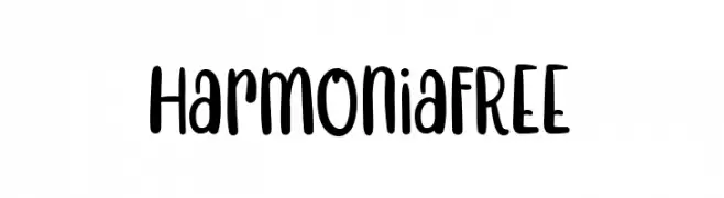
A playful, casual handwritten font with rounded, smooth letterforms.
![HarmoniaFREE Frei Schriftart Herunterladen]() Herunterladen 61 Downloads@WebFont
Herunterladen 61 Downloads@WebFont -
( Ana - www.anasfonts.com/ )
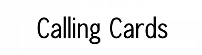
A clean, modern sans-serif font with balanced proportions and high legibility.
![Calling Cards Frei Schriftart Herunterladen]() Herunterladen 61 Downloads@WebFont
Herunterladen 61 Downloads@WebFont -
( Fonts by Wahyu & Sani Co. )
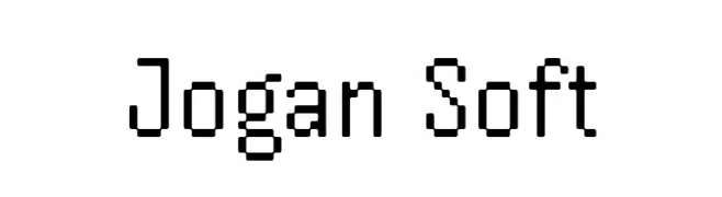
A pixelated, monospaced font with a retro digital aesthetic.
![Jogan Soft Frei Schriftart Herunterladen]() Herunterladen 61 Downloads@WebFont
Herunterladen 61 Downloads@WebFont -
( Fonts by Allouse Studio - Personal-use only. For commercial use please contact owner. )
A charming script font with elegant, flowing lines and smooth curves.
![Ancukaseyo Demo Version Frei Schriftart Herunterladen]() Herunterladen 61 Downloads@WebFont
Herunterladen 61 Downloads@WebFont -
( Fonts by bey Design - Personal-use only. For commercial use please contact owner. )
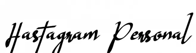
A dynamic, cursive script font with fluid, expressive strokes.
![Hastagram Personal Frei Schriftart Herunterladen]() Herunterladen 61 Downloads@WebFont
Herunterladen 61 Downloads@WebFont -
( Debut Studio - Ari Fadli - creativemarket.com/debutstudio )
A bold, flowing script font with dynamic, elegant strokes.
![Nichole Script Frei Schriftart Herunterladen]() Herunterladen 61 Downloads@WebFont
Herunterladen 61 Downloads@WebFont -
( Iconian Fonts - Daniel Zadorozny - www.iconian.com )
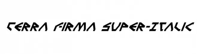
A bold, angular, and italicized font with a futuristic design.
![Terra Firma Super-Italic Frei Schriftart Herunterladen]() Herunterladen 61 Downloads@WebFont
Herunterladen 61 Downloads@WebFont -
( weknow - Wino S Kadir - www.creativefabrica.com/designer/weknow/ )
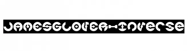
A bold, geometric font with medium contrast and a futuristic, decorative style.
![JAMES GLOVER-Inverse Frei Schriftart Herunterladen]() Herunterladen 61 Downloads@WebFont
Herunterladen 61 Downloads@WebFont -
( Fonts by Nick Curtis - Personal-use only. For commercial use please contact owner. )
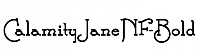
A bold, decorative font with vintage and western influences.
![CalamityJaneNF-Bold Frei Schriftart Herunterladen]() Herunterladen 61 Downloads@WebFont
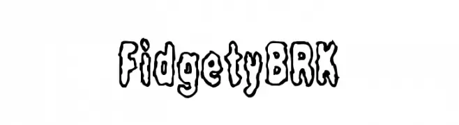
Herunterladen 61 Downloads@WebFont -
![Fidgety BRK Frei Schriftart Herunterladen]() Herunterladen 61 Downloads@WebFont
Herunterladen 61 Downloads@WebFont -
( Fonts by Bexxtype - Personal-use only. For commercial use please contact owner. )
A graceful and elegant script font with flowing cursive letterforms.
![chetlie Frei Schriftart Herunterladen]() Herunterladen 61 Downloads@WebFont
Herunterladen 61 Downloads@WebFont -
( Fonts by Creavora Studio - Personal-use only. For commercial use please contact owner. )
A modern serif font with elegant, refined letterforms and balanced proportions.
![Moetya Frei Schriftart Herunterladen]() Herunterladen 61 Downloads@WebFont
Herunterladen 61 Downloads@WebFont -
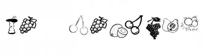
( Fonts by Kat`s Fun Fonts - Personal-use only. For commercial use please contact owner. )
Hand-drawn fruit illustrations replace letters and numbers.
![KR Fruitsy Frei Schriftart Herunterladen]() Herunterladen 61 Downloads@WebFont
Herunterladen 61 Downloads@WebFont -
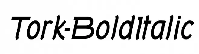
( Fonts by Typodermic Fonts - Raymond Larabie - Personal-use only. For commercial use please contact owner. )
A bold, italicized font with dynamic, slanted letterforms and strong visual impact.
![Tork-BoldItalic Frei Schriftart Herunterladen]() Herunterladen 61 Downloads@WebFont
Herunterladen 61 Downloads@WebFont -
( memesbruh03 - Aaron D. Chand )
A geometric, blocky font with a digital, pixelated style.
![Cutouts Frei Schriftart Herunterladen]() Herunterladen 61 Downloads@WebFont
Herunterladen 61 Downloads@WebFont -
( Fonts by Creavora Studio - Personal-use only. For commercial use please contact owner. )
A bold, high-contrast serif font with dramatic strokes and elegant serifs.
![Riglia Frei Schriftart Herunterladen]() Herunterladen 61 Downloads@WebFont
Herunterladen 61 Downloads@WebFont -
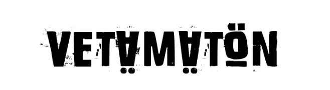
( Fonts by www.junkohanhero.com - Personal-use only. For commercial use please contact owner. )
A bold, distressed font with a rugged, vintage appearance.
![Vetämätön Frei Schriftart Herunterladen]() Herunterladen 61 Downloads@WebFont
Herunterladen 61 Downloads@WebFont -
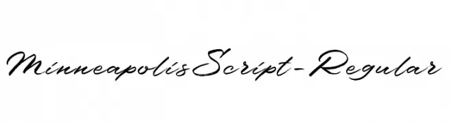
( Fonts by Debut Studio - Ari Fadli - Personal-use only. For commercial use please contact owner. )
A fluid and graceful script font with interconnected cursive letters.
![MinneapolisScript-Regular Frei Schriftart Herunterladen]() Herunterladen 61 Downloads@WebFont
Herunterladen 61 Downloads@WebFont -
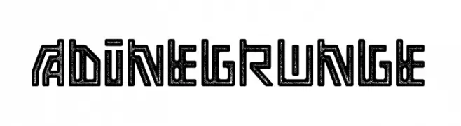
( Fonts by Faqih Fawaji - Personal-use only. For commercial use please contact owner. )
A bold, geometric font with a grunge texture and industrial style.
![Adine grunge Frei Schriftart Herunterladen]() Herunterladen 61 Downloads@WebFont
Herunterladen 61 Downloads@WebFont -
( Font Environment - www.fontenvironment.com/ )
The image shows currency designs, not a font.
![Mo Money Frei Schriftart Herunterladen]() Herunterladen 61 Downloads@WebFont
Herunterladen 61 Downloads@WebFont -
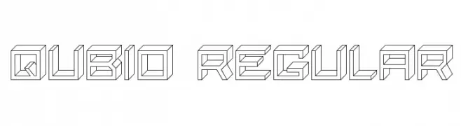
( Fonts by vladimirnikolic - Personal-use only. For commercial use please contact owner. )
A geometric, 3D block-style font with a modern and futuristic look.
![Qubio Regular Frei Schriftart Herunterladen]() Herunterladen 61 Downloads@WebFont
Herunterladen 61 Downloads@WebFont -
( Fonts by Dikas Studio - Andika Setiawan - Personal-use only. For commercial use please contact owner. )
A playful and whimsical font with rounded, consistent letterforms.
![LD Cherries Light Frei Schriftart Herunterladen]() Herunterladen 61 Downloads@WebFont
Herunterladen 61 Downloads@WebFont -
( Fonts by Letterara - Thomas Aradea - Personal-use only. For commercial use please contact owner. )
A bold, playful handwritten font with thick strokes and rounded edges.
![Heal The World Frei Schriftart Herunterladen]() Herunterladen 61 Downloads@WebFont
Herunterladen 61 Downloads@WebFont -
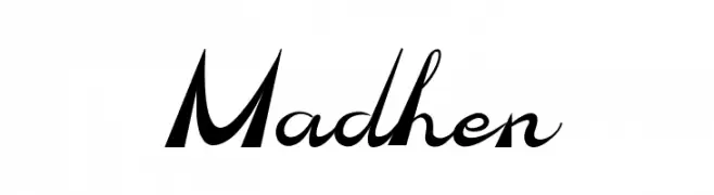
( Fonts by PutraCetol Studio - www.putracetol.com - Personal-use only. For commercial use please contact owner. )
A dynamic and energetic font with bold, slanted uppercase and fluid, cursive lowercase letters.
![Madhen Frei Schriftart Herunterladen]() Herunterladen 61 Downloads@WebFont
Herunterladen 61 Downloads@WebFont -
( Fonts by bey Design - Personal-use only. For commercial use please contact owner. )
A bold, playful script font with a handwritten feel.
![Playstick Frei Schriftart Herunterladen]() Herunterladen 61 Downloads@WebFont
Herunterladen 61 Downloads@WebFont


Welche Schriften sind gerade am populärsten?
Poppins, Roboto, Montserrat, Open Sans und Lato sind wegen ihrer klaren Formen und breiten Einsetzbarkeit sehr gefragt – von Markenauftritt über Landingpages bis hin zu Postern.
Welche Fonts eignen sich für Logos?
Geometrische Sans‑Serifs (z. B. Poppins, Familien im Gotham‑Stil) sind ein häufiger Griff für sauberes, skalierbares Branding. Für eine persönlichere Note bleiben Scripts und Handschrift‑Stile beliebt. Kombinieren Sie einen prägnanten Headline‑Font mit einer neutralen Brotschrift für Wiedererkennung und Harmonie.
Wie oft wird die Top‑Liste aktualisiert?
Regelmäßig – basierend auf realen Downloads und Interaktionen. Schauen Sie öfter vorbei, um aufstrebende Favoriten früh zu entdecken.
💡 Tipp: Seite bookmarken – Trends wechseln schnell, und heutige Top‑Schriften inspirieren morgen vielleicht das Rebranding.