Willkommen bei den Top‑Schriften – hier treffen Beliebtheit und Qualität aufeinander. Das sind die in diesem Jahr am häufigsten heruntergeladenen und genutzten Fonts. Wenn Sie sichere Optionen für Logo, Web oder Social suchen, starten Sie hier.
Jeder Top‑Font überzeugt durch Balance, Lesbarkeit und Vielseitigkeit. Sie finden moderne Sans‑Serifs, elegante Scripts, Vintage‑Serifs und minimalistische Displays.
-
( Fonts by Rodrigo German - RASDESIGN )
A bold, block-like font with a vintage athletic feel.
 Herunterladen 1615 Downloads@WebFont
 -
( Fonts by Castcraft Software - opti.netii.net - check the website before use )
A playful, handwritten font with smooth curves and a friendly appearance.
![ClarkOpti-Light Frei Schriftart Herunterladen]() Herunterladen 1614 Downloads@WebFont
Herunterladen 1614 Downloads@WebFont -
( Copyright 2017 The Exo Project Authors (https://github.com/NDISCOVER/Exo-1.0) )
A modern, geometric font with clean lines and a futuristic feel.
![Exo ExtraLight Frei Schriftart Herunterladen]() Herunterladen 1614 Downloads@WebFont
Herunterladen 1614 Downloads@WebFont -
![Serif12Beta-Regular Frei Schriftart Herunterladen]() Herunterladen 1614 Downloads@WebFont
Herunterladen 1614 Downloads@WebFont -
![JGJ Dürer Gothic Frei Schriftart Herunterladen]() Herunterladen 1614 Downloads@WebFont
Herunterladen 1614 Downloads@WebFont -
![FunkyFresh Frei Schriftart Herunterladen]() Herunterladen 1614 Downloads@WebFont
Herunterladen 1614 Downloads@WebFont -
( Fonts by MJType )
A playful, rounded font with a hand-drawn feel, ideal for casual designs.
![Milk Cream Frei Schriftart Herunterladen]() Herunterladen 1613 Downloads@WebFont
Herunterladen 1613 Downloads@WebFont -
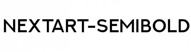
( Alexander Pravdin )
A modern sans-serif font with semi-bold weight and medium contrast.
![NEXTART-SemiBold Frei Schriftart Herunterladen]() Herunterladen 1613 Downloads@WebFont
Herunterladen 1613 Downloads@WebFont -
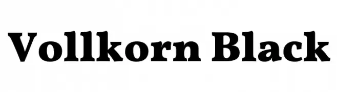
( Copyright 2017 The Vollkorn Project Authors (https://github.com/FAlthausen/Vollkorn-Typeface) )
A bold, robust serif font with strong strokes and elegant curves.
![Vollkorn Black Frei Schriftart Herunterladen]() Herunterladen 1613 Downloads@WebFont
Herunterladen 1613 Downloads@WebFont -
( Fonts by Otto Maurer Design )
A whimsical, hand-drawn font with curly embellishments and dynamic strokes.
![Corps-Script Frei Schriftart Herunterladen]() Herunterladen 1613 Downloads@WebFont
Herunterladen 1613 Downloads@WebFont -
![2006 Team Frei Schriftart Herunterladen]() Herunterladen 1613 Downloads@WebFont
Herunterladen 1613 Downloads@WebFont -
![BR Thorns Frei Schriftart Herunterladen]() Herunterladen 1613 Downloads@WebFont
Herunterladen 1613 Downloads@WebFont -
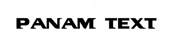
( Fonts by Graham Meade - GemFonts )
A bold, geometric font with a modern and impactful design.
![PanAm Text Frei Schriftart Herunterladen]() Herunterladen 1613 Downloads@WebFont
Herunterladen 1613 Downloads@WebFont -
( Fonts by fabiandesmet.com )
A refined stencil serif font with ultra-light strokes and modern elegance.
![ButlerStencil-UltraLight Frei Schriftart Herunterladen]() Herunterladen 1612 Downloads@WebFont
Herunterladen 1612 Downloads@WebFont -
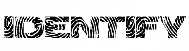
( Fonts by a Max Infeld - XEROGRAPHER FONTS - xerographer.blogspot.com . Personal-use only. For commercial use please contact owner. )
A bold, decorative font with a textured, diagonal line pattern.
![identify Frei Schriftart Herunterladen]() Herunterladen 1612 Downloads@WebFont
Herunterladen 1612 Downloads@WebFont -
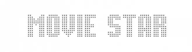
( Fonts by Jonathan Paterson )
A decorative font made of star shapes, perfect for glamorous and theatrical designs.
![Movie Star Frei Schriftart Herunterladen]() Herunterladen 1612 Downloads@WebFont
Herunterladen 1612 Downloads@WebFont -
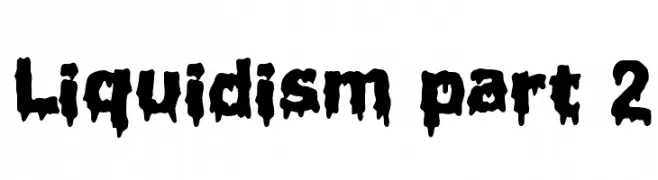
( Fonts by Jacob Fisher - www.pizzadude.dk )
A bold, liquid-like font with a dripping, playful style.
![Liquidism part 2 Frei Schriftart Herunterladen]() Herunterladen 1612 Downloads@WebFont
Herunterladen 1612 Downloads@WebFont -
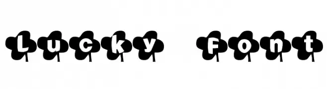
![Lucky Font Frei Schriftart Herunterladen]() Herunterladen 1612 Downloads@WebFont
Herunterladen 1612 Downloads@WebFont -
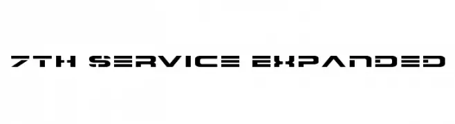
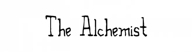
( Fonts by Daniel Zadorozny - www.iconian.com )
A bold, futuristic font with geometric and technical design elements.
![7th Service Expanded Frei Schriftart Herunterladen]() Herunterladen 1612 Downloads@WebFont
Herunterladen 1612 Downloads@WebFont -
![The Alchemist Frei Schriftart Herunterladen]() Herunterladen 1612 Downloads@WebFont
Herunterladen 1612 Downloads@WebFont -
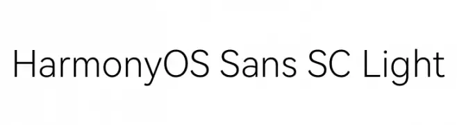
( Fonts by huawei.com - Personal-use only. For commercial use please contact owner. )
A modern, light sans-serif font with clean lines and excellent readability.
![HarmonyOS Sans SC Light Frei Schriftart Herunterladen]() Herunterladen 1611 Downloads@WebFont
Herunterladen 1611 Downloads@WebFont -
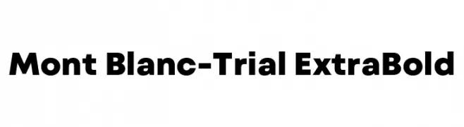
( Fonts by Fontfabric - Svetoslav Simov - Personal-use only. For commercial use please contact owner. )
A bold, modern sans-serif font with strong, consistent strokes.
![Mont Blanc-Trial ExtraBold Frei Schriftart Herunterladen]() Herunterladen 1611 Downloads@WebFont
Herunterladen 1611 Downloads@WebFont -
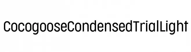
( Zetafonts - www.zetafonts.com )
A modern, condensed sans-serif font with a light weight and geometric design.
![Cocogoose Condensed Trial Light Frei Schriftart Herunterladen]() Herunterladen 1611 Downloads@WebFont
Herunterladen 1611 Downloads@WebFont -
( Khurasan - Syaf Rizal - creativemarket.com/khurasan?u=khurasan )
A cursive, handwritten font with elegant, flowing strokes.
![Apalu Frei Schriftart Herunterladen]() Herunterladen 1611 Downloads@WebFont
Herunterladen 1611 Downloads@WebFont -
Schriftart von spideraysfonts. For commercial use please contact the owner.
![ALCATRAZ Frei Schriftart Herunterladen]() Herunterladen 1611 Downloads@WebFont
Herunterladen 1611 Downloads@WebFont -
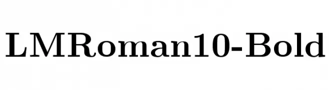
( Fonts by www.gust.org.pl )
A bold, classic serif font with strong strokes and elegant curves.
![LMRoman10-Bold Frei Schriftart Herunterladen]() Herunterladen 1611 Downloads@WebFont
Herunterladen 1611 Downloads@WebFont -
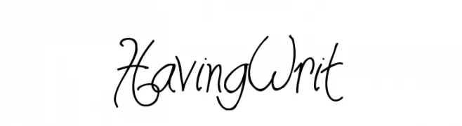
![HavingWrit Frei Schriftart Herunterladen]() Herunterladen 1611 Downloads@WebFont
Herunterladen 1611 Downloads@WebFont -
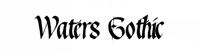
![Waters Gothic Frei Schriftart Herunterladen]() Herunterladen 1611 Downloads@WebFont
Herunterladen 1611 Downloads@WebFont -
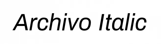
( Copyright 2016 The Archivo Project Authors (omnibus.type@gmail.com) )
A modern, italicized sans-serif font with clean lines and consistent stroke width.
![Archivo Italic Frei Schriftart Herunterladen]() Herunterladen 1610 Downloads@WebFont
Herunterladen 1610 Downloads@WebFont -
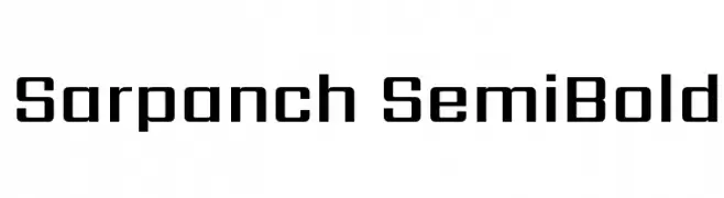
( Copyright (c) 2014, Indian Type Foundry (info@indiantypefoundry.com). )
A modern, semi-bold font with geometric and structured characteristics.
![Sarpanch SemiBold Frei Schriftart Herunterladen]() Herunterladen 1610 Downloads@WebFont
Herunterladen 1610 Downloads@WebFont -
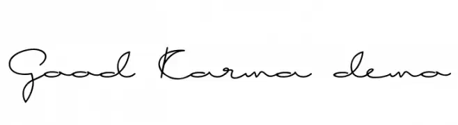
( Fonts by Roland Huse - rolandhuse.com )
A cursive, handwritten-style font with elegant loops and fluid connections.
![Good Karma demo Frei Schriftart Herunterladen]() Herunterladen 1610 Downloads@WebFont
Herunterladen 1610 Downloads@WebFont -
( SDFonts. http://www.angelfire.com/scifi2/sdfonts/index.html )
A bold, modern font with geometric cuts and high contrast.
![Progressiva Frei Schriftart Herunterladen]() Herunterladen 1610 Downloads@WebFont
Herunterladen 1610 Downloads@WebFont -
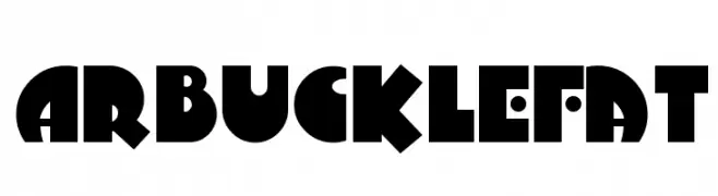
( Fonts by Nick Curtis - www.nicksfonts.com )
A bold, playful typeface with geometric and rounded shapes.
![ArbuckleFat Frei Schriftart Herunterladen]() Herunterladen 1610 Downloads
Herunterladen 1610 Downloads -
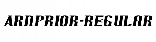
![Arnprior-Regular Frei Schriftart Herunterladen]() Herunterladen 1610 Downloads@WebFont
Herunterladen 1610 Downloads@WebFont -
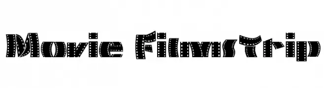
( Fonts by Galdino Otten - galdinootten.com )
A bold, decorative font styled like a filmstrip, perfect for cinematic themes.
![Movie Filmstrip Frei Schriftart Herunterladen]() Herunterladen 1610 Downloads@WebFont
Herunterladen 1610 Downloads@WebFont


Welche Schriften sind gerade am populärsten?
Poppins, Roboto, Montserrat, Open Sans und Lato sind wegen ihrer klaren Formen und breiten Einsetzbarkeit sehr gefragt – von Markenauftritt über Landingpages bis hin zu Postern.
Welche Fonts eignen sich für Logos?
Geometrische Sans‑Serifs (z. B. Poppins, Familien im Gotham‑Stil) sind ein häufiger Griff für sauberes, skalierbares Branding. Für eine persönlichere Note bleiben Scripts und Handschrift‑Stile beliebt. Kombinieren Sie einen prägnanten Headline‑Font mit einer neutralen Brotschrift für Wiedererkennung und Harmonie.
Wie oft wird die Top‑Liste aktualisiert?
Regelmäßig – basierend auf realen Downloads und Interaktionen. Schauen Sie öfter vorbei, um aufstrebende Favoriten früh zu entdecken.
💡 Tipp: Seite bookmarken – Trends wechseln schnell, und heutige Top‑Schriften inspirieren morgen vielleicht das Rebranding.