Willkommen bei den Top‑Schriften – hier treffen Beliebtheit und Qualität aufeinander. Das sind die in diesem Jahr am häufigsten heruntergeladenen und genutzten Fonts. Wenn Sie sichere Optionen für Logo, Web oder Social suchen, starten Sie hier.
Jeder Top‑Font überzeugt durch Balance, Lesbarkeit und Vielseitigkeit. Sie finden moderne Sans‑Serifs, elegante Scripts, Vintage‑Serifs und minimalistische Displays.
-
( Fonts by Digital Graphics Labs - www.digitalgraphiclabs.com )
A bold, geometric font with sharp angles and an outlined, futuristic design.
 Herunterladen 1582 Downloads@WebFont
 -
![Waters Gothic Frei Schriftart Herunterladen]() Herunterladen 1582 Downloads@WebFont
Herunterladen 1582 Downloads@WebFont -
![Cocktail Frei Schriftart Herunterladen]() Herunterladen 1582 Downloads@WebFont
Herunterladen 1582 Downloads@WebFont -
( Fonts by Typologic - Fadiel Muhammad - Personal-use only. For commercial use please contact owner. )
A bold, modern font with geometric precision and strong visual impact.
![Armstrong Extrabold Frei Schriftart Herunterladen]() Herunterladen 1581 Downloads@WebFont
Herunterladen 1581 Downloads@WebFont -
( Fonts by Omnibus Type )
A bold, modern font with a friendly and dynamic style.
![Sansita Medium Frei Schriftart Herunterladen]() Herunterladen 1581 Downloads@WebFont
Herunterladen 1581 Downloads@WebFont -
( Lukas Gerber - www.lukas-gerber.ch/ )
A bold, high-contrast stencil-style font with dramatic and artistic flair.
![FEMORALIS Regular Frei Schriftart Herunterladen]() Herunterladen 1581 Downloads@WebFont
Herunterladen 1581 Downloads@WebFont -
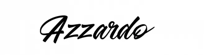
( Haris Purnama - creativemarket.com/RitsType )
A dynamic and flowing script font with elegant, cursive letterforms.
![Azzardo Frei Schriftart Herunterladen]() Herunterladen 1581 Downloads@WebFont
Herunterladen 1581 Downloads@WebFont -
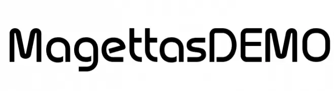
( Fonts by www.studiotypo.com - Personal-use only. For commercial use please contact owner. )
A modern, geometric font with smooth, rounded edges and balanced spacing.
![Magettas DEMO Frei Schriftart Herunterladen]() Herunterladen 1581 Downloads@WebFont
Herunterladen 1581 Downloads@WebFont -
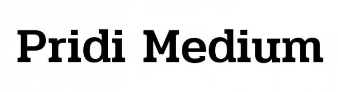
( Copyright (c) 2015, Cadson Demak (info@cadsondemak.com) )
A modern, clean font with a friendly and approachable design.
![Pridi Medium Frei Schriftart Herunterladen]() Herunterladen 1581 Downloads@WebFont
Herunterladen 1581 Downloads@WebFont -
( Copyright (c) 2014, Indian Type Foundry (info@indiantypefoundry.com). )
A modern, geometric sans-serif font with a clean and compact design.
![Khand Frei Schriftart Herunterladen]() Herunterladen 1581 Downloads@WebFont
Herunterladen 1581 Downloads@WebFont -
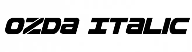
( Fonts by Daniel Zadorozny - www.iconian.com )
A bold, italicized font with a futuristic and dynamic style.
![Ozda Italic Frei Schriftart Herunterladen]() Herunterladen 1581 Downloads@WebFont
Herunterladen 1581 Downloads@WebFont -
( Fonts by www.gust.org.pl )
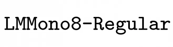
A monospaced slab serif font with uniform width and consistent stroke weight.
![LMMono8-Regular Frei Schriftart Herunterladen]() Herunterladen 1581 Downloads@WebFont
Herunterladen 1581 Downloads@WebFont -
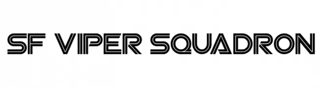
![SF Viper Squadron Frei Schriftart Herunterladen]() Herunterladen 1581 Downloads@WebFont
Herunterladen 1581 Downloads@WebFont -
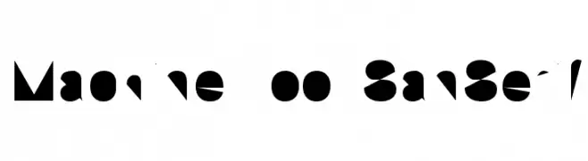
![Machine Tool SanSerif Frei Schriftart Herunterladen]() Herunterladen 1581 Downloads
Herunterladen 1581 Downloads -
( Fonts by Apostrophic Lab )
A sophisticated serif font with a blend of classic and modern elements.
![Amerika Alternates Frei Schriftart Herunterladen]() Herunterladen 1581 Downloads@WebFont
Herunterladen 1581 Downloads@WebFont -
( Kyle Hathcoat )
A bold, rounded font with a modern and friendly appearance.
![Bracheos Frei Schriftart Herunterladen]() Herunterladen 1580 Downloads@WebFont
Herunterladen 1580 Downloads@WebFont -
( Fonts by junkohanhero )
A bold, distressed font with a rugged, vintage look.
![Gsubadaslowly Frei Schriftart Herunterladen]() Herunterladen 1580 Downloads@WebFont
Herunterladen 1580 Downloads@WebFont -
( Fonts by Arkandis Digital Foundry )
A bold, italic serif font with a modern and dynamic style.
![TribunADFStd-BoldCondItalic Frei Schriftart Herunterladen]() Herunterladen 1580 Downloads@WebFont
Herunterladen 1580 Downloads@WebFont -
( Fonts by www.gust.org.pl )
A clean, modern sans-serif font with excellent readability and balance.
![LMSans10-Regular Frei Schriftart Herunterladen]() Herunterladen 1580 Downloads@WebFont
Herunterladen 1580 Downloads@WebFont -
![Sira Frei Schriftart Herunterladen]() Herunterladen 1580 Downloads@WebFont
Herunterladen 1580 Downloads@WebFont -
![Eccentric Bold Frei Schriftart Herunterladen]() Herunterladen 1580 Downloads@WebFont
Herunterladen 1580 Downloads@WebFont -
( Fonts by Rich Gast - www.greywolfwebworks.com Sponsoren Schriftart )
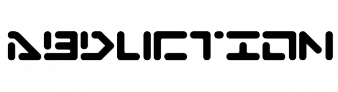
A futuristic, geometric font with bold, rounded shapes and cut-out sections.
![Abduction Frei Schriftart Herunterladen]() Herunterladen 1580 Downloads
Herunterladen 1580 Downloads -
( Personal-use only. For commercial use please contact owner. )
A modern, semi-bold sans-serif font with clean lines and balanced proportions.
![Railway-Semibold Frei Schriftart Herunterladen]() Herunterladen 1579 Downloads@WebFont
Herunterladen 1579 Downloads@WebFont -
![Old Hero Frei Schriftart Herunterladen]() Herunterladen 1579 Downloads@WebFont
Herunterladen 1579 Downloads@WebFont -
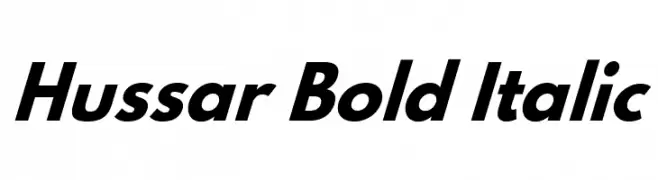
Schriftart von CannotIntoSpaceFonts. For commercial use please contact the owner.
![Hussar Bold Italic Frei Schriftart Herunterladen]() Herunterladen 1579 Downloads@WebFont
Herunterladen 1579 Downloads@WebFont -
( Fonts by Adien Gunarta - fontasticindonesia.blogspot.com )
A geometric, modern font with a bold and structured design.
![Awesome South Korea Frei Schriftart Herunterladen]() Herunterladen 1579 Downloads@WebFont
Herunterladen 1579 Downloads@WebFont -
( Fonts by Ingo Zimmermann - www.ingofonts.com )
A modern, italic font with clean lines and a professional appearance.
![Absolut Pro Book Italic reduced Frei Schriftart Herunterladen]() Herunterladen 1579 Downloads@WebFont
Herunterladen 1579 Downloads@WebFont -
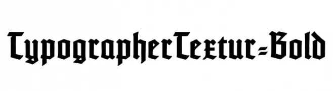
( Fonts by Dieter Steffmann )
A bold, blackletter font with sharp, angular strokes and a Gothic aesthetic.
![TypographerTextur-Bold Frei Schriftart Herunterladen]() Herunterladen 1579 Downloads@WebFont
Herunterladen 1579 Downloads@WebFont -
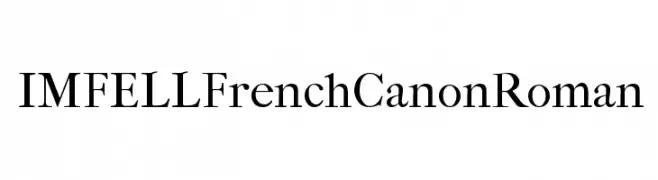
( Copyright (c) 2010, Igino Marini (mail@iginomarini.com) )
A classic serif font with high contrast and sharp serifs, exuding elegance and sophistication.
![IM FELL French Canon Roman Frei Schriftart Herunterladen]() Herunterladen 1579 Downloads@WebFont
Herunterladen 1579 Downloads@WebFont -
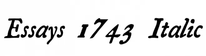
![Essays 1743 Italic Frei Schriftart Herunterladen]() Herunterladen 1579 Downloads@WebFont
Herunterladen 1579 Downloads@WebFont -
( Fonts by Erico Lebedenco - www.ericolebedenco.com )
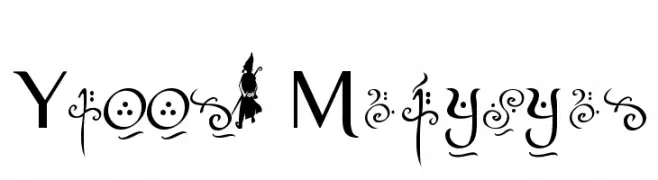
A whimsical serif font with decorative and magical elements.
![Yellow Magician Frei Schriftart Herunterladen]() Herunterladen 1579 Downloads@WebFont
Herunterladen 1579 Downloads@WebFont -
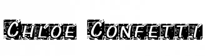
![Chloe Confetti Frei Schriftart Herunterladen]() Herunterladen 1579 Downloads@WebFont
Herunterladen 1579 Downloads@WebFont -
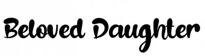
( Fonts by Syaf Rizal - www.creativefabrica.com/ref/53/ - Personal-use only. For commercial use please contact owner. )
A bold, playful script font with smooth, flowing curves and rounded edges.
![Beloved Daughter Frei Schriftart Herunterladen]() Herunterladen 1578 Downloads@WebFont
Herunterladen 1578 Downloads@WebFont -
( Fonts by Arkandis Digital Foundry )
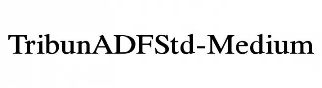
A classic serif font with medium weight and elegant style.
![TribunADFStd-Medium Frei Schriftart Herunterladen]() Herunterladen 1578 Downloads@WebFont
Herunterladen 1578 Downloads@WebFont -
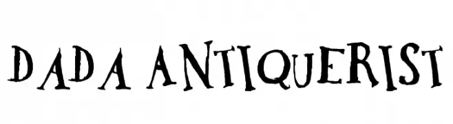
![DaDa Antiquerist Frei Schriftart Herunterladen]() Herunterladen 1578 Downloads@WebFont
Herunterladen 1578 Downloads@WebFont


Welche Schriften sind gerade am populärsten?
Poppins, Roboto, Montserrat, Open Sans und Lato sind wegen ihrer klaren Formen und breiten Einsetzbarkeit sehr gefragt – von Markenauftritt über Landingpages bis hin zu Postern.
Welche Fonts eignen sich für Logos?
Geometrische Sans‑Serifs (z. B. Poppins, Familien im Gotham‑Stil) sind ein häufiger Griff für sauberes, skalierbares Branding. Für eine persönlichere Note bleiben Scripts und Handschrift‑Stile beliebt. Kombinieren Sie einen prägnanten Headline‑Font mit einer neutralen Brotschrift für Wiedererkennung und Harmonie.
Wie oft wird die Top‑Liste aktualisiert?
Regelmäßig – basierend auf realen Downloads und Interaktionen. Schauen Sie öfter vorbei, um aufstrebende Favoriten früh zu entdecken.
💡 Tipp: Seite bookmarken – Trends wechseln schnell, und heutige Top‑Schriften inspirieren morgen vielleicht das Rebranding.