Willkommen bei den Top‑Schriften – hier treffen Beliebtheit und Qualität aufeinander. Das sind die in diesem Jahr am häufigsten heruntergeladenen und genutzten Fonts. Wenn Sie sichere Optionen für Logo, Web oder Social suchen, starten Sie hier.
Jeder Top‑Font überzeugt durch Balance, Lesbarkeit und Vielseitigkeit. Sie finden moderne Sans‑Serifs, elegante Scripts, Vintage‑Serifs und minimalistische Displays.
-
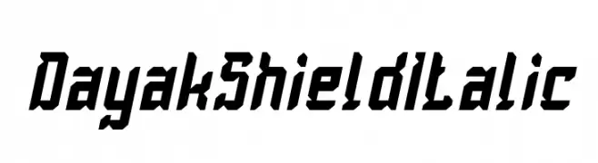
( weknow - Wino S Kadir - www.creativefabrica.com/designer/weknow/ )
A bold, angular italic font with a dynamic and modern style.
 Herunterladen 59 Downloads@WebFont
 -
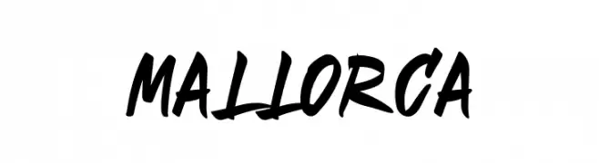
( Fonts by Mabhal Studio - Abdullah - Personal-use only. For commercial use please contact owner. )
A bold, energetic script font with a brush-like, handcrafted style.
![Mallorca Frei Schriftart Herunterladen]() Herunterladen 59 Downloads@WebFont
Herunterladen 59 Downloads@WebFont -
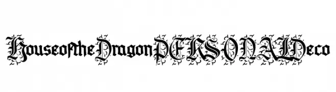
( Fonts by Mans Greback - Personal-use only. For commercial use please contact owner. )
A bold, decorative font with medieval-inspired flourishes.
![House of the Dragon PERSONAL Deco Frei Schriftart Herunterladen]() Herunterladen 59 Downloads@WebFont
Herunterladen 59 Downloads@WebFont -
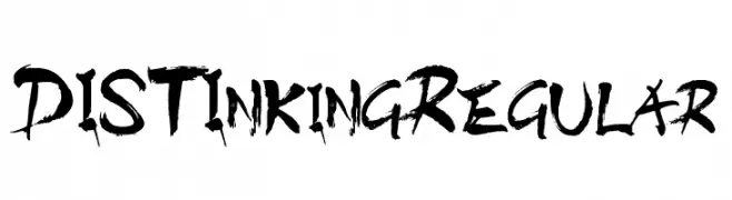
( TypeLand - Digidea Lee - typeland.com/ )
A bold, brush-style font with dynamic, hand-painted strokes.
![DISTInkingRegular Frei Schriftart Herunterladen]() Herunterladen 59 Downloads@WebFont
Herunterladen 59 Downloads@WebFont -
( Fonts by Darrell Flood - Personal-use only. For commercial use please contact owner. )
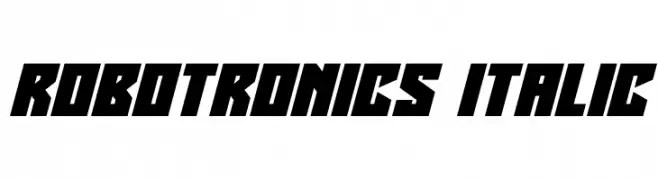
A bold, angular font with a futuristic and dynamic style.
![Robotronics Italic Frei Schriftart Herunterladen]() Herunterladen 59 Downloads@WebFont
Herunterladen 59 Downloads@WebFont -
( Fonts by Fontfabric - Svetoslav Simov - Personal-use only. For commercial use please contact owner. )
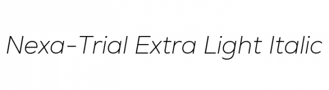
A sleek, extra-light italic sans-serif font with a modern and fluid design.
![Nexa-Trial Extra Light Italic Frei Schriftart Herunterladen]() Herunterladen 59 Downloads@WebFont
Herunterladen 59 Downloads@WebFont -
( Fonts by Lukas Schiltknecht - Personal-use only. For commercial use please contact owner. )
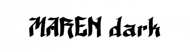
A bold, Gothic-inspired font with sharp, angular edges and intricate detailing.
![MAREN dark Frei Schriftart Herunterladen]() Herunterladen 59 Downloads@WebFont
Herunterladen 59 Downloads@WebFont -
( Fonts by weknow - Wino S Kadir - Personal-use only. For commercial use please contact owner. )
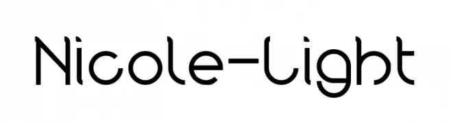
A modern, geometric font with consistent stroke width and rounded forms.
![Nicole-Light Frei Schriftart Herunterladen]() Herunterladen 59 Downloads@WebFont
Herunterladen 59 Downloads@WebFont -
( Fabian Kirst - www.fabiankirst.tumblr.com )
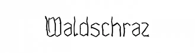
A rugged, hand-drawn font with an organic, twig-like appearance.
![Waldschraz Frei Schriftart Herunterladen]() Herunterladen 59 Downloads@WebFont
Herunterladen 59 Downloads@WebFont -
( Iconian Fonts - Daniel Zadorozny - www.iconian.com )
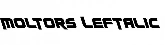
A bold, futuristic font with angular cuts and a dynamic slant.
![Moltors Leftalic Frei Schriftart Herunterladen]() Herunterladen 59 Downloads@WebFont
Herunterladen 59 Downloads@WebFont -
( Fonts by Neoqueto - Personal-use only. For commercial use please contact owner. )
A bold, geometric font with a futuristic, digital aesthetic.
![LDR HEXATRON Regular Frei Schriftart Herunterladen]() Herunterladen 59 Downloads@WebFont
Herunterladen 59 Downloads@WebFont -
( Noto is a trademark of Google Inc. Noto fonts are open source. All Noto fonts are published under the SIL Open Font License, Version 1.1 )
Not a valid font sample.
![Noto Sans Cham ExtraLight Frei Schriftart Herunterladen]() Herunterladen 59 Downloads@WebFont
Herunterladen 59 Downloads@WebFont -
( Fonts by 177studio - Personal-use only. For commercial use please contact owner. )
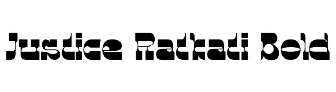
A bold, geometric font with circular cutouts and a modern aesthetic.
![Justice Ratkati Bold Frei Schriftart Herunterladen]() Herunterladen 59 Downloads@WebFont
Herunterladen 59 Downloads@WebFont -
( Chung-Deh Tien - www.redbubble.com/people/Kaiju )
A decorative and artistic font with elongated, flowing letterforms and bold geometric numbers.
![CHASE ZEN PARIS Frei Schriftart Herunterladen]() Herunterladen 59 Downloads@WebFont
Herunterladen 59 Downloads@WebFont -
( Iconian Fonts - Daniel Zadorozny - www.iconian.com )
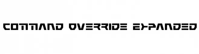
A bold, futuristic font with geometric shapes and sharp angles.
![Command Override Expanded Frei Schriftart Herunterladen]() Herunterladen 59 Downloads@WebFont
Herunterladen 59 Downloads@WebFont -
( Fonts by Typodermic Fonts - Raymond Larabie - Personal-use only. For commercial use please contact owner. )
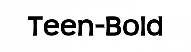
A bold, modern font with clean lines and a playful touch.
![Teen-Bold Frei Schriftart Herunterladen]() Herunterladen 59 Downloads@WebFont
Herunterladen 59 Downloads@WebFont -
( London's Letters - www.londonsletters.com/ )
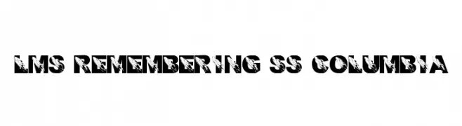
A bold, decorative font with integrated space shuttle graphics for a dynamic look.
![LMS Remembering SS Columbia Frei Schriftart Herunterladen]() Herunterladen 59 Downloads@WebFont
Herunterladen 59 Downloads@WebFont -
( Fonts by Maulana Creative )
Elegant handwritten script font.
![Meganfoxy Frei Schriftart Herunterladen]() Herunterladen 59 Downloads@WebFont
Herunterladen 59 Downloads@WebFont -
( Fonts by Chasim - Personal-use only. For commercial use please contact owner. )
A decorative font with elegant cursive strokes and playful accents.
![Batousai Demo Frei Schriftart Herunterladen]() Herunterladen 59 Downloads@WebFont
Herunterladen 59 Downloads@WebFont -
( Fonts by Kat`s Fun Fonts - Personal-use only. For commercial use please contact owner. )
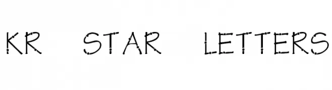
A decorative font with star embellishments on each character.
![KR Star Letters Frei Schriftart Herunterladen]() Herunterladen 59 Downloads@WebFont
Herunterladen 59 Downloads@WebFont -
( Fonts by Nick Curtis - Personal-use only. For commercial use please contact owner. )
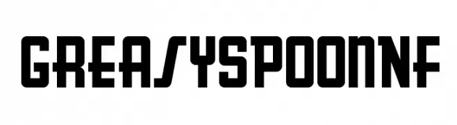
A bold, geometric font with a vintage, industrial style.
![GreasySpoonNF Frei Schriftart Herunterladen]() Herunterladen 59 Downloads@WebFont
Herunterladen 59 Downloads@WebFont -
( Noto is a trademark of Google Inc. Noto fonts are open source. All Noto fonts are published under the SIL Open Font License, Version 1.1 )
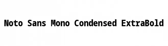
A monospaced, condensed, extra bold font with a modern and clean aesthetic.
![Noto Sans Mono Condensed ExtraBold Frei Schriftart Herunterladen]() Herunterladen 59 Downloads@WebFont
Herunterladen 59 Downloads@WebFont -
( Fonts by Iconian Fonts )
A playful, handwritten-style font with bold, rounded strokes and a condensed, italicized form.
![Kangaroo Court Condensed Italic Frei Schriftart Herunterladen]() Herunterladen 59 Downloads@WebFont
Herunterladen 59 Downloads@WebFont -
( Fonts by Mabhal Studio - Abdullah - Personal-use only. For commercial use please contact owner. )
A bold, geometric font with sharp angles and a modern aesthetic.
![NAHL Frei Schriftart Herunterladen]() Herunterladen 59 Downloads@WebFont
Herunterladen 59 Downloads@WebFont -
( Fonts by twinletter - Rozikan - Personal-use only. For commercial use please contact owner. )
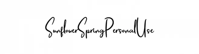
A playful, handwritten font with a whimsical and elegant style.
![Sunflower Spring Personal Use Frei Schriftart Herunterladen]() Herunterladen 59 Downloads@WebFont
Herunterladen 59 Downloads@WebFont -
( Vladimir Nikolic - www.coroflot.com/vladimirnikolic )
A bold, shadowed font with a theatrical, three-dimensional style.
![Theatrical Shadow Bold Frei Schriftart Herunterladen]() Herunterladen 59 Downloads@WebFont
Herunterladen 59 Downloads@WebFont -
( Noto is a trademark of Google Inc. Noto fonts are open source. All Noto fonts are published under the SIL Open Font License, Version 1.1 )
A modern, condensed, and thin font with a clean and minimalistic design.
![Noto Serif Thai Condensed Thin Frei Schriftart Herunterladen]() Herunterladen 59 Downloads@WebFont
Herunterladen 59 Downloads@WebFont -
( Noto is a trademark of Google Inc. Noto fonts are open source. All Noto fonts are published under the SIL Open Font License, Version 1.1 )
Condensed semi-bold sans-serif font for Georgian script.
![Noto Sans Georgian Condensed SemiBold Frei Schriftart Herunterladen]() Herunterladen 59 Downloads@WebFont
Herunterladen 59 Downloads@WebFont -
( Fonts by Aksoro 99 - Wahyu Nugroho - Personal-use only. For commercial use please contact owner. )
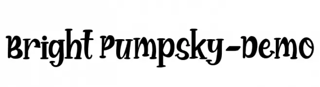
A playful, bold font with rounded, whimsical letterforms.
![Bright Pumpsky-Demo Frei Schriftart Herunterladen]() Herunterladen 59 Downloads@WebFont
Herunterladen 59 Downloads@WebFont -
( Fonts by nomlimofont - Personal-use only. For commercial use please contact owner. )
A bold, geometric font with sharp angles and a blocky, futuristic style.
![ENSAVIER Frei Schriftart Herunterladen]() Herunterladen 59 Downloads@WebFont
Herunterladen 59 Downloads@WebFont -
( Iconian Fonts - Daniel Zadorozny - www.iconian.com )
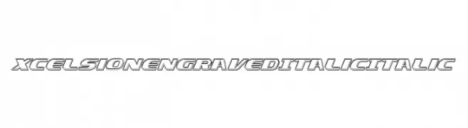
A bold, italicized font with an engraved, three-dimensional effect.
![Xcelsion Engraved Italic Italic Frei Schriftart Herunterladen]() Herunterladen 59 Downloads@WebFont
Herunterladen 59 Downloads@WebFont -
( imagex - www.imagex-fonts.com )
Tropical and tiki-inspired decorative dingbat set.
![Tiki Club Frei Schriftart Herunterladen]() Herunterladen 59 Downloads@WebFont
Herunterladen 59 Downloads@WebFont -
( Fonts by Edric Studio - Personal-use only. For commercial use please contact owner. )
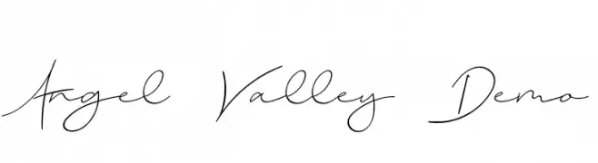
A fluid and elegant script font with interconnected, delicate strokes.
![Angel Valley Demo Frei Schriftart Herunterladen]() Herunterladen 59 Downloads@WebFont
Herunterladen 59 Downloads@WebFont -
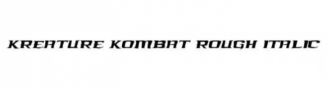
( Iconian Fonts - Daniel Zadorozny - www.iconian.com )
A bold, angular, and italicized font with a rough texture for dynamic impact.
![Kreature Kombat Rough Italic Frei Schriftart Herunterladen]() Herunterladen 59 Downloads@WebFont
Herunterladen 59 Downloads@WebFont -
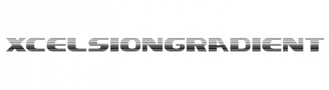
( Iconian Fonts - Daniel Zadorozny - www.iconian.com )
A futuristic font with a gradient effect created by horizontal lines.
![Xcelsion Gradient Frei Schriftart Herunterladen]() Herunterladen 59 Downloads@WebFont
Herunterladen 59 Downloads@WebFont


Welche Schriften sind gerade am populärsten?
Poppins, Roboto, Montserrat, Open Sans und Lato sind wegen ihrer klaren Formen und breiten Einsetzbarkeit sehr gefragt – von Markenauftritt über Landingpages bis hin zu Postern.
Welche Fonts eignen sich für Logos?
Geometrische Sans‑Serifs (z. B. Poppins, Familien im Gotham‑Stil) sind ein häufiger Griff für sauberes, skalierbares Branding. Für eine persönlichere Note bleiben Scripts und Handschrift‑Stile beliebt. Kombinieren Sie einen prägnanten Headline‑Font mit einer neutralen Brotschrift für Wiedererkennung und Harmonie.
Wie oft wird die Top‑Liste aktualisiert?
Regelmäßig – basierend auf realen Downloads und Interaktionen. Schauen Sie öfter vorbei, um aufstrebende Favoriten früh zu entdecken.
💡 Tipp: Seite bookmarken – Trends wechseln schnell, und heutige Top‑Schriften inspirieren morgen vielleicht das Rebranding.