Willkommen bei den Top‑Schriften – hier treffen Beliebtheit und Qualität aufeinander. Das sind die in diesem Jahr am häufigsten heruntergeladenen und genutzten Fonts. Wenn Sie sichere Optionen für Logo, Web oder Social suchen, starten Sie hier.
Jeder Top‑Font überzeugt durch Balance, Lesbarkeit und Vielseitigkeit. Sie finden moderne Sans‑Serifs, elegante Scripts, Vintage‑Serifs und minimalistische Displays.
-
( Fonts by Staircase Studio )
A fluid and elegant script font with dynamic cursive letterforms.
 Herunterladen 57 Downloads@WebFont
 -
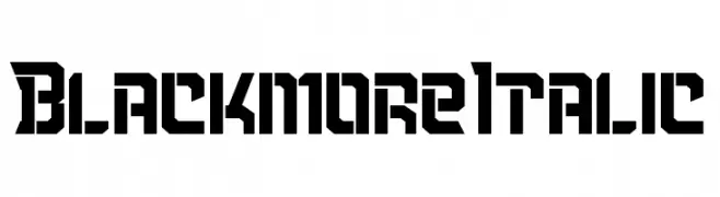
( Fonts by Kong Font - https://fontkong.com/ - Personal-use only. For commercial use please contact owner. )
A bold, angular font with a geometric, blocky style.
![Blackmore Italic Frei Schriftart Herunterladen]() Herunterladen 57 Downloads@WebFont
Herunterladen 57 Downloads@WebFont -
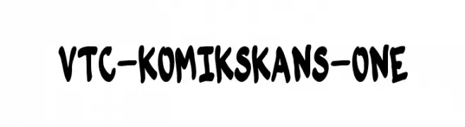
( Fonts by Vigilante Typeface Corporation Larry Yerkes. Personal-use only. For commercial use please contact owner. )
A playful, hand-drawn comic-style font with a bold and friendly appearance.
![VTC-KomikSkans-One Frei Schriftart Herunterladen]() Herunterladen 57 Downloads@WebFont
Herunterladen 57 Downloads@WebFont -
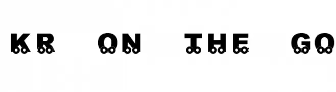
( Fonts by Kat`s Fun Fonts - Personal-use only. For commercial use please contact owner. )
A playful, train-themed decorative font with bold, uppercase letters and wheel elements.
![KR On The Go Frei Schriftart Herunterladen]() Herunterladen 57 Downloads@WebFont
Herunterladen 57 Downloads@WebFont -
( Fonts by Eddy Goodboy - Personal-use only. For commercial use please contact owner. )
A bold, brush-style font with dynamic, hand-painted strokes.
![Beauty Day Frei Schriftart Herunterladen]() Herunterladen 57 Downloads@WebFont
Herunterladen 57 Downloads@WebFont -
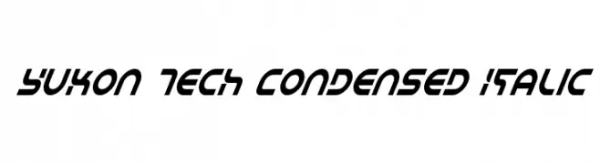
-
![Yukon Tech Condensed Italic Frei Schriftart Herunterladen]() Herunterladen 57 Downloads@WebFont
Herunterladen 57 Downloads@WebFont -
( Fonts by Daniel Zadorozny - www.iconian.com - Personal-use only. For commercial use please contact owner. )
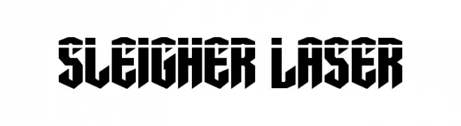
A bold, angular font with a futuristic and geometric design.
![Sleigher Laser Frei Schriftart Herunterladen]() Herunterladen 57 Downloads@WebFont
Herunterladen 57 Downloads@WebFont -
( Fonts by a Neale Davidson - www.pixelsagas.com. Personal-use only. For commercial use please contact owner. )
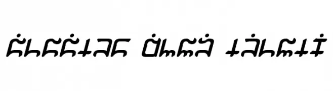
A bold, angular font with a futuristic and ancient script-like appearance.
![Dwemer Bold Frei Schriftart Herunterladen]() Herunterladen 57 Downloads@WebFont
Herunterladen 57 Downloads@WebFont -
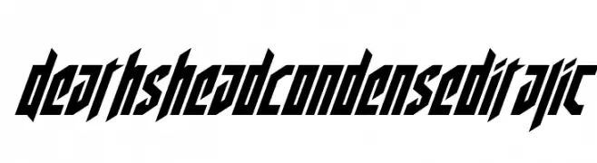
( Fonts by Iconian Fonts - Daniel Zadorozny - Personal-use only. For commercial use please contact owner. )
A bold, angular, condensed italic font with a futuristic style.
![Deathshead Condensed Italic Frei Schriftart Herunterladen]() Herunterladen 57 Downloads@WebFont
Herunterladen 57 Downloads@WebFont -
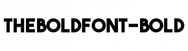
( Fonts by New Bold Times - Sven Pels - Personal-use only. For commercial use please contact owner. )
A bold, modern font with thick strokes and a geometric design.
![TheBoldFont-Bold Frei Schriftart Herunterladen]() Herunterladen 57 Downloads@WebFont
Herunterladen 57 Downloads@WebFont -
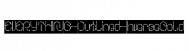
( weknow - Wino S Kadir - www.creativefabrica.com/designer/weknow/ )
A modern, outlined font with inverse bold style and geometric structure.
![EVERYTHING-Outlined-Inverse Bold Frei Schriftart Herunterladen]() Herunterladen 57 Downloads@WebFont
Herunterladen 57 Downloads@WebFont -
( Fonts by a Neale Davidson - www.pixelsagas.com. Personal-use only. For commercial use please contact owner. )
A bold, italicized decorative font with a flowing, script-like style.
![Gargish Bold Italic Frei Schriftart Herunterladen]() Herunterladen 57 Downloads@WebFont
Herunterladen 57 Downloads@WebFont -
( Fonts by Nico Muslib - Personal-use only. For commercial use please contact owner. )
A sleek, modern font with thin, elongated characters and a slightly italicized style.
![Qing Frei Schriftart Herunterladen]() Herunterladen 57 Downloads@WebFont
Herunterladen 57 Downloads@WebFont -
( Fonts by Anomali Creative - Krisna Teja - Personal-use only. For commercial use please contact owner. )
A bold, cursive font with a smooth, flowing, handwritten style.
![Spidolita Frei Schriftart Herunterladen]() Herunterladen 57 Downloads@WebFont
Herunterladen 57 Downloads@WebFont -
( Fonts by Java Pep - Personal-use only. For commercial use please contact owner. )
A sophisticated, cursive script font with elegant loops and swashes.
![aesthetica Frei Schriftart Herunterladen]() Herunterladen 57 Downloads@WebFont
Herunterladen 57 Downloads@WebFont -
( Noto is a trademark of Google Inc. Noto fonts are open source. All Noto fonts are published under the SIL Open Font License, Version 1.1 )
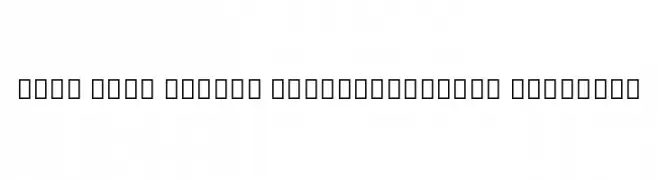
A modern, extra condensed sans-serif font with semi-bold weight.
![Noto Sans Arabic ExtraCondensed SemiBold Frei Schriftart Herunterladen]() Herunterladen 57 Downloads@WebFont
Herunterladen 57 Downloads@WebFont -
( Fonts by Daniel Zadorozny - www.iconian.com - Personal-use only. For commercial use please contact owner. )
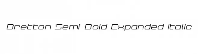
A modern, geometric, semi-bold, expanded italic font with a futuristic style.
![Bretton Semi-Bold Expanded Italic Frei Schriftart Herunterladen]() Herunterladen 57 Downloads@WebFont
Herunterladen 57 Downloads@WebFont -
( Fonts by Kat`s Fun Fonts - Personal-use only. For commercial use please contact owner. )
A bold, playful font with a hand-drawn, casual style.
![KR Driverz Frei Schriftart Herunterladen]() Herunterladen 57 Downloads@WebFont
Herunterladen 57 Downloads@WebFont -
( Fonts on us )
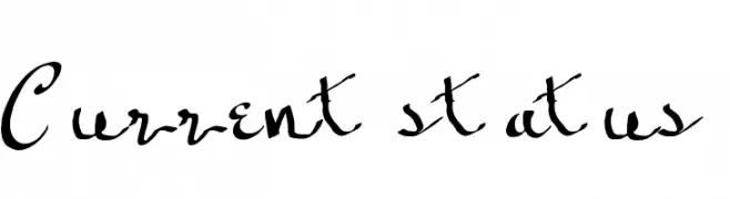
A lively, expressive handwritten font with dynamic strokes and playful loops.
![Current status Frei Schriftart Herunterladen]() Herunterladen 57 Downloads@WebFont
Herunterladen 57 Downloads@WebFont -
( Fonts by George Williams - Personal-use only. For commercial use please contact owner. )
An outline font with a blend of serif and decorative elements, offering a bold and artistic style.
![EddaOutline Frei Schriftart Herunterladen]() Herunterladen 57 Downloads@WebFont
Herunterladen 57 Downloads@WebFont -
( Fonts by Edric Studio - Personal-use only. For commercial use please contact owner. )
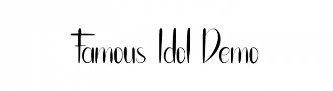
A stylish, handwritten font with elongated, flowing characters and artistic flair.
![Famous Idol Demo Frei Schriftart Herunterladen]() Herunterladen 57 Downloads@WebFont
Herunterladen 57 Downloads@WebFont -
( Fonts by Darrell Flood - Personal-use only. For commercial use please contact owner. )
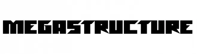
A bold, geometric font with sharp angles and a futuristic style.
![Megastructure Frei Schriftart Herunterladen]() Herunterladen 57 Downloads@WebFont
Herunterladen 57 Downloads@WebFont -
( Fonts by wep - Wahyu Eka Prasetya - Personal-use only. For commercial use please contact owner. )
A bold, playful script font with smooth curves and dynamic flow.
![Adulsa Script Frei Schriftart Herunterladen]() Herunterladen 57 Downloads@WebFont
Herunterladen 57 Downloads@WebFont -
( Fonts by Mans Greback - www.mansgreback.com - Personal-use only. For commercial use please contact owner. )
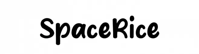
A playful, rounded font with a hand-drawn, whimsical style.
![Space Rice Frei Schriftart Herunterladen]() Herunterladen 57 Downloads@WebFont
Herunterladen 57 Downloads@WebFont -
![Joy Shark Semi-Expanded Frei Schriftart Herunterladen]() Herunterladen 57 Downloads@WebFont
Herunterladen 57 Downloads@WebFont -
( Fonts by Ahmad Zulfikar Ali - Personal-use only. For commercial use please contact owner. )
A playful, hand-drawn font with a bold, doodle-like style and sketchy outlines.
![Doodletoon fill Frei Schriftart Herunterladen]() Herunterladen 57 Downloads@WebFont
Herunterladen 57 Downloads@WebFont -
( Fonts by twinletter - Rozikan - Personal-use only. For commercial use please contact owner. )
A playful, bold font with rounded strokes and a friendly appearance.
![Arcadedemo Frei Schriftart Herunterladen]() Herunterladen 57 Downloads@WebFont
Herunterladen 57 Downloads@WebFont -
( weknow - Wino S Kadir - www.creativefabrica.com/designer/weknow/ )
A sleek, modern italic font with continuous line design and smooth curves.
![EVERYTHING Italic Frei Schriftart Herunterladen]() Herunterladen 57 Downloads@WebFont
Herunterladen 57 Downloads@WebFont -
( Fonts by AlifRyanZulfikar - Personal-use only. For commercial use please contact owner. )
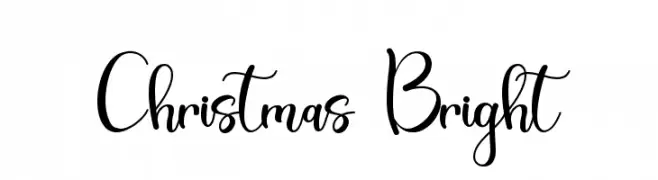
A festive, cursive font with elegant loops and swirls, perfect for holiday themes.
![Christmas Bright Frei Schriftart Herunterladen]() Herunterladen 57 Downloads@WebFont
Herunterladen 57 Downloads@WebFont -
( Fonts by Bulent Yuksel - Personal-use only. For commercial use please contact owner. )
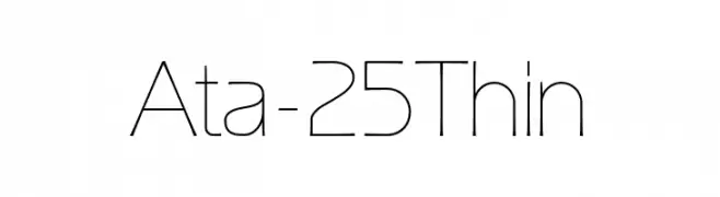
A sleek, modern font with thin lines and a minimalist design.
![Ata-25Thin Frei Schriftart Herunterladen]() Herunterladen 57 Downloads@WebFont
Herunterladen 57 Downloads@WebFont -
( Fonts by Burhan Afif - hanscostudio.com - Personal-use only. For commercial use please contact owner. )
A playful, cursive script font with flowing, elegant strokes.
![Holly Days Frei Schriftart Herunterladen]() Herunterladen 57 Downloads@WebFont
Herunterladen 57 Downloads@WebFont -
( Fonts by 38.lineart - Muhammad Ridha Agusni - Personal-use only. For commercial use please contact owner. )
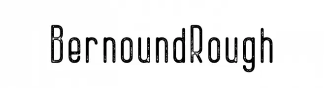
A rough, vintage-style font with a tall, narrow design and consistent stroke width.
![Bernound Rough Frei Schriftart Herunterladen]() Herunterladen 57 Downloads@WebFont
Herunterladen 57 Downloads@WebFont -
( Fonts by Almarkhatype - Abdul Malik Wisnu - Personal-use only. For commercial use please contact owner. )
A bold, condensed font ideal for impactful headlines.
![Blackheat Frei Schriftart Herunterladen]() Herunterladen 57 Downloads@WebFont
Herunterladen 57 Downloads@WebFont -
( Fonts by Daniel Zadorozny - www.iconian.com - Free for personal use )
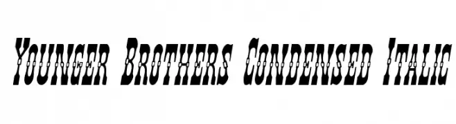
A bold, condensed, and italic font with decorative elements.
![Younger Brothers Condensed Italic Frei Schriftart Herunterladen]() Herunterladen 57 Downloads@WebFont
Herunterladen 57 Downloads@WebFont -
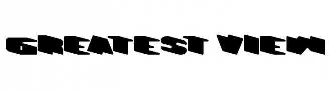
( Fonts by Wino S Kadir - weknow - www.revolge.com/shop/weknow/ - Personal-use only. For commercial use please contact owner. )
A bold, geometric font with a three-dimensional effect and retro appeal.
![GREATEST VIEW Frei Schriftart Herunterladen]() Herunterladen 57 Downloads@WebFont
Herunterladen 57 Downloads@WebFont


Welche Schriften sind gerade am populärsten?
Poppins, Roboto, Montserrat, Open Sans und Lato sind wegen ihrer klaren Formen und breiten Einsetzbarkeit sehr gefragt – von Markenauftritt über Landingpages bis hin zu Postern.
Welche Fonts eignen sich für Logos?
Geometrische Sans‑Serifs (z. B. Poppins, Familien im Gotham‑Stil) sind ein häufiger Griff für sauberes, skalierbares Branding. Für eine persönlichere Note bleiben Scripts und Handschrift‑Stile beliebt. Kombinieren Sie einen prägnanten Headline‑Font mit einer neutralen Brotschrift für Wiedererkennung und Harmonie.
Wie oft wird die Top‑Liste aktualisiert?
Regelmäßig – basierend auf realen Downloads und Interaktionen. Schauen Sie öfter vorbei, um aufstrebende Favoriten früh zu entdecken.
💡 Tipp: Seite bookmarken – Trends wechseln schnell, und heutige Top‑Schriften inspirieren morgen vielleicht das Rebranding.