Willkommen bei den Top‑Schriften – hier treffen Beliebtheit und Qualität aufeinander. Das sind die in diesem Jahr am häufigsten heruntergeladenen und genutzten Fonts. Wenn Sie sichere Optionen für Logo, Web oder Social suchen, starten Sie hier.
Jeder Top‑Font überzeugt durch Balance, Lesbarkeit und Vielseitigkeit. Sie finden moderne Sans‑Serifs, elegante Scripts, Vintage‑Serifs und minimalistische Displays.
-
( Fonts by StringLabs - stringlabscreative.com - Personal-use only. For commercial use please contact owner. )
A bold, energetic script font with a dynamic, handwritten style.
 Herunterladen 51 Downloads@WebFont
 -
( Fonts by Jadatype - Jada Akbal - Personal-use only. For commercial use please contact owner. )
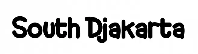
A playful, bold, and rounded hand-drawn font with a casual vibe.
![South Djakarta Frei Schriftart Herunterladen]() Herunterladen 51 Downloads@WebFont
Herunterladen 51 Downloads@WebFont -
( Fonts by Mans Greback - Personal-use only. For commercial use please contact owner. )
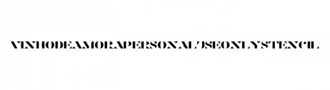
A bold, stencil-style font with geometric cutouts and a modern industrial feel.
![Vinho De Amora PERSONAL USE ONLY Stencil Frei Schriftart Herunterladen]() Herunterladen 51 Downloads@WebFont
Herunterladen 51 Downloads@WebFont -
( Fonts by weknow - Wino S Kadir - Personal-use only. For commercial use please contact owner. )
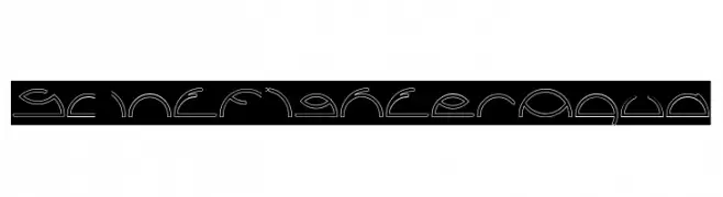
A decorative, abstract font with fluid, mystical designs.
![Saint Fighter Aqua Frei Schriftart Herunterladen]() Herunterladen 51 Downloads@WebFont
Herunterladen 51 Downloads@WebFont -
( Fonts by FreshtypeINK )
A whimsical, hand-lettered script with decorative swashes.
![Cruises Frei Schriftart Herunterladen]() Herunterladen 51 Downloads@WebFont
Herunterladen 51 Downloads@WebFont -
-
( Fonts by Darrell Flood - Personal-use only. For commercial use please contact owner. )
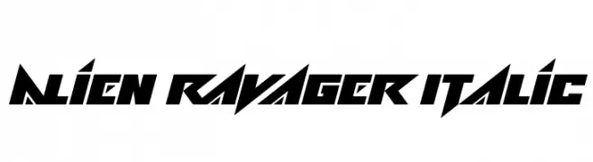
A bold, futuristic font with sharp angles and an italicized slant.
![Alien Ravager Italic Frei Schriftart Herunterladen]() Herunterladen 51 Downloads@WebFont
Herunterladen 51 Downloads@WebFont -
( Fonts by Deniz86 - Rahmat Hidayat - Personal-use only. For commercial use please contact owner. )
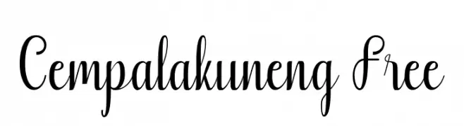
A playful and elegant script font with a modern twist, featuring distinctive loops and smooth curves.
![Cempalakuneng Free Frei Schriftart Herunterladen]() Herunterladen 51 Downloads@WebFont
Herunterladen 51 Downloads@WebFont -
( Fonts by Kong Font - Personal-use only. For commercial use please contact owner. )
A flowing, cursive font with elegant loops and swashes.
![Aurella Frei Schriftart Herunterladen]() Herunterladen 51 Downloads@WebFont
Herunterladen 51 Downloads@WebFont -
( Fonts by Letterara - Thomas Aradea - Personal-use only. For commercial use please contact owner. )
A flowing, cursive font with elegant and artistic flair.
![Black Pink Summer Frei Schriftart Herunterladen]() Herunterladen 51 Downloads@WebFont
Herunterladen 51 Downloads@WebFont -
( LeChefRene - members.aol.com/lcrfonts/ )
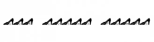
A stylish font featuring characters embedded in high-heeled shoe silhouettes.
![LCR Lisa's Pumps Frei Schriftart Herunterladen]() Herunterladen 51 Downloads@WebFont
Herunterladen 51 Downloads@WebFont -
( Fonts by Vladimir Nikolic )
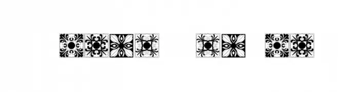
Ornamental font with decorative tile patterns for each character.
![Vorlagen Regular Frei Schriftart Herunterladen]() Herunterladen 51 Downloads@WebFont
Herunterladen 51 Downloads@WebFont -
( Noto is a trademark of Google Inc. Noto fonts are open source. All Noto fonts are published under the SIL Open Font License, Version 1.1 )
A modern, condensed sans-serif font designed for UI clarity and readability.
![Noto Sans Arabic UI Condensed Frei Schriftart Herunterladen]() Herunterladen 51 Downloads@WebFont
Herunterladen 51 Downloads@WebFont -
( Noto is a trademark of Google Inc. Noto fonts are open source. All Noto fonts are published under the SIL Open Font License, Version 1.1 )
A modern, extra bold, semi-condensed font with high legibility.
![Noto Sans Armenian SemiCondensed ExtraBold Frei Schriftart Herunterladen]() Herunterladen 51 Downloads@WebFont
Herunterladen 51 Downloads@WebFont -
( Fonts by Geronimo Fonts - Personal-use only. For commercial use please contact owner. )
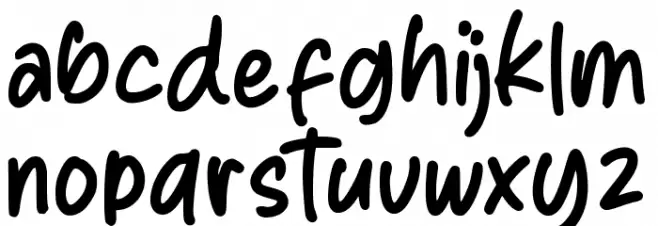
A playful, handwritten font with a casual and friendly style.
![Multilingual Hand Frei Schriftart Herunterladen]() Herunterladen 51 Downloads@WebFont
Herunterladen 51 Downloads@WebFont -
( Iconian Fonts - Daniel Zadorozny - www.iconian.com )
A bold, italic, and futuristic font with sharp, angular lines and high contrast.
![Searider Falcon Super-Italic Frei Schriftart Herunterladen]() Herunterladen 51 Downloads@WebFont
Herunterladen 51 Downloads@WebFont -
( Vladimir Nikolic - www.coroflot.com/vladimirnikolic )
A modern, italic font with smooth curves and a sleek design.
![Typolino Bold Italic Frei Schriftart Herunterladen]() Herunterladen 51 Downloads@WebFont
Herunterladen 51 Downloads@WebFont -
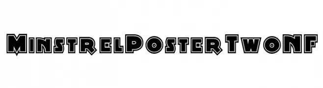
( Fonts by Nick Curtis - Personal-use only. For commercial use please contact owner. )
A bold, geometric font with a three-dimensional outline effect.
![MinstrelPosterTwoNF Frei Schriftart Herunterladen]() Herunterladen 51 Downloads@WebFont
Herunterladen 51 Downloads@WebFont -
( Noto is a trademark of Google Inc. Noto fonts are open source. All Noto fonts are published under the SIL Open Font License, Version 1.1 )
Extra bold, semi-condensed sans-serif with clean, geometric shapes.
![Noto Sans Thai SemiCondensed ExtraBold Frei Schriftart Herunterladen]() Herunterladen 51 Downloads@WebFont
Herunterladen 51 Downloads@WebFont -
( Fonts by Madatype Studio - Andri Ardianto - Personal-use only. For commercial use please contact owner. )
A flowing, cursive font with elegant loops and playful flourishes.
![Banakenda Frei Schriftart Herunterladen]() Herunterladen 51 Downloads@WebFont
Herunterladen 51 Downloads@WebFont -
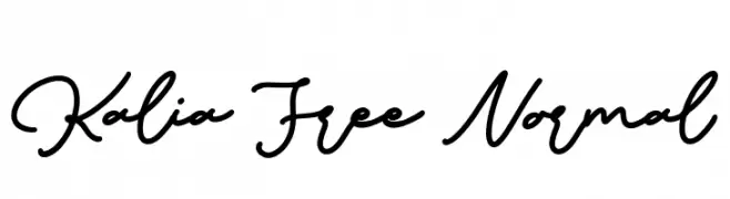
( Fonts by Maulana Creative - Gilang Maulana - Personal-use only. For commercial use please contact owner. )
A flowing, cursive script font with elegant, interconnected characters.
![Kalia Free Normal Frei Schriftart Herunterladen]() Herunterladen 51 Downloads@WebFont
Herunterladen 51 Downloads@WebFont -
( Fonts by Rangkai Aksara - Personal-use only. For commercial use please contact owner. )
A dynamic and flowing script font with elegant curves and smooth transitions.
![Joy Day Frei Schriftart Herunterladen]() Herunterladen 51 Downloads@WebFont
Herunterladen 51 Downloads@WebFont -
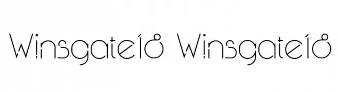
( RichieWins - Riky Riswandi )
A modern, geometric font with clean lines and a minimalist aesthetic.
![Winsgate18 Winsgate18 Frei Schriftart Herunterladen]() Herunterladen 51 Downloads@WebFont
Herunterladen 51 Downloads@WebFont -
( Fonts by StringLabs - stringlabscreative.com - Personal-use only. For commercial use please contact owner. )
A decorative serif font with playful curls on uppercase letters.
![Girdens Frei Schriftart Herunterladen]() Herunterladen 51 Downloads@WebFont
Herunterladen 51 Downloads@WebFont -
( Fonts by Saiful Bahri - Personal-use only. For commercial use please contact owner. )
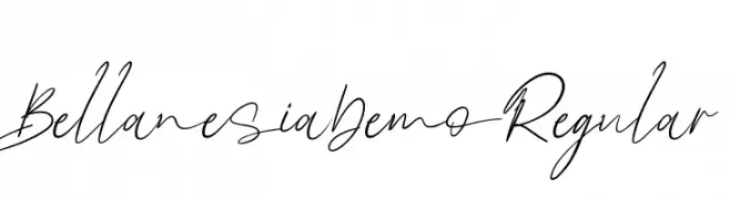
A fluid and elegant handwritten script with dynamic movement.
![BellanesiaDemoRegular Frei Schriftart Herunterladen]() Herunterladen 51 Downloads@WebFont
Herunterladen 51 Downloads@WebFont -
( imagex - www.imagex-fonts.com )
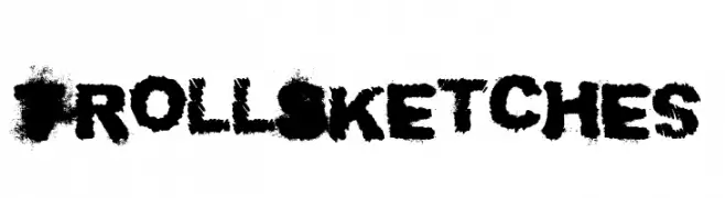
A bold, textured font with a rough, sketched appearance.
![Troll Sketches Frei Schriftart Herunterladen]() Herunterladen 51 Downloads@WebFont
Herunterladen 51 Downloads@WebFont -
( Fonts by Daniel Zadorozny - www.iconian.com - Personal-use only. For commercial use please contact owner. )
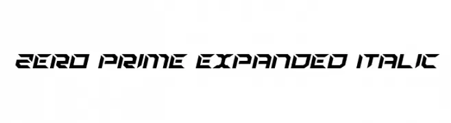
A bold, expanded, and angular italic font with a futuristic style.
![Zero Prime Expanded Italic Frei Schriftart Herunterladen]() Herunterladen 51 Downloads@WebFont
Herunterladen 51 Downloads@WebFont -
( Fonts by Nick Curtis - Personal-use only. For commercial use please contact owner. )
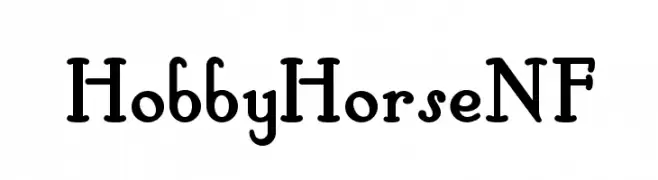
A playful, vintage-inspired serif font with bold, rounded characters.
![HobbyHorseNF Frei Schriftart Herunterladen]() Herunterladen 51 Downloads@WebFont
Herunterladen 51 Downloads@WebFont -
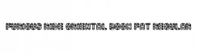
( Fonts by Vladimir Nikolic - https://www.creativefabrica.com/product/educated-deers/ref/144265/ - Personal-use only. For commercial use please contact owner. )
A bold, decorative font with intricate geometric patterns inside each uppercase letter.
![Furious Ride Oriental Book Fat Regular Frei Schriftart Herunterladen]() Herunterladen 51 Downloads@WebFont
Herunterladen 51 Downloads@WebFont -
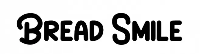
( Fonts by Brithos Type - Personal-use only. For commercial use please contact owner. )
A playful, bold, and rounded font with a friendly and approachable style.
![Bread Smile Frei Schriftart Herunterladen]() Herunterladen 51 Downloads@WebFont
Herunterladen 51 Downloads@WebFont -
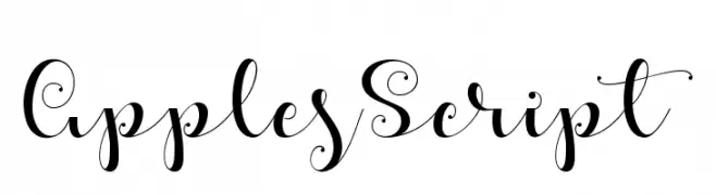
( Misti's Fonts - mistifonts.com/ )
An elegant script font with decorative swirls and flourishes.
![ApplesScript Frei Schriftart Herunterladen]() Herunterladen 51 Downloads@WebFont
Herunterladen 51 Downloads@WebFont -
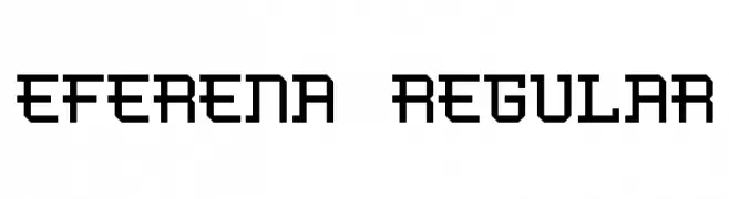
( André Felipe - www.behance.net/andfelcaslop )
A bold, geometric font with a digital, monospaced appearance.
![Eferena Regular Frei Schriftart Herunterladen]() Herunterladen 51 Downloads@WebFont
Herunterladen 51 Downloads@WebFont -
( Fonts by Suhee Hwang )
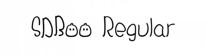
Playful, hand-drawn display font with quirky, irregular shapes.
![SDBoo Regular Frei Schriftart Herunterladen]() Herunterladen 51 Downloads@WebFont
Herunterladen 51 Downloads@WebFont -
( Fonts by Peter Wiegel - www.peter-wiegel.de - Personal-use only. For commercial use please contact owner. )
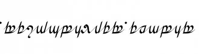
A decorative script with flowing, intricate lines inspired by Tengwar.
![Greifswalder Tengwar Frei Schriftart Herunterladen]() Herunterladen 51 Downloads@WebFont
Herunterladen 51 Downloads@WebFont -
( Fonts by Daniel Zadorozny - www.iconian.com - Personal-use only. For commercial use please contact owner. )
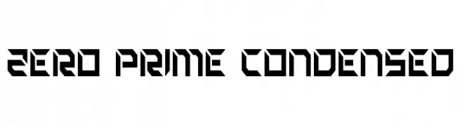
A futuristic, angular font with bold, condensed characters and geometric shapes.
![Zero Prime Condensed Frei Schriftart Herunterladen]() Herunterladen 51 Downloads@WebFont
Herunterladen 51 Downloads@WebFont -
( Fonts by Vladimir Nikolic - www.creativefabrica.com/designer/vladimirnikolic/ - Personal-use only. For commercial use please contact owner. )
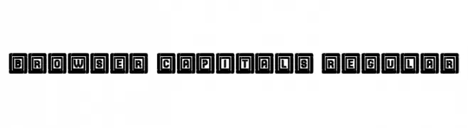
A bold, blocky font with characters enclosed in square frames, evoking a vintage or industrial aesthetic.
![Browser Capitals Regular Frei Schriftart Herunterladen]() Herunterladen 51 Downloads@WebFont
Herunterladen 51 Downloads@WebFont


Welche Schriften sind gerade am populärsten?
Poppins, Roboto, Montserrat, Open Sans und Lato sind wegen ihrer klaren Formen und breiten Einsetzbarkeit sehr gefragt – von Markenauftritt über Landingpages bis hin zu Postern.
Welche Fonts eignen sich für Logos?
Geometrische Sans‑Serifs (z. B. Poppins, Familien im Gotham‑Stil) sind ein häufiger Griff für sauberes, skalierbares Branding. Für eine persönlichere Note bleiben Scripts und Handschrift‑Stile beliebt. Kombinieren Sie einen prägnanten Headline‑Font mit einer neutralen Brotschrift für Wiedererkennung und Harmonie.
Wie oft wird die Top‑Liste aktualisiert?
Regelmäßig – basierend auf realen Downloads und Interaktionen. Schauen Sie öfter vorbei, um aufstrebende Favoriten früh zu entdecken.
💡 Tipp: Seite bookmarken – Trends wechseln schnell, und heutige Top‑Schriften inspirieren morgen vielleicht das Rebranding.