Willkommen bei den Top‑Schriften – hier treffen Beliebtheit und Qualität aufeinander. Das sind die in diesem Jahr am häufigsten heruntergeladenen und genutzten Fonts. Wenn Sie sichere Optionen für Logo, Web oder Social suchen, starten Sie hier.
Jeder Top‑Font überzeugt durch Balance, Lesbarkeit und Vielseitigkeit. Sie finden moderne Sans‑Serifs, elegante Scripts, Vintage‑Serifs und minimalistische Displays.
-
( Fonts by StringLabs - stringlabscreative.com - Personal-use only. For commercial use please contact owner. )
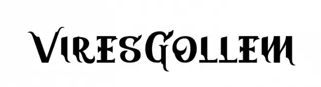
A bold, Gothic-inspired font with intricate serifs and dramatic flourishes.
 Herunterladen 49 Downloads@WebFont
 -
( Fonts by Daniel Zadorozny - www.iconian.com - Personal-use only. For commercial use please contact owner. )
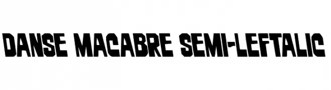
A bold, left-leaning font with angular cuts and a strong visual impact.
![Danse Macabre Semi-Leftalic Frei Schriftart Herunterladen]() Herunterladen 49 Downloads@WebFont
Herunterladen 49 Downloads@WebFont -
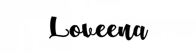
( Fonts by Em Nazar - Personal-use only. For commercial use please contact owner. )
A bold, expressive handwritten font with a brush-like style.
![Loveena Frei Schriftart Herunterladen]() Herunterladen 49 Downloads@WebFont
Herunterladen 49 Downloads@WebFont -
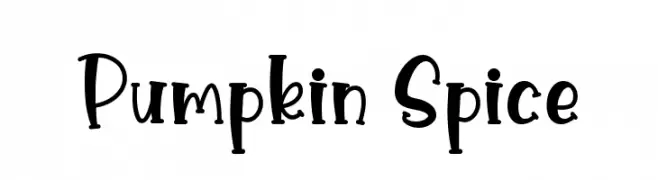
( Fonts by Graphix Line Studio - Personal-use only. For commercial use please contact owner. )
A playful, hand-drawn font with a whimsical and energetic style.
![Pumpkin Spice Frei Schriftart Herunterladen]() Herunterladen 49 Downloads@WebFont
Herunterladen 49 Downloads@WebFont -
( Fonts by Royaltype - Darwinoo - Personal-use only. For commercial use please contact owner. )
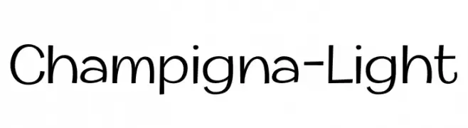
A modern, light sans-serif font with clean lines and balanced spacing.
![Champigna-Light Frei Schriftart Herunterladen]() Herunterladen 49 Downloads@WebFont
Herunterladen 49 Downloads@WebFont -
-
( Fonts by dcoxy - Greg Medina - Personal-use only. For commercial use please contact owner. )
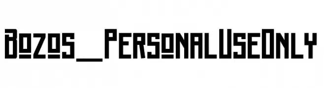
A bold, geometric font with a vintage yet modern appeal.
![Bozos_PersonalUseOnly Frei Schriftart Herunterladen]() Herunterladen 49 Downloads@WebFont
Herunterladen 49 Downloads@WebFont -
( Fonts by sronstudio - Yusron Billah - Personal-use only. For commercial use please contact owner. )
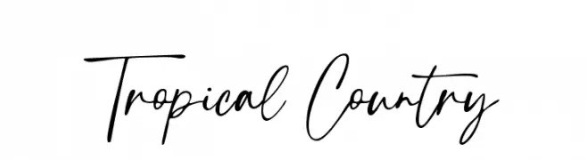
A lively, handwritten font with fluid, cursive letterforms and medium contrast.
![Tropical Country Frei Schriftart Herunterladen]() Herunterladen 49 Downloads@WebFont
Herunterladen 49 Downloads@WebFont -
( Fonts by Runsell Studio - Personal-use only. For commercial use please contact owner. )
A dynamic and elegant cursive script font with moderate stroke thickness.
![Vertica Frei Schriftart Herunterladen]() Herunterladen 49 Downloads@WebFont
Herunterladen 49 Downloads@WebFont -
( LALATO FONTS )
A casual, handwritten font with a playful and informal style.
![freetowrite Frei Schriftart Herunterladen]() Herunterladen 49 Downloads@WebFont
Herunterladen 49 Downloads@WebFont -
Schriftart von ZedFonts2334. For commercial use please contact the owner.
( Updated : Multilingual support has been added aswell as 3 more styles. ZF2334 That's All Right is a low contrast condensed sans-serif font. It is a bit geometric and somewhat similar to DIN and Frutiger. The 3 first styles are monoline except for some c )
A bold, modern font with thick strokes and a strong presence.
![ZF2334 That's All Right Bold Frei Schriftart Herunterladen]() Herunterladen 49 Downloads@WebFont
Herunterladen 49 Downloads@WebFont -
( Fonts by Daniel Zadorozny - www.iconian.com - Personal-use only. For commercial use please contact owner. )
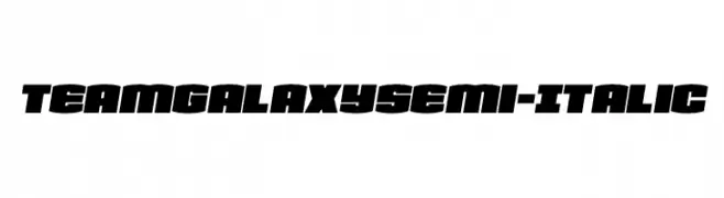
A bold, semi-italic font with a modern, dynamic style and high contrast.
![Team Galaxy Semi-Italic Frei Schriftart Herunterladen]() Herunterladen 49 Downloads@WebFont
Herunterladen 49 Downloads@WebFont -
( Fonts by LetterCraft Studio - Personal-use only. For commercial use please contact owner. )
A modern, clean sans-serif font with geometric shapes and uniform stroke width.
![Andallan Frei Schriftart Herunterladen]() Herunterladen 49 Downloads@WebFont
Herunterladen 49 Downloads@WebFont -
( Fonts by Vladimir Nikolic - Personal-use only. For commercial use please contact owner. )
A bold, italicized font with a modern, geometric style.
![Progress Bold Italic Frei Schriftart Herunterladen]() Herunterladen 49 Downloads@WebFont
Herunterladen 49 Downloads@WebFont -
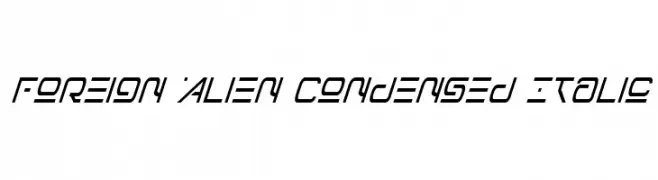
( Fonts by Daniel Zadorozny - www.iconian.com - Personal-use only. For commercial use please contact owner. )
A futuristic, condensed italic font with angular, geometric characters.
![Foreign Alien Condensed Italic Frei Schriftart Herunterladen]() Herunterladen 49 Downloads@WebFont
Herunterladen 49 Downloads@WebFont -
( Fonts by Khurasan - Syaf Rizal - Personal-use only. For commercial use please contact owner. )
A modern, rounded sans-serif font with a clean and balanced design.
![Mbkaos Frei Schriftart Herunterladen]() Herunterladen 49 Downloads@WebFont
Herunterladen 49 Downloads@WebFont -
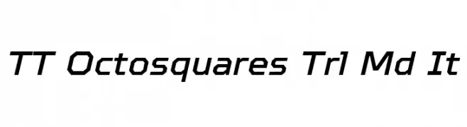
( Fonts by TypeType Foundry )
A modern, geometric font with angular, italicized characters.
![TT Octosquares Trl Md It Frei Schriftart Herunterladen]() Herunterladen 49 Downloads@WebFont
Herunterladen 49 Downloads@WebFont -
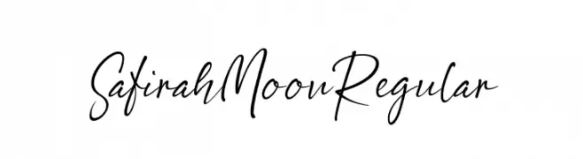
( Fonts by Silverdav Studio )
Elegant handwritten script font.
![Safirah Moon Regular Frei Schriftart Herunterladen]() Herunterladen 49 Downloads@WebFont
Herunterladen 49 Downloads@WebFont -
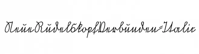
( Fonts by Peter Wiegel - www.peter-wiegel.de - Personal-use only. For commercial use please contact owner. )
A flowing, cursive italic font with connected letters and a classic, elegant style.
![NeueRudelskopfVerbunden-Italic Frei Schriftart Herunterladen]() Herunterladen 49 Downloads@WebFont
Herunterladen 49 Downloads@WebFont -
( Fonts by Daniel Zadorozny - www.iconian.com - Personal-use only. For commercial use please contact owner. )
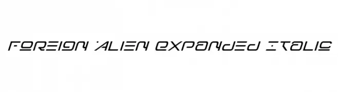
A futuristic, expanded italic font with sharp angles and smooth curves.
![Foreign Alien Expanded Italic Frei Schriftart Herunterladen]() Herunterladen 49 Downloads@WebFont
Herunterladen 49 Downloads@WebFont -
( Fonts by Lemonthe - Dwi Ahidian - Personal-use only. For commercial use please contact owner. )
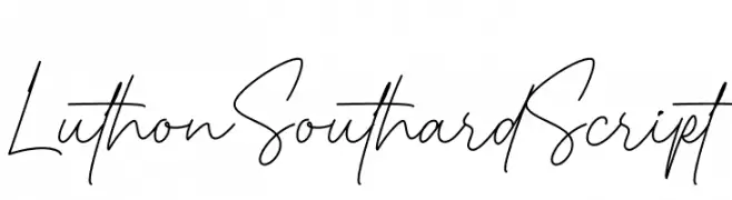
A flowing, elegant script font with a natural handwritten style.
![Luthon Southard Script Frei Schriftart Herunterladen]() Herunterladen 49 Downloads@WebFont
Herunterladen 49 Downloads@WebFont -
( Fonts by Mans Greback - Personal-use only. For commercial use please contact owner. )
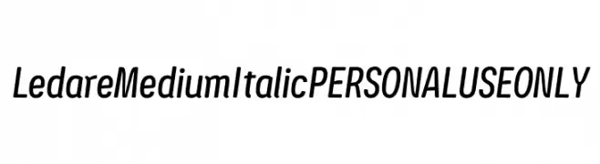
A sleek, modern italic font with medium weight and balanced proportions.
![Ledare Medium Italic PERSONAL USE ONLY Frei Schriftart Herunterladen]() Herunterladen 49 Downloads@WebFont
Herunterladen 49 Downloads@WebFont -
( Fonts by CannotIntoSpaceFonts - KineticPlasma Fonts - Personal-use only. For commercial use please contact owner. )
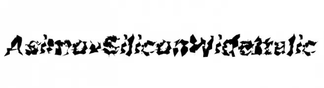
A bold, wide, and italic decorative font with a fragmented, abstract design.
![Asimov Silicon Wide Italic Frei Schriftart Herunterladen]() Herunterladen 49 Downloads@WebFont
Herunterladen 49 Downloads@WebFont -
( Fonts by Mooniak - Personal-use only. For commercial use please contact owner. )
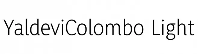
A modern, light sans-serif typeface with clean lines and excellent readability.
![YaldeviColombo Light Frei Schriftart Herunterladen]() Herunterladen 49 Downloads@WebFont
Herunterladen 49 Downloads@WebFont -
( Fonts by CannotIntoSpaceFonts - KineticPlasma Fonts - Personal-use only. For commercial use please contact owner. )
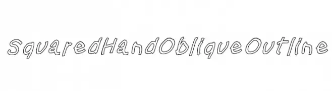
An oblique outline font with a playful and dynamic style.
![Squared Hand Oblique Outline Frei Schriftart Herunterladen]() Herunterladen 49 Downloads@WebFont
Herunterladen 49 Downloads@WebFont -
( Fonts by Graphue - Personal-use only. For commercial use please contact owner. )
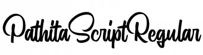
A lively and flowing script font with smooth, connected strokes and playful curves.
![Pathita Script Regular Frei Schriftart Herunterladen]() Herunterladen 49 Downloads@WebFont
Herunterladen 49 Downloads@WebFont -
( Java Pep )
A smooth, flowing script font with elegant, connected characters.
![Sunderlines Frei Schriftart Herunterladen]() Herunterladen 49 Downloads@WebFont
Herunterladen 49 Downloads@WebFont -
( Noto is a trademark of Google Inc. Noto fonts are open source. All Noto fonts are published under the SIL Open Font License, Version 1.1 )
Not a valid font sample.
![Noto Sans Myanmar UI SemiCondensed SemiBold Frei Schriftart Herunterladen]() Herunterladen 49 Downloads@WebFont
Herunterladen 49 Downloads@WebFont -
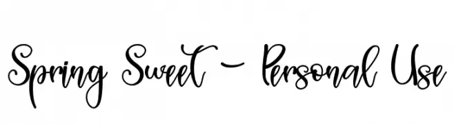
( Fonts by AlifRyanZulfikar - Personal-use only. For commercial use please contact owner. )
A playful and elegant script font with a handwritten style.
![Spring Sweet - Personal Use Frei Schriftart Herunterladen]() Herunterladen 49 Downloads@WebFont
Herunterladen 49 Downloads@WebFont -
( Fonts by CBRTEXT Studio - Muhammad Khoirul Amal - Personal-use only. For commercial use please contact owner. )
A dynamic and fluid script font with elegant, flowing letterforms.
![Dapka Frei Schriftart Herunterladen]() Herunterladen 49 Downloads@WebFont
Herunterladen 49 Downloads@WebFont -
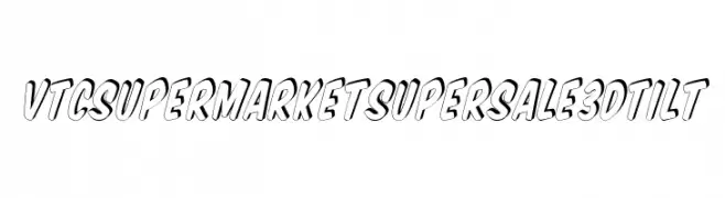
( Fonts by Vigilante Typeface Corporation Larry Yerkes. Personal-use only. For commercial use please contact owner. )
A bold, 3D tilted font with a playful, cartoon-like style.
![VTCSuperMarketSuperSale3DTilt Frei Schriftart Herunterladen]() Herunterladen 49 Downloads@WebFont
Herunterladen 49 Downloads@WebFont -
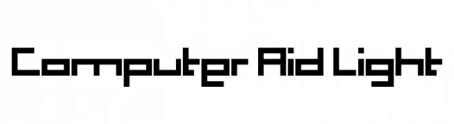
( Fonts by Benoit Champy - www.vnbc.fr - Personal-use only. For commercial use please contact owner. )
A geometric, block-like font with a modern, digital aesthetic.
![Computer Aid Light Frei Schriftart Herunterladen]() Herunterladen 49 Downloads@WebFont
Herunterladen 49 Downloads@WebFont -
( Fonts by Kong Font - Personal-use only. For commercial use please contact owner. )
An elegant, flowing script font with high contrast and italic style.
![Sunny Rommansa Italic Frei Schriftart Herunterladen]() Herunterladen 49 Downloads@WebFont
Herunterladen 49 Downloads@WebFont -
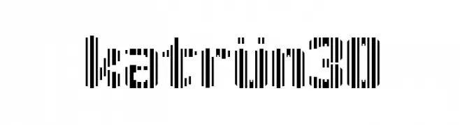
( Ignacio Ponce )
A modern, striped font with a barcode-like appearance.
![katrün30 Frei Schriftart Herunterladen]() Herunterladen 49 Downloads@WebFont
Herunterladen 49 Downloads@WebFont -
( Fonts by Khurasan - Syaf Rizal - Personal-use only. For commercial use please contact owner. )
A playful, rounded font with a friendly and approachable style.
![School Story Frei Schriftart Herunterladen]() Herunterladen 49 Downloads@WebFont
Herunterladen 49 Downloads@WebFont -
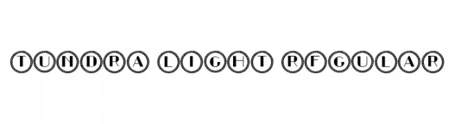
( Fonts by Vladimir Nikolic - www.creativefabrica.com/designer/vladimirnikolic/ - Personal-use only. For commercial use please contact owner. )
A decorative sans-serif font with bold letters encased in circular borders.
![Tundra Light Regular Frei Schriftart Herunterladen]() Herunterladen 49 Downloads@WebFont
Herunterladen 49 Downloads@WebFont


Welche Schriften sind gerade am populärsten?
Poppins, Roboto, Montserrat, Open Sans und Lato sind wegen ihrer klaren Formen und breiten Einsetzbarkeit sehr gefragt – von Markenauftritt über Landingpages bis hin zu Postern.
Welche Fonts eignen sich für Logos?
Geometrische Sans‑Serifs (z. B. Poppins, Familien im Gotham‑Stil) sind ein häufiger Griff für sauberes, skalierbares Branding. Für eine persönlichere Note bleiben Scripts und Handschrift‑Stile beliebt. Kombinieren Sie einen prägnanten Headline‑Font mit einer neutralen Brotschrift für Wiedererkennung und Harmonie.
Wie oft wird die Top‑Liste aktualisiert?
Regelmäßig – basierend auf realen Downloads und Interaktionen. Schauen Sie öfter vorbei, um aufstrebende Favoriten früh zu entdecken.
💡 Tipp: Seite bookmarken – Trends wechseln schnell, und heutige Top‑Schriften inspirieren morgen vielleicht das Rebranding.