Willkommen bei den Top‑Schriften – hier treffen Beliebtheit und Qualität aufeinander. Das sind die in diesem Jahr am häufigsten heruntergeladenen und genutzten Fonts. Wenn Sie sichere Optionen für Logo, Web oder Social suchen, starten Sie hier.
Jeder Top‑Font überzeugt durch Balance, Lesbarkeit und Vielseitigkeit. Sie finden moderne Sans‑Serifs, elegante Scripts, Vintage‑Serifs und minimalistische Displays.
-
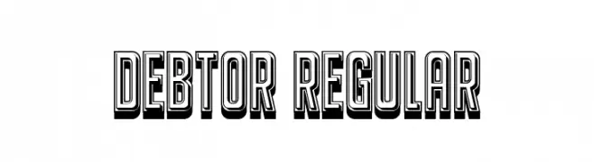
( Fonts by Vladimir Nikolic - www.creativefabrica.com/designer/vladimirnikolic/ - Personal-use only. For commercial use please contact owner. )
A bold, three-dimensional font with shadow effects for impactful designs.
 Herunterladen 55 Downloads@WebFont
 -
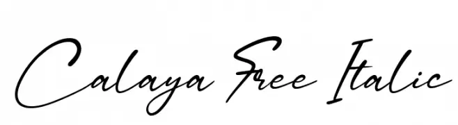
( Fonts by Craft Supply Co - Personal-use only. For commercial use please contact owner. )
A fluid and elegant script font with a natural, cursive flow.
![Calaya Free Italic Frei Schriftart Herunterladen]() Herunterladen 55 Downloads@WebFont
Herunterladen 55 Downloads@WebFont -
( Fonts by Kong Font - Personal-use only. For commercial use please contact owner. )
A bold, hand-drawn font with expressive, dynamic strokes and textured edges.
![StandRock Frei Schriftart Herunterladen]() Herunterladen 55 Downloads@WebFont
Herunterladen 55 Downloads@WebFont -
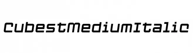
( Fonts by Mans Greback - Personal-use only. For commercial use please contact owner. )
A modern, geometric italic font with clean lines and rounded corners.
![Cubest Medium Italic Frei Schriftart Herunterladen]() Herunterladen 55 Downloads@WebFont
Herunterladen 55 Downloads@WebFont -
( Fonts by Zetafonts - Personal-use only. For commercial use please contact owner. )
A modern, italicized font with sleek, elongated characters.
![HeadingNow Trial 43 Book Italic Frei Schriftart Herunterladen]() Herunterladen 55 Downloads@WebFont
Herunterladen 55 Downloads@WebFont -
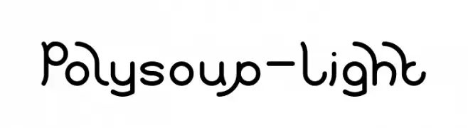
( Fonts by weknow - Wino S Kadir - Personal-use only. For commercial use please contact owner. )
A playful, modern font with rounded, flowing lines and consistent stroke width.
![Polysoup-Light Frei Schriftart Herunterladen]() Herunterladen 55 Downloads@WebFont
Herunterladen 55 Downloads@WebFont -
( Fonts by Awansenja Type - Personal-use only. For commercial use please contact owner. )
A bold, playful handwritten font with rounded strokes and a casual style.
![Barryone Frei Schriftart Herunterladen]() Herunterladen 55 Downloads@WebFont
Herunterladen 55 Downloads@WebFont -
( Fonts by Sunset Gallery - Personal-use only. For commercial use please contact owner. )
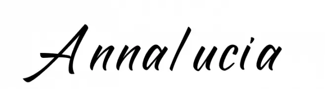
A dynamic, cursive handwritten font with a fluid and elegant style.
![Annalucia Frei Schriftart Herunterladen]() Herunterladen 55 Downloads@WebFont
Herunterladen 55 Downloads@WebFont -
( Pixel Kitchen )
A futuristic, geometric font with a digital, tech-inspired design.
![Cybernaut Delta Regular Frei Schriftart Herunterladen]() Herunterladen 55 Downloads@WebFont
Herunterladen 55 Downloads@WebFont -
( Noto is a trademark of Google Inc. Noto fonts are open source. All Noto fonts are published under the SIL Open Font License, Version 1.1 )
Error: Characters are not visible or valid.
![Noto Sans Lao SemiCondensed Thin Frei Schriftart Herunterladen]() Herunterladen 55 Downloads@WebFont
Herunterladen 55 Downloads@WebFont -
( Fonts by Graphix Line Studio )
Bold, modern script with a handwritten brush style.
![Aleya Frei Schriftart Herunterladen]() Herunterladen 55 Downloads@WebFont
Herunterladen 55 Downloads@WebFont -
( Fonts by Edric Studio - Personal-use only. For commercial use please contact owner. )
A playful, decorative font with bold, inline designs and whimsical character.
![Happy Rhino Demo Inline Frei Schriftart Herunterladen]() Herunterladen 55 Downloads@WebFont
Herunterladen 55 Downloads@WebFont -
( Fonts by Darrell Flood - Personal-use only. For commercial use please contact owner. )
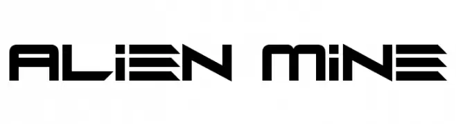
A futuristic, angular font with a bold, sci-fi aesthetic.
![Alien Mine Frei Schriftart Herunterladen]() Herunterladen 55 Downloads@WebFont
Herunterladen 55 Downloads@WebFont -
( Fonts by Din Studio - Donis Miftahudin - Personal-use only. For commercial use please contact owner. )
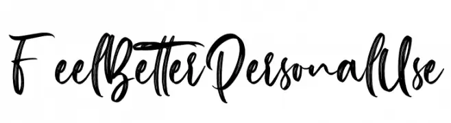
A lively, expressive handwritten font with bold, brush-like strokes.
![Feel Better Personal Use Frei Schriftart Herunterladen]() Herunterladen 55 Downloads@WebFont
Herunterladen 55 Downloads@WebFont -
( Fonts by Inermedia Studio - Personal-use only. For commercial use please contact owner. )
A graceful and elegant script font with flowing, interconnected letters.
![Rosallia Frei Schriftart Herunterladen]() Herunterladen 55 Downloads@WebFont
Herunterladen 55 Downloads@WebFont -
( Fonts by Maulana Creative - Gilang Maulana - Personal-use only. For commercial use please contact owner. )
A flowing, cursive font with elegant loops and a handwritten style.
![Brasons Risool Free Frei Schriftart Herunterladen]() Herunterladen 55 Downloads@WebFont
Herunterladen 55 Downloads@WebFont -
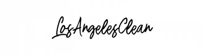
( Fonts by Bandit handmade )
![LosAngelesClean Frei Schriftart Herunterladen]() Herunterladen 55 Downloads@WebFont
Herunterladen 55 Downloads@WebFont -
( Fonts by deFharo - Fernando Haro - Personal-use only. For commercial use please contact owner. )
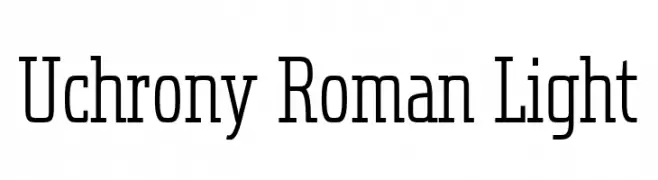
A modern slab serif font with a structured and balanced design.
![Uchrony Roman Light Frei Schriftart Herunterladen]() Herunterladen 55 Downloads@WebFont
Herunterladen 55 Downloads@WebFont -
( Daddi Daryawan )
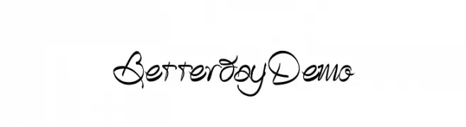
A whimsical and artistic script font with flowing, interconnected letters.
![BetterdayDemo Frei Schriftart Herunterladen]() Herunterladen 55 Downloads@WebFont
Herunterladen 55 Downloads@WebFont -
( Fonts by Letterena Studios - letterena.com - Personal-use only. For commercial use please contact owner. )
A playful, bold, hand-drawn font with a whimsical and friendly style.
![Boykids Frei Schriftart Herunterladen]() Herunterladen 55 Downloads@WebFont
Herunterladen 55 Downloads@WebFont -
( Fonts by Typodermic Fonts - Raymond Larabie - Personal-use only. For commercial use please contact owner. )
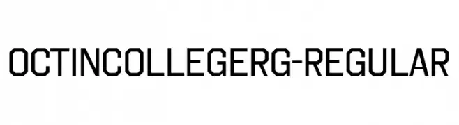
A bold, geometric font with a collegiate and athletic style.
![OctinCollegeRg-Regular Frei Schriftart Herunterladen]() Herunterladen 55 Downloads@WebFont
Herunterladen 55 Downloads@WebFont -
( Fonts by AminMario - Amin Mario - Personal-use only. For commercial use please contact owner. )
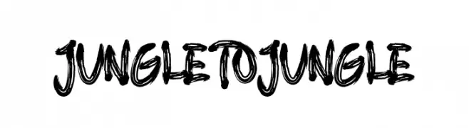
A bold, brush-textured font with an adventurous and dynamic style.
![JUNGLE TO JUNGLE Frei Schriftart Herunterladen]() Herunterladen 55 Downloads@WebFont
Herunterladen 55 Downloads@WebFont -
( Fonts by Four Lines - zain Fahroni - Personal-use only. For commercial use please contact owner. )
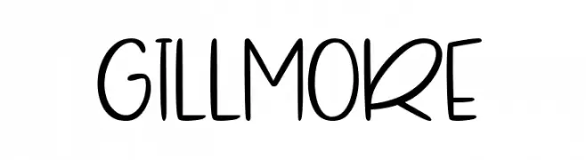
A playful, casual handwritten font with smooth, rounded edges and consistent strokes.
![Gillmore Frei Schriftart Herunterladen]() Herunterladen 55 Downloads@WebFont
Herunterladen 55 Downloads@WebFont -
( Fonts by Maulana Creative - Gilang Maulana - Personal-use only. For commercial use please contact owner. )
A bold, expressive handwritten font with dynamic strokes and medium contrast.
![Aftercoma Free Regular Frei Schriftart Herunterladen]() Herunterladen 55 Downloads@WebFont
Herunterladen 55 Downloads@WebFont -
( Fonts by Daniel Zadorozny - www.iconian.com - Personal-use only. For commercial use please contact owner. )
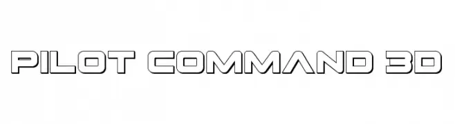
A bold, 3D font with a futuristic, technical design.
![Pilot Command 3D Frei Schriftart Herunterladen]() Herunterladen 55 Downloads@WebFont
Herunterladen 55 Downloads@WebFont -
( Fonts by Letterhend Studio - Hendry Juanda - Personal-use only. For commercial use please contact owner. )
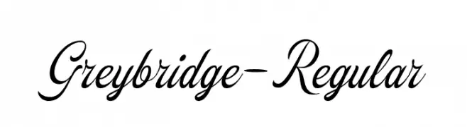
An elegant script font with flowing, cursive letterforms and ornate details.
![Greybridge-Regular Frei Schriftart Herunterladen]() Herunterladen 55 Downloads@WebFont
Herunterladen 55 Downloads@WebFont -
( Fonts by Vladimir Nikolic - www.creativefabrica.com/designer/vladimirnikolic/ - Personal-use only. For commercial use please contact owner. )
A bold, geometric font with a modern, futuristic style.
![Messina Regular Frei Schriftart Herunterladen]() Herunterladen 55 Downloads@WebFont
Herunterladen 55 Downloads@WebFont -
( Fonts by Fadlilah Studio - Personal-use only. For commercial use please contact owner. )
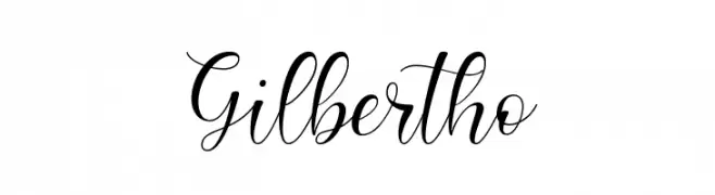
An elegant, flowing script font with smooth, cursive strokes.
![Gilbertho Frei Schriftart Herunterladen]() Herunterladen 55 Downloads@WebFont
Herunterladen 55 Downloads@WebFont -
( Fonts by Inermedia Studio - Personal-use only. For commercial use please contact owner. )
A whimsical, elegant script font with playful loops and swirls.
![Smoothing Frei Schriftart Herunterladen]() Herunterladen 55 Downloads@WebFont
Herunterladen 55 Downloads@WebFont -
( Fonts by Zetafonts - Personal-use only. For commercial use please contact owner. )
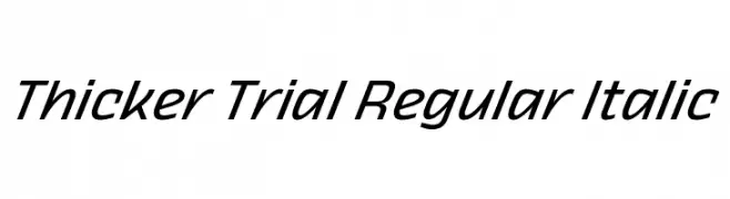
A sleek, modern italic font with consistent stroke width and dynamic appearance.
![Thicker Trial Regular Italic Frei Schriftart Herunterladen]() Herunterladen 55 Downloads@WebFont
Herunterladen 55 Downloads@WebFont -
( Fonts by PutraCetol Studio )
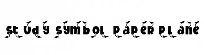
A bold, playful font with integrated paper plane motifs, perfect for creative projects.
![Study Symbol Paper Plane Frei Schriftart Herunterladen]() Herunterladen 55 Downloads@WebFont
Herunterladen 55 Downloads@WebFont -
( Fonts by Kotak Kuning Studio - kotakkuning.com - Personal-use only. For commercial use please contact owner. )
A playful, bold, handwritten-style font with rounded, flowing characters.
![Marrocin Funnies Frei Schriftart Herunterladen]() Herunterladen 55 Downloads@WebFont
Herunterladen 55 Downloads@WebFont -
( Fonts by Eifetstype - Stefie Justprince - Personal-use only. For commercial use please contact owner. )
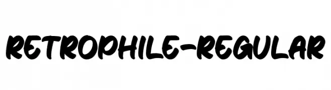
A bold, playful handwritten font with rounded, slanted letters.
![Retrophile-Regular Frei Schriftart Herunterladen]() Herunterladen 55 Downloads@WebFont
Herunterladen 55 Downloads@WebFont -
( Fonts by Woodcutter - woodcutter Manero - Personal-use only. For commercial use please contact owner. )
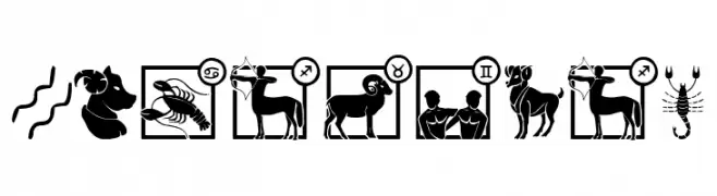
A decorative collection of zodiac-themed symbols representing the twelve astrological signs.
![Zodiac Mix Frei Schriftart Herunterladen]() Herunterladen 55 Downloads@WebFont
Herunterladen 55 Downloads@WebFont -
( Fonts by Iconian Fonts - Daniel Zadorozny - Personal-use only. For commercial use please contact owner. )
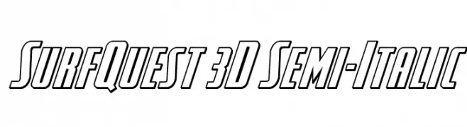
A bold, 3D semi-italic font with a dynamic and modern style.
![SurfQuest 3D Semi-Italic Frei Schriftart Herunterladen]() Herunterladen 55 Downloads@WebFont
Herunterladen 55 Downloads@WebFont


Welche Schriften sind gerade am populärsten?
Poppins, Roboto, Montserrat, Open Sans und Lato sind wegen ihrer klaren Formen und breiten Einsetzbarkeit sehr gefragt – von Markenauftritt über Landingpages bis hin zu Postern.
Welche Fonts eignen sich für Logos?
Geometrische Sans‑Serifs (z. B. Poppins, Familien im Gotham‑Stil) sind ein häufiger Griff für sauberes, skalierbares Branding. Für eine persönlichere Note bleiben Scripts und Handschrift‑Stile beliebt. Kombinieren Sie einen prägnanten Headline‑Font mit einer neutralen Brotschrift für Wiedererkennung und Harmonie.
Wie oft wird die Top‑Liste aktualisiert?
Regelmäßig – basierend auf realen Downloads und Interaktionen. Schauen Sie öfter vorbei, um aufstrebende Favoriten früh zu entdecken.
💡 Tipp: Seite bookmarken – Trends wechseln schnell, und heutige Top‑Schriften inspirieren morgen vielleicht das Rebranding.