Willkommen bei den Top‑Schriften – hier treffen Beliebtheit und Qualität aufeinander. Das sind die in diesem Jahr am häufigsten heruntergeladenen und genutzten Fonts. Wenn Sie sichere Optionen für Logo, Web oder Social suchen, starten Sie hier.
Jeder Top‑Font überzeugt durch Balance, Lesbarkeit und Vielseitigkeit. Sie finden moderne Sans‑Serifs, elegante Scripts, Vintage‑Serifs und minimalistische Displays.
-
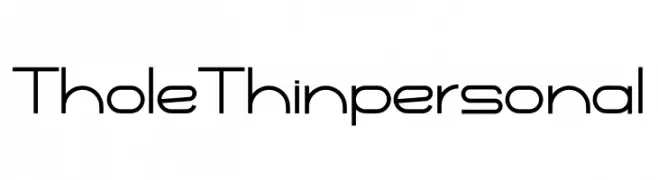
( Fonts by twinletter - Rozikan - Personal-use only. For commercial use please contact owner. )
A sleek, modern geometric font with thin strokes and a minimalist design.
 Herunterladen 45 Downloads@WebFont
 -
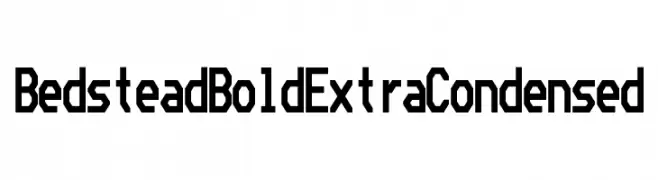
( Fonts by Ben Harris - Personal-use only. For commercial use please contact owner. )
A bold, extra-condensed font with geometric and angular letterforms.
![Bedstead Bold Extra Condensed Frei Schriftart Herunterladen]() Herunterladen 45 Downloads@WebFont
Herunterladen 45 Downloads@WebFont -
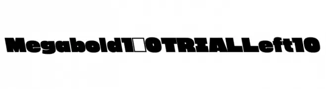
( Fonts by Justin Penner - Personal-use only. For commercial use please contact owner. )
A bold, modern font with thick, block-like characters for impactful designs.
![Megabold 1.0 TRIAL Left 10 Frei Schriftart Herunterladen]() Herunterladen 45 Downloads@WebFont
Herunterladen 45 Downloads@WebFont -
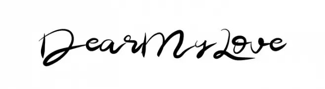
( Fonts by Muharima Rasyid - Personal-use only. For commercial use please contact owner. )
A flowing, elegant cursive font with dynamic curves and artistic flair.
![Dear My Love Frei Schriftart Herunterladen]() Herunterladen 45 Downloads@WebFont
Herunterladen 45 Downloads@WebFont -
( Fonts by fana merah jambu - Personal-use only. For commercial use please contact owner. )
A whimsical and playful script font with flowing, interconnected letters.
![Fishing Frei Schriftart Herunterladen]() Herunterladen 45 Downloads@WebFont
Herunterladen 45 Downloads@WebFont -
-
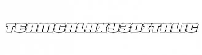
( Fonts by Daniel Zadorozny - www.iconian.com - Personal-use only. For commercial use please contact owner. )
A bold, 3D italic font with a futuristic and dynamic style.
![Team Galaxy 3D Italic Frei Schriftart Herunterladen]() Herunterladen 45 Downloads@WebFont
Herunterladen 45 Downloads@WebFont -
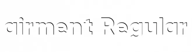
( Fonts by ArtDesWorld - Aleksandr Ananin - Personal-use only. For commercial use please contact owner. )
A modern, geometric stencil font with clean lines and sharp angles.
![airment Regular Frei Schriftart Herunterladen]() Herunterladen 45 Downloads@WebFont
Herunterladen 45 Downloads@WebFont -
( Fonts by Nico Muslib - Personal-use only. For commercial use please contact owner. )
A bold, modern script font with connected, flowing characters.
![Symo Frei Schriftart Herunterladen]() Herunterladen 45 Downloads@WebFont
Herunterladen 45 Downloads@WebFont -
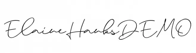
( Fonts by Saridezra - Personal-use only. For commercial use please contact owner. )
A fluid, handwritten-style font with elegant, connected characters.
![ElaineHanksDEMO Frei Schriftart Herunterladen]() Herunterladen 45 Downloads@WebFont
Herunterladen 45 Downloads@WebFont -
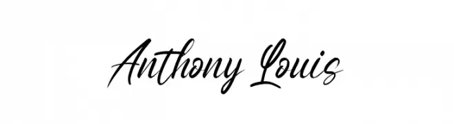
( Fonts by StringLabs - stringlabscreative.com - Personal-use only. For commercial use please contact owner. )
A modern, elegant script font with flowing, cursive letters and stylish numerals.
![Anthony Louis Frei Schriftart Herunterladen]() Herunterladen 45 Downloads@WebFont
Herunterladen 45 Downloads@WebFont -
( Fonts by Tomasz Skowronski - Personal-use only. For commercial use please contact owner. )
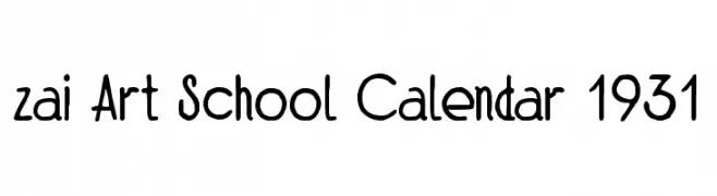
A playful, hand-drawn font with a whimsical and artistic style.
![zai Art School Calendar 1931 Frei Schriftart Herunterladen]() Herunterladen 45 Downloads@WebFont
Herunterladen 45 Downloads@WebFont -
( Fonts by Vunira Design - Personal-use only. For commercial use please contact owner. )
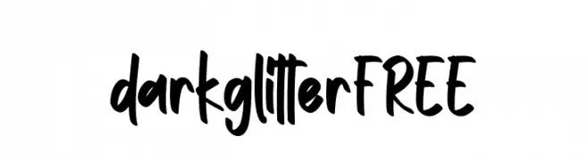
A bold, playful handwritten font with a casual and friendly style.
![darkglitterFREE Frei Schriftart Herunterladen]() Herunterladen 45 Downloads@WebFont
Herunterladen 45 Downloads@WebFont -
( Fonts by Billy Argel Fonts - www.billyargel.com - Personal-use only. For commercial use please contact owner. )
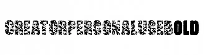
A bold, textured font with intricate patterns and a rebellious vibe.
![CREATOR PERSONAL USE Bold Frei Schriftart Herunterladen]() Herunterladen 45 Downloads@WebFont
Herunterladen 45 Downloads@WebFont -
( Personal-use only. For commercial use please contact owner. )
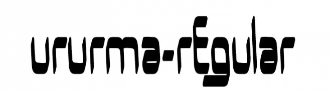
A bold, futuristic font with geometric and angular design.
![UrUrMa-Regular Frei Schriftart Herunterladen]() Herunterladen 45 Downloads@WebFont
Herunterladen 45 Downloads@WebFont -
( Fonts by fcvkreative - Personal-use only. For commercial use please contact owner. )
A flowing, cursive font with elegant, sweeping strokes and high contrast.
![bruke Frei Schriftart Herunterladen]() Herunterladen 45 Downloads@WebFont
Herunterladen 45 Downloads@WebFont -
( Fonts by Modestype Studio )
A bold, playful font with thick, rounded characters ideal for fun and engaging designs.
![Big-Mickey Frei Schriftart Herunterladen]() Herunterladen 45 Downloads@WebFont
Herunterladen 45 Downloads@WebFont -
( Noto is a trademark of Google Inc. Noto fonts are open source. All Noto fonts are published under the SIL Open Font License, Version 1.1 )
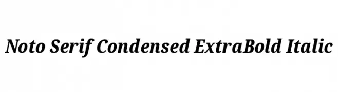
A classic serif font with a condensed, extra bold, and italic style, offering high contrast and elegance.
![Noto Serif Condensed ExtraBold Italic Frei Schriftart Herunterladen]() Herunterladen 45 Downloads@WebFont
Herunterladen 45 Downloads@WebFont -
( Fonts by Daniel Zadorozny - www.iconian.com - Personal-use only. For commercial use please contact owner. )
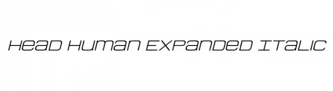
A modern, expanded, and italicized font with a geometric and futuristic style.
![Head Human Expanded Italic Frei Schriftart Herunterladen]() Herunterladen 45 Downloads@WebFont
Herunterladen 45 Downloads@WebFont -
( Fonts by Daniel Zadorozny - www.iconian.com - Personal-use only. For commercial use please contact owner. )
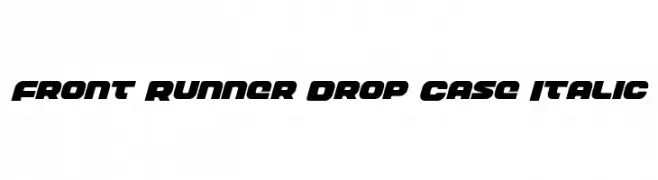
A bold, italic font with high contrast and a dynamic, modern style.
![Front Runner Drop Case Italic Frei Schriftart Herunterladen]() Herunterladen 45 Downloads@WebFont
Herunterladen 45 Downloads@WebFont -
( Fonts by Daniel Zadorozny - www.iconian.com - Personal-use only. For commercial use please contact owner. )
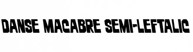
A bold, left-leaning font with angular cuts and a strong visual impact.
![Danse Macabre Semi-Leftalic Frei Schriftart Herunterladen]() Herunterladen 45 Downloads@WebFont
Herunterladen 45 Downloads@WebFont -
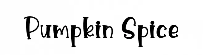
( Fonts by Graphix Line Studio - Personal-use only. For commercial use please contact owner. )
A playful, hand-drawn font with a whimsical and energetic style.
![Pumpkin Spice Frei Schriftart Herunterladen]() Herunterladen 45 Downloads@WebFont
Herunterladen 45 Downloads@WebFont -
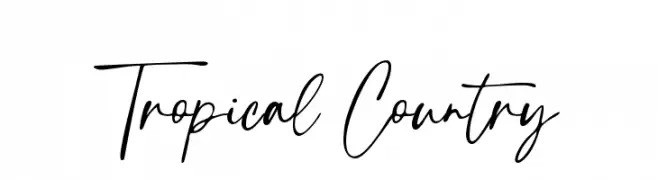
( Fonts by sronstudio - Yusron Billah - Personal-use only. For commercial use please contact owner. )
A lively, handwritten font with fluid, cursive letterforms and medium contrast.
![Tropical Country Frei Schriftart Herunterladen]() Herunterladen 45 Downloads@WebFont
Herunterladen 45 Downloads@WebFont -
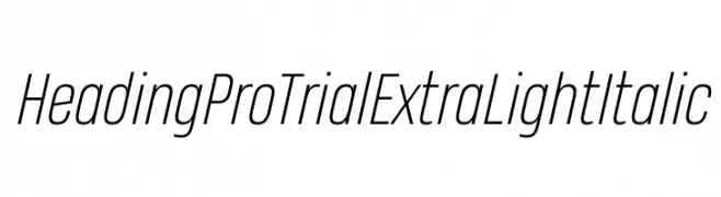
( Zetafonts - www.zetafonts.com )
A sleek, modern extra light italic font with tight spacing and low contrast.
![Heading Pro Trial ExtraLight Italic Frei Schriftart Herunterladen]() Herunterladen 45 Downloads@WebFont
Herunterladen 45 Downloads@WebFont -
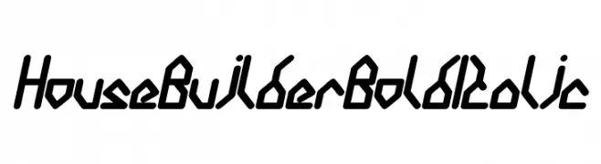
( weknow - Wino S Kadir - www.creativefabrica.com/designer/weknow/ )
A bold, italicized font with a geometric and angular design.
![House Builder Bold Italic Frei Schriftart Herunterladen]() Herunterladen 45 Downloads@WebFont
Herunterladen 45 Downloads@WebFont -
( Fonts by zone108.main.jp - Personal-use only. For commercial use please contact owner. )
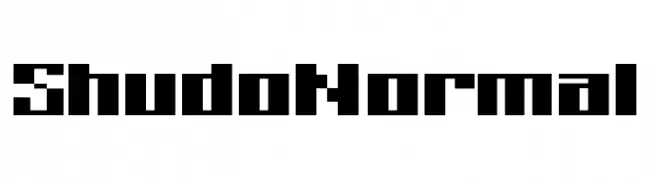
A bold, pixelated font with a retro digital aesthetic.
![Shudo Normal Frei Schriftart Herunterladen]() Herunterladen 45 Downloads@WebFont
Herunterladen 45 Downloads@WebFont -
( Fonts by Daniel Zadorozny - www.iconian.com - Personal-use only. For commercial use please contact owner. )
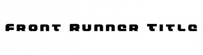
A bold, geometric font with rounded edges and a modern style.
![Front Runner Title Frei Schriftart Herunterladen]() Herunterladen 45 Downloads@WebFont
Herunterladen 45 Downloads@WebFont -
( Fonts by TypeScrib Studio - Personal-use only. For commercial use please contact owner. )
A bold, playful handwritten font with thick strokes and rounded edges.
![Grithani Frei Schriftart Herunterladen]() Herunterladen 45 Downloads@WebFont
Herunterladen 45 Downloads@WebFont -
( Iconian Fonts - Daniel Zadorozny - www.iconian.com )
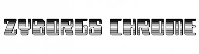
A bold, futuristic font with a chrome-like, three-dimensional appearance.
![Zyborgs Chrome Frei Schriftart Herunterladen]() Herunterladen 45 Downloads@WebFont
Herunterladen 45 Downloads@WebFont -
( Fonts by Daniel Zadorozny - www.iconian.com - Personal-use only. For commercial use please contact owner. )
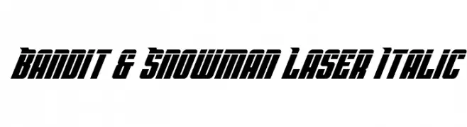
A bold, italicized font with a futuristic and dynamic style.
![Bandit & Snowman Laser Italic Frei Schriftart Herunterladen]() Herunterladen 45 Downloads@WebFont
Herunterladen 45 Downloads@WebFont -
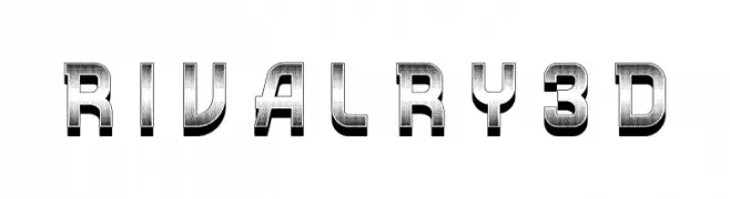
( Fonts by Vladimir Nikolic - www.creativefabrica.com/designer/vladimirnikolic/ - Personal-use only. For commercial use please contact owner. )
A bold, 3D metallic font with a futuristic and industrial style.
![Rivalry 3D Frei Schriftart Herunterladen]() Herunterladen 45 Downloads@WebFont
Herunterladen 45 Downloads@WebFont -
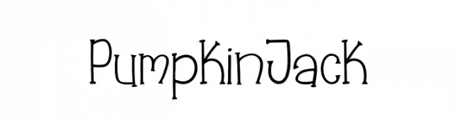
( Fonts by Booga Letter - Fajar Wicaksono - Personal-use only. For commercial use please contact owner. )
A playful, hand-drawn font with a whimsical, quirky style.
![Pumpkin Jack Frei Schriftart Herunterladen]() Herunterladen 45 Downloads@WebFont
Herunterladen 45 Downloads@WebFont -
( Fonts by SSI.Scraps - Syukur Setiyadi - Personal-use only. For commercial use please contact owner. )
A playful, bold handwritten font with smooth, rounded edges and consistent stroke width.
![One_Heart Frei Schriftart Herunterladen]() Herunterladen 45 Downloads@WebFont
Herunterladen 45 Downloads@WebFont -
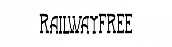
( Fonts by Vunira Design - Personal-use only. For commercial use please contact owner. )
A bold, decorative font with a vintage railway-inspired style.
![RailwayFREE Frei Schriftart Herunterladen]() Herunterladen 45 Downloads@WebFont
Herunterladen 45 Downloads@WebFont -
( Iconian Fonts - Daniel Zadorozny - www.iconian.com )
A modern, italicized font with a segmented, gradient design ideal for tech-themed projects.
![Light Brigade Gradient Italic Frei Schriftart Herunterladen]() Herunterladen 45 Downloads@WebFont
Herunterladen 45 Downloads@WebFont -
( Fonts by letterey )
A playful, hand-drawn font with boxed characters and decorative elements.
![SketchbookPaper Frei Schriftart Herunterladen]() Herunterladen 45 Downloads@WebFont
Herunterladen 45 Downloads@WebFont


Welche Schriften sind gerade am populärsten?
Poppins, Roboto, Montserrat, Open Sans und Lato sind wegen ihrer klaren Formen und breiten Einsetzbarkeit sehr gefragt – von Markenauftritt über Landingpages bis hin zu Postern.
Welche Fonts eignen sich für Logos?
Geometrische Sans‑Serifs (z. B. Poppins, Familien im Gotham‑Stil) sind ein häufiger Griff für sauberes, skalierbares Branding. Für eine persönlichere Note bleiben Scripts und Handschrift‑Stile beliebt. Kombinieren Sie einen prägnanten Headline‑Font mit einer neutralen Brotschrift für Wiedererkennung und Harmonie.
Wie oft wird die Top‑Liste aktualisiert?
Regelmäßig – basierend auf realen Downloads und Interaktionen. Schauen Sie öfter vorbei, um aufstrebende Favoriten früh zu entdecken.
💡 Tipp: Seite bookmarken – Trends wechseln schnell, und heutige Top‑Schriften inspirieren morgen vielleicht das Rebranding.